WPF AvatarView Control
- Display initials, images, and pre-defined avatars.
- Add up to three initials or images in a single view using group avatar view.
- Customize the avatar’s border, background, and more.
- Built-in visual styles in different sizes with shapes such as circles and squares.
.NET 10 support now available
Trusted by the world’s leading companies

Overview
The AvatarView (profile view) control for WPF provides a graphical representation of users that can be customized by adding images, background colors, icons, text, and more.
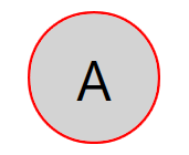
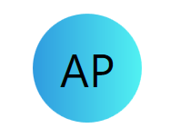
Initials
The WPF AvatarView control supports both single and double characters in initials. So, users can generate initials based on the text provided.
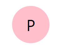
Single character
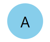
Used to show one character (the first character) from the avatar name.
Double character
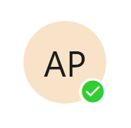
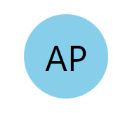
Used to show two characters (first and last characters for a single word/first character for more than one word) from the avatar name as initials.
Custom image
Set any custom image as the avatar for the user in the WPF AvatarView control.
Avatar character
The WPF AvatarView control has 25 pre-defined avatar character images to set the avatar for users.
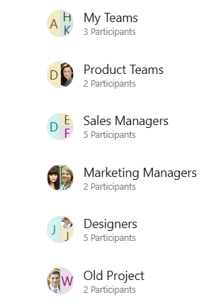
Group view
A group view is one of the most common UIs in any chat application. Almost all chat applications support group chats that require a common group picture to represent the group. The WPF AvatarView control supports group avatar view.
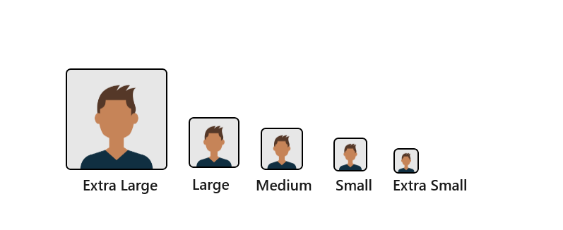
Visual style
The WPF AvatarView control comes with a predefined style as per design guidelines. Sizing specifications based on style factors such as extra-large, large, medium, small, and extra-small for squares and circles are available.
Square
WPF AvatarView supports predefined square-shaped styles.
Circle
WPF AvatarView supports predefined circle-shaped styles.
Customization
The WPF AvatarView control has customization options such as border, background, gradient background, font, and more.
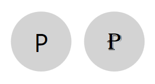
Border customization
Users can easily customize the border color and thickness of the control.
Font customization
Users can change the font size, font color, and font family of the initials.
Background
Users can customize the background of the control.
Gradient background
Users can customize the control background with a gradient color.
WPF AvatarView code example
Easily get started with the WPF AvatarView control using a few simple lines of XAML and CS code example, as demonstrated below.
<Window x:Class="AvatarView.MainWindow"
        xmlns="http://schemas.microsoft.com/winfx/2006/xaml/presentation"
        xmlns:x="http://schemas.microsoft.com/winfx/2006/xaml"
        xmlns:d="http://schemas.microsoft.com/expression/blend/2008"
        xmlns:mc="http://schemas.openxmlformats.org/markup-compatibility/2006"
        xmlns:local="clr-namespace:AvatarView"
        xmlns:syncfusion="http://schemas.syncfusion.com/wpf"
        mc:Ignorable="d"
        Title="MainWindow" Height="450" Width="800">
    <Grid>
        <syncfusion:SfAvatarView ContentType="Initials" AvatarName="Anderson Perry"/>
    </Grid>
</Window>
public MainWindow()
{
InitializeComponent();
Grid grid = new Grid();
SfAvatarView avatarView = new SfAvatarView();
avatarView.ContentType = AvatarContentType.Initials;
avatarView.AvatarName = "Anderson Perry";
grid.Children.Add(avatarView);
this.Content = grid;
}140+ WPF CONTROLS
ALL CONTROLS
SMART COMPONENTS
DATA VISUALIZATION
MODERN THEMES
LAYOUT
NAVIGATION
INPUT CONTROLS
BUTTON
BUSINESS INTELLIGENCE
MISCELLANEOUS
LISTS & DROPDOWNS
FILE VIEWERS & EDITORS
CONVERSATIONAL UI
Standalone UI SDKs
Integrate the DataGrid, Chart, Scheduler, Gantt, Rich Text Editor, File Manager, and Diagram UI components into applications to enable rich interaction and visualization, delivering a seamless user experience.
Document Solutions
Integrate the PDF Viewer, DOCX Editor, Spreadsheet Editor, and document-processing libraries into the WPF applications to enable a smooth user experience.
Our Customers Love Us
Having an excellent set of tools and a great support team, Syncfusion® reduces customers’ development time.Here are some of their experiences.

Excellent experience with Syncfusion!
Syncfusion is a product that makes life easier! I use it to create Blazor applications (server side and webassembly) and the controls speed up development a lot. Furthermore, if needed, it is possible to ask for direct support that is never long in coming!

Andrea Scarpante,

Sydea srl
The complete component set
It is the most complete component set available. Also very handy is the fact that there is a community edition, this gives me the opportunity to test thing at home without buying a separate license.

Johan Visser,

H and T Pawnbrokers
See Real Success Stories
Developers around the world trust Syncfusion’s Essential Studio to simplify complex projects and speed up delivery. With a vast library of UI controls, powerful SDKs, and reliable support, Essential Studio helps teams build enterprise-ready applications with confidence.
Read Our Customer StoriesIndustry
Software development
75% Cost reduction
50% Faster development
Industry
Utilities (oil and gas)
450+ hours saved
Streamlined processes and hours of development effort saved.
Advanced, flexible features
Empowered users through robust and versatile functionality.
Industry
Software and technology
1000+ of hours saved
Accelerated development with enterprise-ready UI components.
Efficient file management
Streamlined workflows with document libraries without building them from scratch.
Industry
Software and technology
2 Years of delay avoided
Two years of delays prevented with proactive planning.
On-time delivery
Projects delivered on schedule using trusted controls.
Industry
IT services and IT consulting
Improved performance
Large datasets handled with easy customization and quick debugging.
Highly customizable
Plug-and-play controls with quick template integration.
Industry
Professional services
Instant access
Quick availability of features and resources.
Reduced dependencies
Fewer dependencies for faster development.
Rated by users across the globe
Syncfusion WPF Resources
Learning
 Documentation
 Documentation


Awards
Greatness—it’s one thing to say you have it, but it means more when others recognize it. Syncfusion® is proud to hold the following industry awards.

