React Gantt Chart – Plan, Schedule, and Track Projects Effortlessly
- A React Gantt Chart is a project management UI component that helps you visualize, schedule, and track tasks on an interactive timeline. It displays task hierarchies, dependencies, and progress in React applications.
- It supports task scheduling, drag‑and‑drop editing, dependency management, resource allocation, progress tracking, and interactive timeline navigation for managing simple to complex projects.

Trusted by the world’s leading companies

Overview
The React Gantt Chart is a project planning and task‑scheduling component used to visualize and manage hierarchical tasks on a timeline. It helps teams estimate project duration, allocate the right resources, track task dependencies, and determine the correct execution order. With an interactive timeline view, it enables efficient planning and monitoring of projects across industries such as software development, construction, manufacturing, and service operations.
Interact with the Live React Gantt Chart
Runs in-browser. No installation required.
Why choose the Syncfusion React Gantt Chart?
High performance
Virtual scrolling in the React Gantt Chart allows you to load large amounts of data without performance degradation.
Seamless data binding
Bind data with various local and remote data sources such as JSON, OData, WCF, and RESTful web services with the help of a data manager.
Elegant animation
The Gantt Chart for React provides fluid animation to present data with smooth transitions.
AI-Assisted Development
Build project management experiences faster with the Agentic UI Builder and Syncfusion Agent Skills. Generate task timelines, dependencies, milestones, and resource planning workflows with minimal manual effort.
Attractive, customizable themes
Create cutting-edge design with several built-in themes, such as Fluent, Tailwind CSS, Bootstrap, Material, and Fabric. Utilize the online Theme Studio tool to customize themes in the Gantt Chart easily.
Globalization and localization
Enable users from different locales to use the control by formatting dates, currency, and numbering to suit preferences.
AI-assisted development
Build feature-rich React Gantt Chart experiences faster
Accelerate project management application development with Syncfusion AI tools that turn requirements into fully configured Gantt chart experiences with minimal manual setup.
Agentic UI Builder
Turn prompts into ready-to-use UI screens, layouts, and workflows with Syncfusion React components.
Example Prompt Create a project planning dashboard with milestones, dependencies, and resource allocation.
Agent Skills
Accelerate development with Syncfusion AI Agent Skills for faster implementation and integration.
Example Prompt Generate a React Gantt chart with dependencies, timeline views, and editing support.
AI Coding Assistant
Accelerate development with AI that generates, configures, and troubleshoots component code directly in your IDE.
Example Prompt Show how to configure task dependencies in the Syncfusion React Gantt Chart.
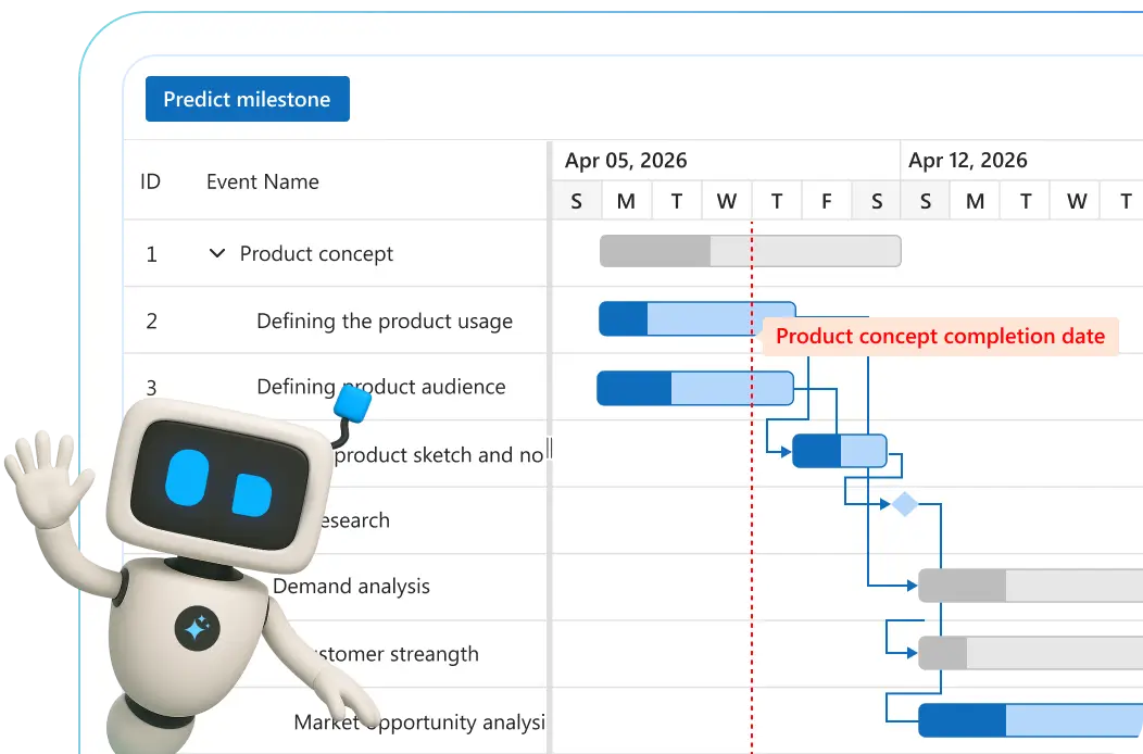
AI-ready Gantt Chart for smarter project planning
Plan and manage projects intelligently with this AI-ready Gantt Chart. Prioritize tasks, predict timelines, and optimize resources effortlessly for peak productivity.
-
Auto-prioritize tasks: Let AI sort tasks by urgency so your team stays focused.
- See how to add task prioritization
-
Timeline prediction: Forecast milestones and completion dates with machine learning.
- See how to integrate timeline forecasting
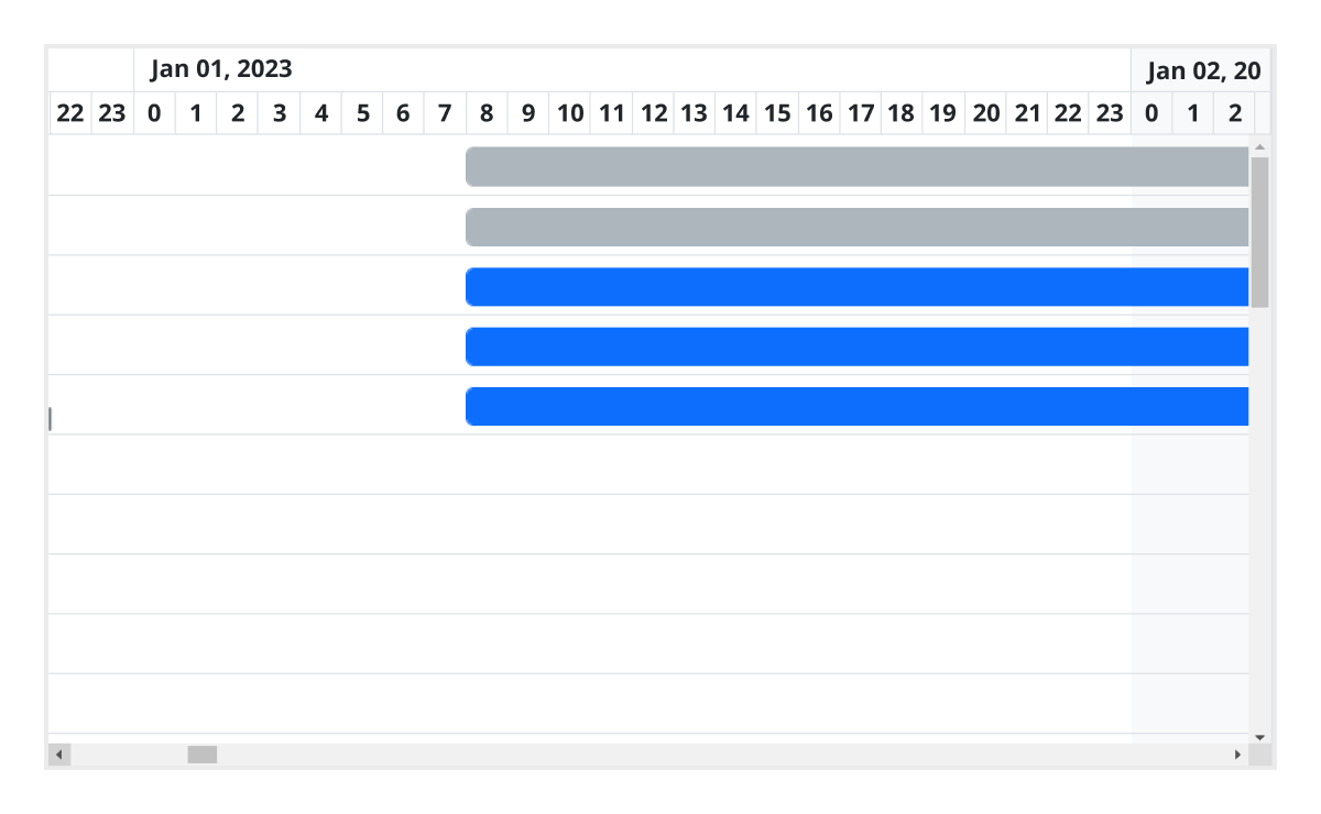
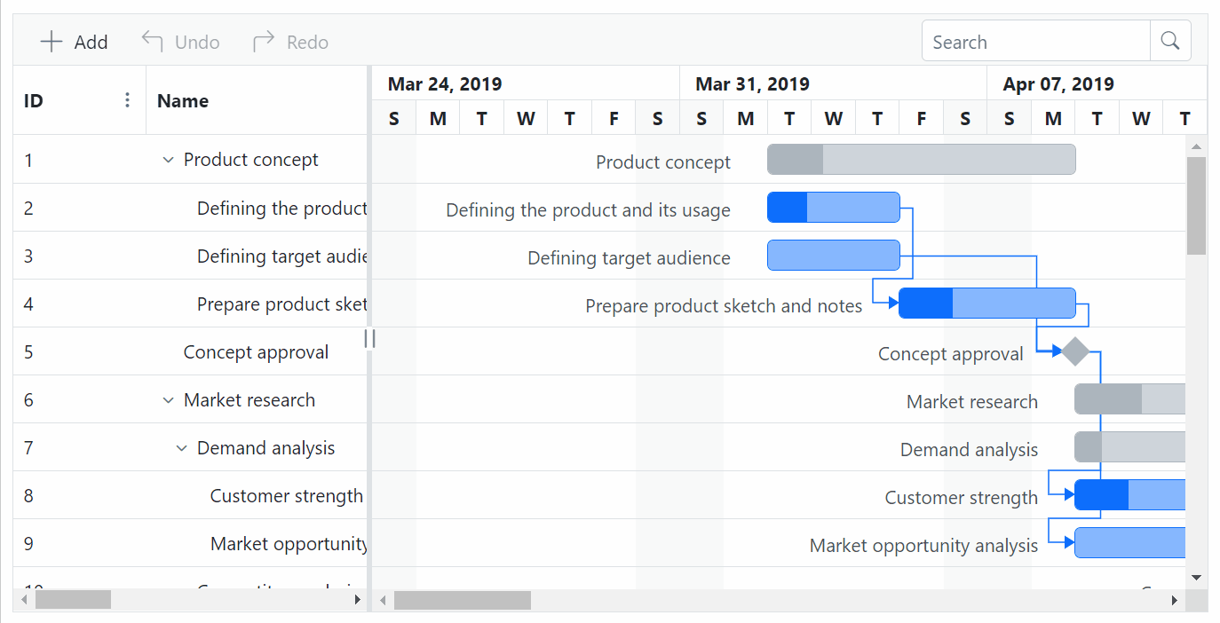
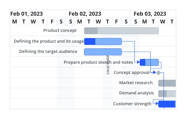
Timeline
The React Gantt Chart Library supports different, configurable timeline views: hour, day, week, month, and year.
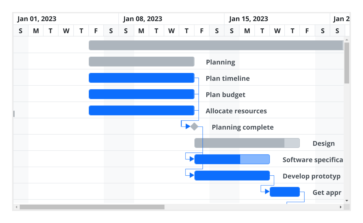
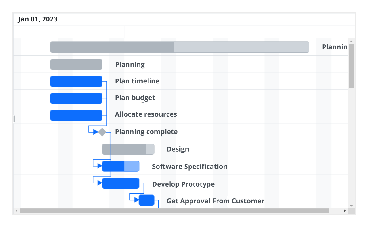
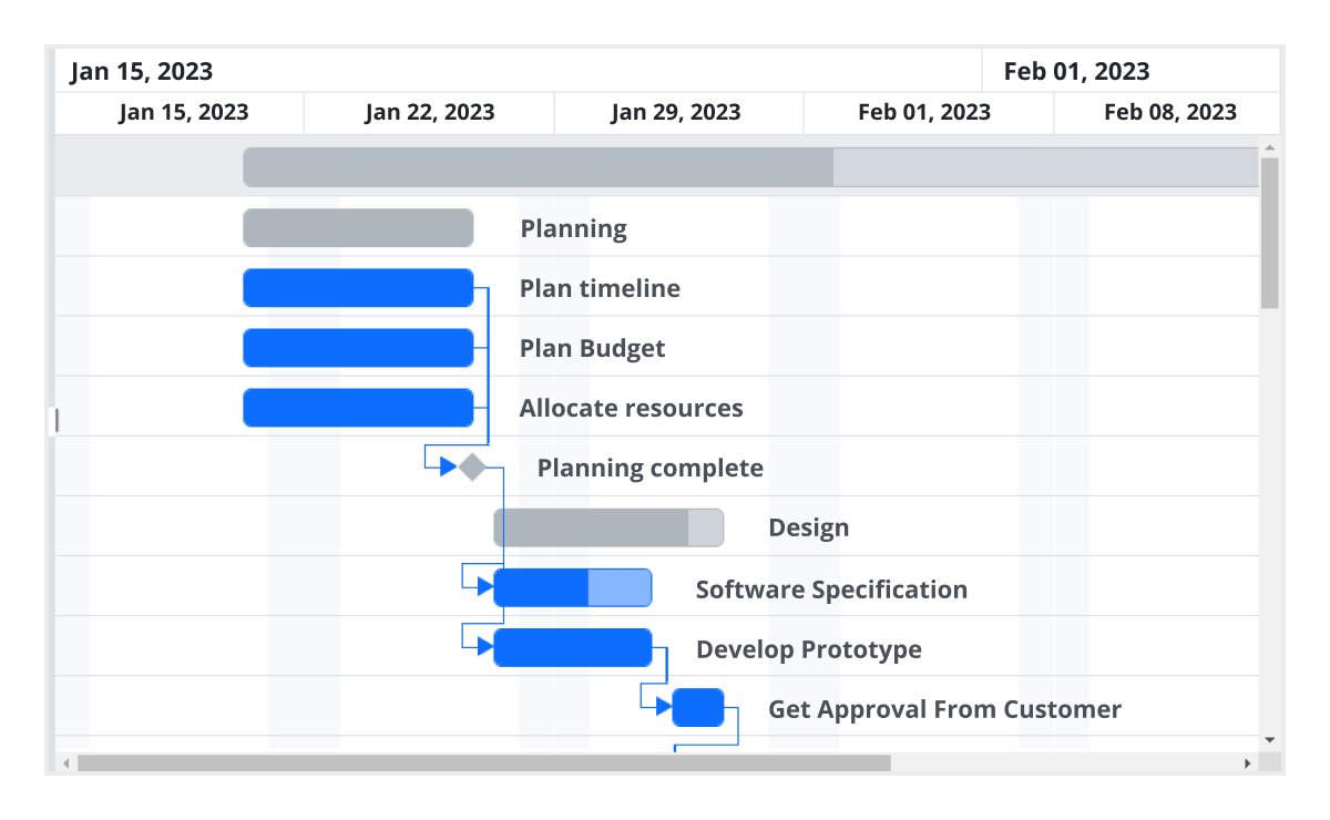
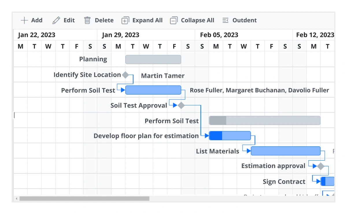
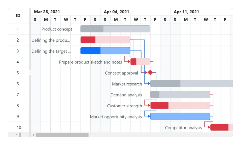
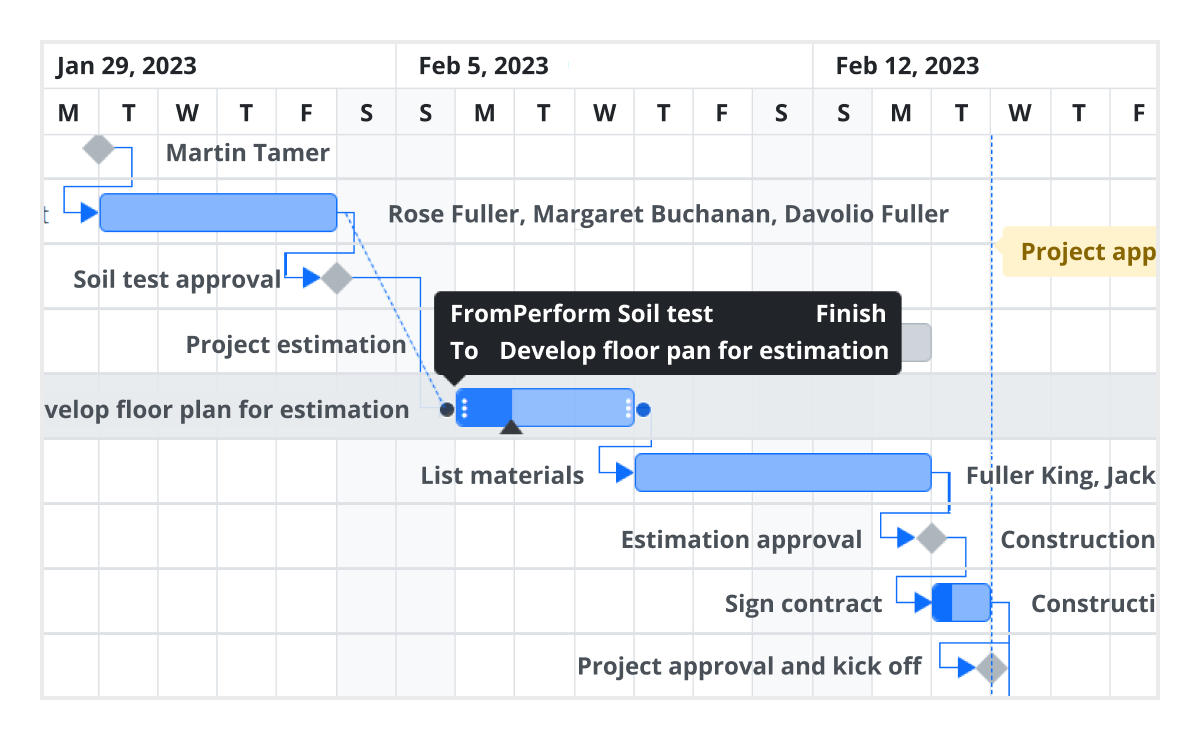
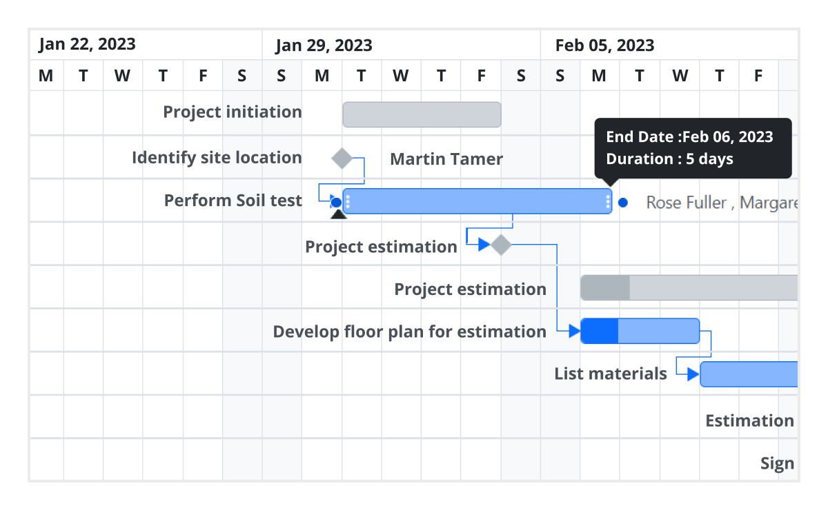
Task scheduling and dependencies
The React Gantt Chart component enables precise task scheduling and seamless management of task relationships, ideal for complex project planning scenarios. It offers full control over how tasks are sequenced, tracked, and linked within your timeline.
- Schedule tasks in automatic or manual mode.
- Visualize and define task dependencies.
- Use four types of task links: finish-to-start (FS), start-to-finish (SF), start-to-start (SS), and finish-to-finish (FF).
- Manage interdependent tasks in large or multiphase projects.
- Determine start and end conditions for each task based on its dependencies.
Critical path
The React Gantt Chart offers support for a critical path, representing a series of tasks that directly influence the calculated finish date of a project. If any task within the critical path is delayed, it leads to a delay in the timeline. This feature is particularly useful for managing projects with fixed deadlines, allowing users to identify and prioritize tasks crucial for timely delivery.
Split and merge tasks
Enhance project visualization by splitting and merging taskbars:
- Split tasks into multiple segments to reflect work interruptions or phased execution.
- Merge segments easily to consolidate split taskbars when needed.
- Make the Gantt Chart more dynamic and realistic for project tracking.
- Improve clarity for tasks that span non-continuous timelines.
- Use for projects with variable work schedules or on-hold tasks.
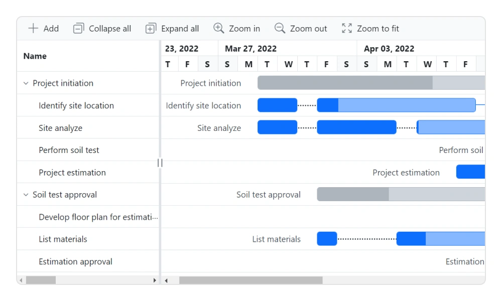
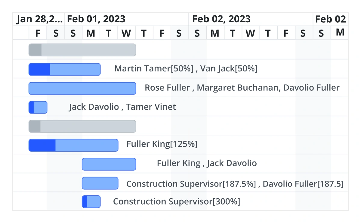
Resource view
Gain a clear view of task assignments across all resources in a structured hierarchy:
- Display task allocation by resource in a collapsible row format.
- View multiple tasks for each resource in a single, organized row.
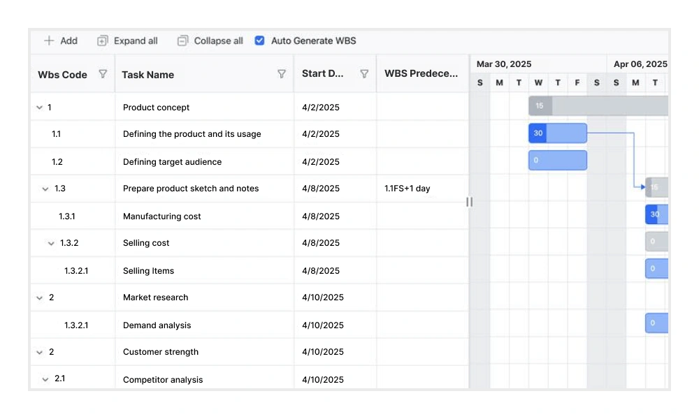
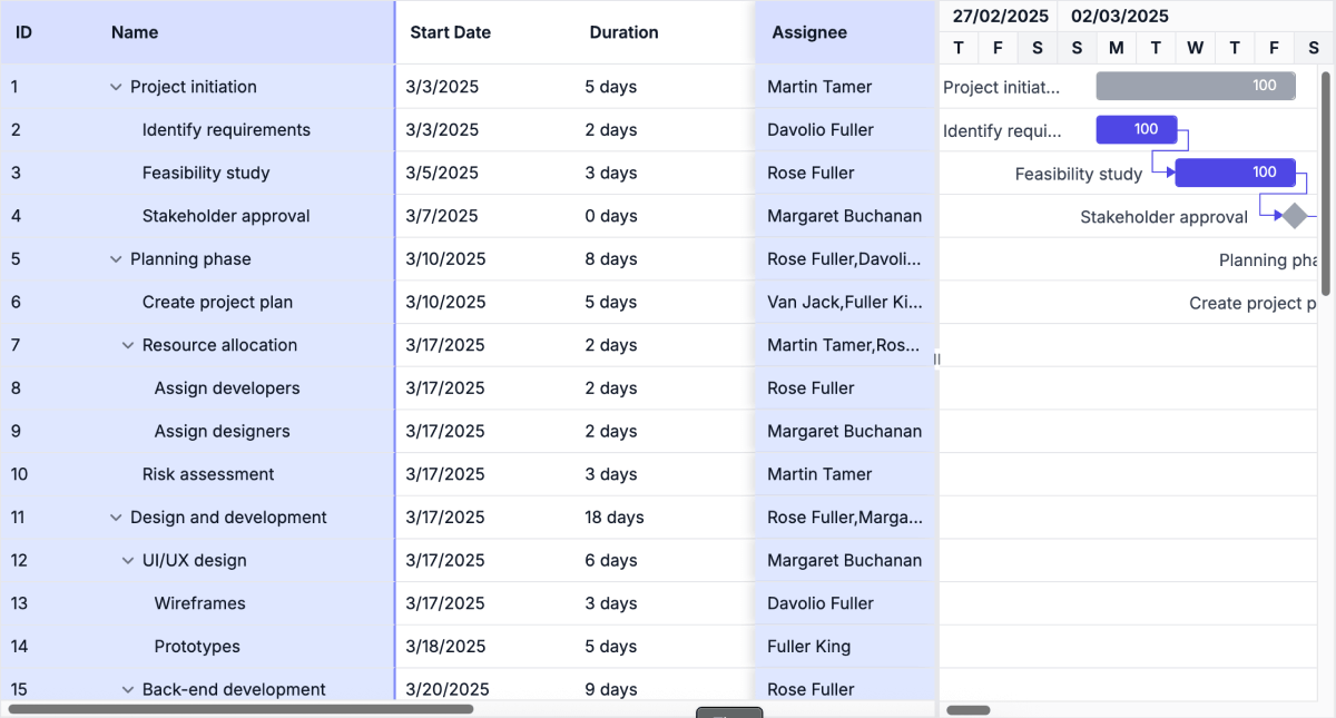
Work breakdown structure (WBS) column
The WBS column organizes project tasks into a multilevel hierarchy by assigning unique codes to each task. This structure improves visibility and control over complex task relationships, making it well-suited for projects such as construction, enterprise systems, and large-scale software development.
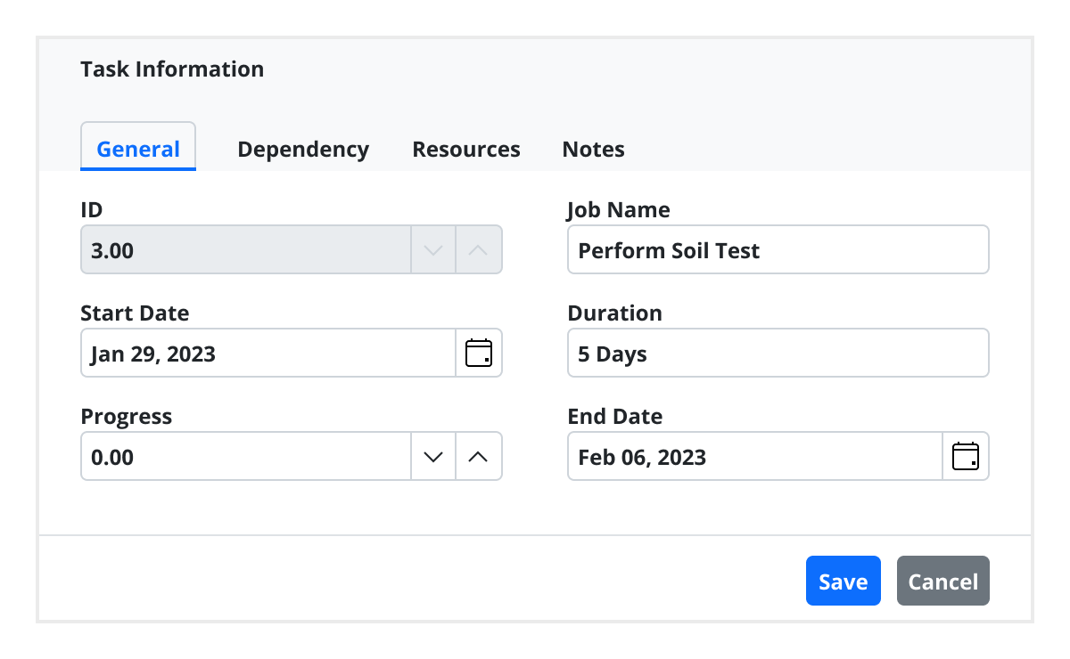
Editing
The Gantt Chart provides full support for create, read, update, and delete (CRUD) operations. In addition to using built-in editor controls to edit a particular column value, users can create custom editor controls using template support. Users can also edit the task fields directly in their respective cells using a dialog or interactively using taskbars.
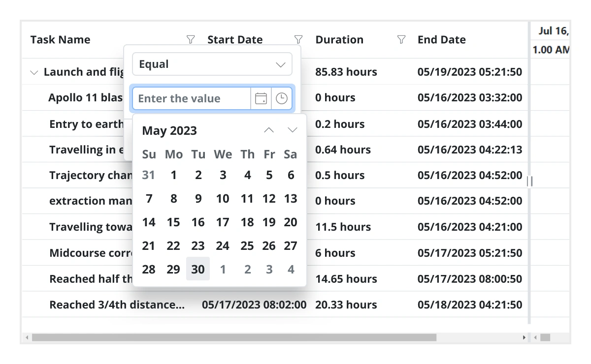
Filtering
Data can be filtered using the filter option in each column and search option in the toolbar. The component supports two filter types: Excel-like filters and menu filters. The React Gantt Chart allows users to choose appropriate filter types, define their own custom filtering logic, and customize the filtering UI. Filtering with related parent or child records can be defined.
Undo and redo
The undo feature enables users to revert the most recent action performed in the Gantt Chart. The redo feature allows users to reapply the action that was previously undone.
Virtual scrolling
Virtual scrolling in the React Gantt Chart allows you to load large amounts of data without performance degradation. In row virtualization mode, all tasks are fetched initially from the data source and rendered in the DOM within a compact viewport area.
Frozen columns
Frozen columns stay fixed on the left, right, or both sides of the chart, while the rest of the content scrolls independently. This makes it easy to keep important task identifiers visible at all times.
Auto scroll to taskbar on row selection
Focus on the tasks that are not visible but scheduled later along the timeline by selecting their rows in the grid section.
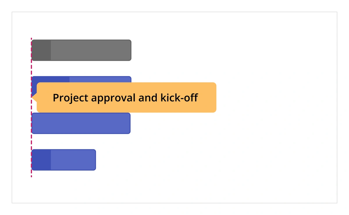
Highlight days and events
Highlight important days or events in a project using event markers.
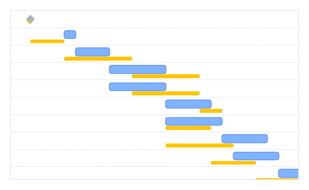
Baselines
Compare the current task’s progress with the planned timeline using baselines.
Resource allocation
Allocate multiple resources like staff, equipment, and materials to each task.
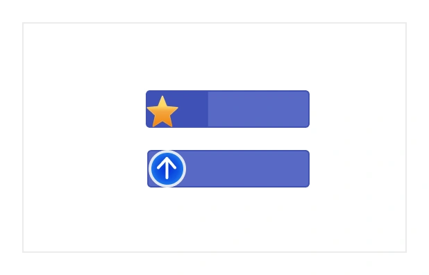
Data markers
Display events for a specific task that can be placed on the timeline on any given date.
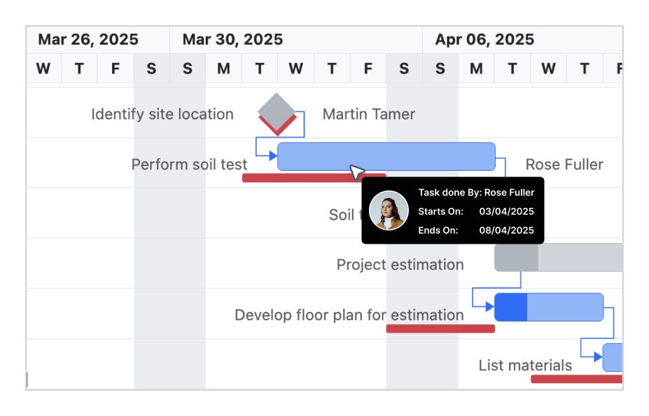
Tooltip
The tooltip displays task information while the mouse hovers over the task and editing actions for the taskbar and connector lines.
Holidays
Display nonworking days using the holidays feature.
Interactive features

Row and taskbar heights
Row height is a major factor when displaying records in the viewport, and it can be customized effortlessly. The height of child taskbars and parent taskbars can be customized using the taskbarHeight property.

Context menu
The context menu improves user interaction with the React Gantt Chart component by providing a pop-up menu. It appears when a cell or header is right-clicked. In addition to built-in, default menu items, it allows you to add custom items.

Exporting
Easily export the React Gantt Chart component in file formats such as Excel, CSV, and PDF.
Accessibility

Keyboard navigation
Every cell in the React Gantt Chart is keyboard-accessible. Major features like sorting, selection, and editing can be performed using keyboard commands alone; no mouse interaction is required. This helps in creating highly accessible applications using this component.

Screen reader
The React Gantt Chart has complete WAI-ARIA accessibility support. The UI includes high-contrast visual elements to help people with low vision have the best viewing experience. Also, valid UI descriptions are easily accessible through assistive technologies such as screen readers.
Mobile-optimized and touch-friendly
The React Gantt Chart has a highly responsive layout and fine touch support for desktops, tablets, and smartphones.

Touch support
User-friendly touch gestures and an interactive UI design help produce the best user experience. All Gantt Chart features work on touch devices with zero configuration.

Responsive
The React Gantt Chart has a responsive layout, allowing it to be viewed on various devices. It is also possible to hide specific columns for particular screen sizes using column-based media query support.
Other supported frameworks
The Gantt Chart is available for the Blazor, Angular, JavaScript, and Vue frameworks. Explore its platform-specific options through the following links:


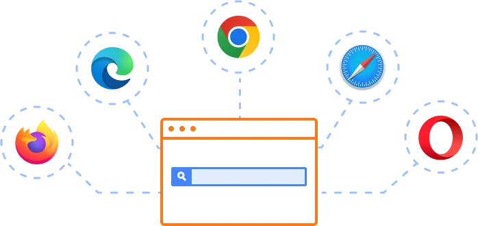
Supported browsers
The React Gantt Chart works well with all modern web browsers, including Chrome, Firefox, Edge, Safari, and Opera.
Not sure how to create your first React Gantt Chart? Our tutorial videos and documentation can help.
I’d love to watch it now I’d love to read it now

Frequently Asked Questions
Why should you choose the Syncfusion React Gantt Chart?
- A complete project management tool to schedule and plan projects.
Extensive features for managing and monitoring specific tasks and resources in a project.
Intuitive user interface to manage complex projects on the go.
Simple configuration and API.
- Support for all modern browsers.
- Touch-friendly and responsive UI.
Extensive learning resources such as demos and documentation help you get started quickly with the React Gantt Chart.
Where can I find the Syncfusion React Gantt Chart demo?
You can find our React Gantt Chart demo here. It demonstrates how to render and configure the Gantt Chart.
What is the Syncfusion React Gantt Chart used for?
React Gantt Charts can be used in various aspects of project management, from initial planning and scheduling to tracking progress and managing risks. They provide a structured framework for organizing and managing complex projects.
How do I customize the timeline view in the React Gantt Chart?
Use the timelineSettings property to configure single or multitier timelines. You can combine units and specify formats for top and bottom tiers. For example, you can set the top tier to Day and bottom tier to Hour with a count of 8 hours per cell.
Does the React Gantt Chart support nested subtasks?
Yes, you can nest subtasks by mapping child tasks in the data source using the child field for hierarchical data or the parentID field for self-referential data binding. This allows the creation of complex task hierarchies.
Can I download and utilize the Syncfusion React Gantt Chart for free?
No, this is a commercial product and requires a paid license. However, a free community license is also available for companies and individuals whose organizations have less than $1 million USD in annual gross revenue, 5 or fewer developers, and 10 or fewer total employees.
How do I get started with Syncfusion React Gantt Chart?
A good place to start would be our comprehensive getting started documentation.
How can I try the React Gantt Chart?
Current customers can download the latest version of Syncfusion controls from the Downloads and Keys section of their Syncfusion account dashboard. If you are new to Syncfusion, try our 30-day free trial to check out all our components.
Can I add, edit, and delete tasks in the React Gantt Chart?
Yes. To enable task management, inject the Edit module and configure the editSettings. You can also enable a toolbar and context menu for interactive task control. The Gantt Chart supports different editing modes including cell editing, dialog editing, and direct taskbar editing.
How can I manage task dependencies and milestones in the React Gantt Chart?
Task dependencies can be defined using predecessor task IDs along with dependency types like finish-to-start or start-to-start. Milestones are defined by setting a task’s duration to zero. The Gantt Chart automatically visualizes dependencies with connector lines and highlights milestones directly on the timeline.
Our Customers Love Us


See Real Success Stories
Developers around the world trust Syncfusion’s Essential Studio to simplify complex projects and speed up delivery. With a vast library of UI controls, powerful SDKs, and reliable support, Essential Studio helps teams build enterprise-ready applications with confidence.
Read Our Customer StoriesIndustry
Software development
75% Cost reduction
50% Faster development
Industry
Utilities (oil and gas)
450+ hours saved
Streamlined processes and hours of development effort saved.
Advanced, flexible features
Empowered users through robust and versatile functionality.
Industry
Software and technology
1000+ of hours saved
Accelerated development with enterprise-ready UI components.
Efficient file management
Streamlined workflows with document libraries without building them from scratch.
Industry
Software and technology
2 Years of delay avoided
Two years of delays prevented with proactive planning.
On-time delivery
Projects delivered on schedule using trusted controls.
Industry
IT services and IT consulting
Improved performance
Large datasets handled with easy customization and quick debugging.
Highly customizable
Plug-and-play controls with quick template integration.
Industry
Professional services
Instant access
Quick availability of features and resources.
Reduced dependencies
Fewer dependencies for faster development.
Rated by users across the globe
Transform your applications today by downloading our free evaluation version
No credit card required | 1.3M+ downloads


 Figma download
Awards
Greatness—it’s one thing to say you have it, but it means more when others recognize it. Syncfusion® is proud to hold the following industry awards.

