Trusted by the world’s leading companies

Overview
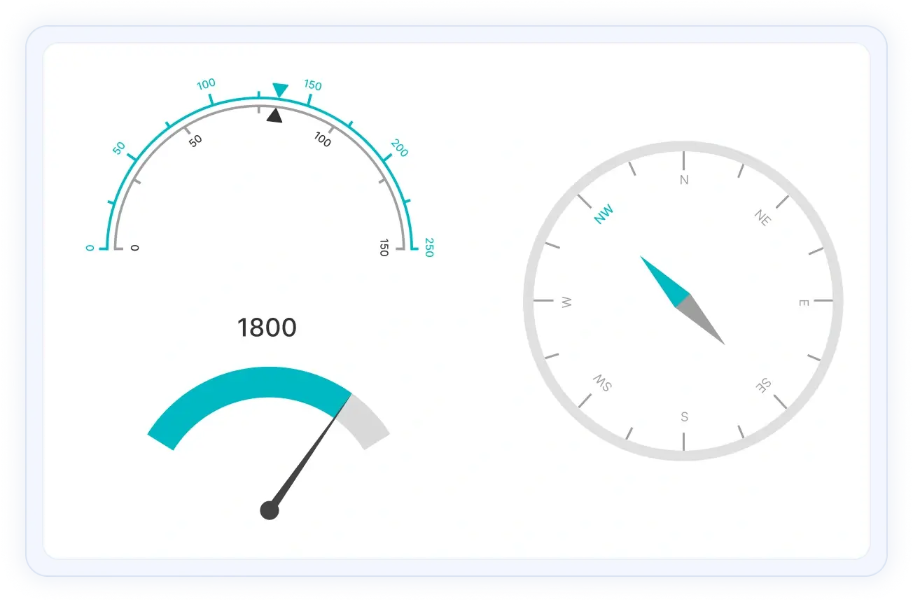
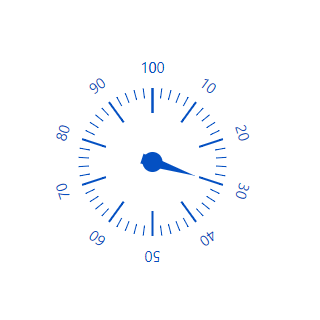
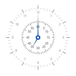
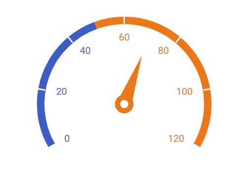
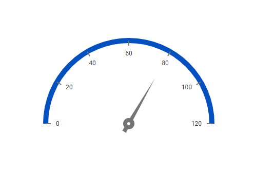
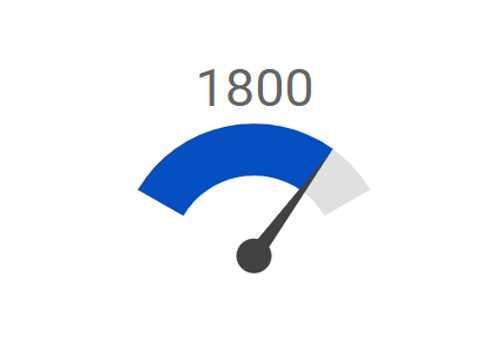
The React Circular Gauge is a component for visualizing numeric values on a circular scale with features like multiple axes and rounded corners. Completely customize the appearance of the gauge to simulate a speedometer, meter gauge, analog clock, etc.
React Circular Gauge code example
Easily get started with the React Circular Gauge using a few simple lines of TSX code, as demonstrated below. Also explore our React Circular Gauge example, which shows you how to render and configure a Circular Gauge in React.
import * as React from "react";
import * as ReactDOM from "react-dom";
import { CircularGaugeComponent } from '@syncfusion/ej2-react-circulargauge';
import { SampleBase } from '../common/sample-base';
export class Default extends SampleBase<{}, {}> {
   render() {
       return (
<CircularGaugeComponent>
</CircularGaugeComponent>
       )
   }
}
Axes customization
The gauge axes are circular scales where a set of values can be plotted based on any business logic. You can easily customize the appearance of the axes.
Label customization
Customize the look and feel of the default labels in a gauge by changing the font style, size, and color. Prefix or suffix text can also be added to the labels.
Ticks customization
Define the desired style for major and minor ticks in the gauge by changing their height, width, and color.
Offset
To enhance readability, change the position of the default axes in the gauge by setting the offset value for the labels, ticks, and axis lines.
Axis lines
Add a border to the gauge by using axis lines. The appearance of the default axis in the Circular Gauge can also be customized.
Multiple axes
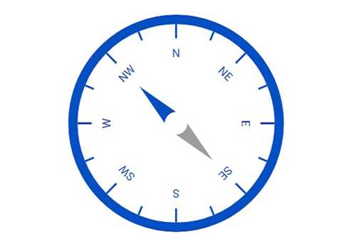
The React Circular Gauge allows you to add multiple axes to design it like a clock, speedometer, meter gauge, etc.
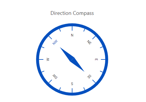
Direction
Render the axes in the Circular Gauge either clockwise or counterclockwise.
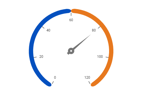
Range customization
A range in an React Circular Gauge is a visual element that helps to quickly visualize where a value falls on the axis.
Range position
Change the position of a range or move it to any place inside the gauge.
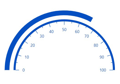
Range width
The range width varies based on the values to enhance usage and readability.
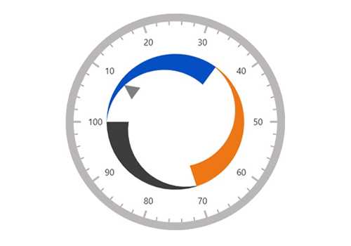
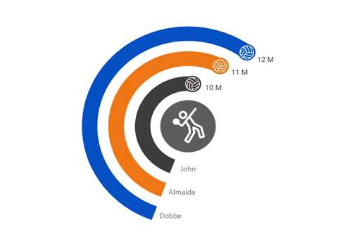
Multiple ranges
You can add multiple ranges inside the axes to show color variations.
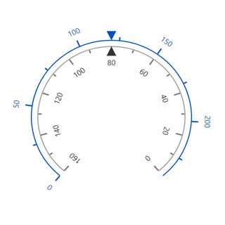
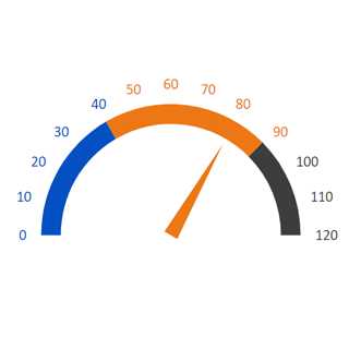
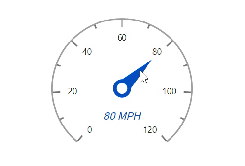
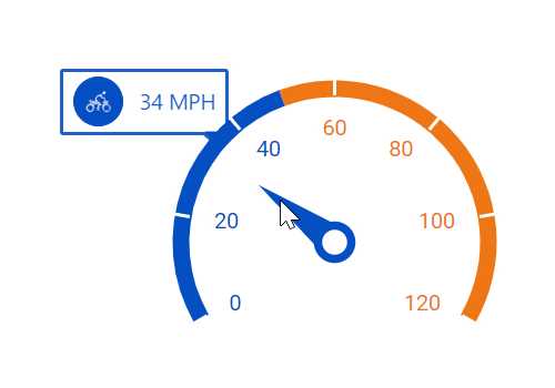
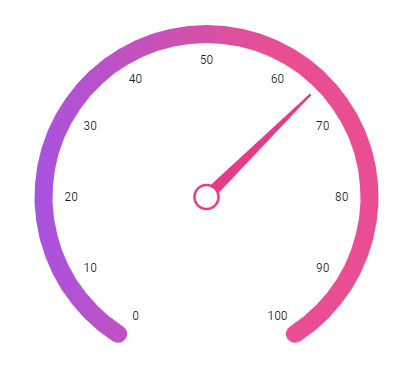
Pointer types
Indicate values on an axis using pointers. The React Circular Gauge component supports three categories of pointers: needle, marker, and range bar.
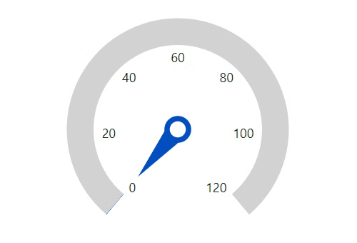
Needle pointer
Point out the current value in the Circular Gauge using a highly customizable needle-type element.
Pointer type
Change the needle pointer shape to a triangle or arrow to point out or highlight values.
Pointer cap
The pointer cap is a rounded ball at the end of the arrow pointer that can also be customized to enhance the pointer’s appearance.
Tail
Add extra styling to the pointer cap by adding a tail.
Multiple needle pointers
You can add more than one needle pointer to the gauge axes to indicate multiple values.
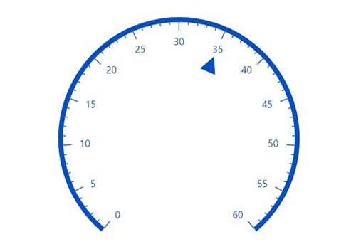
Marker pointer
Point out the current value by using the following different types of marker pointers.
Pointer type
Change the marker pointer type to built-in shapes such as a triangle, inverted triangle, square, or circle to highlight values.
Marker pointer position
You can change or move the marker pointer to any place inside the gauge.
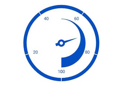
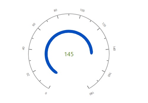
Range bar pointer
Use the range bar pointer to point to the current value from the start value of the axes.
Pointer position
You can change or move the range bar pointer to any place inside the gauge.
Multiple pointers
You can add more than one range bar pointer to the axes to indicate multiple values.
Pointer animation
The React Circular Gauge component provides a visually appealing way to view its pointers with animated transitions for a certain duration. Experience smooth pointer transitions by moving the pointer from one place to another.
Pointer interaction
The interactive React Circular Gauge component lets you drag the pointer from one place to another. Swipe gestures can be used to control the pointer, and the value is changed at runtime.
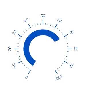
Arc gauges
The ranges and range bar pointer corners in a Circular Gauge can be rounded to form arc gauges.
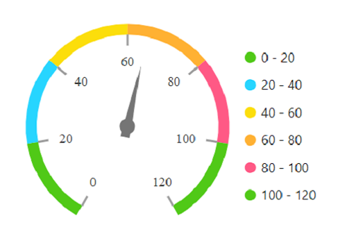
Legends
A legend provides additional information that is helpful in identifying the ranges in a Circular Gauge. It can be docked at the left, right, top, and bottom positions around the plot area.
Tooltip
Display details about a pointer value in the interactive React Circular Gauge component through a tooltip when hovering the mouse over the pointer.
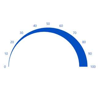
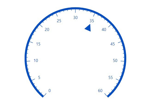
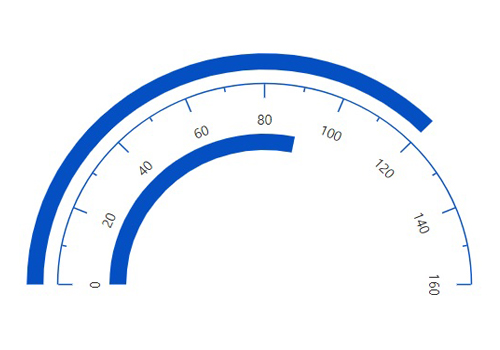
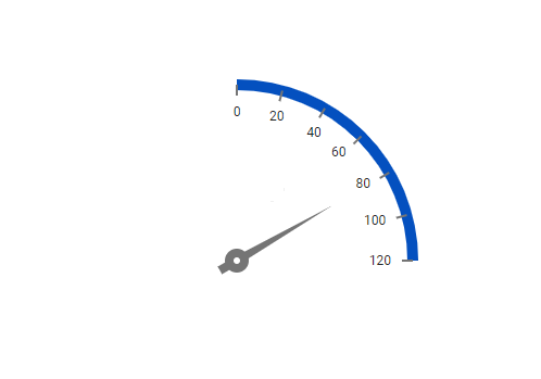
Half and quarter gauges
Form half or quarter circular gauges by modifying the start and end angles of a gauge. This allows the gauge to render in a very small area.
Annotations
Display any HTML element as an annotation at a specific point of interest in the React Circular Gauge. You can also add multiple annotations in a gauge.
Appearance
The appearance of each element in a Circular Gauge, such as axes, ranges, axis intervals, pointer positions, label positions, and tick positions, can be customized easily.
Gradient color
Colors applied to the range and pointer can change gradually to create a smooth color transition.
Gauge title
Add a title to visualize additional information on the Circular Gauge. You can also customize the font of the title.
Right to left (RTL)
Render React Circular Gauge along with its legend and tooltip in the right-to-left direction.


Globalization
Users from different locales can personalize the Circular Gauge component by formatting numbers, currency, and more to suit their preferences.
Touch and browser support
The interactive Circular Gauge component supports touch interactions.

Touch support
All the features in Circular Gauge will work on touch devices with zero configuration. Use touch features such as tooltip and pointer drag without any customization.
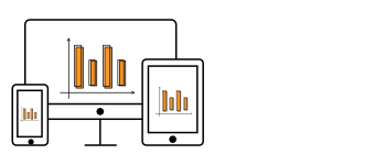
Responsive
You can view the Circular Gauge on various devices. It is also possible to hide specific elements in the gauges for particular screen sizes by making a minimal change in the gauge events.

Cross-browser support
You can render the Circular Gauge component in all modern browsers.


Not sure how to create your first React Circular Gauge? Our tutorial videos and documentation can help.
I’d love to watch it now I’d love to read it nowDiscover Syncfusion’s Complete React Component Ecosystem
Explore over 140+ React UI components featuring established, production-ready controls and the latest pure React components built natively for modern web app development.
-
React Components
-
Pure React Components
-
SMART COMPONENTSGRIDSDATA VISUALIZATIONDROPDOWNSFILE VIEWERS & EDITORSBUTTONSINTERACTIVE CHATINPUTSNAVIGATIONFORMSNOTIFICATIONS
-
GRIDSDATA VISUALIZATIONNAVIGATION
Standalone UI SDKs
Integrate the DataGrid, Chart, Scheduler, Gantt, Rich Text Editor, File Manager, and Diagram UI components into applications to enable rich interaction and visualization, delivering a seamless user experience.
Document Solutions
Integrate the PDF Viewer, DOCX Editor, Spreadsheet Editor, and document-processing libraries into the React applications to enable a smooth user experience.
Frequently Asked Questions
Why should you choose Syncfusion’s React Circular Gauge?
Easy visualization of numeric values in a circular scale with features like multiple axes and rounded corners.
- Completely customizable appearance.
- Half or quarter circular gauges can visualize data in a small area. Create them by modifying the start and end angles.
- Simple configuration and API.
- Support for all modern browsers.
- Touch-friendly and responsive UI.
- One of the best React Circular Gauge in the market that offers feature-rich UI to interact with the software.
Extensive demos and documentation to let you get started quickly with React Circular Gauge.
Where can I find the Syncfusion React Circular Gauge demo?
You can find our React Circular Gauge demo, which demonstrates how to render and configure the Circular Gauge.
Can I download and utilize the Syncfusion React Circular Gauge for free?
No, this is a commercial product and requires a paid license. However, a free community license is also available for companies and individuals whose organizations have less than $1 million USD in annual gross revenue, 5 or fewer developers, and 10 or fewer total employees.
How do I get started with Syncfusion React Circular Gauge?
A good place to start would be our comprehensive getting started documentation.
Our Customers Love Us
Having an excellent set of tools and a great support team, Syncfusion® reduces customers’ development time.Here are some of their experiences.

Aweseome, enough said. really
Easy usability, solving real life problems. easy to implement. most of the cases has the operators and settings possibilities you right away need. never fails to impress

Oliver O,

Geschäftsführung Kreation/Artdirektion, Small-Business
A giant framework with great pricing options
I have loved the components and options that Syncfusion has, besides, its documentation, demos, and Support are excellent.

Alejandro Javier V,
CEO, Small-Business
See Real Success Stories
Developers around the world trust Syncfusion’s Essential Studio to simplify complex projects and speed up delivery. With a vast library of UI controls, powerful SDKs, and reliable support, Essential Studio helps teams build enterprise-ready applications with confidence.
Read Our Customer StoriesIndustry
Software development
75% Cost reduction
50% Faster development
Industry
Utilities (oil and gas)
450+ hours saved
Streamlined processes and hours of development effort saved.
Advanced, flexible features
Empowered users through robust and versatile functionality.
Industry
Software and technology
1000+ of hours saved
Accelerated development with enterprise-ready UI components.
Efficient file management
Streamlined workflows with document libraries without building them from scratch.
Industry
Software and technology
2 Years of delay avoided
Two years of delays prevented with proactive planning.
On-time delivery
Projects delivered on schedule using trusted controls.
Industry
IT services and IT consulting
Improved performance
Large datasets handled with easy customization and quick debugging.
Highly customizable
Plug-and-play controls with quick template integration.
Industry
Professional services
Instant access
Quick availability of features and resources.
Reduced dependencies
Fewer dependencies for faster development.
Rated by users across the globe
Syncfusion React Resources
Learning
 Documentation
 Documentation


Awards
Greatness—it’s one thing to say you have it, but it means more when others recognize it. Syncfusion® is proud to hold the following industry awards.

