Trusted by the world’s leading companies

Overview
React Avatar is a pure CSS component used to add initials, icons, or images representing people or objects in different shapes and sizes. It can be easily integrated with ListView, Badge, Card, and other container components.
Profile or image avatar
The React Avatar component supports various types of images to represent users profiles like those in applications such as Gmail, Outlook, GitHub, and StackOverflow.
Initials avatar
Represent users’ initials in different sizes.
Text or word avatar
Create word or text avatars from user names.
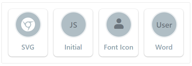
Media types
The avatar supports well-known media types, icons, SVG, font icons, and text.
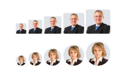
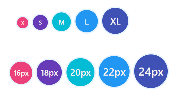
Shapes and sizes
The React Avatar component can be square or circular and in one of five sizes: extra small, small, medium, large, and extra large. By default, avatars are created in a square shape with a medium size.
UI customization
Completely customize the avatar attributes, like dimensions and colors.
Avatar generator
In applications like Gmail, StackOverflow, GitHub, user avatars are represented using Identicons, which are visual representations of hash values of IP addresses.
Use the Syncfusion React Avatar and Badge components to integrate dynamically generated Identicons by following the instructions in this blog:
Integration with other components
Easily integrate the React Avatar component with layout controls, specifically ListView and Card, to achieve different applications, such as a mobile contact list or Outlook-like appearance. Integrate it with the Badge component to show a notification count like in email applications.


Not sure how to create your first React Avatar? Our tutorial videos and documentation can help.
I’d love to watch it now I’d love to read it nowDiscover Syncfusion’s Complete React Component Ecosystem
Explore over 140+ React UI components featuring established, production-ready controls and the latest pure React components built natively for modern web app development.
-
React Components
-
Pure React Components
-
SMART COMPONENTSGRIDSDATA VISUALIZATIONDROPDOWNSFILE VIEWERS & EDITORSBUTTONSINTERACTIVE CHATINPUTSNAVIGATIONFORMSNOTIFICATIONS
-
GRIDSDATA VISUALIZATIONNAVIGATION
Standalone UI SDKs
Integrate the DataGrid, Chart, Scheduler, Gantt, Rich Text Editor, File Manager, and Diagram UI components into applications to enable rich interaction and visualization, delivering a seamless user experience.
Document Solutions
Integrate the PDF Viewer, DOCX Editor, Spreadsheet Editor, and document-processing libraries into the React applications to enable a smooth user experience.
Our Customers Love Us
Having an excellent set of tools and a great support team, Syncfusion® reduces customers’ development time.Here are some of their experiences.

Aweseome, enough said. really
Easy usability, solving real life problems. easy to implement. most of the cases has the operators and settings possibilities you right away need. never fails to impress

Oliver O,

Geschäftsführung Kreation/Artdirektion, Small-Business
A giant framework with great pricing options
I have loved the components and options that Syncfusion has, besides, its documentation, demos, and Support are excellent.

Alejandro Javier V,
CEO, Small-Business
See Real Success Stories
Developers around the world trust Syncfusion’s Essential Studio to simplify complex projects and speed up delivery. With a vast library of UI controls, powerful SDKs, and reliable support, Essential Studio helps teams build enterprise-ready applications with confidence.
Read Our Customer StoriesIndustry
Software development
75% Cost reduction
50% Faster development
Industry
Utilities (oil and gas)
450+ hours saved
Streamlined processes and hours of development effort saved.
Advanced, flexible features
Empowered users through robust and versatile functionality.
Industry
Software and technology
1000+ of hours saved
Accelerated development with enterprise-ready UI components.
Efficient file management
Streamlined workflows with document libraries without building them from scratch.
Industry
Software and technology
2 Years of delay avoided
Two years of delays prevented with proactive planning.
On-time delivery
Projects delivered on schedule using trusted controls.
Industry
IT services and IT consulting
Improved performance
Large datasets handled with easy customization and quick debugging.
Highly customizable
Plug-and-play controls with quick template integration.
Industry
Professional services
Instant access
Quick availability of features and resources.
Reduced dependencies
Fewer dependencies for faster development.
Rated by users across the globe
Syncfusion React Resources
Learning
 Documentation
 Documentation


Awards
Greatness—it’s one thing to say you have it, but it means more when others recognize it. Syncfusion® is proud to hold the following industry awards.

