Overview
Axes in a Cartesian chart play a vital role in identifying the value of the visualized data. Charts typically have two axes that are used to measure and categorize data: a vertical axis (y-axis) and a horizontal axis (x-axis).
The vertical axis always uses a numerical scale. The horizontal axis supports the following scale types:
- Category
- Numeric
- Date-time
- Logarithmic
- Date-time category
Types
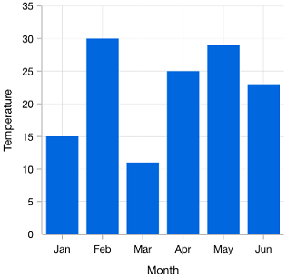
Categorical
The categorical axis is a nonlinear axis that displays text in axis labels.
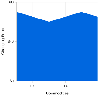
Numerical
The numerical axis is a linear axis that displays numbers with an equal interval in axis labels.
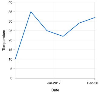
Date-time
The date-time axis displays date-time values with an equal interval in axis labels. It is typically used as an x-axis.

Logarithmic
Uses a logarithmic scale and displays numbers in labels.

Date-time category
Nonlinear date-time axis that accepts date-time values and renders data based on its index.
Customizations

Opposite axis
Axis being rendered in the opposite side of the default position.
Smart range calculation
The best possible axis ranges and intervals are calculated automatically based on the given values. The ranges can also be further customized using range padding.

Axis crossing
The position of the axis can be moved anywhere in the chart relative to its associated axis.

Multiple panes
Add multiple panes to a chart.

Axis labels
Charts provides many customization options for axis labels, including positioning, placement, label format, and rotation. It also has options to avoid labels overlapping.

Axis scale break
A scale break is a stripe drawn chart area of a to denote a break in continuity of data points. This allows users to view different ranges in the same chart area without having a huge space in the plot area.

Multiple axes
Use multiple axes to plot different data sets along two or more axes having different data points and values.

Inversed axis
The values in an axis are inverted. Data on an inverted axis is plotted in the opposite direction–top to bottom for Y-axis and right to left for X-axis.
Our Customers Love Us


See Real Success Stories
Developers around the world trust Syncfusion’s Essential Studio to simplify complex projects and speed up delivery. With a vast library of UI controls, powerful SDKs, and reliable support, Essential Studio helps teams build enterprise-ready applications with confidence.
Read Our Customer StoriesIndustry
Software development
75% Cost reduction
50% Faster development
Industry
Utilities (oil and gas)
450+ hours saved
Streamlined processes and hours of development effort saved.
Advanced, flexible features
Empowered users through robust and versatile functionality.
Industry
Software and technology
1000+ of hours saved
Accelerated development with enterprise-ready UI components.
Efficient file management
Streamlined workflows with document libraries without building them from scratch.
Industry
Software and technology
2 Years of delay avoided
Two years of delays prevented with proactive planning.
On-time delivery
Projects delivered on schedule using trusted controls.
Industry
IT services and IT consulting
Improved performance
Large datasets handled with easy customization and quick debugging.
Highly customizable
Plug-and-play controls with quick template integration.
Industry
Professional services
Instant access
Quick availability of features and resources.
Reduced dependencies
Fewer dependencies for faster development.