Syncfusion WPF ToolBar Control
- Manages multiple toolbars in a single window.
- Docking and floating toolbars are available along with an overflow button.
- Rich UI through built-in themes and appearance customization.
.NET 10 support now available
Trusted by the world’s leading companies

Overview
The WPF ToolBar control is used to display shortcut commands and place them conveniently anywhere within the application for better access. It supports multiple toolbars, an overflow style mechanism, custom orientation, and more.
Adding controls to the ToolBar
Supports various kinds of controls, such as label, text box, combo box, drop-down list, list, and so on. Users can order the commands based on their priority with ease.


Docking support
Using docking option, end users can move the control around the form and dock to the top, bottom, or sides. Also, end users can restrict docking of the control at certain positions using predefined APIs.
Floating ToolBar
Floating option allows end users to move the control anywhere within the screen conveniently.


Vertical ToolBar
The WPF ToolBar control has the ability to arrange the items vertically in the window.
Overflow style
When the chevron option is enabled, an overflow button appears on the toolbar allowing users to show or hide additional commands.
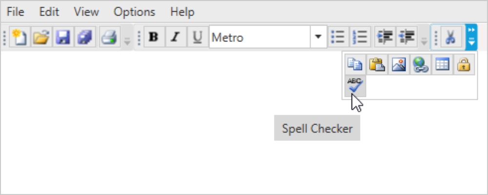

Tooltip
Supports displaying rich formatted and informative content about a toolbar item on tooltip while mouse hovering on it.
Custom style and themes

Built-in themes
The component is shipped with built-in themes like Office 2003, Office 2007, Visual Studio 2010, Blend, Transparent, and Metro.

Custom style
Complete customization of the appearance of the control is possible programmatically.
Keyboard support
Allows accessing the toolbar items by defining shortcut and mnemonic keys for individual items. It is also capable of navigating between those items using keyboard.


Localization
Allows users to customize the text available in the user interface based on the locale culture.
Right-to-left (RTL)
Allows the text direction and layout of the control to be displayed from right to left (RTL).

Icon template
Supports adding any type of image such as path data, font icons, etc. as a template in the ToolBar dropdown list items.
WPF ToolBar Code Example
Easily get started with the WPF ToolBar using a few simple lines of XAML, and C# code example as demonstrated below. Also explore our WPF ToolBar Example that shows you how to render and configure the ToolBar in WPF.
<syncfusion:ToolBarAdv Height="100" HorizontalAlignment="Left" Name="toolBarAdv1" VerticalAlignment="Top" Width="200" />public partial class MainWindow : Window
{
public MainWindow()
{
InitializeComponent();
ToolBarAdv tool = new ToolBarAdv();
tool.Name = "toolBarAdv1";
tool.Width = 100;
tool.Height = 50;
this.Content = tool;
}
}Not sure how to create your first WPF ToolBar? Our documentation can help.
I’d love to read it now140+ WPF CONTROLS
ALL CONTROLS
SMART COMPONENTS
DATA VISUALIZATION
MODERN THEMES
LAYOUT
NAVIGATION
INPUT CONTROLS
BUTTON
BUSINESS INTELLIGENCE
MISCELLANEOUS
LISTS & DROPDOWNS
FILE VIEWERS & EDITORS
CONVERSATIONAL UI
Standalone UI SDKs
Integrate the DataGrid, Chart, Scheduler, Gantt, and Diagram UI components into applications to enable rich interaction and visualization, delivering a seamless user experience.
Document Solutions
Integrate the PDF Viewer, DOCX Editor, Spreadsheet Editor, and document-processing libraries into the WPF applications to enable a smooth user experience.
Frequently Asked Questions
Why should you choose Syncfusion WPF ToolBar?
The Syncfusion WPF ToolBar provides the following:
- Multiple toolbars in a single window.
- Docking and floating toolbars along with an overflow button.
Rich UI through built-in themes and appearance customization.
- One of the best WPF ToolBar in the market that offers feature-rich UI to interact with the software.
- Simple configuration and API.
- Touch-friendly and responsive UI.
Extensive demos, documentation to learn quickly and get started with WPF ToolBar.
Can I download and utilize the Syncfusion WPF ToolBar for free?
No, this is a commercial product and requires a paid license. However, a free community license is also available for companies and individuals whose organizations have less than $1 million USD in annual gross revenue, 5 or fewer developers, and 10 or fewer total employees.
How do I get started with Syncfusion WPF ToolBar?
A good place to start would be our comprehensive getting started documentation.
Our Customers Love Us
Having an excellent set of tools and a great support team, Syncfusion® reduces customers’ development time.Here are some of their experiences.

Excellent experience with Syncfusion!
Syncfusion is a product that makes life easier! I use it to create Blazor applications (server side and webassembly) and the controls speed up development a lot. Furthermore, if needed, it is possible to ask for direct support that is never long in coming!

Andrea Scarpante,

Sydea srl
The complete component set
It is the most complete component set available. Also very handy is the fact that there is a community edition, this gives me the opportunity to test thing at home without buying a separate license.

Johan Visser,

H and T Pawnbrokers
See Real Success Stories
Developers around the world trust Syncfusion’s Essential Studio to simplify complex projects and speed up delivery. With a vast library of UI controls, powerful SDKs, and reliable support, Essential Studio helps teams build enterprise-ready applications with confidence.
Read Our Customer StoriesIndustry
Software development
75% Cost reduction
50% Faster development
Industry
Utilities (oil and gas)
450+ hours saved
Streamlined processes and hours of development effort saved.
Advanced, flexible features
Empowered users through robust and versatile functionality.
Industry
Software and technology
1000+ of hours saved
Accelerated development with enterprise-ready UI components.
Efficient file management
Streamlined workflows with document libraries without building them from scratch.
Industry
Software and technology
2 Years of delay avoided
Two years of delays prevented with proactive planning.
On-time delivery
Projects delivered on schedule using trusted controls.
Industry
IT services and IT consulting
Improved performance
Large datasets handled with easy customization and quick debugging.
Highly customizable
Plug-and-play controls with quick template integration.
Industry
Professional services
Instant access
Quick availability of features and resources.
Reduced dependencies
Fewer dependencies for faster development.
Rated by users across the globe
Syncfusion WPF Resources
Learning
 Documentation
 Documentation


Awards
Greatness—it’s one thing to say you have it, but it means more when others recognize it. Syncfusion® is proud to hold the following industry awards.

