We use cookies to give you the best experience on our website. If you continue to browse, then you agree to our privacy policy and cookie policy.


The Range Slider control allows you select a range of values within a specified minimum and maximum limit. The range can be selected by moving the thumb control along a track. The control is intended to provide a UI to filter collection items within a range.
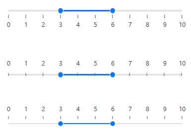
Choose a single or a range of values (start and end) between minimum and maximum.
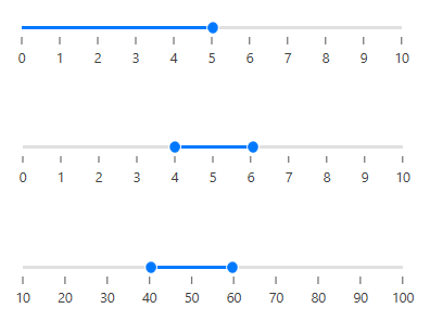
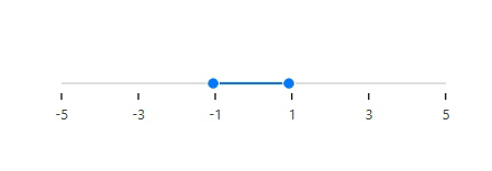
The range slider control supports number, float, and negative values.
Split the range of values into equal intervals to help users choose the required values easily.

While sliding, snap to visualize tick frequency or programmatic snap frequency.
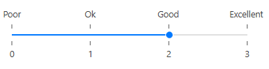
The Range Slider is not restricted to numeric values, so you can visualize values as text, like: Low, Medium, High; or Bad, Good, Excellent.
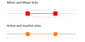
Supports major and minor ticks representation and can be easily customized as active and inactive ticks based on the range.
Place or align ticks and labels in a different direction or orientation.
You can control the orientation of a slider to render it in a vertical direction.

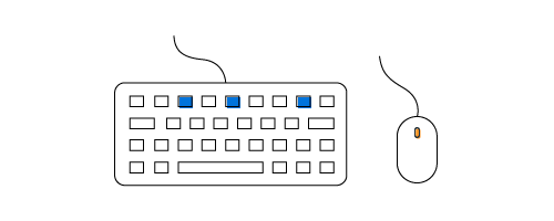
Use arrow keys to adjust the value of a slider.
The value of the pointer or range is shown in a tooltip. You can control the placement of tooltips.

The WPF Range Slider’s orientation can be set to horizontal or vertical. The default option is horizontal.

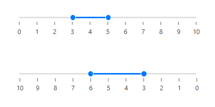
Reverse the direction of a slider as needed.
Customize each element of the Range Slider in easy ways like thumb, active and inactive tracks, ticks and tooltips.

Easily get started with the WPF Range Slider using a few simple lines of XAML or C# code example as demonstrated below. Also explore our WPF Range Slider Example that shows you how to render and configure the WPF Range Slider in WPF.
<Grid>
        <syncfusion:SfRangeSlider Minimum="100" Maximum="500"  ShowValueLabels="True" TickFrequency="50" Width="400"/>
</Grid>
public MainWindow()
{
InitializeComponent();
Grid grid = new Grid();
SfRangeSlider sfRangeSlider = new SfRangeSlider();
sfRangeSlider.Minimum = 100;
sfRangeSlider.Maximum = 500;
sfRangeSlider.ShowValueLabels = true;
sfRangeSlider.TickFrequency = 50;
sfRangeSlider.Width = 400;
grid.Children.Add(sfRangeSlider);
this.Content = grid;
}Syncfusion WPF Range Slider provides the following:
No, this is a commercial product and requires a paid license. However, a free community license is also available for companies and individuals whose organizations have less than $1 million USD in annual gross revenue, 5 or fewer developers, and 10 or fewer total employees.
A good place to start would be our comprehensive getting started documentation.


 Documentation
Greatness—it’s one thing to say you have it, but it means more when others recognize it. Syncfusion is proud to hold the following industry awards.


