WPF OLAP Grid Control for slice and dice
- Slices and dices an OLAP cube and its data.
- Supports filtering, sorting, summarizing, and grouping of OLAP cube data.
- Highlights key performance indicators (KPI) in the grid.
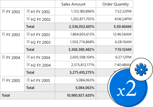
.NET 10 support now available
Trusted by the world’s leading companies

Overview
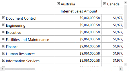
The WPF OLAP Grid control organizes and summarizes business data and displays results in a cross-table format.


Data binding
The WPF OLAP Grid control enables you to retrieve multidimensional data (OLAP) from SSAS or any XML/A provider. The data sources supported are SSAS, Mondrian, ActivePivot, and Oracle.
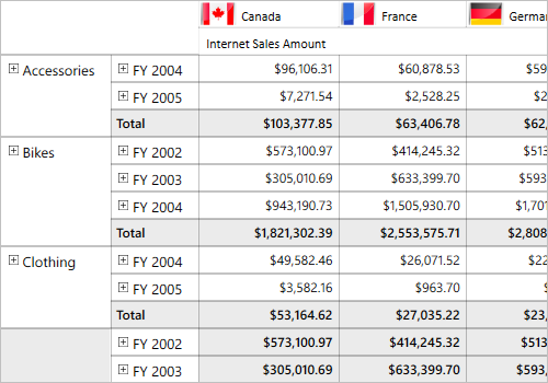
Slice and dice
With the slice and dice feature, you can create a new view for end users by selecting dimensions and measures from the OLAP cube and filtering them.

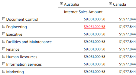
Drill-down and drill-up
Drill down (expand) and drill up (collapse) to visualize the grid information in both abstract and detailed views.
Drill member
This option delivers a detailed view of any selected level member while drilling down and shows an abstract view after drilling up.
Drill position
You can drill only the current position of a selected level member.
Drill replace
This option replaces an existing node with its child nodes into which the end user has drilled.

Key performance indicators (KPIs)
KPIs are collections of calculations associated with a measure group that evaluates business success. Typically, these calculations are a combination of multidimensional expressions (MDX) or calculated members. Four different types of KPI indicators available are:
- Goal
- Status
- Trend
- Value
Named sets
Named sets are MDX expressions that return a set of dimension members, which can be defined and saved as a part of the OLAP cube definition. Named sets simplify MDX queries and provide useful aliases for complex, typically used, set expressions.

Calculated members and measures
You can create and display your own dimensions and measures in reports through code behind.
Member properties
Member properties provide basic information about each member in each tuple, including member name, parent level, and number of children. These member properties are available for all members at any given level and can be enabled in reports through their code behind.

Filtering
With built-in filtering options, you can easily filter and visualize data. It is also possible to filter programmatically.

Filtering by member
You can filter the headers in rows and columns based on hierarchy members to selectively display records.You can filter the headers in rows and columns based on hierarchy members to selectively display records.
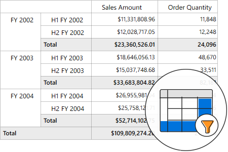
Filtering by value
You can filter the results in rows and columns based on active measures to selectively display records.

Sorting
Order the columns and rows based on measure values. You can do this only through reports in code behind.
Paging
Load and render a large amount of data without any performance constraints through paging.


Drill-through
The drill-through feature obtains a list of raw items for a particular value cell or summary cell.
Conditional formatting
Define conditions that, when met, format the font, color, and border settings of values and summary cells.

Cell template
Format the column header, row header, summary cell, and value cell of the control.
Number formatting and date formatting
Number formatting and date formatting help to transform the appearance of the actual cell value.
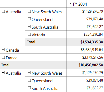
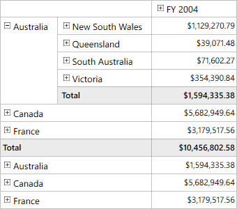
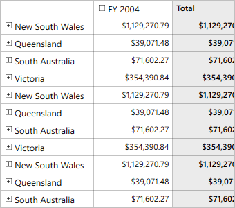
Visualization
Users can visualize the control as a pivot table, similar to Excel. Users can also position summaries at the top or hide the summaries.
Normal layout
The normal layout looks like the pivot table in earlier Excel versions, allowing end users to view the parent and child members adjacent to each other.

Summary layout
The summary layout easily switches the summary position to either the top or bottom beside each member in the control.

Excel-like layout
The Excel-like layout simulates the pivot table look and feel of Excel with child members positioned below their parent member with some indent space.

No summaries
The no-summaries layout hides the subtotal and grand total and shows only header and value cells.


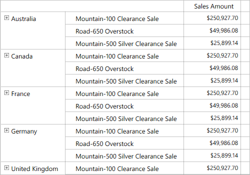
Totals
Subtotals and grand totals are calculated automatically by the engine inside the control and displayed in the grid. This helps users make decisions based on the totals.
Column and row
Hyperlinks
Clicking a hyperlink cell helps users retrieve information about that particular cell. This feature allows you to perform custom operations through code.

Tooltip
Tooltip provide basic information about a value cell while the pointer hovers over it.
Freeze header
Users can freeze row and column headers while performing scroll operations to have a precise view of the content.

Save and load reports
Settings in the WPF OLAP grid control can be serialized to an XML format and saved. The saved report can be loaded back through the built-in deserialization options.


Exporting
Export data to Excel, Word, PDF, and CSV formats. You can customize the exporting operations.
Custom style and themes

Built-in themes
Ships with built-in themes like Blend, Office 2010, Office 2013, Office 2016, Office 365, Visual Studio 2013, Visual Studio 2015, and Metro.

Custom styling
You can customize the control’s appearance to any extent in code behind.

Theme studio
Easily customize all aspects of the control’s appearance using the Theme studio utility.
Developer-friendly API
For a great developer experience, flexible built-in APIs are available to define and customize the WPF OLAP Grid control. Developers can optimize the data bound to the control and customize the user interface (UI) completely using code with ease.
Globalization and localization

Globalization
Users from different locales can use the control by applying appropriate date formats, currency formats, and number formats.

Right to left (RTL)
The text direction and layout of the control can be displayed in from right-to-left(RTL).

140+ WPF CONTROLS
ALL CONTROLS
SMART COMPONENTS
DATA VISUALIZATION
MODERN THEMES
LAYOUT
NAVIGATION
INPUT CONTROLS
BUTTON
BUSINESS INTELLIGENCE
MISCELLANEOUS
LISTS & DROPDOWNS
FILE VIEWERS & EDITORS
CONVERSATIONAL UI
Standalone UI SDKs
Integrate the DataGrid, Chart, Scheduler, Gantt, Rich Text Editor, File Manager, and Diagram UI components into applications to enable rich interaction and visualization, delivering a seamless user experience.
Document Solutions
Integrate the PDF Viewer, DOCX Editor, Spreadsheet Editor, and document-processing libraries into the WPF applications to enable a smooth user experience.
Our Customers Love Us
Having an excellent set of tools and a great support team, Syncfusion® reduces customers’ development time.Here are some of their experiences.

Excellent experience with Syncfusion!
Syncfusion is a product that makes life easier! I use it to create Blazor applications (server side and webassembly) and the controls speed up development a lot. Furthermore, if needed, it is possible to ask for direct support that is never long in coming!

Andrea Scarpante,

Sydea srl
The complete component set
It is the most complete component set available. Also very handy is the fact that there is a community edition, this gives me the opportunity to test thing at home without buying a separate license.

Johan Visser,

H and T Pawnbrokers
See Real Success Stories
Developers around the world trust Syncfusion’s Essential Studio to simplify complex projects and speed up delivery. With a vast library of UI controls, powerful SDKs, and reliable support, Essential Studio helps teams build enterprise-ready applications with confidence.
Read Our Customer StoriesIndustry
Software development
75% Cost reduction
50% Faster development
Industry
Utilities (oil and gas)
450+ hours saved
Streamlined processes and hours of development effort saved.
Advanced, flexible features
Empowered users through robust and versatile functionality.
Industry
Software and technology
1000+ of hours saved
Accelerated development with enterprise-ready UI components.
Efficient file management
Streamlined workflows with document libraries without building them from scratch.
Industry
Software and technology
2 Years of delay avoided
Two years of delays prevented with proactive planning.
On-time delivery
Projects delivered on schedule using trusted controls.
Industry
IT services and IT consulting
Improved performance
Large datasets handled with easy customization and quick debugging.
Highly customizable
Plug-and-play controls with quick template integration.
Industry
Professional services
Instant access
Quick availability of features and resources.
Reduced dependencies
Fewer dependencies for faster development.
Rated by users across the globe
Syncfusion WPF Resources
Learning
 Documentation
 Documentation


Awards
Greatness—it’s one thing to say you have it, but it means more when others recognize it. Syncfusion® is proud to hold the following industry awards.

