Trusted by the world’s leading companies

Overview
The WPF Double TextBox control provides a simple and intuitive interface to display and edit culture-specific double values. It supports culture-based formatting, number formatting, minimum and maximum value validation, watermark support, built-in themes, a range adorner, right-to-left support, positive and negative colors, and more.

Number formats
The numeric text box can be formatted based on the number formats listed on MSDN. Through formatting, the number of decimal digits, the decimal separator, and the group separator can be provided.

Validation
Minimum and maximum value validation can be done within the given range. Users can choose when the validation needs to be carried out, either while entering the value or when the control loses its focus. The Double TextBox control also allows users to do custom validation on their own.

Internationalization
The WPF Double TextBox control comes with internationalization support to adapt to any culture through simple settings.

Watermark
Watermarks provide additional hints to users about the value they need to enter in the text box.

Style and Customization

Built-in themes
The WPF Double TextBox provides built-in themes like Office2016, Office2013, Metro, and Blend.

Fore color customization
Set different fore colors based on positive, negative, and zero color.

Range adorner
Increase or decrease a value just by scrolling the mouse or through extended scrolling. Display the entered value with progress notation.
Right-to-left (RTL)
The control supports right-to-left (RTL) direction for users working in right-to-left languages like Hebrew, Arabic, or Persian.

Complete keyboard and mouse support
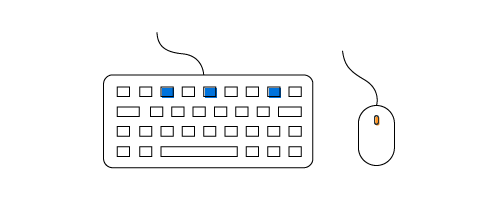
Increment or decrement values through keyboard down and up operations. Change the values through mouse wheel operations.

145+ WPF CONTROLS
Build Document Workflows in WPF
Integrate a powerful PDF Viewer, rich DOCX Editor, and full‑featured Spreadsheet Editor into your WPF applications, alongside robust document processing libraries, to create smooth document experiences. Empower users to work with documents interactively while developers automate processing behind the scenes.
Our Customers Love Us


 Documentation
Awards
Greatness—it’s one thing to say you have it, but it means more when others recognize it. Syncfusion® is proud to hold the following industry awards.


