We use cookies to give you the best experience on our website. If you continue to browse, then you agree to our privacy policy and cookie policy.


The WPF CheckedListBox control provides an efficient way to check items in a list, making sure you missed nothing. The control also supports select-all, grouping, sorting, virtualization, theming, keyboard, and right-to-left alignment.

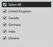
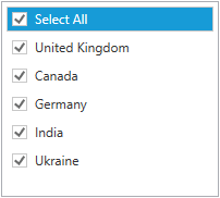
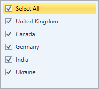
You can check or uncheck individual items in the list. You can also check or clear all the items in the list with a single click.

Categorize items by grouping them together. You can expand or collapse a group and check or uncheck all items in a group. You can also do nested grouping.

Navigate to an item easily by sorting it in the ascending or descending order.

Load a large set of items in a check list box without affecting loading or scrolling performance. UI Virtualization is a technique that loads only items that are in view. Items will be visualized only when they are in view.

You can navigate, expand, and collapse items using arrow keys. Space bar is used to check and uncheck items. Navigate a large set of data using Page-up, Page-Down, Home, and End keys.

RTL support displays the content in the right-to-left direction. This is helpful in the right to left scripted languages like Arabic, Hebrew, Urdu, etc.

Items in the list can be customized with an image or custom control using templates.

Customize the appearance of the control to any extent programmatically.

Users can easily load and edit the WPF CheckListBox control in Expression Blend for custom styles.

WPF CheckedListBox provides various built-in themes like Office2016, Office2013, Metro, Blend, etc., which help adopt the control based on the application UI.


Easily get started with the WPF CheckedListBox using a few simple lines of XAML and C# code example as demonstrated below. Also explore our WPF CheckedListBox Example that shows you how to render and configure the CheckedListBox in WPF.
<syncfusion:CheckListBox Height="200" Width="200">
            <syncfusion:CheckListBoxItem Content="Austria" />
            <syncfusion:CheckListBoxItem Content="Australia"/>
            <syncfusion:CheckListBoxItem Content="Canada"/>
            <syncfusion:CheckListBoxItem Content="Finland"/>
            <syncfusion:CheckListBoxItem Content="NewZealand"/>
        </syncfusion:CheckListBox>
namespace WpfApp1
{
public partial class MainWindow : Window
{
public MainWindow()
{
InitializeComponent();
CheckListBox checkListBox = new CheckListBox();
checkListBox.Height = 200;
checkListBox.Width = 200;
CheckListBoxItem item1 = new CheckListBoxItem() { Content = "Austria" };
CheckListBoxItem item2 = new CheckListBoxItem() { Content = "Australia" };
CheckListBoxItem item3 = new CheckListBoxItem() { Content = "Canada" };
CheckListBoxItem item4 = new CheckListBoxItem() { Content = "Finland" };
CheckListBoxItem item5 = new CheckListBoxItem() { Content = "NewZealand" };
checkListBox.Items.Add(item1);
checkListBox.Items.Add(item2);
checkListBox.Items.Add(item3);
checkListBox.Items.Add(item4);
checkListBox.Items.Add(item5);
this.Content = checkListBox;
}
}
}No, this is a commercial product and requires a paid license. However, a free community license is also available for companies and individuals whose organizations have less than $1 million USD in annual gross revenue, 5 or fewer developers, and 10 or fewer total employees.
A good place to start would be our comprehensive getting started documentation.


 Documentation
Greatness—it’s one thing to say you have it, but it means more when others recognize it. Syncfusion is proud to hold the following industry awards.


