We use cookies to give you the best experience on our website. If you continue to browse, then you agree to our privacy policy and cookie policy.


The WPF AutoComplete control provides a common autocomplete text box to select values from a predefined list easily and adds the common autocomplete paradigm to text boxes. The control is loaded with features to help you customize the behavior, look, and feel in many different ways.
Select multiple items from the suggestion list and display the selected items either as tokens, such as in an email address bar, or text separated by a delimiter.
Customizable token representation in the AutoComplete control allows users to remove an item with its close button.

Delimit the selected items with desired characters such as ‘$’ for dollar representation, or ‘,’ for traditional comma separation.
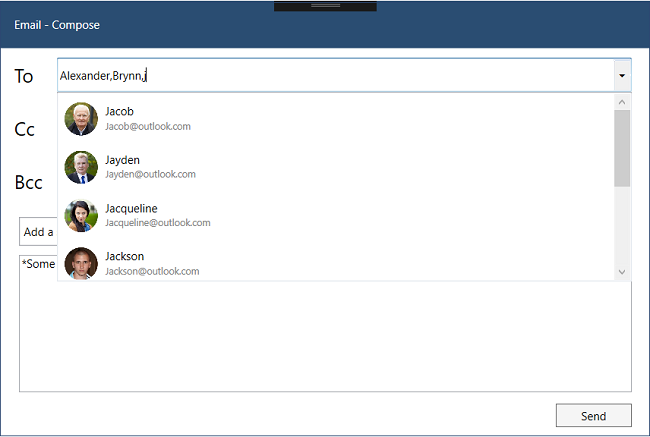
When a character is entered, the control searches for items related to the entered character and filters results, displaying the suggestion in the drop-down list.
The control starts offering matches as soon as users start typing. This feature can be changed by setting the number of characters required to start matching.
You can pick from various filtering options such as starts with, contains, and ends with. You can also choose whether to filter with or without case sensitivity.
The WPF AutoComplete control can suggest a list of filtered items in a pop-up or append the rest of the suggested words in the input area. It can also append the matched item and display the list of filtered items suggested in a pop-up at the same time.

The WPF AutoComplete control is not limited to one type of keyboard, so it can be populated with items from a language with letters containing diacritics. Words with diacritics can be searched for with English characters from an en-US keyboard.
If the control is at the bottom of the application, where the default keyboard appears and would hide the pop-up, the pop-up can be placed at the top, instead.
APIs are available to avoid pop-ups and retrieve filtered suggestion items to arrange list or item controls.
Delay the opening of the pop-up.
APIs are available to display all the items in the pop-up whenever the control is in focus.
The AutoComplete control highlights the matching text of each filtered item. This option shows how the item is filtered in the list and clearly displays the items to be picked.
Highlights the matching text that occurs first.

Highlights the matching text that occurs multiple times.

The control accepts a template for pop-ups to change the look and feel of the items.

The customizable appearance of the control is designed, by default, to adapt to the native look and feel of the deployment platform.

The color of pop-ups and text can be customized to fit the application design.

The font size can be customized with pixel precision or with standard options such as small, medium, and large.

Use traditional fonts or custom fonts, as suits your application. The control renders certain iconic fonts, too.

Show in the AutoComplete control a drop-down button that users can click to open and select items from the suggestions.

Every aspect of the AutoComplete control has been designed with the MVVM pattern in mind.

All static text can be localized with the required language.

Along with a list of strings, a real-time object can also be used to direct the search member to search and display.

You can place icons in the pop-up lists. A member can also be assigned to form the object.

The Clear button is available to clear all the tokens with a single tap. The button can be enabled or disabled.

A watermark prompts with an information hint when the search box is not in focus and contains an empty string.
Easily get started with the WPF AutoComplete using a few simple lines of XAML and C# code example as demonstrated below. Also explore our WPF AutoComplete Example that shows you how to render and configure the AutoComplete in WPF.
<Grid>
<syncfusion:SfTextBoxExt Width="300" Height="30" Text="Hello World!" HorizontalContentAlignment="Center" VerticalContentAlignment="Center"/>
</Grid>
public MainWindow()
{
InitializeComponent();
Grid grid = new Grid();
SfTextBoxExt sfTextBoxExt = new SfTextBoxExt();
sfTextBoxExt.Width = 300;
sfTextBoxExt.Height = 30;
sfTextBoxExt.Text = "Hello World!";
sfTextBoxExt.HorizontalContentAlignment = HorizontalAlignment.Center;
sfTextBoxExt.VerticalContentAlignment = VerticalAlignment.Center;
grid.Children.Add(sfTextBoxExt);
this.Content = grid;
}


 Documentation
Greatness—it’s one thing to say you have it, but it means more when others recognize it. Syncfusion is proud to hold the following industry awards.


