Overview
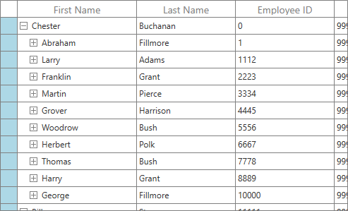
The WPF TreeGrid control allows you to customize the appearance style of the control and its inner elements such as cells, rows, columns, and column headers to adapt the control to the rest of your business application.
Editing styles using Visual Studio Designer
- Edit the styles of the TreeGrid control in Visual Studio Designer.
- Copy the TreeGrid control’s style templates to XAML view without writing a single line of code.

Row style
Users can customize these aspects of appearance for the rows using a template:
- Text color
- Background color
- Font
- Border

Column style
Users can customize these aspects of appearance for any column using a template:
- Text color
- Background color
- Font
- Border

Stacked header style
You can customize the appearance of a stacked header row or column using a template.

Conditional styling
Customize the appearance of cells, rows, or columns based on data.

Row header style
Customize the appearance of a row header. Conditional row header styling is also possible.
Row drag-and-drop UI style
Customize the UI appearance of the row drag-and-drop UI using a template.

Built-in themes
The WPF TreeGrid control provides built-in themes to adapt the control to the rest of your business application. Some of the different built-in themes are:
- Blend
- Metro
- Office 2010 and 2013
- Visual Studio
Users can customize the built-in themes or write their own custom theme by using the Theme Studio utility.

140+ WPF CONTROLS