Overview
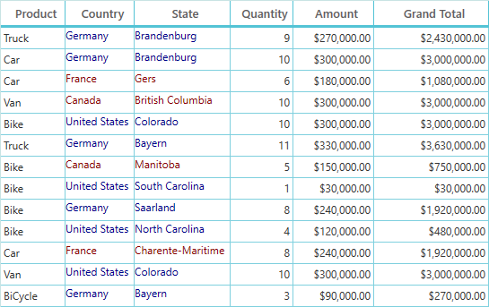
The WPF DataGrid control allows you to customize the appearance style of the control and its inner elements such as cells, rows, columns, column headers, filter UI pop-ups, row headers, and summary rows to adapt the control to the rest of your business application.
Editing styles using Visual Studio Designer
- Edit the styles of WPF DataGrid elements in Visual Studio Designer.
- Copy the element style templates to XAML view without writing a single line of code.
- Edit the styles for every datagrid element, including the filter user interface pop-up.

Row style
Customize a row style with the help of Visual Studio Designer. Users can add the row style template to a XAML view without writing a single line of code.

Column style
Customize a column style with the help of Visual Studio Designer. Users can add the column style template to a XAML view without writing a single line of code.

Other elements styles
Customize the style of all other elements, such as:
- Summary row
- Group caption row
- Row header
- Unbound row
- Group drop area

Template selectors
Set any custom template to cells or rows using template selectors. Users can customize an appearance style based on the data conditionally.
Animating the row or cell on property change
Customize a row or cell on property change. Row or cell animation is possible to show a better UI experience.

Built-in themes
The WPF DataGrid control provides 10+ built-in themes support to adapt the control to the rest of your business application. Some of the different built-in themes are:
- Fluent Light
- Fluent Dark
- Material Dark
- Material Light
- System Theme
- Office 2019 Themes
Users can customize the built-in themes or create their custom themes by using the ThemeStudio utility.

Our Customers Love Us


See Real Success Stories
Developers around the world trust Syncfusion’s Essential Studio to simplify complex projects and speed up delivery. With a vast library of UI controls, powerful SDKs, and reliable support, Essential Studio helps teams build enterprise-ready applications with confidence.
Read Our Customer StoriesIndustry
Software development
75% Cost reduction
50% Faster development
Industry
Utilities (oil and gas)
450+ hours saved
Streamlined processes and hours of development effort saved.
Advanced, flexible features
Empowered users through robust and versatile functionality.
Industry
Software and technology
1000+ of hours saved
Accelerated development with enterprise-ready UI components.
Efficient file management
Streamlined workflows with document libraries without building them from scratch.
Industry
Software and technology
2 Years of delay avoided
Two years of delays prevented with proactive planning.
On-time delivery
Projects delivered on schedule using trusted controls.
Industry
IT services and IT consulting
Improved performance
Large datasets handled with easy customization and quick debugging.
Highly customizable
Plug-and-play controls with quick template integration.
Industry
Professional services
Instant access
Quick availability of features and resources.
Reduced dependencies
Fewer dependencies for faster development.
140+ WPF CONTROLS