Interactive WinForms Pivot Chart Control
- Wide range of chart types such as bar chart, column chart, pie chart, line chart, etc.
- Pivot table field list (UI) for changing pivot reports at runtime.
- Provides drill-down capability with multiple-level labels (grouping labels).
.NET 10 support now available
Trusted by the world’s leading companies

Overview
The WinForms Pivot Chart control organizes and summarizes business data and displays the result in a graphical format.

Data binding
The WinForms Pivot Chart control simulates the pivot chart feature of Excel. The data source for the control should be a DataTable, DataView, or DataSet from SQL databases or collections like IEnumerable, ICollection, IList, List
Chart types
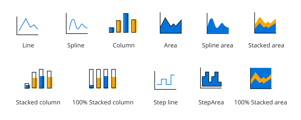
The WinForms Pivot Chart control allows users to visualize data using these different chart types: line, spline, column, area, spline area, stacking area, stacking column, 100% stacking area, 100% stacking column, step line, and step area. Each one is highly and easily configurable with built-in support for creating stunning visual effects. Users can easily switch among different chart types dynamically.

Pivot table field list and group fields
The pivot table field list and group fields are automatically populated with fields from the bound data source. They then allow end users to drag fields, filter and sort them, and create a pivot report at runtime.
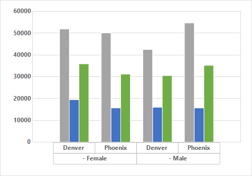
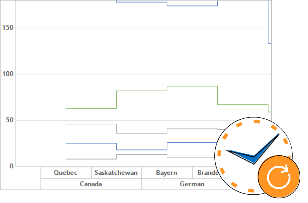
Drill down and drill up
There is built-in support to drill down (expand) and drill up (collapse) to visualize the pivot information in both abstract and detailed views.
Defer update
Refresh the control only on demand and not during every UI interaction.
Real-time update
Update the series values in real time by pushing the live data and refreshing the chart area whenever it’s required.
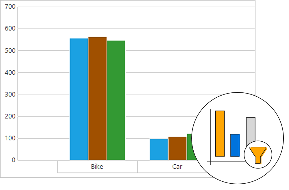
Filtering
Display only selective values for a field through either UI or code-behind.
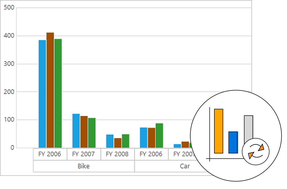
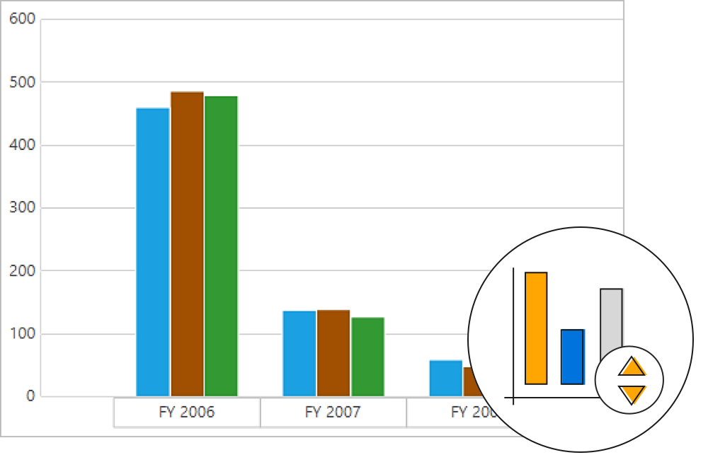
Sorting
Order the column and row header text based on the custom comparer defined by user.
Summaries and calculations
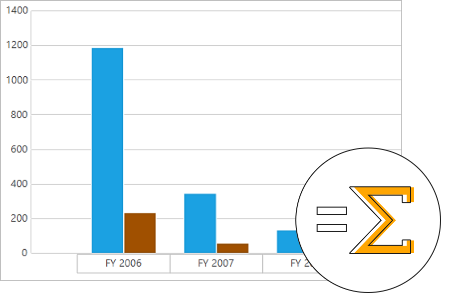
Summaries
Define your own custom summaries or use 10 built-in summary types.
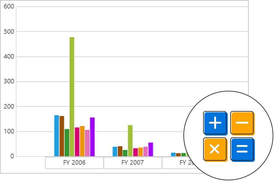
Calculations
Insert new calculations or use one of 16 built-in calculation types.
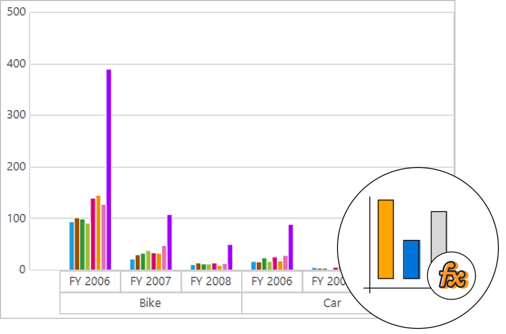
Calculated field
A calculated field, otherwise known as an unbound field, generates a unique field with your own calculated values by executing a simple, user-defined formula.
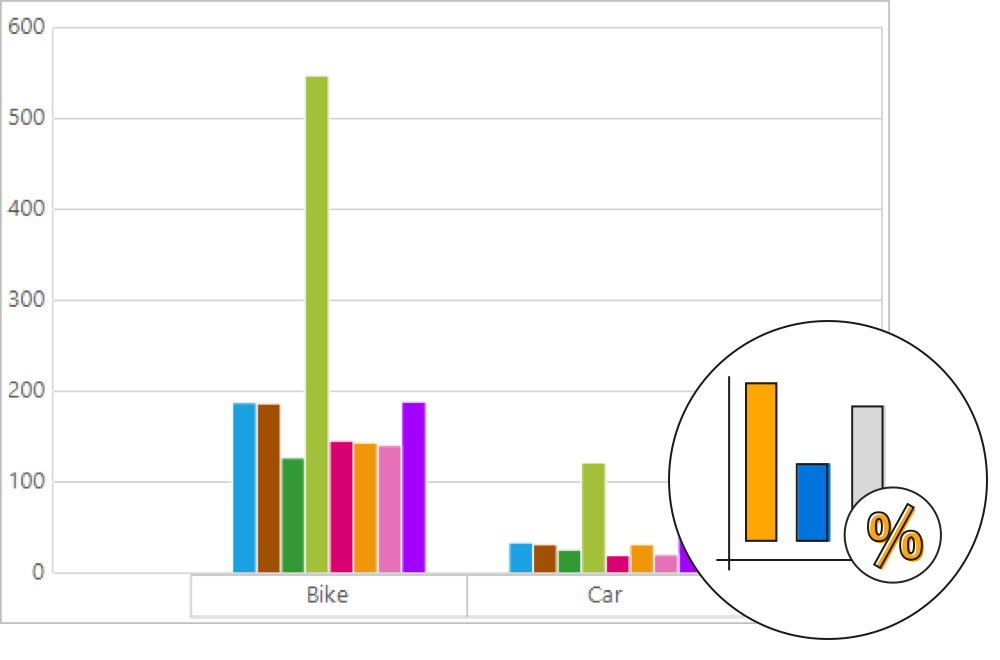
Expression field
Expression fields generate data by executing a user-defined expression. The generated data is specific to a few fields from the underlying data source.
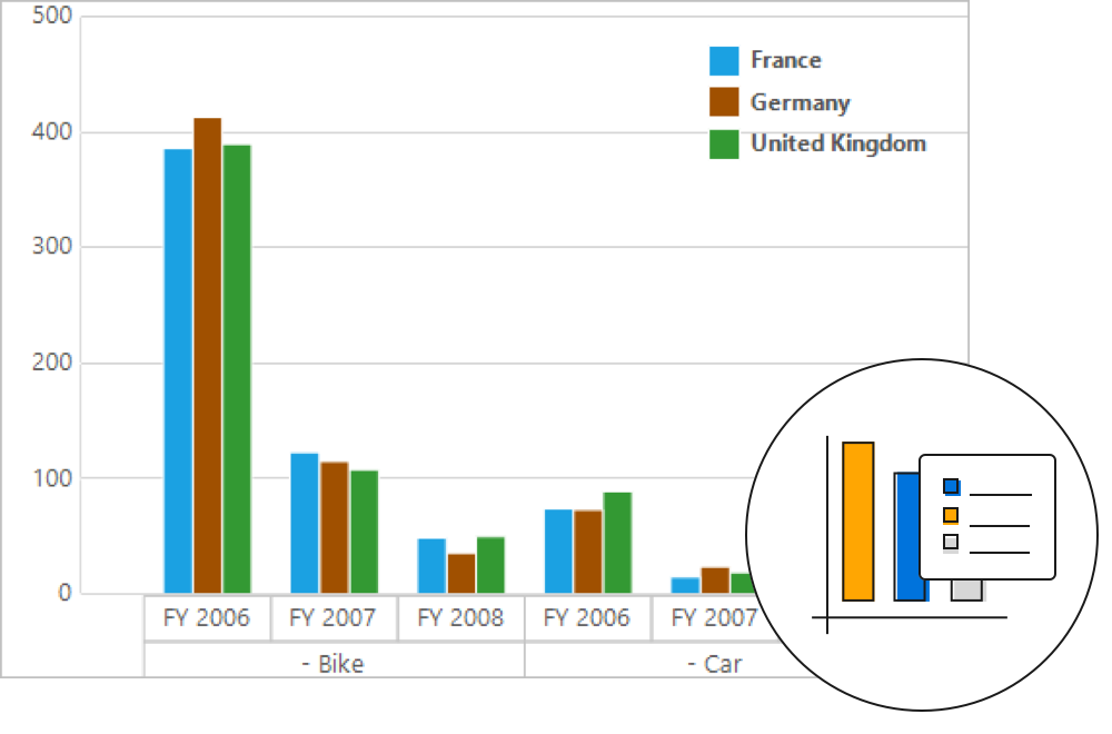
Legend
A color code helps to differentiate between chart series items. A legend has labels beside each color to present some detail about the series.
Axes and series

Series customization
Customize the series color, border color, and border width of the control.

Data labels
Data labels provide information about a data point with the help of adornments in series.

Axis labels
Customization options for the axis labels include positioning, placement, label format, and rotation. There are also options for avoiding labels overlapping.

Chart palettes
The control comes with a set of color palettes that are automatically applied to a chart’s data points if no custom colors are specified for the series. These built-in palettes offer a rich set of colors to render professional-looking charts.

Titles
Titles provide captions for the chart and chart axes, describing the control’s actual purpose in an application.

Watermarks
Watermarks provide faint imprints on the chart that can be either images or text.
User interaction

Marker and crosshair
Markers are symbolic representations of points in the control. Crosshair will return the exact data for the X and Y coordinates under the pointer.

Zooming and scrolling
Users can take a close look at a data point plotted in the series at runtime with the zooming feature. Once any part of the chart area is zoomed in, scroll bars will automatically appear to let the user view areas beyond the currently displayed chart area.

Tooltip
Tooltip provide basic information about a series while hovering the pointer over it.
Exporting and printing
The WinForms Pivot Chart can be exported to an Excel document. A printing option is also available.

Custom style and themes

Built-in themes
Ships with built-in themes like Office 2016 and Metro.

Custom style
Customize the appearance of the control to any extent in code behind.
Globalization and localization

Globalization
Users from different locales can use the control by applying a date format, currency format, and number format to suit local preferences.

Right-to-left (RTL)
The text direction and layout of the control can be displayed in the right-to-left (RTL) direction.

Localization
Allows users to customize the text in the user interface based on the local culture.
WinForms Pivot Chart Code Example
Easily get started with the WinForms Pivot Chart using a few simple lines of C# code example as demonstrated below. Also explore our WinForms Pivot Chart Example that shows you how to render and configure the WinForms Pivot Chart.
using Syncfusion.PivotAnalysis.Base;
using Syncfusion.Windows.Forms;
using Syncfusion.Windows.Forms.PivotChart;
namespace WindowsFormsApplication1
{
public partial class Form1 : Form
{
public Form1()
{
InitializeComponent();
PivotChart pivotChart1 = new PivotChart();
pivotChart1.ChartTypes = PivotChartTypes.Column;
pivotChart1.ShowLegend = true;
pivotChart1.ShowPivotTableFieldList = false;
pivotChart1.Size = new System.Drawing.Size(997, 498);
pivotChart1.TabIndex = 0;
pivotChart1.Text = "pivotChart1";
pivotChart1.UpdateManager = null;
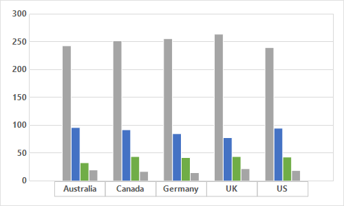
pivotChart1.ItemSource = ProductSalesData.GetSalesData();
pivotChart1.PivotAxis.Add(new PivotItem { FieldMappingName = "Product", TotalHeader = "Total" });
pivotChart1.PivotAxis.Add(new PivotItem { FieldMappingName = "Country", TotalHeader = "Total" });
pivotChart1.PivotAxis.Add(new PivotItem { FieldMappingName = "State", TotalHeader = "Total" });
pivotChart1.PivotLegend.Add(new PivotItem { FieldMappingName = "Date", TotalHeader = "Total" });
pivotChart1.PivotCalculations.Add(new PivotComputationInfo { FieldName = "Quantity", Format = "#,##0" });
this.Controls.Add(pivotChart1);
}
}
}using System;
using System.Collections.ObjectModel;
namespace WindowsFormsApplication1
{
/// <summary>
/// Represents a class that contains product sale details.
/// </summary>
public class ProductSales
{
public string Product { get; set; }
public string Date { get; set; }
public string Country { get; set; }
public string State { get; set; }
public int Quantity { get; set; }
public double Amount { get; set; }
public double UnitPrice { get; set; }
public double TotalPrice { get; set; }
}
}using System;
using System.Collections.Generic;
namespace WindowsFormsApplication1
{
/// <summary>
/// Represents a class that contains the product sale details collection.
/// </summary>
public class ProductSalesData
{
public static List<ProductSales> GetSalesData()
{
// Geography
string[] countries = { "Australia", "Germany", "Canada", "United States" };
string[] ausStates = { "Queensland" };
string[] canadaStates = { "Ontario", "Quebec" };
string[] germanyStates = { "Bayern", "Brandenburg" };
string[] ussStates = { "New York", "Colorado", "New Mexico" };
// Time
string[] dates = { "FY 2008", "FY 2009", "FY 2010", "FY 2011", "FY 2012" };
// Products
string[] products = { "Bike" };
Random r = new Random(123345);
int numberOfRecords = 2000;
List<ProductSales> listOfProductSales = new List<ProductSales>();
for (int i = 0; i < numberOfRecords; i++)
{
ProductSales sales = new ProductSales();
sales.Country = countries[r.Next(0, countries.GetLength(0))];
sales.Quantity = r.Next(1, 12);
// 1 percent discount for 1 quantity
double discount = (30000 * sales.Quantity) * (double.Parse(sales.Quantity.ToString()) / 100);
sales.Amount = (30000 * sales.Quantity) - discount;
sales.TotalPrice = sales.Amount * sales.Quantity;
sales.UnitPrice = sales.Amount / sales.Quantity;
sales.Date = dates[r.Next(r.Next(dates.GetLength(0) + 1))];
sales.Product = products[r.Next(r.Next(products.GetLength(0) + 1))];
switch (sales.Country)
{
case "Australia":
{
sales.State = ausStates[r.Next(ausStates.GetLength(0))];
break;
}
case "Canada":
{
sales.State = canadaStates[r.Next(canadaStates.GetLength(0))];
break;
}
case "Germany":
{
sales.State = germanyStates[r.Next(germanyStates.GetLength(0))];
break;
}
case "United States":
{
sales.State = ussStates[r.Next(ussStates.GetLength(0))];
break;
}
}
listOfProductSales.Add(sales);
}
return listOfProductSales;
}
}
}Not sure how to create your first WinForms Pivot Chart? Our documentation can help.
I’d love to read it now120+ WINDOWS FORMS CONTROLS
ALL CONTROLS
CONVERSATIONAL UI
DATA VISUALIZATION
INPUT CONTROLS
NAVIGATION
DIALOGS & NOTIFICATION
LAYOUT
LISTS & DROPDOWN
CALENDAR
MISCELLANEOUS
FILE VIEWERS & EDITORS
BUTTONS
Standalone UI SDKs
Integrate the DataGrid, Chart, Scheduler, Gantt, Rich Text Editor, File Manager, and Diagram UI components into applications to enable rich interaction and visualization, delivering a seamless user experience.
Document Solutions
Integrate the PDF Viewer, DOCX Editor, Spreadsheet Editor, and document-processing libraries into the WinForms applications to enable a smooth user experience.
Frequently Asked Questions
Why should you choose Syncfusion WinForms Pivot Chart?
Offers a wide range of chart types such as bar chart, column chart, pie chart, line chart, etc.
- Provides drill-down capability with multiple-level labels (grouping labels).
- Supports populating pivot charts with data sources such as IEnumerable list or data tables.
- Enables navigating through inner levels of a particular element in the row axis.
- Provides a built-in pivot schema designer very similar to Microsoft Excel’s.
Provides interaction support for grouping data in a pivot chart.
- Helps to differentiate among chart series using a color code along with labels to indicate information from series 1, series 2, and so on.
- Provides customization options for every part of a pivot chart, such as the chart area, series, and legend.
- Allows you to export the pivot chart control into Excel format.
- Provides interaction support to zoom into an area of a chart so that the data can be viewed more clearly.
Offers extensive demos and documentation to learn quickly and get started with the WinForms Pivot Chart control.
Where can I find the Syncfusion WinForms Pivot Chart demo?
You can find our WinForms Pivot Chart demo on
GitHub location.
Can I download and utilize the Syncfusion WinForms Pivot Chart for free?
No, this is a commercial product and requires a paid license. However, a free community license is also available for companies and individuals whose organizations have less than $1 million USD in annual gross revenue, 5 or fewer developers, and 10 or fewer total employees.
How do I get started with Syncfusion WinForms Pivot Chart?
A good place to start would be our comprehensive getting started documentation.
Our Customers Love Us
Having an excellent set of tools and a great support team, Syncfusion® reduces customers’ development time.Here are some of their experiences.

Excellent experience with Syncfusion!
Syncfusion is a product that makes life easier! I use it to create Blazor applications (server side and webassembly) and the controls speed up development a lot. Furthermore, if needed, it is possible to ask for direct support that is never long in coming!

Andrea Scarpante,

Sydea srl
The complete component set
It is the most complete component set available. Also very handy is the fact that there is a community edition, this gives me the opportunity to test thing at home without buying a separate license.

Johan Visser,

H and T Pawnbrokers
See Real Success Stories
Developers around the world trust Syncfusion’s Essential Studio to simplify complex projects and speed up delivery. With a vast library of UI controls, powerful SDKs, and reliable support, Essential Studio helps teams build enterprise-ready applications with confidence.
Read Our Customer StoriesIndustry
Software development
75% Cost reduction
50% Faster development
Industry
Utilities (oil and gas)
450+ hours saved
Streamlined processes and hours of development effort saved.
Advanced, flexible features
Empowered users through robust and versatile functionality.
Industry
Software and technology
1000+ of hours saved
Accelerated development with enterprise-ready UI components.
Efficient file management
Streamlined workflows with document libraries without building them from scratch.
Industry
Software and technology
2 Years of delay avoided
Two years of delays prevented with proactive planning.
On-time delivery
Projects delivered on schedule using trusted controls.
Industry
IT services and IT consulting
Improved performance
Large datasets handled with easy customization and quick debugging.
Highly customizable
Plug-and-play controls with quick template integration.
Industry
Professional services
Instant access
Quick availability of features and resources.
Reduced dependencies
Fewer dependencies for faster development.
Rated by users across the globe
Syncfusion Windows Forms Resources
Learning
 Documentation
 Documentation


Awards
Greatness—it’s one thing to say you have it, but it means more when others recognize it. Syncfusion® is proud to hold the following industry awards.