Overview
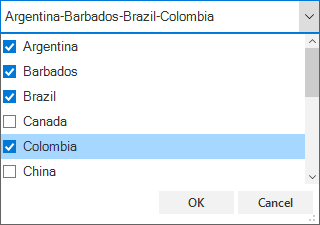
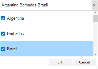
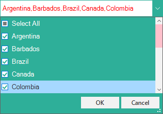
The WinForms multi select combobox control lets users select multiple items from a dropdown using the checkboxes next to each item. It also supports confirmation buttons (OK and Cancel) in the dropdown, similar to Excel.
Multiselect
Built-in checkboxes allow users to select more than one item in the ComboBox control with complete keyboard support.

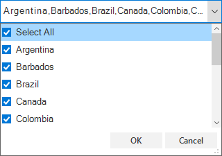
Select all (check all) option
Select all the items in the dropdown with just one click of the select-all checkbox.
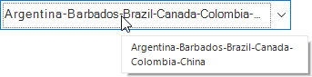
Custom delimiter character
Customized delimiters (separators) separate the selected items displayed in the ComboBox.
Header and footer
- Freeze the header and footer at the top and bottom of the dropdown list.
- Load any UI control as the header of the dropdown. This helps users perform customized operations like search and filter in the dropdown itself.

Excel-like selection
- Perform selection after user confirmation using OK and Cancel buttons, similar to in Excel.
- Hide the OK and Cancel buttons from the dropdown.

Item height
Users can adjust (auto fit) the item height in the dropdown based on the content of the item to enhance the readability of the content. It is also possible to set the item height conditionally.
Tokens
Selected item(s) from a predefined list will be added as tokens to the combobox.

Tooltip
Provide hint or information to user using Tooltip. This hint will be displayed when user mouse over the control. You can customize the appearance of the tooltip as required.
Appearance style
Customize the appearance of the ComboBox edit control and dropdown. You can customize the appearance based on data conditionally. Some customizable aspects:
- Background color
- Text color
- Checkbox style
- OK and Cancel buttons style
- Font.
120+ WINDOWS FORMS CONTROLS