Microsoft Office-inspired WPF Color Picker Palette
- Select color from predefined color palette.
- Displays recently used colors for future use.
- RGB, HSV, and hex color codes can be used to pick colors from additional color windows.
.NET 10 support now available
Trusted by the world’s leading companies

Overview
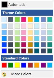
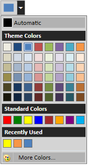
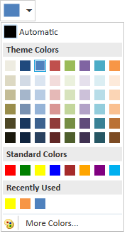
The WPF Color Picker Palette control is available as either a drop-down palette with the selected color highlighted at the top, or a direct-selection color palette. It has various color panel options to display the palettes based on color themes. A More Colors option provides a separate window for selecting colors with RGB or HSV values. Colors can also be picked using hex color values..

Different view modes in color panel
The WPF Color Picker Palette control is available in three modes:
- In drop-down mode, the color palette is presented in a pop-up which helps better utilize the available space in applications.
- In standard palette mode, the complete palette is displayed in the application.
- In split-button mode, the control acts like a command button and drop-down palette.

Custom header template
You can add an icon to indicate what the picker is used for. You can also customize the header any way you want.

Different color panels to pick colors
The color palette contains three different panels which display the selected theme palettes, standard color palettes, and the recently used color palettes.
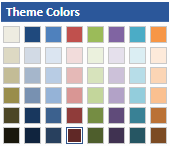
Theme Panel
The Theme Color panel displays the selected theme palettes from among 10 built-in themes.

Standard Panel
The standard color panel displays a palette of 8 preset colors.

Recently used panel
The most recently used color palettes are displayed under the Recently Used panel.
Built-in Color Palettes
The color picker palette contains 10 built-in color themes and displays the palette colors based on selected themes.


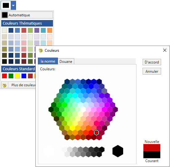
Color Dialog
More Colors windows allow users to pick additional colors from a standard category or with RGB or HSV values. It also allows users to choose colors with hex color code values.

Standard Colors
The Colors window allows users to select colors from a displayed set of standard colors.

Custom Colors
Additional colors not available in the color palette can be picked using RGB, HSV, and hex color code values.
Themes
The WPF Color Picker Palette contains built-in themes to suit all themed applications.


Right to Left
Supports right to left (RTL) direction for users working in right-to-left languages like Hebrew, Arabic, or Persian.

Localization
Localize the static text of the control to any language.
WPF Color Picker Palette Code Example
Easily get started with the WPF Color Picker Palette using a few simple lines of XAML and C# code example as demonstrated below. Also explore our WPF Color Picker Palette Example that shows you how to render and configure the Color Picker Palette in WPF.
<syncfusion:ColorPickerPalette x:Name="colorPickerPalette" Width="60" Height="40" />using Syncfusion.Windows.Tools.Controls;
{
public partial class MainWindow : Window
{
public MainWindow()
{
InitializeComponent();
//Creating an instance of ColorPickerPalette control
ColorPickerPalette colorPickerPalette = new ColorPickerPalette();
colorPickerPalette.Width = 60;
colorPickerPalette.Height = 40;
//Adding ColorPickerPalette as window content
this.Content = colorPickerPalette;
}
}
}Not sure how to create your first WPF Color Picker Palette? Our documentation can help.
I’d love to read it now140+ WPF CONTROLS
ALL CONTROLS
SMART COMPONENTS
DATA VISUALIZATION
MODERN THEMES
LAYOUT
NAVIGATION
INPUT CONTROLS
BUTTON
BUSINESS INTELLIGENCE
MISCELLANEOUS
LISTS & DROPDOWNS
FILE VIEWERS & EDITORS
CONVERSATIONAL UI
Standalone UI SDKs
Integrate the DataGrid, Chart, Scheduler, Gantt, and Diagram UI components into applications to enable rich interaction and visualization, delivering a seamless user experience.
Document Solutions
Integrate the PDF Viewer, DOCX Editor, Spreadsheet Editor, and document-processing libraries into the WPF applications to enable a smooth user experience.
Frequently Asked Questions
Why should you choose Syncfusion WPF Color Picker Palette?
Syncfusion WPF Color Picker Palette provides the following:
Support for expanded and pop-up modes.
- Inbuilt, home-curated standard colors.
- Quick navigation to recent colors with recent colors tab.
- A wide range of colors from inbuilt color picker.
- Has a simple configuration and APIs.
- Is touch-friendly and responsive.
Learn quickly and get started with WPF Color Picker Palette using its extensive demos and documentation.
Can I download and utilize the Syncfusion WPF Color Picker Palette for free?
No, this is a commercial product and requires a paid license. However, a free community license is also available for companies and individuals whose organizations have less than $1 million USD in annual gross revenue, 5 or fewer developers, and 10 or fewer total employees.
How do I get started with Syncfusion WPF Color Picker Palette?
A good place to start would be our comprehensive getting started documentation.
Our Customers Love Us
Having an excellent set of tools and a great support team, Syncfusion® reduces customers’ development time.Here are some of their experiences.

Excellent experience with Syncfusion!
Syncfusion is a product that makes life easier! I use it to create Blazor applications (server side and webassembly) and the controls speed up development a lot. Furthermore, if needed, it is possible to ask for direct support that is never long in coming!

Andrea Scarpante,

Sydea srl
The complete component set
It is the most complete component set available. Also very handy is the fact that there is a community edition, this gives me the opportunity to test thing at home without buying a separate license.

Johan Visser,

H and T Pawnbrokers
See Real Success Stories
Developers around the world trust Syncfusion’s Essential Studio to simplify complex projects and speed up delivery. With a vast library of UI controls, powerful SDKs, and reliable support, Essential Studio helps teams build enterprise-ready applications with confidence.
Read Our Customer StoriesIndustry
Software development
75% Cost reduction
50% Faster development
Industry
Utilities (oil and gas)
450+ hours saved
Streamlined processes and hours of development effort saved.
Advanced, flexible features
Empowered users through robust and versatile functionality.
Industry
Software and technology
1000+ of hours saved
Accelerated development with enterprise-ready UI components.
Efficient file management
Streamlined workflows with document libraries without building them from scratch.
Industry
Software and technology
2 Years of delay avoided
Two years of delays prevented with proactive planning.
On-time delivery
Projects delivered on schedule using trusted controls.
Industry
IT services and IT consulting
Improved performance
Large datasets handled with easy customization and quick debugging.
Highly customizable
Plug-and-play controls with quick template integration.
Industry
Professional services
Instant access
Quick availability of features and resources.
Reduced dependencies
Fewer dependencies for faster development.
Rated by users across the globe
Syncfusion WPF Resources
Learning
 Documentation
 Documentation


Awards
Greatness—it’s one thing to say you have it, but it means more when others recognize it. Syncfusion® is proud to hold the following industry awards.

