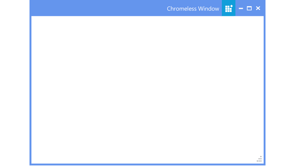
WPF Chromeless Window for application
- Customizable window that enriches your application’s UI.
- Style the window by modifying the border, corner radius, and in-build visual styles.
- Add custom controls on either side of the title bar.
.NET 10 support now available
Trusted by the world’s leading companies

Overview
The WPF Chromeless Window is used to create customizable windows that have a great UI. With these windows, you have control over the entire window, including the borders and headers. This feature includes resizing, dragging, and moving the window. It implements several other customizable features to present an appealing user interface to the end users.
Snap (Smart Window)
Similar to the Windows OS, when a chromeless window is dragged either to the sides or corners of the screen, the window will be aligned side-by-side. This helps compare the contents of different windows easily.

Customizing the title bar
With the predefined settings, title bar options such as background color, foreground color, title, icon, and height can be accessed. The appearance of minimize, maximize, and restore buttons can also be customized. There are also options to show or hide the title, minimize button, maximize button, and restore button.

Adding controls to the title bar
Option provided to add adaptive controls like Button, Textbox, Label, etc. on either side of the title bar in a window.

Customizing the border
It is possible to customize the border thickness, color, and corner radius. Resizing and resizing grip can also be turned on/off to effectively resize the window based on the user’s requirement.
Command binding
The WPF Chromeless Window facilitates command binding support and predefined commands that can be configured externally by the user to minimize, maximize, and close options.
Custom templates
The WPF Chromeless Window comes with a rich custom template binding support for:
• Title bar
• Maximize button
• Minimize button
• Restore button
• Close button
• Resize grip
For a better user experience, the window template can also be completely changed.

Custom style and themes

Built-in themes
Shipped with built-in themes like Blend, Office 2010, Office 2013, Office 2016, Office 365, Visual Studio 2013, Visual Studio 2015, Metro, etc.

Custom styling
The appearance of the control can be customized to any extent programmatically.

Localization
Allows users to customize the text in the user interface based on the local culture.

Right to left (RTL)
The text direction and layout of a window can be displayed in the right-to-left direction.

WPF Chromeless Window Code Example
Easily get started with the WPF Chromeless Window using a few simple lines of XAML and C# code example as demonstrated below. Also explore our WPF Chromeless Window Example that shows you how to render and configure the Chromeless Window in WPF.
<syncfusion:ChromelessWindow  xmlns:syncfusion="http://schemas.syncfusion.com/wpf" x:Class="Chrome.MainWindow"
        xmlns="http://schemas.microsoft.com/winfx/2006/xaml/presentation"
        xmlns:x="http://schemas.microsoft.com/winfx/2006/xaml"
        xmlns:d="http://schemas.microsoft.com/expression/blend/2008"
        xmlns:mc="http://schemas.openxmlformats.org/markup-compatibility/2006"
        xmlns:local="clr-namespace:Chrome"
        mc:Ignorable="d"
        Title="MainWindow" Height="450" Width="800">
</syncfusion:ChromelessWindow>
using Syncfusion.Windows.Shared;
public partial class MainWindow : ChromelessWindow
{
public MainWindow()
{
InitializeComponent();
}
}Not sure how to create your first WPF Chromeless Window? Our documentation can help.
I’d love to read it now140+ WPF CONTROLS
ALL CONTROLS
SMART COMPONENTS
DATA VISUALIZATION
MODERN THEMES
LAYOUT
NAVIGATION
INPUT CONTROLS
BUTTON
BUSINESS INTELLIGENCE
MISCELLANEOUS
LISTS & DROPDOWNS
FILE VIEWERS & EDITORS
CONVERSATIONAL UI
Standalone UI SDKs
Integrate the DataGrid, Chart, Scheduler, Gantt, and Diagram UI components into applications to enable rich interaction and visualization, delivering a seamless user experience.
Document Solutions
Integrate the PDF Viewer, DOCX Editor, Spreadsheet Editor, and document-processing libraries into the WPF applications to enable a smooth user experience.
Frequently Asked Questions
Why should you choose Syncfusion WPF Chromeless Window?
Customize the title bar with options to modify the colors, text, and all the icons.
Style the window by modifying the border, corner radius, and built-in visual styles.
- Do this through Theme Studio to enrich your application’s UI.
Add custom controls on either side of the title bar.
- One of the best WPF Chromeless Window in the market that offers feature-rich UI to interact with the software.
- Use a simple configuration and API.
Take advantage of extensive demos and documentation to learn quickly and get started with the WPF Chromeless Window control.
Can I download and utilize the Syncfusion WPF Chromeless Window for free?
No, this is a commercial product and requires a paid license. However, a free community license is also available for companies and individuals whose organizations have less than $1 million USD in annual gross revenue, 5 or fewer developers, and 10 or fewer total employees.
How do I get started with Syncfusion WPF Chromeless Window?
A good place to start would be our comprehensive getting started documentation.
Our Customers Love Us
Having an excellent set of tools and a great support team, Syncfusion® reduces customers’ development time.Here are some of their experiences.

Excellent experience with Syncfusion!
Syncfusion is a product that makes life easier! I use it to create Blazor applications (server side and webassembly) and the controls speed up development a lot. Furthermore, if needed, it is possible to ask for direct support that is never long in coming!

Andrea Scarpante,

Sydea srl
The complete component set
It is the most complete component set available. Also very handy is the fact that there is a community edition, this gives me the opportunity to test thing at home without buying a separate license.

Johan Visser,

H and T Pawnbrokers
See Real Success Stories
Developers around the world trust Syncfusion’s Essential Studio to simplify complex projects and speed up delivery. With a vast library of UI controls, powerful SDKs, and reliable support, Essential Studio helps teams build enterprise-ready applications with confidence.
Read Our Customer StoriesIndustry
Software development
75% Cost reduction
50% Faster development
Industry
Utilities (oil and gas)
450+ hours saved
Streamlined processes and hours of development effort saved.
Advanced, flexible features
Empowered users through robust and versatile functionality.
Industry
Software and technology
1000+ of hours saved
Accelerated development with enterprise-ready UI components.
Efficient file management
Streamlined workflows with document libraries without building them from scratch.
Industry
Software and technology
2 Years of delay avoided
Two years of delays prevented with proactive planning.
On-time delivery
Projects delivered on schedule using trusted controls.
Industry
IT services and IT consulting
Improved performance
Large datasets handled with easy customization and quick debugging.
Highly customizable
Plug-and-play controls with quick template integration.
Industry
Professional services
Instant access
Quick availability of features and resources.
Reduced dependencies
Fewer dependencies for faster development.
Rated by users across the globe
Syncfusion WPF Resources
Learning
 Documentation
 Documentation


Awards
Greatness—it’s one thing to say you have it, but it means more when others recognize it. Syncfusion® is proud to hold the following industry awards.

