Overview
The WinForms DataGrid allows you to customize the appearance style of the DataGrid control and its inner elements such as cell, row, column, column header, row header, summary rows, unbound rows, filter UI popup, column chooser, tooltip, and more to adopt the DataGrid control to the rest of the business application.
Row style
Customize the appearance of all the rows of DataGrid. The following can be customized:
- Back color
- Text color
- Font
- Border
- Text alignment, and more

Column style
Customize the appearance of an individual column or all the columns of the DataGrid. It is also possible to customize the column header appearance. The following can be customized:
- Back color
- Text color
- Font
- Border
- Text alignment, and more

Other elements styles
Allows users to customize the appearance of all the other elements of DataGrid such as:
- Summary row
- Group caption row
- Row header
- Unbound row
- Group drop area and its item
- Built-in add new row, and more

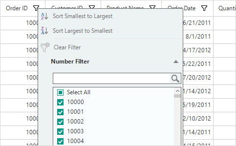
Excel inspired filter UI style
Users can customize the appearance of the Excel inspired filter UI style such as checkbox filter, text filter, numeric filter and datetime filter. Also, it’s possible to customize the appearance of built-in filter row.
Column chooser style
Customize the appearance style of the column chooser UI. Users can customize all the elements in the column chooser UI like checked ListBox, OK and cancel buttons, TextBox, and more.

Tooltip style
The WinForms DataGrid allows users to customize the appearance style of the tooltip. Also, customize the tooltip style conditionally. The following are supported:
- Text color
- Back color
- Font
- Loading image, and more

Built-in themes
The WinForms DataGrid control provides Office 2016 built-in theme support to adapt the control to the rest of the business application. The following Office 2016 themes are supported.
- Colorful
- Black
- Dark gray
- White
Our Customers Love Us


See Real Success Stories
Developers around the world trust Syncfusion’s Essential Studio to simplify complex projects and speed up delivery. With a vast library of UI controls, powerful SDKs, and reliable support, Essential Studio helps teams build enterprise-ready applications with confidence.
Read Our Customer StoriesIndustry
Software development
75% Cost reduction
50% Faster development
Industry
Utilities (oil and gas)
450+ hours saved
Streamlined processes and hours of development effort saved.
Advanced, flexible features
Empowered users through robust and versatile functionality.
Industry
Software and technology
1000+ of hours saved
Accelerated development with enterprise-ready UI components.
Efficient file management
Streamlined workflows with document libraries without building them from scratch.
Industry
Software and technology
2 Years of delay avoided
Two years of delays prevented with proactive planning.
On-time delivery
Projects delivered on schedule using trusted controls.
Industry
IT services and IT consulting
Improved performance
Large datasets handled with easy customization and quick debugging.
Highly customizable
Plug-and-play controls with quick template integration.
Industry
Professional services
Instant access
Quick availability of features and resources.
Reduced dependencies
Fewer dependencies for faster development.
120+ WINDOWS FORMS CONTROLS