WPF MaskedTextBox control
- Masking the input value is made easy.
- Three types of mask options based on input.
- Watermark text support when value is null.
.NET 10 support now available
Trusted by the world’s leading companies

Overview
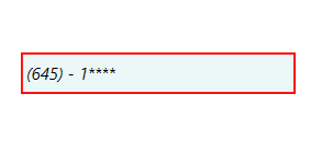
The WPF MaskedTextBox control is an enhanced version of the text box that additionally restricts input to conform to a specific structure or mask.
Variable length mask expression
The WPF MaskedTextBox control gives you great flexibility to control variable length of data input.

Culture
Special symbols like currency symbols, date separators, decimal separators etc., are applied based on the provided culture

Custom prompt character
The WPF MaskedTextBox control provides the flexibility to customize the prompt character when the default prompt character ( _ ) is not suitable for your scenario.
Validation Mode
The WPF MaskedTextBox control lets you to choose when to validate the data input.

Lost focus
Validate the data input when the control loses its focus.

Key press
Validation triggers for each key press.
Formatting Value
While fetching the value, masked text box control provides the option to format the text with literals and prompt characters.

Exclude prompt and literals
Value contains only the typed characters; the prompt characters and literals are excluded.

Include prompt
Value contains the typed characters and available prompt characters, literals are excluded.

Include literals
Value contains the typed characters and literals; prompt characters are excluded.

Include prompt and literals
Value contains typed characters, prompt characters, and literals.
Watermark
The watermark will prompt you with instructions or important information, when it is not in focus and no characters are not entered.

Appearance
Appearance is highly customizable.

Text appearance
The WPF MaskedTextBox control allows you to change the font name, font style, font size and its color.

Border color
Customize border color of the masked edit control to any of the preferred color.

Error border color
The WPF MaskedTextBox control provides the flexibility to customize the error border color when the default error border color (Color.Red) is not suitable for your scenario.
WPF MaskedTextBox Code Example
Easily get started with the WPF MaskedTextBox using a few simple lines of XAML and C# code example as demonstrated below. Also explore our WPF MaskedTextBox Example that shows you how to render and configure the MaskedTextBox in WPF.
<syncfusion:SfMaskedEdit x:Name="sfMaskedEdit" Width="100" Height="25" />using Syncfusion.Windows.Controls.Input;
{
public partial class MainWindow : Window
{
public MainWindow()
{
InitializeComponent();
//Creating an instance of SfMaskedEdit control
SfMaskedEdit sfMaskedEdit = new SfMaskedEdit();
sfMaskedEdit.Width = 100;
sfMaskedEdit.Height = 25;
//Adding SfMaskedEdit as window content
this.Content = sfMaskedEdit;
}
}
}Not sure how to create your first WPF MaskedTextBox? Our documentation can help.
I’d love to read it now140+ WPF CONTROLS
ALL CONTROLS
SMART COMPONENTS
DATA VISUALIZATION
MODERN THEMES
LAYOUT
NAVIGATION
INPUT CONTROLS
BUTTON
BUSINESS INTELLIGENCE
MISCELLANEOUS
LISTS & DROPDOWNS
FILE VIEWERS & EDITORS
CONVERSATIONAL UI
Standalone UI SDKs
Integrate the DataGrid, Chart, Scheduler, Gantt, and Diagram UI components into applications to enable rich interaction and visualization, delivering a seamless user experience.
Document Solutions
Integrate the PDF Viewer, DOCX Editor, Spreadsheet Editor, and document-processing libraries into the WPF applications to enable a smooth user experience.
Frequently Asked Questions
Why should you choose Syncfusion WPF MaskedTextBox?
- Masking the input value is made easy.
Three types of mask options based on input.
- Watermark text support when value is null.
- Simple configuration and API.
- Touch-friendly and responsive UI.
Extensive demos, documentation to learn quickly and get started with WPF MaskedTextBox.
Can I download and utilize the Syncfusion WPF MaskedTextBox for free?
No, this is a commercial product and requires a paid license. However, a free community license is also available for companies and individuals whose organizations have less than $1 million USD in annual gross revenue, 5 or fewer developers, and 10 or fewer total employees.
How do I get started with Syncfusion WPF MaskedTextBox?
A good place to start would be our comprehensive getting started documentation.
Our Customers Love Us
Having an excellent set of tools and a great support team, Syncfusion® reduces customers’ development time.Here are some of their experiences.

Excellent experience with Syncfusion!
Syncfusion is a product that makes life easier! I use it to create Blazor applications (server side and webassembly) and the controls speed up development a lot. Furthermore, if needed, it is possible to ask for direct support that is never long in coming!

Andrea Scarpante,

Sydea srl
The complete component set
It is the most complete component set available. Also very handy is the fact that there is a community edition, this gives me the opportunity to test thing at home without buying a separate license.

Johan Visser,

H and T Pawnbrokers
See Real Success Stories
Developers around the world trust Syncfusion’s Essential Studio to simplify complex projects and speed up delivery. With a vast library of UI controls, powerful SDKs, and reliable support, Essential Studio helps teams build enterprise-ready applications with confidence.
Read Our Customer StoriesIndustry
Software development
75% Cost reduction
50% Faster development
Industry
Utilities (oil and gas)
450+ hours saved
Streamlined processes and hours of development effort saved.
Advanced, flexible features
Empowered users through robust and versatile functionality.
Industry
Software and technology
1000+ of hours saved
Accelerated development with enterprise-ready UI components.
Efficient file management
Streamlined workflows with document libraries without building them from scratch.
Industry
Software and technology
2 Years of delay avoided
Two years of delays prevented with proactive planning.
On-time delivery
Projects delivered on schedule using trusted controls.
Industry
IT services and IT consulting
Improved performance
Large datasets handled with easy customization and quick debugging.
Highly customizable
Plug-and-play controls with quick template integration.
Industry
Professional services
Instant access
Quick availability of features and resources.
Reduced dependencies
Fewer dependencies for faster development.
Rated by users across the globe
Syncfusion WPF Resources
Learning
 Documentation
 Documentation


Awards
Greatness—it’s one thing to say you have it, but it means more when others recognize it. Syncfusion® is proud to hold the following industry awards.

