Basic Charts

Line Chart
Visualize time-dependent data to show trends at equal intervals.
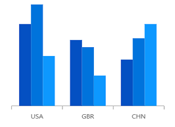

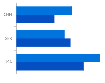
Spline charts
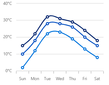

Spline Area Chart
Like the area chart, but with the data points connected with a smooth line.
Step charts
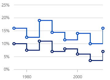
Step line Chart
Data points are connected through vertical and horizontal lines to show step-like progress.
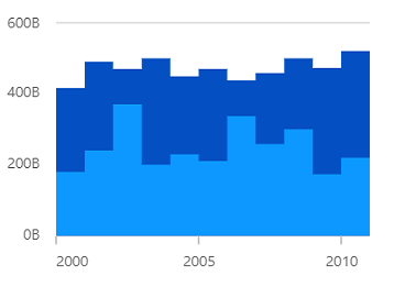
Step area Chart
Like the step line chart, but with the areas connected with lines shaded.
Stacked charts
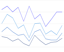
Stacked line
Like the line chart, but with the data points stacked on top of each other.
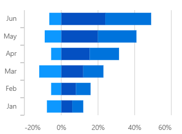
Stacked Bar
Plots data points on top of each other using horizontal bars.

Stacked Column
Plots data points on top of each other using vertical bars.
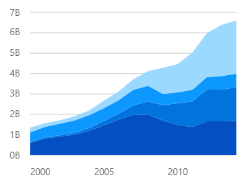
Stacked Area
Like the area chart, but with the data points stacked on top of each other.
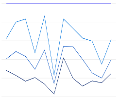
100% Stacked line
Shows the relative percentage of multiple data series in stacked lines. The cumulative proportion of each stacked line always totals 100%.
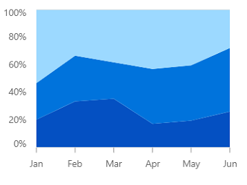
100% Stacked Area
Shows the relative percentage of multiple data series in stacked columns. The cumulative proportion of each stacked column always totals 100%.
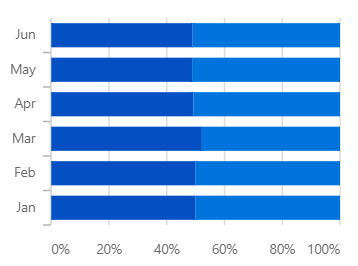
100% Stacked Bar
Shows the relative percentage of multiple data series in stacked bars. The cumulative proportion of each stacked bar always totals 100%.
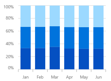
100% Stacked Column
Shows the relative percentage of multiple data series in stacked columns. The cumulative proportion of each stacked column always totals 100%.
Range charts
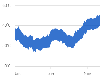
Range area Chart
Shows variations in the data values for a given time. The area between the high and low range is filled.
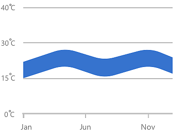
Spline range area Chart
Similar to the range area chart, except that the data points are connected by a smooth line.
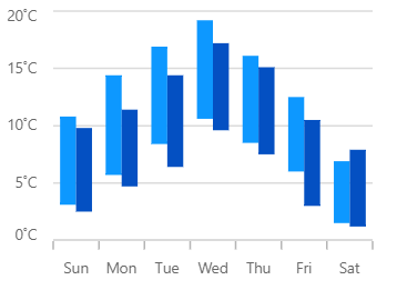
Range column Chart
Like the column chart, but shows the variations in the data values for a given time using vertical bars.
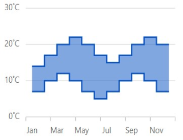
Range step area Chart
Similar to the range area chart, except that the data points are connected by a step line.
Correlation charts
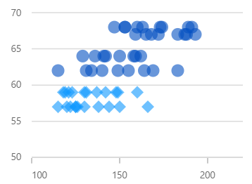
Scatter
Scatter plot or scatter chart plots data with two numeric parameters.

Bubble
Visualize data with three numeric parameters. The bubble size depends on third parameter.
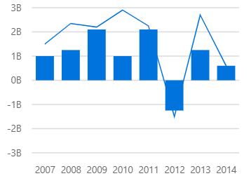
Combination Chart / Mixed chart
Combines two or more chart types in a single chart.
Circular charts
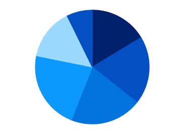
Pie Chart
Displays proportions and percentages between different categories.

Donut Chart
Similar to pie chart for data analysis, but with an open space at the center.
Triangular charts

Pyramid Chart
Represent hierarchies visually in a pyramid-like structure that shows proportions of the total.
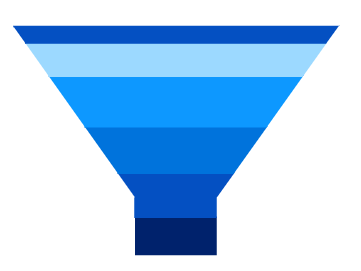
Funnel Chart
Plots streamlined data to show various stages in a process.
Polar & Radar Charts
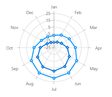
Polar Chart
Visually compare several quantitative or qualitative aspects of a situation.
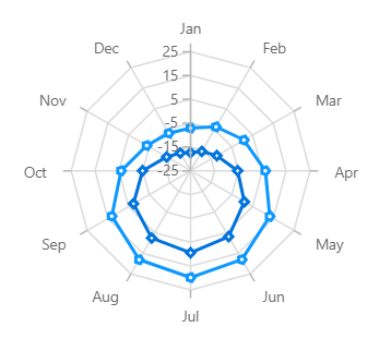
Radar Chart
Visually compare several quantitative or qualitative aspects of a situation.
Financial Charts
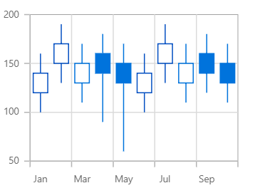
Candle Chart
Used in the stock market to represent the high, low, open, close values of a stock.
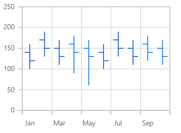
OHLC Chart
Used in the stock market to represent the high, low, open, close values of a stock.
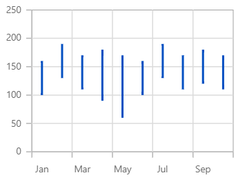
HighLow Chart
Shows the high and low values of the stock over the given period of time.
Other Charts
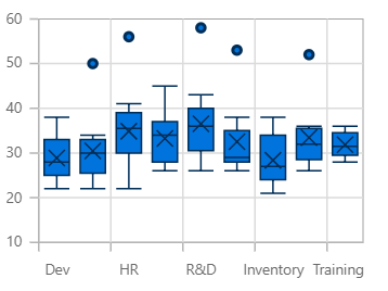
Box and Whisker Chart
Visualize a group of numerical data through its quartiles.
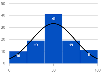
Histogram Chart
Plot the frequency of occurrences in a continuous data set.
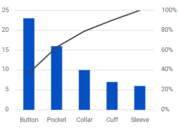
Pareto Chart
Indicates the frequency of defects, as well as their cumulative impact.
Our Customers Love Us




See Real Success Stories
Developers around the world trust Syncfusion’s Essential Studio to simplify complex projects and speed up delivery. With a vast library of UI controls, powerful SDKs, and reliable support, Essential Studio helps teams build enterprise-ready applications with confidence.
Read Our Customer StoriesIndustry
Software development
75% Cost reduction
50% Faster development

Industry
Utilities (oil and gas)

450+ hours saved
Streamlined processes and hours of development effort saved.

Advanced, flexible features
Empowered users through robust and versatile functionality.
Industry
Software and technology
1000+ of hours saved
Accelerated development with enterprise-ready UI components.

Efficient file management
Streamlined workflows with document libraries without building them from scratch.
Industry
Software and technology

2 Years of delay avoided
Two years of delays prevented with proactive planning.

On-time delivery
Projects delivered on schedule using trusted controls.
Industry
IT services and IT consulting

Improved performance
Large datasets handled with easy customization and quick debugging.

Highly customizable
Plug-and-play controls with quick template integration.
Industry
Professional services
Instant access
Quick availability of features and resources.
Reduced dependencies
Fewer dependencies for faster development.
140+ ANGULAR UI COMPONENTS