Overview
The Angular Line Chart helps represent and visualize data. It shows progressions and trends at equal intervals. This chart handles large amounts of data with smooth animation, zooming, and panning support.
Multi series
Allows you to plot multiple series in a single chart to compare different data sets. Enabling legend and tooltip gives more information about the individual series.

Marker
Marks data points with built-in shapes such as circles, rectangles, ellipses, vertical lines, horizontal lines, diamonds, triangles, pentagons, crosses, and pluses. In addition to these shapes, use images to make the point more attractive.
Data label
Data labels display information about data points. Add a template to display data labels with HTML elements such as images, DIV, and spans for more informative data labels. You can rotate a data label by its given angle.

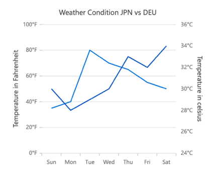
Multiple axes
Use multiple axes to plot different data sets that widely vary from one other.
Zoom and pan
Zoom and pan when dealing with large amounts of data to visualize data points in any region.
Dynamic line chart
Create and update the line chart with live data that changes over seconds or minutes.
Empty/null data point
Angular Line Charts handle the missed data elegantly with empty points support.

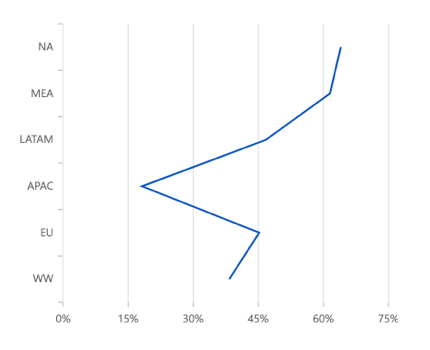
Vertical chart
The line chart can be transposed vertically to view the data in a different perspective.
Customization
Customize the color, thickness, and dash array of the line chart using built-in APIs.
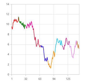
Multi color line
Dashed line

Angular Line Chart Code Example
Easily get started with Angular Line Chart by using a few lines of HTML and TS code, as demonstrated below. Also explore our Angular Line Chart Example that shows how to render and configure the chart.
<ejs-chart style='display:block' id='chartcontainer'  [primaryXAxis]='primaryXAxis'>
<e-series-collection>
    <e-series [dataSource]='data' type='Line' xName='x' yName='y'> </e-series>
</e-series-collection>
</ejs-chart>
//app.component.ts
import { Component } from '@angular/core';
export class AppComponent {
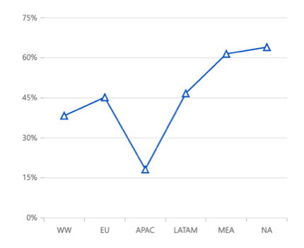
public data: Object[] = [{ x: 'WW', y: 38.3, text: 'World Wide' },
{ x: 'EU', y: 45.2, text: 'Europe' },
{ x: 'APAC', y: 18.2, text: 'Asia Pacific' },
{ x: 'LATAM', y: 46.7, text: 'Latin America' },
{ x: 'MEA', y: 61.5, text: 'Middle East Africa' },
{ x: 'NA', y: 64, text: 'North America' }];
//Initializing Primary X Axis
public primaryXAxis: Object = {
valueType: 'Category',
};
}
//app.module.ts
import { ChartModule } from '@syncfusion/ej2-ng-charts';
import { LineSeriesService, CategoryService} from '@syncfusion/ej2-ng-charts';
import { AppComponent } from './app.component';
@NgModule({
declarations: [
AppComponent
],
imports: [
BrowserModule, ChartModule
],
providers: [ LineSeriesService, CategoryService],
bootstrap: [AppComponent]
})
export class AppModule { }