Trusted by the world’s leading companies

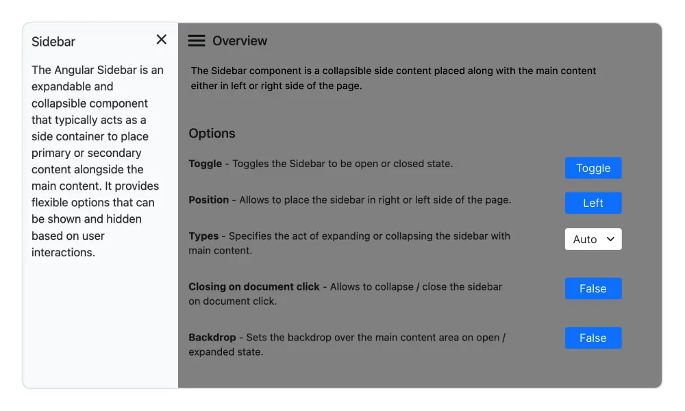
Overview
The Angular Sidebar, also called the side navigation menu, can be used to simplify the navigation hierarchy. Users can place primary or secondary content alongside the main content in this control. It provides a flexible container that can be expanded or collapsed based on user interactions. Any type of HTML content or component can be placed in the Sidebar for quick access and easy navigation, like quick references, menus, lists, and tree views.
Angular Sidebar code example
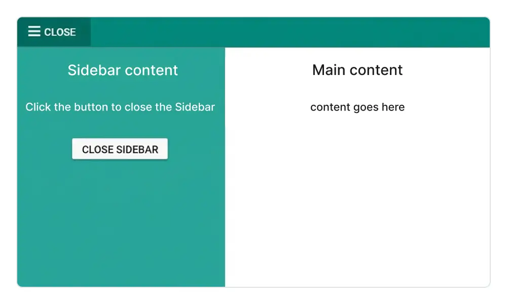
Easily get started with the Angular SideBar using a few simple lines of HTML and TS code, as demonstrated in the following. Also explore our Angular Sidebar example, which shows you how to render and configure a Sidebar in Angular.
<ejs-sidebar id="default-sidebar" >
<div class="title"> Sidebar content</div>
</ejs-sidebar>
<div>
<div class="title">Main content</div>
<div class="sub-title">
    Content goes here.
</div>
</div>
import { Component } from '@angular/core';
@Component({
selector: 'app-root',
templateUrl: 'app/app.component.html',
styleUrls: ['app/app.component.css']
})
export class AppComponent {
}AI-assisted development
Build feature-rich Angular Sidebar experiences faster
Accelerate navigation layout development with Syncfusion AI tools that turn requirements into fully configured sidebar experiences with minimal manual setup.
Agentic UI Builder
Turn prompts into ready-to-use UI screens, layouts, and workflows with Syncfusion Angular components.
Example Prompt Create a responsive admin layout with collapsible sidebar navigation.
Agent Skills
Accelerate development with Syncfusion AI Agent Skills for faster implementation and integration.
Example Prompt Generate a Angular sidebar with a dock mode, responsive behavior, and menu integration.
AI Coding Assistant
Accelerate development with AI that generates, configures, and troubleshoots component code directly in your IDE.
Example Prompt Show how to toggle and control sidebar states in the Syncfusion Angular Sidebar.
Transition and animation
Different types of slide-out content in the Angular Sidebar component give users the flexibility to view or hide content over or above the main content by pushing, sliding, or overlaying it.
HTML content positioning to the sides
The Angular Sidebar control positions its content to the left or right side of the main content area. This option allows the placement of two sidebars in a page, to the left and right, to show primary and secondary content simultaneously.
Dock the HTML side panel content
When the side content is docked to give the main content more space, the navigation text is represented as a shortened view of icons.
Toggle Sidebar menu
Bind custom actions to an element (hamburger menu or buttons) to toggle the Sidebar.
Responsive Sidebar
Auto closing the Sidebar component’s content allows the main content area to be more readable.


Animate Sidebar
Show or hide the Angular Sidebar with CSS3 animation effects.
Backdrop
Apply a shadow effect to the content area until the sidebar menu closes.
Incorporate Syncfusion controls
Easily integrate any Syncfusion Angular UI control within the Sidebar.
Fit to target
The Angular Sidebar can render within any HTML target element.

Mobile-friendly side navigation menu
The Angular Sidebar component’s responsive mode gives an adaptive, redesigned UI appearance for mobile devices.
Media query
Control the expand and close behavior of Angular Sidebar based on screen resolution.
Developer-friendly APIs
Developers have control over all the UI elements and behaviors of the component to provide the best user experience with a rich set of developer-friendly APIs.
Built-in themes
The Angular Sidebar component is shipped with several built-in themes: Material, Bootstrap, Fabric (Office 365), Tailwind CSS, and high contrast.
Users can customize any one of these built-in themes or create new themes by either simply overriding SASS variables or using our Theme Studio application.
Angular version compatibility
With continuous improvement in Angular versions, the Angular Sidebar is kept up to date to make it compatible with versions starting from 4 to the latest version.
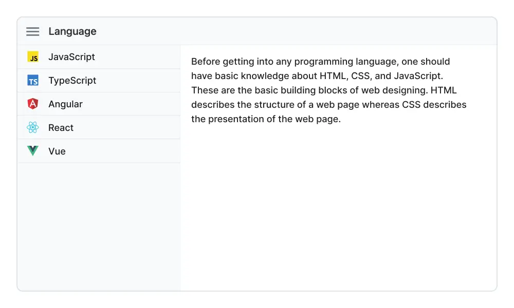
Other supported frameworks
The Sidebar is available for the Blazor, React, JavaScript, and Vue frameworks. Explore its platform-specific options through the following links:


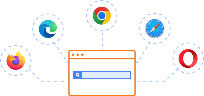
Supported browsers
The Angular Sidebar works well with all modern web browsers, including Chrome, Firefox, Edge, Safari, and Opera.
Not sure how to create your first Angular Sidebar? Our tutorial videos and documentation can help.
I’d love to watch it now I’d love to read it now140+ ANGULAR UI COMPONENTS
ALL COMPONENTS
SMART COMPONENTS
GRIDS
DATA VISUALIZATION
DROPDOWNS
FILE VIEWERS & EDITORS
BUTTONS
INTERACTIVE CHAT
INPUTS
NAVIGATION
FORMS
NOTIFICATION
Standalone UI SDKs
Integrate the DataGrid, Chart, Scheduler, Gantt, Rich Text Editor, File Manager, and Diagram UI components into applications to enable rich interaction and visualization, delivering a seamless user experience.
Document Solutions
Integrate the PDF Viewer, DOCX Editor, Spreadsheet Editor, and document-processing libraries into the Angular applications to enable a smooth user experience.
Frequently Asked Questions
Why should I choose Syncfusion’s Angular Sidebar?
Syncfusion Angular Sidebar provides the following features:
- Expanded and collapsed states, depending on the resolution.
Highly customizable component with docking options.
An effective feature sets component in an opened or closed state depending on the screen resolution.
- Support for display of short notifications about the content in docked mode.
- Support for all modern browsers.
- Touch-friendly and responsive UI.
Extensive demos and documentation so you can get started quickly with the Angular Sidebar.
Where can I find the Syncfusion Angular Sidebar demo?
You can find our Angular Sidebar demo, which demonstrates how to render and configure the Sidebar.
How do I make a sidebar in Angular?
You can create a sidebar by using Syncfusion’s Angular Sidebar component, which provides a responsive and customizable panel that slides in from the left, right, top, or bottom of the page.
How do I create a collapsible sidebar in Angular?
Use the Syncfusion Sidebar component, which includes built-in options for collapsible behavior. You can easily toggle its visibility and configure it to expand or collapse based on user interaction.
What is a sidebar menu component?
A sidebar menu component is a combination of a sidebar and navigation controls. Syncfusion’s Sidebar provides ready-to-use integrations with other Syncfusion components, like Menu and TreeView, for building interactive sidebar menus.
Can I download and utilize the Syncfusion Angular Sidebar for free?
No, this is a commercial product and requires a paid license. However, a free community license is also available for companies and individuals whose organizations have less than $1 million USD in annual gross revenue, 5 or fewer developers, and 10 or fewer total employees.
How do I get started with the Syncfusion Angular Sidebar?
A good place to start would be our comprehensive getting started documentation.
What is the Angular Sidebar component?
The Syncfusion Sidebar component for Angular is a collapsible panel used for navigation or displaying additional content. It supports docking, plus push and overlay modes for flexible layouts.
How do I add a side navigation bar in Angular?
Use the Syncfusion Sidebar component and combine it with navigation elements like menus or lists to create a fully functional side navigation bar for your Angular application.
What are a sidebar and a navbar?
A sidebar is a vertical panel for navigation or content, while a navbar is a horizontal bar for navigation typically placed at the top of a page. Syncfusion offers components for both, enabling responsive layouts for modern web apps.
Our Customers Love Us
Having an excellent set of tools and a great support team, Syncfusion® reduces customers’ development time.Here are some of their experiences.

An amazing toolset to accelerate UI development
The number of components available is the best thing about this library. We think of a UI component, and the Angular JS library already offers it. We use the Angular JS library to accelerate development. The experience using and implementing has been great. The support is also excellent.

Shrikant P,

Customer Success Manager, Small-Business
A giant framework with great pricing options
I have loved the components and options that Syncfusion has, besides, its documentation, demos, and Support are excellent.

Alejandro Javier V,
CEO, Small-Business
See Real Success Stories
Developers around the world trust Syncfusion’s Essential Studio to simplify complex projects and speed up delivery. With a vast library of UI controls, powerful SDKs, and reliable support, Essential Studio helps teams build enterprise-ready applications with confidence.
Read Our Customer StoriesIndustry
Software development
75% Cost reduction
50% Faster development
Industry
Utilities (oil and gas)
450+ hours saved
Streamlined processes and hours of development effort saved.
Advanced, flexible features
Empowered users through robust and versatile functionality.
Industry
Software and technology
1000+ of hours saved
Accelerated development with enterprise-ready UI components.
Efficient file management
Streamlined workflows with document libraries without building them from scratch.
Industry
Software and technology
2 Years of delay avoided
Two years of delays prevented with proactive planning.
On-time delivery
Projects delivered on schedule using trusted controls.
Industry
IT services and IT consulting
Improved performance
Large datasets handled with easy customization and quick debugging.
Highly customizable
Plug-and-play controls with quick template integration.
Industry
Professional services
Instant access
Quick availability of features and resources.
Reduced dependencies
Fewer dependencies for faster development.
Rated by users across the globe
Syncfusion Angular Resources
Learning
 Documentation
 Documentation


Awards
Greatness—it’s one thing to say you have it, but it means more when others recognize it. Syncfusion® is proud to hold the following industry awards.

