ASP.NET Web Forms Tooltip : Popover control with Smart Positioning
- Automatically adjust display position based on the view page without inconsistent.
- Customize the content with icons, images, or dynamic AJAX template and much more.
- Enhance open and close of popover with out of the box animations.
Trusted by the world’s leading companies

Overview
The ASP.NET Tooltip is a pop-up component. It shows an information or message when you hover, click, focus, or touch an image, button, anchor tag, etc.,. The information displayed in the tooltip can include simple texts, images, hyperlinks, or custom templates.
Position and mouse trails
The ASP.NET tooltip has twelve different options to position it around the target. Also, you can configure the Tooltip to follow or not follow the mouse. To position the tip pointer, there are four options: Right, left, top, and bottom.

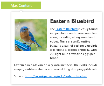
Dynamic AJAX content
You can load dynamic content for Tooltip on demand using an AJAX callback.
Custom tooltip
Using templates, the tooltip content is loaded with inline HTML, images, iframe, videos, and maps. You can also add a title to the content.


Show and hide
You can control show and hide triggers of the tooltip using auto, hover, click, focus, and custom modes. Implement your own custom mode to control the show and hide behaviors.
Interactivity
By default, the Tooltip will show and hide when hovering in and out. You can stop the show and hide triggers and make the Tooltip visible always.

Triggers
You can show tooltips on hover, click, touch, and focus of any element.
Tooltip design
The ASP.NET Tooltip is shipped with several built-in themes such as material, bootstrap, fabric (office 365), and high contrast. Users can customize any one of these built-in themes or create new themes to achieve their own desired look and feel. It is achieved either by simply overriding SASS variables or using our Theme Studio application with ease.


Touch-Friendly
The Tooltip responds to screen size and adapts its contents to fit any touch device. It recognizes touch gestures, displays the message when performing touch and hold action. This provides the best user experience for touch devices such as phones, tablets, and desktops.
Animation effects
The ASP.NET tooltip shows and hides animations that are completely customizable. You can include animation effect, duration, and delay. You can also control transition effects at the application level.
Accessibility
-
Fully supports WAI-ARIA accessibility to make it accessible to screen readers and assistive devices.
-
Based on the WCAG 2.0 standard, UI element visuals such as foreground color, background color, line spacing, text, and images are designed.
-
Follows WAI-ARIA best practices for implementing keyboard interaction.
Developer-friendly APIs
In Tooltip, you have control over all the UI elements and its behaviors. It provides the best user experience to users through a rich set of developer-friendly APIs.
75+ ASP.NET UI CONTROLS
ALL CONTROLS
GRIDS
DATA VISUALIZATION
DATA SCIENCE
EDITORS
NAVIGATION
NOTIFICATION
BUSINESS INTELLIGENCE
Our Customers Love Us
Having an excellent set of tools and a great support team, Syncfusion® reduces customers’ development time.Here are some of their experiences.

We chose Essential Studio based on the breadth and quality of the components and the excellent support.
I would highly recommend using Essential Studio and have found that the Syncfusion support team is one of the fastest I have worked with.
Rated by users across the globe
Syncfusion ASP.NET Resources
Learning
 Documentation
 Documentation


Awards
Greatness—it’s one thing to say you have it, but it means more when others recognize it. Syncfusion® is proud to hold the following industry awards.

