
ASP.NET Web Forms ComboBox Control
- A user-friendly and advanced editable input-selection element.
- New values not present in the predefined list can be added.
- Built-in support for autofill (auto suggest), grouping, and UI customization with templates.
Trusted by the world’s leading companies

Overview
The ASP.NET ComboBox control is a drop-down list component with an editable option that also allows users to choose an option from a predefined pop-up list. It can be used as an alternative to the HTML select tag and has several out-of-the-box features such as data binding, filtering, grouping, templates, UI and pop-up list customization, cascading, and more.

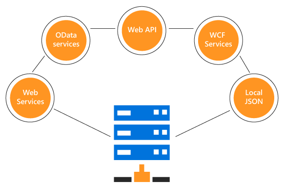
Data binding
You can bind data from a variety of data sources in an array or list of primitive data, JSON data collections, or remote data sources using different kinds of adapters such as OData, OData V4, URL, JSON, and Web API. The control uses the data manager to manage data, and also has customization options for data requests and processing.
Editable combo box with custom value
The editable combo box allows the entry of a custom value when the option the user searched for is not available in the pop-up list. Also,you can set a value for the combo box or get the selected value from the combo box at any time through the interactive APIs.

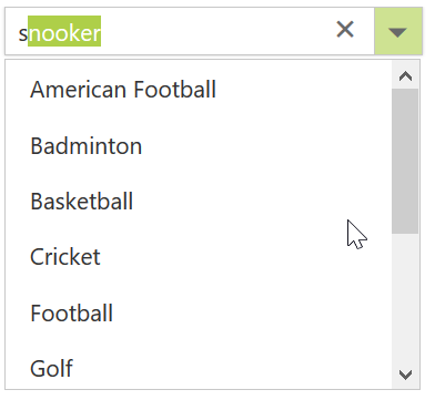
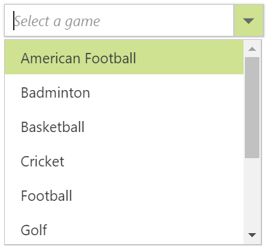
Filtering
Built-in filtering support with a rich set of filtering configurations is available to meet all your application needs.
Custom filtering
Filter queries are customizable, and you can use your own filter libraries to filter data.

Filter settings
The filter search can be customized with case sensitivity, and can be performed with minimum query string characters.

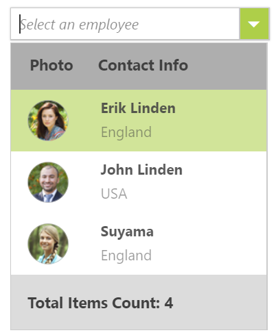
Grouping with category
Group the pop-up list items with a corresponding category that makes it easy for users to pick an item quickly from the drop-down, and also improves the visual experience for users.
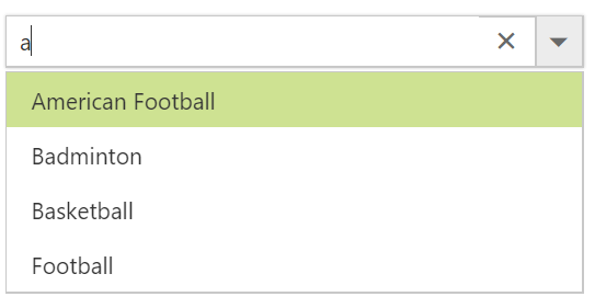
Autofill
The autofill option allows users to easily search through options in the combo box. When a user is typing a query string to search, the available matching options will be filled automatically.

Cascading combo boxes
The ASP.NET ComboBox control provides an option to create multiple cascading combo boxes, which helps users populate data for a child combo box based on the current selected value of the parent combo box.
Drop-down styles with templates
Another important combo box feature is templates, which allow you to make custom appearances for the header, footer, and list items in the pop-up list.
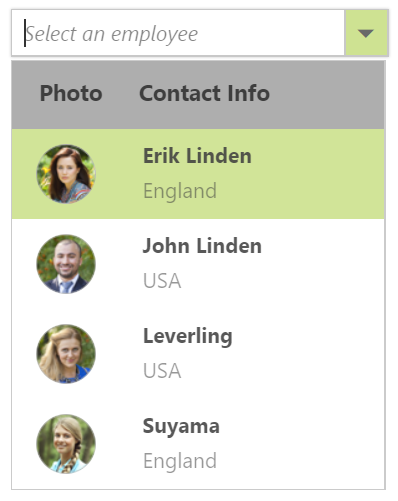
Header template
Design your own header for the pop-up list using a header template.

Item template
Define the appearance of each item in the pop-up list with item templates.
Footer template
Design your own custom and static footers for the pop-up list using footer templates.
Customizing the UI
You can customize each part of the combo box based on your application requirements.
Icons in list items
Each list item can be configured to display a custom icon to improve the component’s readability and appearance.
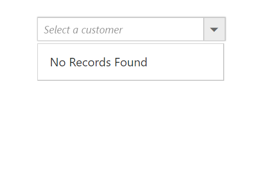
Empty record
Configure a custom look for the pop-up list when no items are available to display.

Customize dimensions
The dimensions of the pop-up list can be customized to fit the application.
Sort list items
The pop-up list items can be sorted in ascending or descending order, which provides users an intuitive way to pick items.
ASP.NET Forms support
Since the ComboBox is a form component, it supports ASP.NET forms and validations.

Mobile responsive UI
The JavaScript ComboBox control supports a responsive mode that provides an adaptive, redesigned UI appearance for mobile devices and touch actions.
Web accessibility
-
Fully supports WAI-ARIA accessibility guidelines to work with screen readers and assistive devices.
-
Follows WAI-ARIA best practices for implementing keyboard interaction.
-
Designs the UI element visuals such as foreground color, background color, line spacing, text, and images based on WCAG 2.0 standard.
-
Supports right-to-left (RTL) direction for users working in right-to-left languages like Hebrew, Arabic, or Persian.
Developer friendly APIs
Developers can customize all UI elements and control their behaviors according to the end user’s requirements using its rich set of client-side APIs.
75+ ASP.NET UI CONTROLS
ALL CONTROLS
GRIDS
DATA VISUALIZATION
DATA SCIENCE
EDITORS
NAVIGATION
NOTIFICATION
BUSINESS INTELLIGENCE
Our Customers Love Us
Having an excellent set of tools and a great support team, Syncfusion® reduces customers’ development time.Here are some of their experiences.

We chose Essential Studio based on the breadth and quality of the components and the excellent support.
I would highly recommend using Essential Studio and have found that the Syncfusion support team is one of the fastest I have worked with.
Rated by users across the globe
Syncfusion ASP.NET Resources
Learning
 Documentation
 Documentation


Awards
Greatness—it’s one thing to say you have it, but it means more when others recognize it. Syncfusion® is proud to hold the following industry awards.

