 Piramanayagam Ramakrishnan
TL;DR: Syncfusion has launched Pure React Components, crafted natively for React using hooks and functional components. These components boost app performance, offer smoother UI interactions, and ensure seamless integration with the React ecosystem. Try them now for a faster, modern React experience.
Introduction
React has revolutionized the way developers build user interfaces, offering a component-based architecture that emphasizes reusability, performance, and developer experience. With over 200,000 websites using React in production and millions of developers worldwide, it has become the most popular JavaScript library for building modern web applications.
Today, we’re excited to introduce Syncfusion®‘s Pure React Components: a complete set of UI components built from ground up specifically for React. Unlike wrapper components that adapt existing JavaScript libraries, our Pure React components are designed to leverage React’s core principles and ecosystem, providing a truly native React experience.
Let’s dive into the key features of these components:
What are Pure React components
Pure React components are built from scratch using React’s functional components and hooks, free from wrappers or non-React libraries. This approach delivers clean, idiomatic React code that integrates seamlessly with modern React applications.
Why choose the Pure React components?
Pure React components, crafted without reliance on non-React libraries like jQuery, JavaScript-based DOM manipulation, offer distinct advantages:
- Provides better integration with the React ecosystem.
- Enhances performance predictability by minimizing overhead.
- Ensure cleaner, more maintainable code through modular hooks and functional patterns.
- Avoids lifecycle mismatch that arises from wrapping non-React libraries.
- Improve the developer experience.
Advantages of the Pure React components
The Pure React components offer the following benefits:
Fully reactive
Our React components are fully reactive, responding quickly and consistently to changes in state or props. They update only the necessary parts of the UI, ensuring efficient rendering.
Each component’s behavior, appearance, and DOM output remain synchronized with React’s state and prop changes, eliminating the need for manual refresh calls or forced updates.
Optimized state updates
State updates are now more efficient. Components avoid full re-renders by updating only the affected parts, resulting in faster response times and smoother user experiences.
Preserved active states
Components now maintain active states, such as focused inputs or active selections, during state change in parent or sibling components. This ensures seamless user interaction without disruptions.
Streamlined template rendering
We’ve replaced our previous portal-based template rendering approach with a Pure React implementation. Template elements are now rendered the React way, making it easier for developers to pass JSX elements directly and components and ensuring the rendering logic stays fully in sync with React’s lifecycle.
Improved performance
From component rendering to user interactions, everything feels snappier. By eliminating unnecessary re-renders and refining our component architecture, we’ve dramatically improved performance so that every interaction is smooth and responsive.
Enhanced themes
Our component themes seamlessly adapt to major design ecosystems including Material Design 3, Tailwind CSS, and Bootstrap standards, delivering modern, consistent, and intuitive user experience. We have integrated scalable, customizable utility-first presets and structural styles for sharp visuals at any resolution and improved accessibility. These optimized, compiled themes help your apps load faster while maintaining a polished, elegant appearance with minimal overhead.
Step-by-step tutorial: Getting started with React components
Step 1: Create a new Vite project with TypeScript
To begin, create a new Vite project configured for React and TypeScript:
npm create vite@latestStep 2: Install the Syncfusion React Grid component and material theme packages
Once your Vite project is ready, install the Syncfusion React Grid package:
npm install @syncfusion/react-gridFor installing material theme, use the command below.
npm install @syncfusion/react-material-themeStep 3: Import required CSS references
To apply the correct style for the Grid component, import the necessary CSS files in the src/App.css file.
@import "../node_modules/@syncfusion/react-material-theme/styles/base/material.css";
@import "../node_modules/@syncfusion/react-material-theme/styles/inputs/material.css";
@import "../node_modules/@syncfusion/react-material-theme/styles/buttons/material.css";
@import "../node_modules/@syncfusion/react-material-theme/styles/dropdowns/material.css";
@import "../node_modules/@syncfusion/react-material-theme/styles/calendars/material.css";
@import "../node_modules/@syncfusion/react-material-theme/styles/navigations/material.css";
@import "../node_modules/@syncfusion/react-material-theme/styles/popups/material.css";
@import "../node_modules/@syncfusion/react-material-theme/styles/pager/material.css";
@import "../node_modules/@syncfusion/react-material-theme/styles/grid/material.css";
Step 4: Render React Grid component
Create a data source file say employee-data.ts to include the required data to load in the Grid component.
export const employeeInformation = [
    {
        EmployeeID: 'EMP-101',
        Name: 'John Smith',
        Designation: 'Software Engineer',
        DateOfJoining: new Date(2020, 5, 12),
        Location: 'WFH',
        isLocked: false,
        EmployeeStatus: 'Available',
        Email: '[email protected]',
        PhoneNumber: '555-123-4567',
        Department: 'Web Development',
        EmploymentType: 'Full-Time',
        ReportingPerson: 'David Thompson',
        ReportingManager: 'James Wilson'
    },
    {
        EmployeeID: 'EMP-102',
        Name: 'James Miller',
        Designation: 'UI/UX Designer',
        DateOfJoining: new Date(2019, 3, 8),
        Location: 'Alpha Office',
        isLocked: false,
        EmployeeStatus: 'Available',
        Email: '[email protected]',
        PhoneNumber: '555-123-4567',
        Department: 'Design',
        EmploymentType: 'Full-Time',
        ReportingPerson: 'Emily Johnson',
        ReportingManager: 'James Wilson'
    },
    {
        EmployeeID: 'EMP-103',
        Name: 'Michael Brown',
        Designation: 'QA Engineer',
        DateOfJoining: new Date(2021, 1, 15),
        Location: 'Beta Office',
        isLocked: true,
        EmployeeStatus: 'Available',
        Email: '[email protected]',
        PhoneNumber: '555-123-4567',
        Department: 'Testing',
        EmploymentType: 'Full-Time',
        ReportingPerson: 'Ella Martin',
        ReportingManager: 'James Wilson'
    },
    {
        EmployeeID: 'EMP-104',
        Name: 'Sarah Davis',
        Designation: 'HR Specialist',
        DateOfJoining: new Date(2018, 10, 20),
        Location: 'WFH',
        isLocked: false,
        EmployeeStatus: 'Available',
        Email: '[email protected]',
        PhoneNumber: '555-123-4567',
        Department: 'HR',
        EmploymentType: 'Full-Time',
        ReportingPerson: 'William Clark',
        ReportingManager: 'James Wilson'
    },
    {
        EmployeeID: 'EMP-105',
        Name: 'James Wilson',
        Designation: 'Software Engineer',
        DateOfJoining: new Date(2017, 7, 5),
        Location: 'Alpha Office',
        isLocked: false,
        EmployeeStatus: 'Available',
        Email: '[email protected]',
        PhoneNumber: '555-123-4567',
        Department: 'UI and UX',
        EmploymentType: 'Full-Time',
        ReportingPerson: 'David Thompson',
        ReportingManager: 'David Thompson'
    }
];
Next, import and use the Grid component in your application.
import { Grid, Columns, Column } from '@syncfusion/react-grid';
import { employeeInformation } from './employee-data.ts';
import './App.css';
export default function App() {
    return (
        <Grid dataSource={employeeInformation}>
            <Columns>
                <Column field="EmployeeID" headerText="Employee ID" />
                <Column field="Name" headerText="Name" />
                <Column field='Designation' headerText='Designation' />
                <Column field="Department" headerText="Department" />
                <Column field="ReportingPerson" headerText="Reports To" />
                <Column field="Location" headerText="Location" />
            </Columns>
        </Grid>
    );
};
Step 5: Run the application
To view your sample app, run the below command:
npm run devThe output is displayed below.
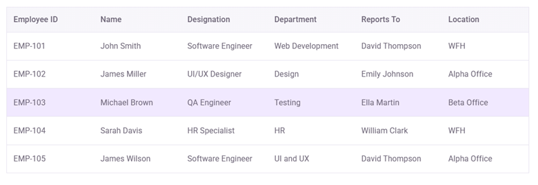

Ready to experience the difference?
We have included the following components in Pure React which are ready to use in React applications.
- Grid: Data Grid
- Data Visualization: Charts
- Calendars: Scheduler, Calendar, DatePicker, TimePicker, DateTimePicker, DateRangePicker
- DropDowns: AutoComplete, ComboBox, Dropdown List, MultiSelect
- Layout: Dialog, Tooltip
- Lists: ListView
- Navigation: Context Menu, Menu, Toolbar
- Buttons: Button, ChipList, Chip, Dropdown Button, Floating Action Button, Radio Button, Split Button, Switch
- Inputs: Checkbox, Numeric TextBox, Form, TextArea, TextBox
- Notifications: Message, Skeleton, Toast, Spinner
We invite you to explore the all-new Syncfusion Pure React components and see the improvements for yourself.
Additionally, we will continue to provide full support and feature enhancements for all the React components.
If you are an existing customer, you can download the new version of Essential Studio on the License and Downloads page. If you are not a Syncfusion customer, try our 30-day free trial to check out our incredible features.
We’d love to hear your feedback and see what you build! If you have questions, feel free to reach out through our support forum, support portal, or feedback portal. We’re always happy to assist you!




 No spam, just valuable updates.