WinUI Date Picker: A Flexible & Touch-Friendly Control
- Provides a simple and flexible interface to quickly select a date.
- Supports different date formatting options to use based on regions.
- Supports restricting date selection within a specific date range.
Trusted by the world’s leading companies

Overview
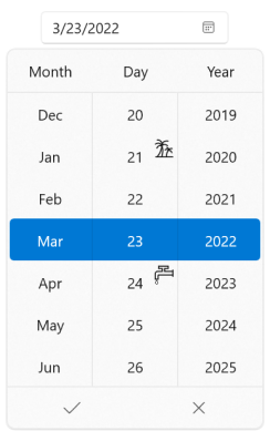
The WinUI Date Picker control provides an intuitive, touch-friendly interface to quickly select a date from a dropdown spinner. It supports different date formats. Date selection can be restricted by specifying minimum and maximum dates. Dates can also be hidden or disable some from selection. In addition, it supports editing with validation and built-in watermark text display.

Date restriction
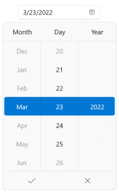
Limit date range
Prevents users from selecting a date in a particular range by specifying minimum and maximum dates.

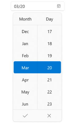
Date editing
The WinUI Date Picker control provides support to edit dates using the text box. Date input can be validated when typing or after the input is completed.
Watermark
Displays hints using watermark text when the selected date is null.
Globalization
The WinUI Date Picker can be used across the globe by applying regional settings.

Calendar types
The WinUI Date Picker control supports different calendar types including Gregorian, Julian, Korean, and more.
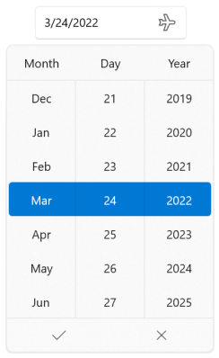
Date formatting
The WinUI Date Picker control supports formatting the date in the editor and spinner UI in the dropdown popup.
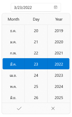
Languages
The WinUI Date Picker supports multiple languages such as French, German, Thai, and more.
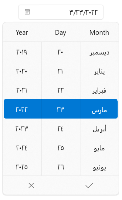
Right to left (RTL)
The WinUI Date Picker supports right-to-left formatting for languages such as Arabic, Hebrew, and more.
Appearance
Drop-down button
The WinUI Date Picker control allows showing or hiding the dropdown button and also customizing it.

Drop-down placement
The placement of the drop-down spinner can be customized. The WinUI Date Picker also smartly shifts the placement if there is no sufficient space.

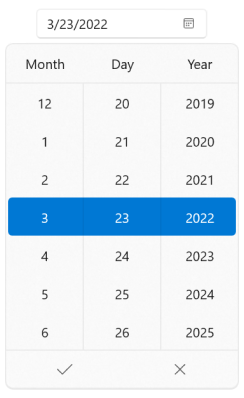
Column header
Display hints for each column to indicate the date field.
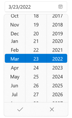
Resize
Customize the size of individual cells, dropdown height, and number of cells to be displayed in the spinner.
Customization
Customize the spinner UI Complete using custom template, style, and its selector.

Syncfusion WinUI DataViz & UI Controls
Standalone UI SDKs
Integrate the DataGrid, Chart, and Scheduler UI components into applications to enable rich interaction and visualization, delivering a seamless user experience.
Document Solutions
Integrate the PDF Viewer, DOCX Editor, Spreadsheet Editor, and document-processing libraries into the WinUI applications to enable a smooth user experience.
Our Customers Love Us


See Real Success Stories
Developers around the world trust Syncfusion’s Essential Studio to simplify complex projects and speed up delivery. With a vast library of UI controls, powerful SDKs, and reliable support, Essential Studio helps teams build enterprise-ready applications with confidence.
Read Our Customer StoriesIndustry
Software development
75% Cost reduction
50% Faster development
Industry
Utilities (oil and gas)
450+ hours saved
Streamlined processes and hours of development effort saved.
Advanced, flexible features
Empowered users through robust and versatile functionality.
Industry
Software and technology
1000+ of hours saved
Accelerated development with enterprise-ready UI components.
Efficient file management
Streamlined workflows with document libraries without building them from scratch.
Industry
Software and technology
2 Years of delay avoided
Two years of delays prevented with proactive planning.
On-time delivery
Projects delivered on schedule using trusted controls.
Industry
IT services and IT consulting
Improved performance
Large datasets handled with easy customization and quick debugging.
Highly customizable
Plug-and-play controls with quick template integration.
Industry
Professional services
Instant access
Quick availability of features and resources.
Reduced dependencies
Fewer dependencies for faster development.
Rated by users across the globe


Awards
Greatness—it’s one thing to say you have it, but it means more when others recognize it. Syncfusion® is proud to hold the following industry awards.

