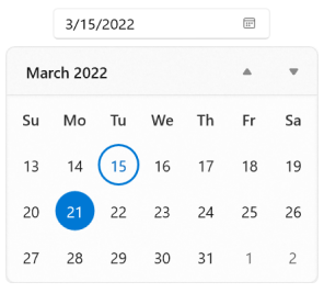
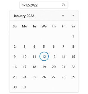
WinUI Calendar Date Picker Control
- A simple, flexible interface to select a date quickly.
- Different date formatting options based on regions.
- Date selection can be restricted within a specific date range.
Trusted by the world’s leading companies

Overview
The WinUI Calendar Date Picker control provides an intuitive, touch-friendly interface to quickly select a date from a drop-down calendar. It supports different date formats. Date selection can be restricted by specifying minimum and maximum dates. Specific dates can also be disabled from selection. In addition, it supports editing with validation and built-in watermark text display.

Date selection

Submit buttons
Accepts a date as soon as a date is selected or only after the Done or Cancel button is clicked.

Date restriction
Restricts users from selecting a date within the minimum and maximum dates.

Blackout dates
Prevent users from selecting specific dates (example: disable all weekends).
Navigation

Navigate between views
Select a date from a different year, decade, or century easily by navigating to the year, decade, or century views.

Navigation restriction
Limit navigation within minimum and maximum calendar views. This will be useful when your date range is smaller and you do not want to show the century view. The WinUI Calendar Date Picker can also be used as a month and year range selector instead of date (example: choosing a credit card validity period).
Date editing
The WinUI Calendar Date Picker control supports editing the date using the text box. The date can be validated as you type or after input is completed.

Watermark
Display hints using watermark text when a date is not selected.

Globalization
The WinUI Calendar Date Picker can be used across the globe by applying regional settings.
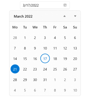
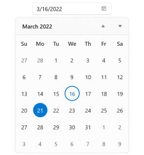
First day of week
Sunday is shown as the first day of week, by default, but you can change this based on the regional settings.
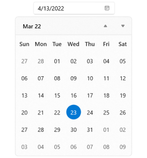
Date formatting
The WinUI Calendar Date Picker allows different date formats for date, day, and month.
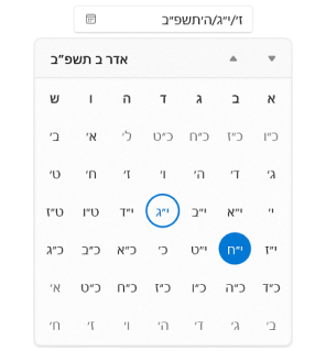
Calendar types
The WinUI Calendar Date Picker control supports nine different calendar types, such as Gregorian, Julian, Hebrew, etc.

Right to left (RTL)
The WinUI Calendar Date Picker supports right-to-left language formatting for calendars such as Arabic and Hebrew.
Appearance
Drop-down button
Show or hide the drop-down button.

Current and selected date’s appearance
The WinUI Calendar Date Picker control supports different ways different ways to highlight current and selected dates.
Number of weeks in a view
The WinUI Calendar Date Picker automatically occupies a minimum space. However, you can increase or decrease the size of the calendar based on the number of weeks.
Out of scope dates visibility
Hide days or give them a blurry appearance if they are out of the current view’s scope.
Drop-down placement
Customize the placement of the drop-down spinner. The WinUI CalendarDatePicker smartly shifts the spinner placement if the space is not sufficient.

Themes
The WinUI Calendar Date Picker control includes light, dark, and high contrast themes.

Customization
Customize the appearance of individual calendar cells using custom templates, styles, and their selectors.

Syncfusion WinUI DataViz & UI Controls
Standalone UI SDKs
Integrate the DataGrid, Chart, and Scheduler UI components into applications to enable rich interaction and visualization, delivering a seamless user experience.
Document Solutions
Integrate the PDF Viewer, DOCX Editor, Spreadsheet Editor, and document-processing libraries into the WinUI applications to enable a smooth user experience.
Our Customers Love Us


See Real Success Stories
Developers around the world trust Syncfusion’s Essential Studio to simplify complex projects and speed up delivery. With a vast library of UI controls, powerful SDKs, and reliable support, Essential Studio helps teams build enterprise-ready applications with confidence.
Read Our Customer StoriesIndustry
Software development
75% Cost reduction
50% Faster development
Industry
Utilities (oil and gas)
450+ hours saved
Streamlined processes and hours of development effort saved.
Advanced, flexible features
Empowered users through robust and versatile functionality.
Industry
Software and technology
1000+ of hours saved
Accelerated development with enterprise-ready UI components.
Efficient file management
Streamlined workflows with document libraries without building them from scratch.
Industry
Software and technology
2 Years of delay avoided
Two years of delays prevented with proactive planning.
On-time delivery
Projects delivered on schedule using trusted controls.
Industry
IT services and IT consulting
Improved performance
Large datasets handled with easy customization and quick debugging.
Highly customizable
Plug-and-play controls with quick template integration.
Industry
Professional services
Instant access
Quick availability of features and resources.
Reduced dependencies
Fewer dependencies for faster development.
Rated by users across the globe


Awards
Greatness—it’s one thing to say you have it, but it means more when others recognize it. Syncfusion® is proud to hold the following industry awards.

