WinUI Calendar DateRange Picker - Highly Customizable Control
- A simple and flexible interface to select a date range quickly.
- Different date formatting options based on regions.
- Date selection can be restricted to a specific date range.
Trusted by the world’s leading companies

Overview
The WinUI Calendar DateRange Picker control provides an intuitive, touch-friendly interface to select a date range quickly from a drop-down calendar. It supports different date formats. Date selection can be restricted by specifying minimum and maximum dates. Specific dates can also be disabled using blackout dates. In addition, it supports built-in watermarks and predefined date ranges.

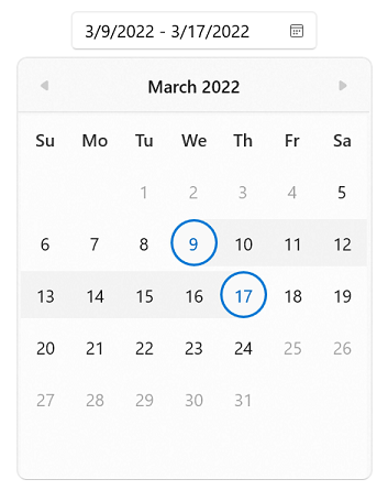
Predefined set of date ranges
A set of predefined items (like the last 30 days or last week) to set date ranges frequently used by the end users.

Date restriction
Limit date range
Restrict users from selecting a date range within the minimum and maximum dates.

Blackout dates
Prevent users from selecting specific dates (example: disable all weekends).

Limit selection duration
Limit the duration of the selected range.
Navigation

Navigate between views
Select a date range from a different year, decade, or century easily by navigating to the year, decade, or century views.

Navigation restriction
Limit navigation within minimum and maximum calendar views. This will be useful when the date range is small, and users do not want to show the century view. The WinUI Calendar DateRange Picker can also be used as a month and year range selector instead of date (example: choosing a credit card validity period).
Watermark
Display hints using watermark text when a date is not selected.

Globalization
The WinUI Calendar DateRange Picker can be used across the globe by applying regional settings.
Calendar types
The WinUI Calendar DateRange Picker control supports nine different calendar types, such as Gregorian, Julian, Hebrew, and more.
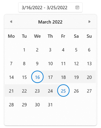
First day of week
Sunday is shown as the first day of the week, by default, but this can be changed based on the regional settings.

Date formatting
The WinUI Calendar DateRange Picker allows different date formats for date, day, and month.

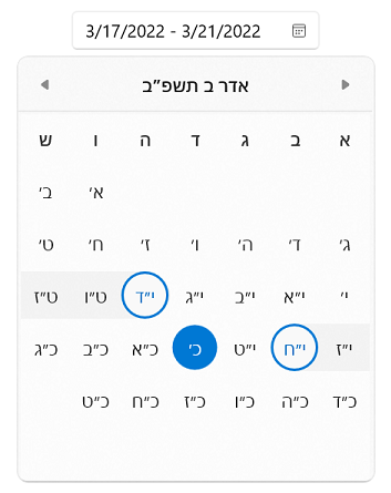
Right to left (RTL)
The WinUI Calendar DateRange Picker supports right-to-left language formatting for calendars such as Arabic and Hebrew.
Appearance
Drop-down button
Show or hide the drop-down button.

Drop-down placement
Customize the placement of the drop-down spinner. The WinUI Calendar DateRange Picker smartly shifts the spinner placement if the space is not sufficient.

Themes
The WinUI Calendar DateRange Picker control includes light, dark, and high contrast themes.

Customization
Customize the appearance of individual calendar cells using custom templates, styles, and selectors.

Code Example
Easily get started with the WinUI Calendar DateRange Picker using a few simple lines of XAML and C# code example as demonstrated below. Also explore our WinUI Calendar DateRange Picker Example that shows you how to render and configure the Calendar DateRange Picker in WinUI.
<Page
    x:Class="GettingStarted.MainPage"
    xmlns="http://schemas.microsoft.com/winfx/2006/xaml/presentation"
    xmlns:x="http://schemas.microsoft.com/winfx/2006/xaml"
    xmlns:local="using:GettingStarted"
    xmlns:d="http://schemas.microsoft.com/expression/blend/2008"
    xmlns:mc="http://schemas.openxmlformats.org/markup-compatibility/2006"
    xmlns:calendar="using:Syncfusion.UI.Xaml.Calendar"
    mc:Ignorable="d"
    Background="{ThemeResource ApplicationPageBackgroundThemeBrush}">
    <Grid Name="grid">
        <!--Adding Calendar DateRange Picker control -->
        <calendar:SfCalendarDateRangePicker Name="sfCalendarDateRangePicker"/>
    </Grid>
</Page>
namespace GettingStarted
{
/// <summary>
/// An empty page that can be used on its own or navigated to within a Frame.
/// </summary>
public sealed partial class MainPage : Page
{
public MainPage()
{
this.InitializeComponent();
// Creating an instance of the Calendar control
SfCalendarDateRangePicker sfCalendarDateRangePicker = new SfCalendarDateRangePicker();
grid.Children.Add(sfCalendarDateRangePicker);
}
}
}Not sure how to create your first WinUI Calendar DateRange Picker? Our documentation can help.
I’d love to read it nowSyncfusion WinUI DataViz & UI Controls
Standalone UI SDKs
Integrate the DataGrid, Chart, and Scheduler UI components into applications to enable rich interaction and visualization, delivering a seamless user experience.
Document Solutions
Integrate the PDF Viewer, DOCX Editor, Spreadsheet Editor, and document-processing libraries into the WinUI applications to enable a smooth user experience.
Frequently Asked Questions
Why should you choose Syncfusion WinUI Calendar DateRange Picker?
Four different types of view modes: month, year, decade, and century.
Select a date range interactively from the dropdown calendar in the month view.
Display week numbers in the dropdown calendar.
- Display a collection of preset items in the dropdown.
Restrict navigation beyond the minimum and maximum dates to prevent users from selecting certain dates.
Restrict selection on blackout dates.
- One of the best WinUI Calendar date range pickers in the market that offers feature-rich UI to interact with the software.
Adapts to different cultures instantly.
Customize the appearance easily.
Where can I find the Syncfusion WinUI Calendar DateRange Picker demo?
You can find our WinUI Calendar DateRange Picker demo here.
Can I download and utilize the Syncfusion WinUI Calendar DateRange Picker for free?
No, this is a commercial product and requires a paid license. However, a free community license is also available for companies and individuals whose organizations have less than $1 million USD in annual gross revenue, 5 or fewer developers, and 10 or fewer total employees.
How do I get started with Syncfusion WinUI Calendar DateRange Picker?
A good place to start would be our comprehensive getting started documentation.
Our Customers Love Us


See Real Success Stories
Developers around the world trust Syncfusion’s Essential Studio to simplify complex projects and speed up delivery. With a vast library of UI controls, powerful SDKs, and reliable support, Essential Studio helps teams build enterprise-ready applications with confidence.
Read Our Customer StoriesIndustry
Software development
75% Cost reduction
50% Faster development
Industry
Utilities (oil and gas)
450+ hours saved
Streamlined processes and hours of development effort saved.
Advanced, flexible features
Empowered users through robust and versatile functionality.
Industry
Software and technology
1000+ of hours saved
Accelerated development with enterprise-ready UI components.
Efficient file management
Streamlined workflows with document libraries without building them from scratch.
Industry
Software and technology
2 Years of delay avoided
Two years of delays prevented with proactive planning.
On-time delivery
Projects delivered on schedule using trusted controls.
Industry
IT services and IT consulting
Improved performance
Large datasets handled with easy customization and quick debugging.
Highly customizable
Plug-and-play controls with quick template integration.
Industry
Professional services
Instant access
Quick availability of features and resources.
Reduced dependencies
Fewer dependencies for faster development.
Rated by users across the globe


Awards
Greatness—it’s one thing to say you have it, but it means more when others recognize it. Syncfusion® is proud to hold the following industry awards.

