We use cookies to give you the best experience on our website. If you continue to browse, then you agree to our privacy policy and cookie policy.


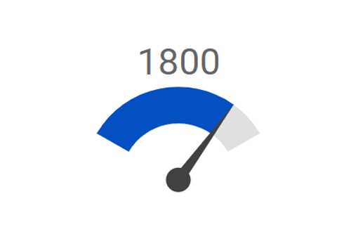
The Angular Circular Gauge is a component for visualizing numeric values on a circular scale with features like multiple axes and rounded corners. Completely customize the appearance of the gauge to simulate a speedometer, meter gauge, analog clock, etc.
The gauge axes are circular scales where a set of values can be plotted based on any business logic. You can easily customize the appearance of the axes.
Customize the look and feel of the default labels in a gauge by changing the font style, size, and color. Prefix or suffix text can also be added to the labels.
Define the desired style for major and minor ticks in the gauge by changing their height, width, and color.
To enhance readability, change the position of the default axes in the gauge by setting the offset value for the labels, ticks, and axis lines.

Add a border to the gauge by using axis lines. The appearance of the default axis in the Circular Gauge can also be customized.

The Angular Circular Gauge allows you to add multiple axes to design it like a clock, speedometer, meter gauge, etc.

Render the axes in the Circular Gauge either clockwise or counterclockwise.
A range in an Angular Circular Gauge is a visual element that helps to quickly visualize where a value falls on the axis.

Change the position of a range or move it to any place inside the gauge.

The range width varies based on the values to enhance usage and readability.

You can add multiple ranges inside the axes to show color variations.
Indicate values on an axis using pointers. The Angular Circular Gauge component supports three categories of pointers: needle, marker, and range bar.
Point out the current value in the Circular Gauge using a highly customizable needle-type element.

Change the needle pointer shape to a triangle or arrow to point out or highlight values.

The pointer cap is a rounded ball at the end of the arrow pointer that can also be customized to enhance the pointer’s appearance.

Add extra styling to the pointer cap by adding a tail.

You can add more than one needle pointer to the gauge axes to indicate multiple values.
Point out the current value by using the following different types of marker pointers.

Change the marker pointer type to built-in shapes such as a triangle, inverted triangle, square, or circle to highlight values.

You can change or move the marker pointer to any place inside the gauge.
Use the range bar pointer to point to the current value from the start value of the axes.

You can change or move the range bar pointer to any place inside the gauge.

You can add more than one range bar pointer to the axes to indicate multiple values.
The Angular Circular Gauge component provides a visually appealing way to view its pointers with animated transitions for a certain duration. Experience smooth pointer transitions by moving the pointer from one place to another.


The interactive Angular Circular Gauge component lets you drag the pointer from one place to another. Swipe gestures can be used to control the pointer, and the value is changed at runtime.
The ranges and range bar pointer corners in a circular gauge can be rounded to form arc gauges.

A legend provides additional information that is helpful in identifying the ranges in a Circular Gauge. It can be docked at the left, right, top, and bottom positions around the plot area.
Display details about a pointer value in the interactive Angular Circular Gauge component through a tooltip when hovering the mouse over the pointer.

Form half or quarter circular gauges by modifying the start and end angles of a gauge. This allows the gauge to render in a very small area.
Display any HTML element as an annotation at a specific point of interest in the Angular Circular Gauge. You can also add multiple annotations in a gauge.
The appearance of each element in a Circular Gauge, such as axes, ranges, axis intervals, pointer positions, label positions, and tick positions, can be customized easily.
Colors applied to the range and pointer can change gradually to create a smooth color transition.


Add a title to visualize additional information on the Circular Gauge. You can also customize the font of the title
Users from different locales can personalize the Circular Gauge component by formatting numbers, currency, and more to suit their preferences.


Render Angular Circular Gauge along with its legend and tooltip in the right-to-left direction.
Export or print the rendered Angular Circular Gauge to save a local copy for further use.

Export the Angular Circular Gauge to a PDF document or in image formats such as SVG, PNG, and JPEG in client-side.

Print the rendered Angular Circular Gauge directly from the browser.
The interactive Circular Gauge component supports touch interactions.
All the features in Circular Gauge will work on touch devices with zero configuration. Use touch features such as tooltip and pointer drag without any customization.

You can view the Circular Gauge on various devices. It is also possible to hide specific elements in the gauges for particular screen sizes by making a minimal change in the gauge events.

You can render the Circular Gauge component in all modern browsers.
Easily get started with Angular Circular Gauge using a few simple lines of HTML and TS code, as demonstrated below. Also explore our Angular Circular Gauge Example that shows you how to render the Circular Gauge in Angular.
<div class="control-section">
    <ejs-circulargauge style='display:block;' (load)='load($event)'>
        <e-axes>
            <e-axis radius='80%' startAngle=230 endAngle=130 [majorTicks]='ticks' [minorTicks]='ticks' [lineStyle]='lineStyle' [labelStyle]="labelStyle">
                <e-pointers>
                    <e-pointer value=60 radius='60%' pointerWidth=7 [cap]="cap" [needleTail]="tail">
                    </e-pointer>
                </e-pointers>
            </e-axis>
        </e-axes>
    </ejs-circulargauge>
</div>
import { Component, ViewEncapsulation } from '@angular/core';
import { ILoadedEventArgs, GaugeTheme } from '@syncfusion/ej2-angular-circulargauge';
@Component({
selector: 'control-content',
templateUrl: 'default.html',
encapsulation: ViewEncapsulation.None
})
export class DefaultComponent {
public ticks: Object = {
width: 0
};
public lineStyle: Object = {
width: 8
};
public load(args: ILoadedEventArgs): void {
let selectedTheme: string = location.hash.split('/')[1];
selectedTheme = selectedTheme ? selectedTheme : 'Material';
args.gauge.theme = <GaugeTheme>(selectedTheme.charAt(0).toUpperCase() +
selectedTheme.slice(1)).replace(/-dark/i, 'Dark').replace(/contrast/i, 'Contrast');
}
public labelStyle: Object = {
font: {
fontFamily: 'Roboto',
size: '12px',
fontWeight: 'Regular'
},
offset: -5
};
public cap: Object = {
radius: 8,
border: { width: 0 }
};
public tail: Object = {
length: '25%',
}
constructor() {
// code
};
}The circular gauge is also available in Blazor, React, Vue, and JavaScript frameworks. Check out the different Circular Gauge platforms from the links below,
With continuous improvement in Angular versions, the Angular Circular Gauge is kept up to date to make it compatible with the latest version.
We do not sell the Angular Circular Gauge separately. It is only available for purchase as part of the Syncfusion team license. This contains over 1,800 components and frameworks, including the Angular Circular Gauge. The price of the team license starts at $395 per month for 5 developers, and includes support and updates until the subscription expires. In addition, we might offer discounts based on currently active promotions. Please contact our product specialists today to see if you qualify for any additional discounts.
You can find our Angular Circular Gauge demo, which demonstrates how to render and configure the Circular Gauge.
No, our 1,800+ components and frameworks for web, mobile, and desktop, including our Angular Circular Gauge, are not sold individually. They are only available as part of a team license. However, we have competitively priced the product, so it only costs a little bit more than what some other vendors charge for their Circular Gauge component alone. We have also found that, in our experience, our customers usually start off using one of our products and then expand to several products quickly, so we felt it was best to offer all 1,800+ components and frameworks for a subscription fee that starts at $395 per month for a team of 5 developers. Additionally, we might be able to offer discounts based on currently active promotions. Please contact our product specialists today to see if you qualify for any additional discounts.
No, this is a commercial product and requires a paid license. However, a free community license is also available for companies and individuals whose organizations have less than $1 million USD in annual gross revenue, 5 or fewer developers, and 10 or fewer total employees.
A good place to start would be our comprehensive getting started documentation.


 Documentation
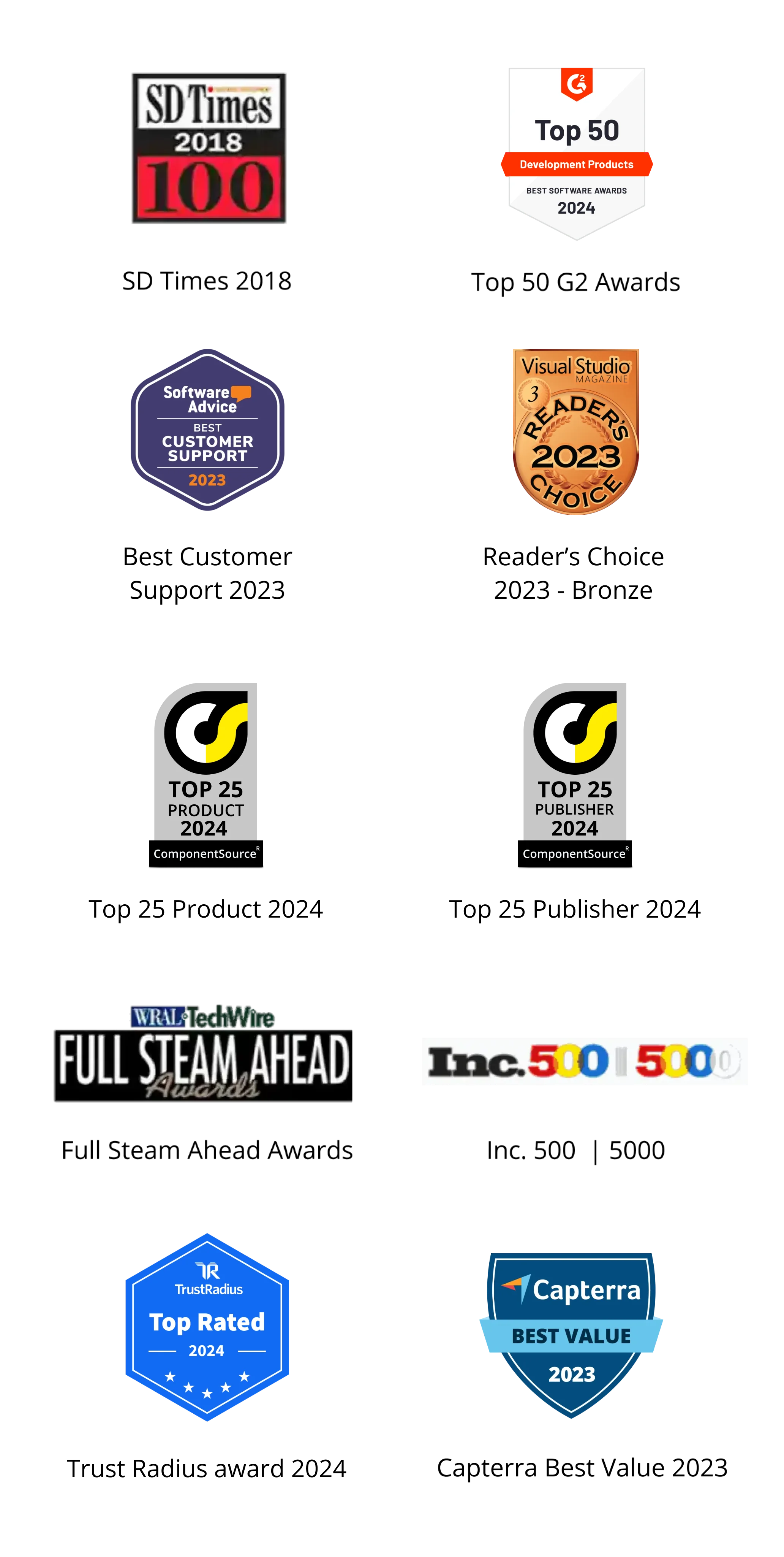
Greatness—it’s one thing to say you have it, but it means more when others recognize it. Syncfusion is proud to hold the following industry awards.


