
 Rajendran R
TLDR: From AI-assisted editing and voice-enabled interactions to smarter analytics, project planning, and content authoring, Syncfusion Blazor 2026 Volume 2 introduces a range of developer-focused enhancements across its most-used components. Read the full blog to discover what’s new, see where these features fit into real applications, and learn how to get started.
A few years ago, building a Blazor application mostly meant assembling UI components and connecting APIs. Today, developers are expected to integrate AI experiences, analyze growing datasets, support richer content creation, and deliver all of it without sacrificing performance or usability.
That’s where many development teams spend their time—not building screens but solving the practical challenges behind them.
Syncfusion® Blazor 2026 Volume 2 focuses on those challenges, introducing AI-assisted editing, smarter analytics capabilities, productivity improvements, and a new SDK packaging model that helps teams adopt only the components they need.
Before exploring the component updates, let’s take a quick look at this new packaging approach.
Pick the right SDK for your project
Not every application requires a full UI suite. A reporting platform may depend heavily on grids and charts, while a project management application might only need scheduling and planning components.
With the 2026 Volume 2 release, Syncfusion offers seven Standalone UI SDKs, each focused on a specific development area:
This model allows teams to adopt only the components relevant to their applications instead of starting with a broader collection of controls.
For projects spanning multiple functional areas, the UI Component Suite remains available. It includes the Grid SDK, Chart SDK, and File Manager SDK, with the Gantt, Scheduler, Diagram, and Rich Text Editor SDKs available separately.
Existing customers don’t need to make any licensing changes. Current entitlements remain unchanged, and all new Volume 2 features are available within existing license coverage. The Standalone UI SDK model only affects how new purchases are packaged going forward.
Note: To learn more, see the Standalone UI SDKs announcement and the Essential Studio 2026 Volume 2 release blogs.
New Inline AI Assist: Bring AI into the editing experience
Many AI integrations still rely on separate chat panels, forcing users to switch between their content and the AI conversation. In content-heavy applications, that extra context switching can quickly disrupt productivity.
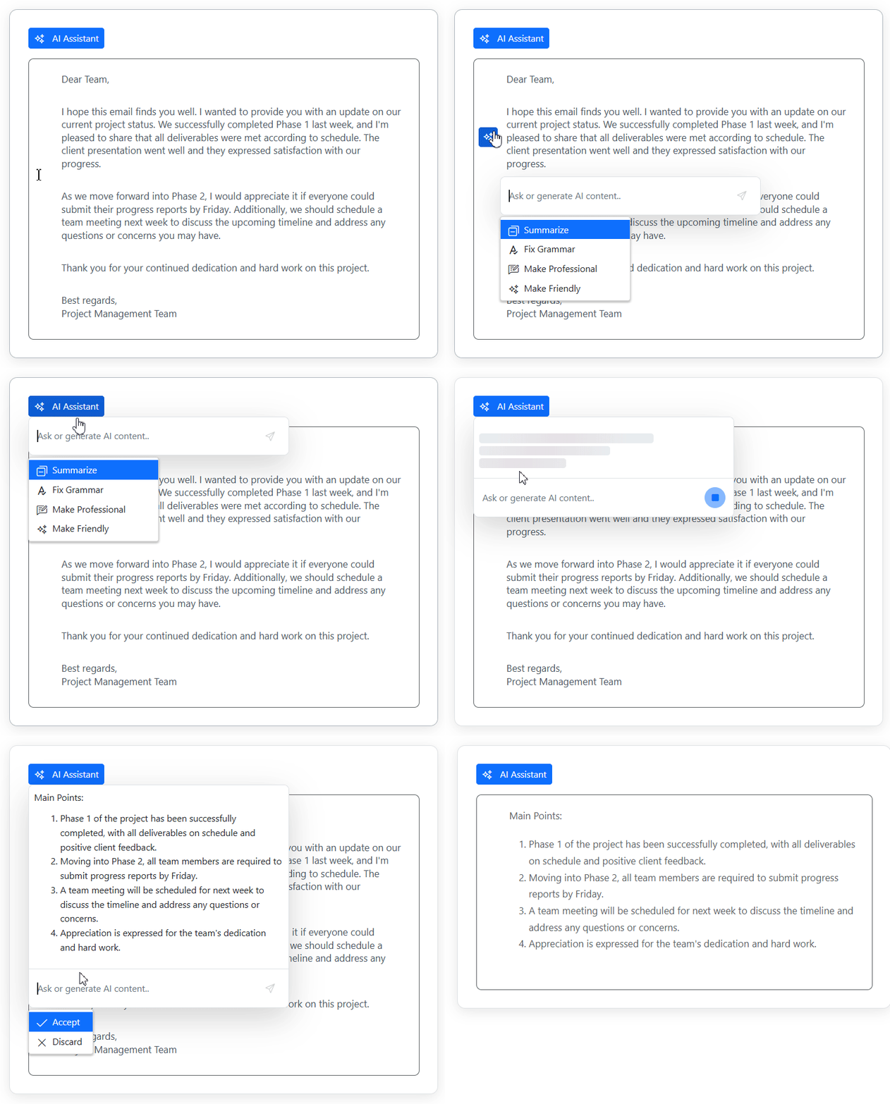
To address this, we introduce the Inline AI Assist, a new component that brings AI interactions directly into the editing surface. Users can select content, request changes, review responses, and apply updates without leaving their current context.
For example, in a Rich Text Editor, a user can highlight a paragraph, ask AI to simplify or rewrite it, and review the streamed suggestion immediately. The same experience fits naturally into IDEs, form-driven applications, and knowledge management tools.
The Blazor Inline AI Assist supports two interaction modes:
- Inline mode: Displays AI suggestions next to the selected content, making it ideal for rewriting text, expanding summaries, or generating code without interrupting the editing process.
- Pop-up mode: Provides a more conversational experience when users need broader assistance.
Key features
- Inline and pop-up response modes.
- Command actions with mention-style suggestions.
- Accept, discard, and custom response actions.
- Configurable action toolbar.
- Automatic Markdown-to-HTML rendering.
- Streaming responses with stop controls.
- Visual indicators for thinking and editing states.
- Customizable appearance.
Note: Explore the Inline AI Assist demo or follow the getting started documentation to add it to your Blazor application.
Get started faster with Syncfusion Blazor templates
Getting a new Blazor project up and running often involves repetitive setup before development can begin. To streamline that process, Syncfusion provides .NET templates that align closely with Microsoft Blazor Web App templates.
These templates generate a fully configured Blazor application with Syncfusion components, themes, and dependencies already in place.
Each template includes:
- NuGet package references,
- Theme and script configuration,
- Required namespace imports,
- Project setup and Syncfusion integration.
This helps developers spend less time configuring their projects and more time building application features.
AI AssistView: Making AI experiences more natural for end users
While the new Inline AI Assist focuses on in-context editing, the existing Blazor AI AssistView continues to improve the experience for chat-style AI interactions. In this release, the focus is on making conversations more accessible while giving users greater control over how they interact with AI-generated responses.
Use voice instead of typing
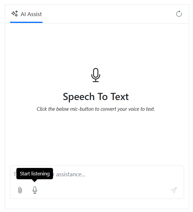
Users can now dictate prompts using built-in speech recognition through the AssistViewSpeechToText tags. This removes the need for developers to integrate a separate speech-to-text solution for prompt entry.
Voice input can be particularly useful for mobile users, field employees, or anyone who prefers speaking over typing when interacting with AI.
Regenerate and compare responses
AI-generated answers aren’t always perfect on the first attempt. To make refinement easier, users can now regenerate responses and switch between different versions using navigation controls.
Rather than replacing the previous answer, AI AssistView retains all generated variations in the RegeneratedResponses collection. This makes it easier to compare alternatives and choose the most useful response for the task at hand.
Listen to responses with text-to-speech conversion
AI AssistView can now read responses aloud, enabling hands-free interaction.
Developers can configure output settings such as Language, Voice, and Volume, helping tailor the experience to different accessibility and user requirements.
This is especially valuable for accessibility-focused applications or situations where users need to consume information while multitasking.
Add context with file attachments
The 2026 Volume 2 release also adds support for file attachments through the new AttachedFiles property and customizable AttachmentTemplate. This allows users to attach supporting documents while giving developers full control over how attachments are presented in the interface.
A practical example is an AI assistant that analyzes invoices, reports, specifications, or other uploaded documents and uses them as context for generating responses.
Blazor DataGrid: Reduce friction in everyday data management
The Blazor DataGrid receives several practical enhancements in this release, focused on tasks users perform every day, such as filtering data, updating records, and exporting results.
Filter different data types from one place
Filtering mixed datasets often requires switching between different filter interfaces for text, numeric, and date columns.
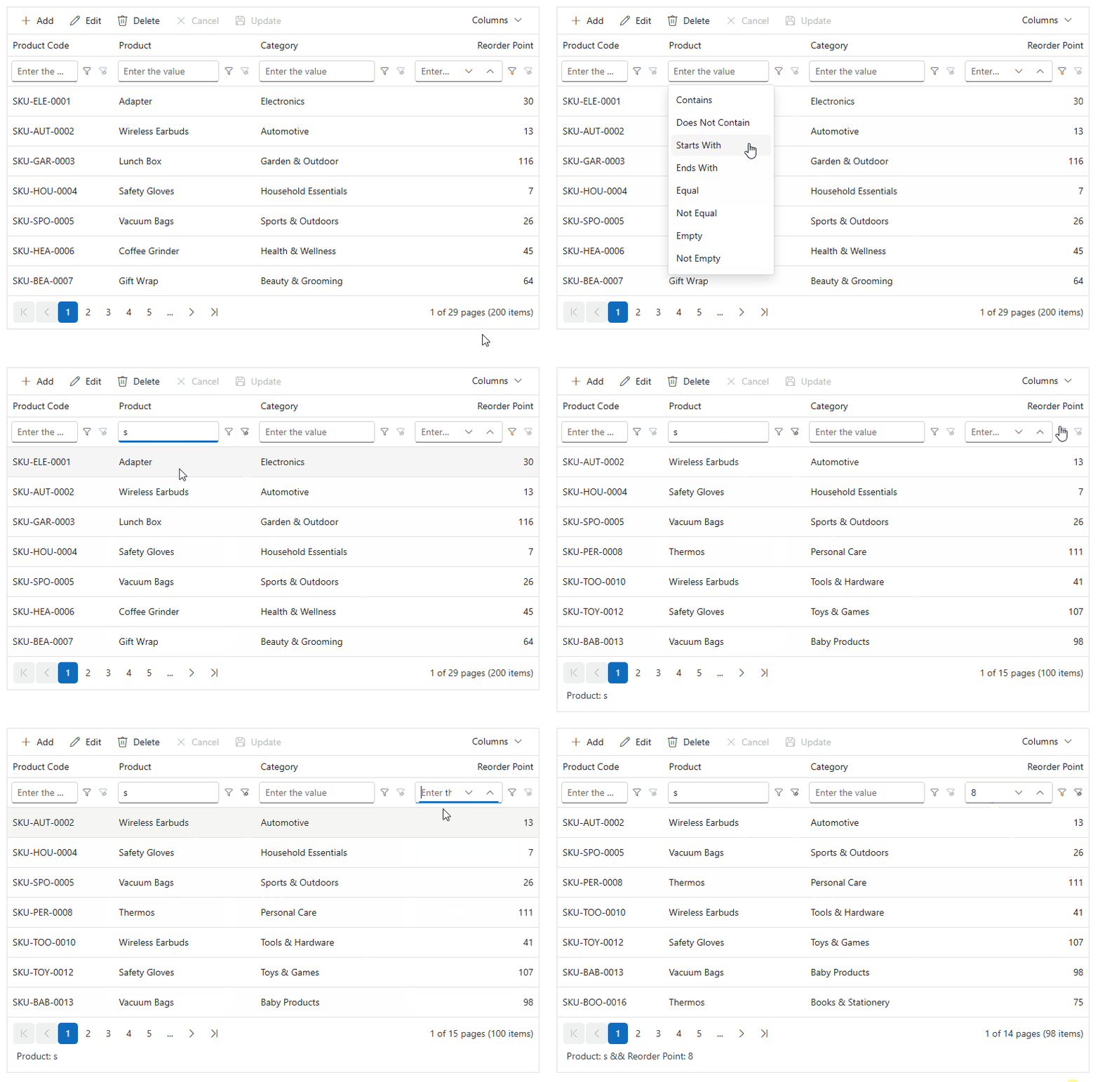
The filter bar now includes an inline operator selector, and the value editor automatically adapts to the column type. Depending on the field, users will see a text box, numeric editor, date picker, or drop-down list, making filtering faster and more intuitive.
<SfGrid TValue="Order" DataSource="@Orders" AllowPaging="true" AllowFiltering="true">
    <GridFilterSettings ShowFilterBarOperator="true" Type="FilterType.FilterBar" />
    <GridColumns>
        <GridColumn Field="@nameof(Order.OrderID)" HeaderText="Order ID" Width="120" />
        <GridColumn Field="@nameof(Order.CustomerID)" HeaderText="Customer ID" Width="150" />
        <GridColumn Field="@nameof(Order.Freight)" HeaderText="Freight" Format="C2" Width="120" />
    </GridColumns>
</SfGrid>
This is especially useful in business applications where users frequently filter across different data types.
Speed up data entry with single-click editing
For data-entry-heavy applications, even small interaction improvements can save time.
A new AllowEditOnSingleClick option lets users start editing a cell with a single click in batch edit mode, eliminating the need for a double-click.
<SfGrid TValue="Order"
        DataSource="@Orders"
        AllowPaging="true"
        Toolbar="@(new List<string>() { "Add", "Edit", "Delete", "Update", "Cancel" })">
    <GridEditSettings AllowAdding="true"
                      AllowEditing="true"
                      AllowDeleting="true"
                      Mode="EditMode.Batch"
                      AllowEditOnSingleClick="true" />
    <GridColumns>
        <GridColumn Field="@nameof(Order.OrderID)" HeaderText="Order ID" Width="120" />
        <GridColumn Field="@nameof(Order.CustomerID)" HeaderText="Customer ID" Width="150" />
        <GridColumn Field="@nameof(Order.Freight)" HeaderText="Freight" Format="C2" Width="120" />
    </GridColumns>
</SfGrid>
In scenarios such as inventory management, finance, or operations dashboards, reducing clicks can make repetitive updates noticeably more efficient.
Preserve international characters in CSV exports
CSV exports now support a configurable Encoding property through ExcelExportProperties.
Using UTF-8 helps ensure names, symbols, accented characters, and multilingual content remain intact when files are opened in different systems or regional environments.
<SfGrid TValue="Order"
        @ref="Grid"
        DataSource="@Orders"
        Toolbar="@(new List<string>() { "CsvExport" })"
        AllowExcelExport="true">
    <GridEvents OnToolbarClick="ToolbarClick"
                TValue="Order" />
    <GridColumns>
        <GridColumn Field="@nameof(Order.OrderID)" HeaderText="Order ID" Width="120" />
        <GridColumn Field="@nameof(Order.CustomerID)" HeaderText="Customer ID" Width="150" />
        <GridColumn Field="@nameof(Order.Freight)" HeaderText="Freight" Format="C2" Width="120" />
    </GridColumns>
</SfGrid>

@code {
    SfGrid<Order>? Grid;
    List<Order> Orders { get; set; }

    public void ToolbarClick(ClickEventArgs args)
    {
        Grid.ExportToCsvAsync(
            new ExcelExportProperties
            {
                Encoding = System.Text.Encoding.UTF8
            }
        );
    }
}
This is particularly valuable for applications that work with global customer data or multilingual datasets.
Pivot Table: Build self-service analytics without extra backend work
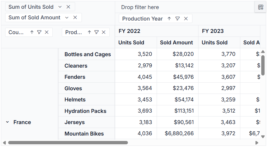
The Blazor Pivot Table receives several enhancements that make it better suited for self-service analytics and reporting applications.
- Built-in CRUD support with configurable server-side controller endpoints, allowing developers to connect existing backend services without building custom data management layers.
- Percentage of running total as a new aggregation type, helping users analyze trends and understand how values contribute to cumulative totals over time.
- Classic layout support in the server-side engine, improving consistency and scalability when working with larger datasets.
These additions make it easier to build interactive analytics experiences while reducing the amount of custom implementation required.
Charts: Improve readability in dense visualizations
The Blazor Charts component receives two enhancements that help users interpret data more quickly, especially in charts with multiple series or dense time-based data.
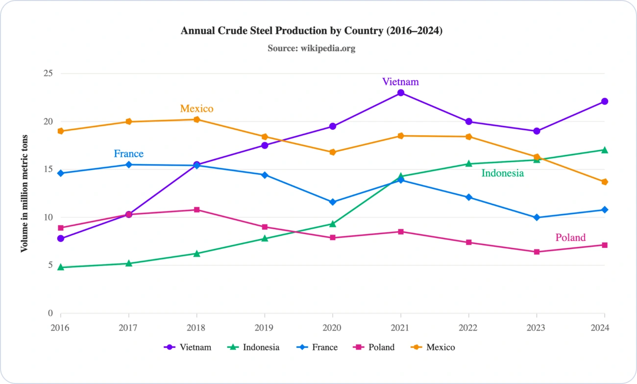
Display series names directly on the chart
Instead of relying solely on legends, developers can now display series names directly within the chart by setting SeriesLabelSettings.Visible to true.
Labels can be customized for position, alignment, formatting, and visibility, helping users identify data series without shifting their focus between the chart and legend.
Note: For more details, review the series label documentation and Line Chart demo.
Create cleaner step charts
A new ShowRisers option on ChartSeries allows developers to hide vertical riser lines in step line and step area charts.
This can reduce visual clutter and make value changes easier to follow, particularly in dense time-series visualizations. The option supports left, right, and center step positions.
Note: See the Step Area Chart without riser documentation and demo for more insights.
Diagram: Better UML modeling and more interactive annotations
The Blazor Diagram component expands its modeling capabilities in this release while giving developers greater control over diagram annotations.
Create UML class diagrams more easily
Developers can now build UML class diagrams with built-in support for common object-oriented design elements, including:
- Classes
- Interfaces
- Enumerations
- Associations
- Aggregations
- Compositions
- Inheritance relationships
- Dependencies
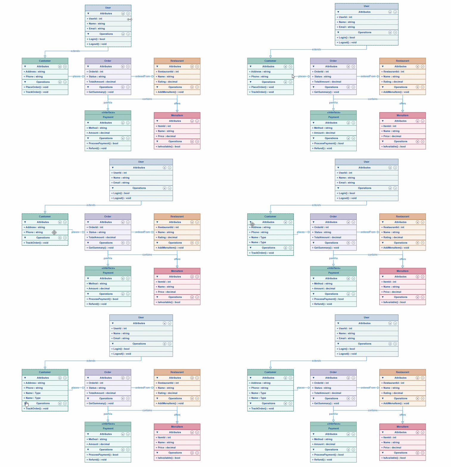
This makes the Diagram component a stronger fit for architecture reviews, system-design tools, and developer-focused applications where software structures need to be visualized and maintained.
Make annotations interactive
Annotations can now support user interactions such as selection, dragging, resizing, and rotation.
These capabilities are controlled through the annotation’s Constraints settings and remain disabled by default, ensuring existing diagrams continue to behave as expected until explicitly enabled.
Add clickable hyperlinks to annotations
Annotations can now include hyperlinks through HyperlinkSettings.
Developers can define a destination using the Url property, customize the displayed text with the Content property, and control how links open using the OpenMode property.
This is particularly useful for linking diagram elements to documentation, specifications, support resources, or related application pages.
Gantt Chart: Better planning for long-term projects
The Blazor Gantt Chart adds enhancements that make it easier to manage projects spanning multiple quarters or years.
View timelines by quarter or half-year
For long-running initiatives, monthly timelines can become difficult to navigate. The Gantt Chart now supports Quarter and HalfYear timeline view modes, making it easier to visualize product roadmaps, construction projects, and strategic programs.
@using Syncfusion.Blazor.Gantt

<SfGantt DataSource="@TaskCollection">
    <GanttTimelineSettings>
        <GanttTopTierSettings Unit="TimelineViewMode.HalfYear" />
        <GanttBottomTierSettings Unit="TimelineViewMode.Quarter" />
    </GanttTimelineSettings>
</SfGantt>
Note: For more details, see the Timeline view mode documentation and demo.
Estimate work in weeks or months
The WorkUnit and DurationUnit properties now support Week and Month units, allowing project plans to use the same units teams commonly use during planning and estimation.
@using Syncfusion.Blazor.Gantt

<SfGantt DurationUnit="DurationUnit.Week"
         WorkUnit="WorkUnit.Month"
         DataSource="@TaskCollection" />
These additions help teams represent long-term schedules and estimates more naturally without relying solely on days or hours.
Rich Text Editor SDK: Build content tools that scale beyond simple text editing
This release marks the production-ready availability of both the Smart Rich Text Editor and Block Editor in the RTE SDK.
The Smart Rich Text Editor combines traditional rich-text editing with AI-assisted content refinement, while the Block Editor enables modern, block-based content creation using interactive content elements.
Rich Text Editor updates
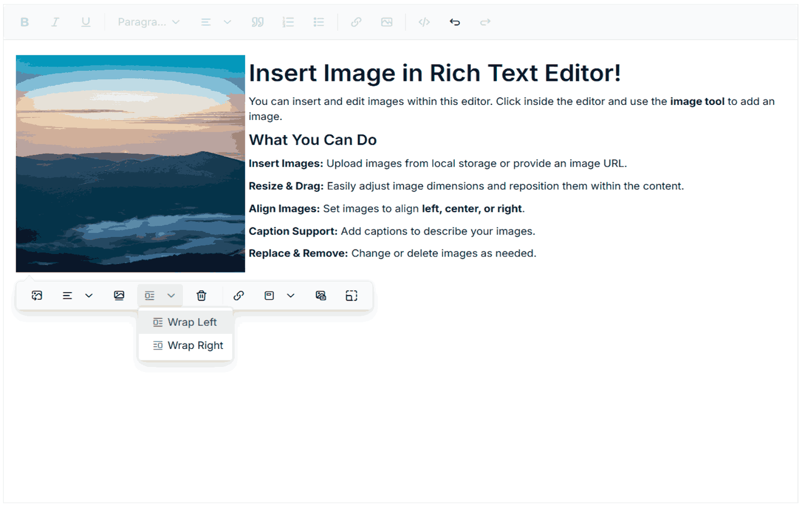
Create more flexible document layouts
The Rich Text Editor now supports image wrapping directly from the image quick toolbar, allowing authors to float images to the left or right of surrounding content.
This makes it easier to create document-style layouts in article editors, knowledge bases, email builders, and content management systems without manually editing HTML.
Handle large documents more efficiently
Large content can now be transferred using chunked message handling, which breaks HTML content into smaller pieces before sending it between the client and server.
For Blazor Server applications, this helps support larger documents without requiring developers to increase SignalR’s default 32 KB message-size limit just to accommodate editor content.
These enhancements make it easier to build content-heavy applications while improving both authoring flexibility and large-document handling.
Block Editor updates: Keep authors focused on content
The Block Editor receives two enhancements aimed at real-world content authoring scenarios.
Upload images with progress tracking
Image uploads can now be configured through the SaveUrl, Path, and SaveFormat properties of BlockEditorImageBlock.
Authors can upload images directly to a server with progress indicators or provide an external image URL instead of uploading a local file. This gives content applications more flexibility in how media assets are added and managed.
Format content inline
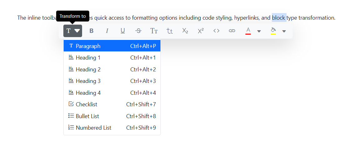
The Block Editor now includes an inline toolbar that keeps formatting actions close to the selected content.
Users can:
- Convert one block type into another, such as changing a paragraph into a heading.
- Transform content into quotes, callouts, and other block formats.
- Apply inline code formatting with syntax highlighting.
- Insert links without leaving the current editing context.
By reducing the need to move between menus and toolbars, these actions help make content creation and document restructuring more efficient.
Scheduler update: Keep busy calendars readable
The Blazor Scheduler introduces a new way to manage heavily booked schedules.
Control overlapping events with MaxEventStack
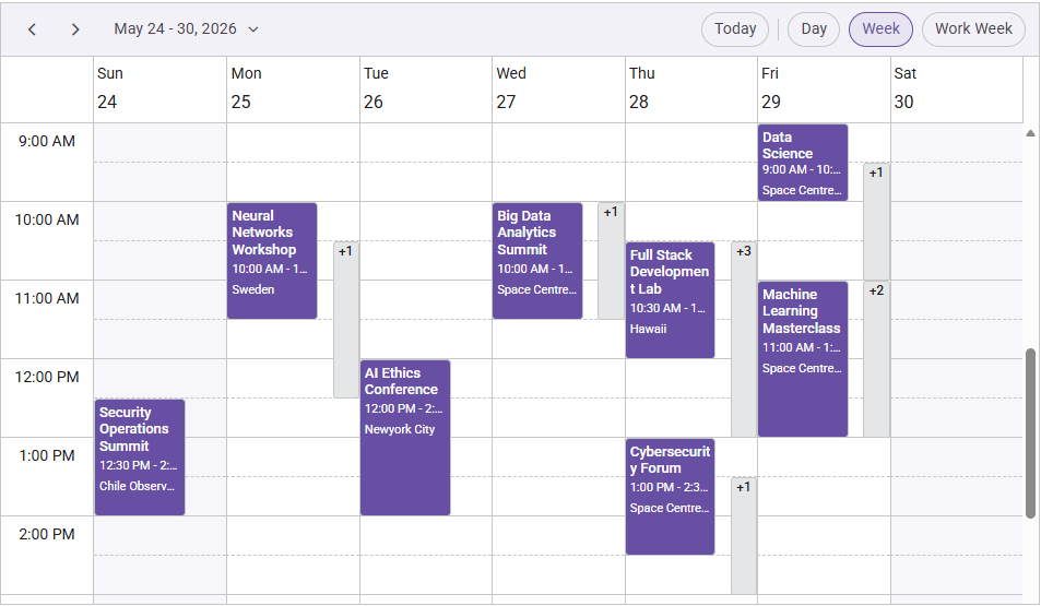
The new MaxEventStack property allows developers to limit the number of events displayed within the same time slot in Day, Week, and WorkWeek views when TimeScale is enabled.
This helps prevent calendar cells from becoming cluttered when multiple appointments overlap.
For example, in a healthcare or service-booking application, a busy time slot may contain several appointments. Limiting the number of visible events keeps the schedule easier to scan while still providing access to the remaining appointments when needed.
Frequently Asked Questions
Inline AI Assist brings AI interactions directly into the editing experience, allowing users to work with AI-generated content without switching to a separate chat window. It supports inline and pop-up modes, streaming responses, command-based actions, mention-style shortcuts, Markdown rendering, response controls, visual status indicators, and customizable actions such as Accept and Discard. AI AssistView now includes: speech-to-text prompt input, response regeneration with alternative response navigation, text-to-speech response playback, file attachment support through These additions make chat-based AI interactions more accessible and flexible for different user scenarios. No. The Standalone UI SDKs provide a more focused option for teams that primarily need a specific component family. The UI Component Suite remains available for applications that require components across multiple areas, and existing customers retain their current licensing entitlements. Yes. New Quarter and HalfYear timeline view modes make it easier to visualize long-range projects, roadmaps, and milestone-based plans without compressing timelines into monthly views. No. Existing customers keep their current entitlements and can access the new Volume 2 features without changing their licenses. The Standalone UI SDK model only affects how new purchases are packaged. The complete Blazor 2026 Volume 2 release notes are available on the Syncfusion help site. Additional documentation, API references, and demos for individual components are linked throughout this article.What is Inline AI Assist?
What's new in AI AssistView?
AttachmentTemplate and the AttachedFiles property. Do Standalone UI SDKs replace the UI Component Suite?
Can the Blazor Gantt Chart support long-term project planning?
Do existing customers need a new license to use these features?
Where can I find the complete release notes?

Start building with the new Blazor features today
Across AI-assisted editing, analytics, scheduling, visualization, and content authoring, the Syncfusion Blazor 2026 Volume 2 release focuses on reducing the amount of custom infrastructure developers need to build themselves.
Whether you’re enhancing an existing application or starting a new Blazor project, these updates address practical challenges that appear repeatedly in real-world development—from editing and reporting to planning and collaboration.
Consider an internal project management platform used by engineering teams. Product managers can plan quarterly initiatives using the Gantt Chart’s new timeline modes, analysts can evaluate delivery metrics in Pivot Tables, and technical writers can refine release notes using Inline AI Assist. Instead of integrating multiple third-party solutions, teams can solve these problems within the same application stack.
See the new features in action
Ready to explore what’s new?
- Browse the Blazor demos to see the latest features in action.
- Read the Essential Studio 2026 Volume 2 release blog for a broader overview.
- Choose between a Standalone UI SDK and the UI Component Suite based on your project needs.
- Start a free trial and evaluate the new features in your own Blazor applications.
Have questions or feedback? Connect with the team through the support forum, support portal, or feedback portal.







 No spam, just valuable updates.