Trusted by the world’s leading companies

Overview
The Vue Stepper is a highly customizable component that enables users to navigate through a series of steps or stages in a process within a web application. Steppers display a list of steps, highlighting the current step, and allow users to move between steps. It includes several built-in features, such as different step types, orientation, linear flow, label positions, and template customization.

Step types
The Vue Stepper component supports the step types listed below.
-
Default: Displays steps with a combination of step indicators and labels. -
Indicator: Displays steps with only the step indicators. -
Label: Displays steps with only the step labels.
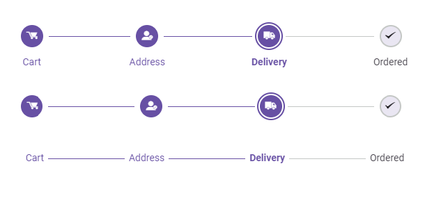
Orientations
Supports orientation for displaying layouts: Horizontal, showing steps side-by-side, and vertical, showing steps one below the other.


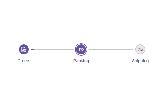
Linear flow
Enable a step-by-step progression, ensuring completion of each step before moving on to the next.
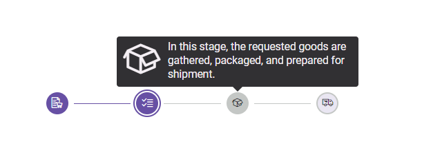
Tooltips
The Vue Stepper component supports tooltips to show additional information when users hover over a step, such as a label or text. Tooltips can be customized using templates to provide more detailed information about steps.
Label positions
Supports positioning the labels at the top, bottom, left, or right.
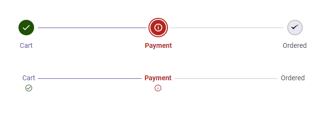
Validation state
The Vue Stepper component enables you to set the validation state for each step, displaying a success or error icon.
Built-in themes
The Vue Stepper supports these built-in themes: Tailwind CSS, Bootstrap 5, Bootstrap 4, Bootstrap, Material, Fabric, Fluent, and high contrast. Users can customize one of these built-in themes or create new themes to achieve their desired look and feel by simply overriding SASS variables or using our Theme Studio application.
Accessibility
- Fully supports WAI-ARIA accessibility practices to work with screen readers and assistive devices.
- Based on WCAG 2.0 standards, UI visual elements such as foreground color, background color, line spacing, text, and images are designed.
- Supports right-to-left (RTL) text direction for users working with RTL languages like Hebrew, Arabic, or Persian.
Developer-friendly APIs
The Vue Stepper component offers APIs for customizing its appearance and behavior, as well as templates for personalizing the look and feel. With these APIs, developers can create a unique and highly personalized Stepper that fits seamlessly into their applications.
140+ VUE UI COMPONENTS
ALL COMPONENTS
SMART COMPONENTS
GRIDS
DATA VISUALIZATION
DROPDOWNS
FILE VIEWERS & EDITORS
BUTTONS
INTERACTIVE CHAT
INPUTS
NAVIGATION
FORMS
NOTIFICATIONS
Standalone UI SDKs
Integrate the DataGrid, Chart, Scheduler, Gantt, Rich Text Editor, File Manager, and Diagram UI components into applications to enable rich interaction and visualization, delivering a seamless user experience.
Document Solutions
Integrate the PDF Viewer, DOCX Editor, Spreadsheet Editor, and document-processing libraries into the Vue applications to enable a smooth user experience.
Our Customers Love Us
Having an excellent set of tools and a great support team, Syncfusion® reduces customers’ development time.Here are some of their experiences.

Syncfusion helps small companies
Syncfusion has a very good service and innovative products. People at syncfusion is helpful and tries to give solution to customer needs. Essential Studio has enough controls for most business applications.

Regina V,

Programador informático, Small-Business
Perfect for any developer
The Syncfusion Essential Studio has excellent features that are updated or added constantly on a regular basis. The support is exceptional—fast and professional responses. The support team provides you with code samples. As for the bugs, they always try to include the fix in the next release.

Dejan D,
Chief Executive Officer, Small-Business
See Real Success Stories
Developers around the world trust Syncfusion’s Essential Studio to simplify complex projects and speed up delivery. With a vast library of UI controls, powerful SDKs, and reliable support, Essential Studio helps teams build enterprise-ready applications with confidence.
Read Our Customer StoriesIndustry
Software development
75% Cost reduction
50% Faster development
Industry
Utilities (oil and gas)
450+ hours saved
Streamlined processes and hours of development effort saved.
Advanced, flexible features
Empowered users through robust and versatile functionality.
Industry
Software and technology
1000+ of hours saved
Accelerated development with enterprise-ready UI components.
Efficient file management
Streamlined workflows with document libraries without building them from scratch.
Industry
Software and technology
2 Years of delay avoided
Two years of delays prevented with proactive planning.
On-time delivery
Projects delivered on schedule using trusted controls.
Industry
IT services and IT consulting
Improved performance
Large datasets handled with easy customization and quick debugging.
Highly customizable
Plug-and-play controls with quick template integration.
Industry
Professional services
Instant access
Quick availability of features and resources.
Reduced dependencies
Fewer dependencies for faster development.
Rated by users across the globe
Syncfusion Vue Resources
Learning
 Documentation
 Documentation


Awards
Greatness—it’s one thing to say you have it, but it means more when others recognize it. Syncfusion® is proud to hold the following industry awards.

