Trusted by the world’s leading companies

Overview
The Vue Rating is a highly customizable component to rate products or services with precise and accurate values by using built-in precision modes. The customization supported in the Vue Rating component makes rating more expressive instead of just showing numeric values.

Precision modes
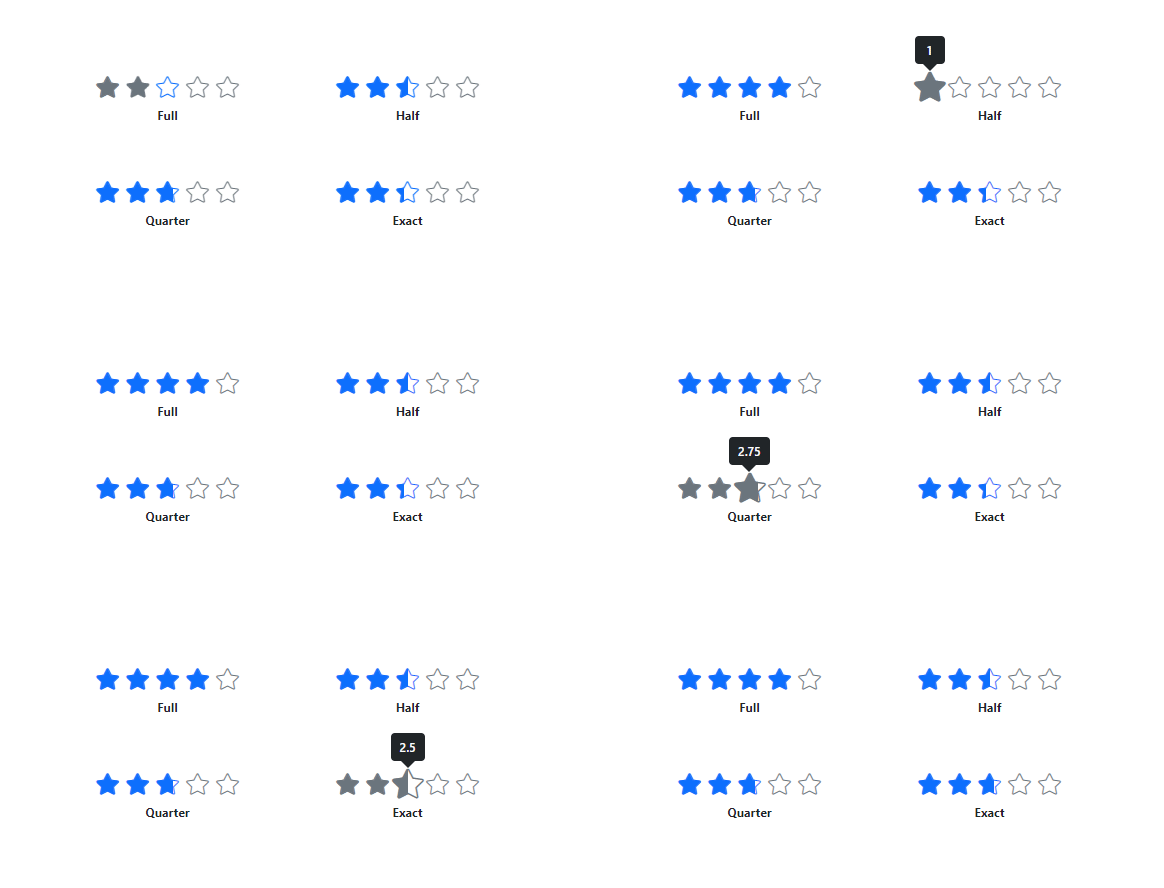
The Vue Rating component has several precision modes, which are listed below.
-
Full: The rating value is displayed in multiples of 1 (whole number). -
Half: The rating value is displayed in multiples of 0.5 (half). -
Quarter: The rating value is displayed in multiples of 0.25 (quarter). -
Exact: The rating value is displayed in multiples of 0.1 (fraction).
Tooltips
The Vue Rating component supports tooltips to provide more information about the rating. Tooltips can be customized using the template to provide more expressive content rather than the item’s numerical values.

Labels
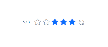
Labels provide additional information about the current rating value. Labels can be customized using the template and placed in different positions around the rating.

Templates
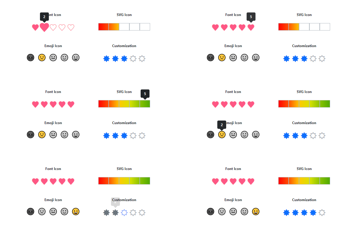
The Vue Rating component supports templates to customize rating items in different ways. Custom icons can be in the form of emojis, hearts, stars, SVG, and more.
Right to left (RTL)
The Vue Rating component supports right-to-left (RTL) rendering.
Customization
Customize rating items’ spacing, rated/unrated fill color, border color, and more, enabling it to fit the application’s needs.
Size of the items
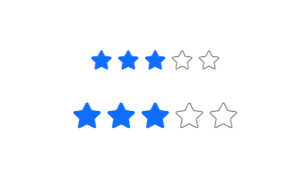
Customizing the size of the items makes the Rating component more accessible and accurate.
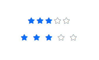
Spacing
Adjust the space between items in the Rating component.
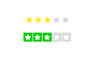
Rated and unrated fill colors
Customize the fill color of rated and unrated states of an item.
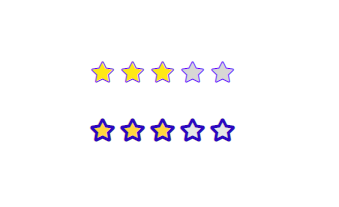
Borders and stroke thickness
Customizing the border color and stroke thickness of rated and unrated items enhances their appearance and makes them stand out.
Built-in themes
The Vue Rating supports these built-in themes: Tailwind CSS, Bootstrap 5, Bootstrap 4, Bootstrap, Material, Fabric, Fluent, and high contrast. Users can customize one of these built-in themes or create new themes to achieve their desired look and feel by simply overriding SASS variables or using our Theme Studio application.
Web Accessibility
- Fully supports WAI-ARIA accessibility to work with screen readers and assistive devices.
- Follows WAI-ARIA best practices for implementing keyboard interaction.
-
Tab: Navigate to the Rating component. -
Left Arrow: Decrease the rating value. -
Right Arrow: Increase the rating value. -
Up Arrow: Increase the rating value. -
Down Arrow: Decrease the rating value.
-
- Follows WCAG 2.0 standards in design of the UI visual elements such as foreground color, background color, line spacing, text, and images.
Vue Rating code example
Easily get started with the Vue Rating using a few simple lines of Vue example as demonstrated below. Also explore our Vue Rating example that shows you how to render and configure the Vue Rating.
<template>
  <ejs-rating id='rating' value="3"></ejs-rating>
</template>
<script>
import Vue from 'vue';
import { RatingPlugin   } from "@syncfusion/ej2-vue-inputs";

Vue.use(RatingPlugin );

export default { }
</script>
Other supported frameworks
The Rating component is also available in Blazor, Angular, React, and JavaScript frameworks. Check out the component on other platforms using these links:
145+ VUE UI COMPONENTS
Build Document Workflows in Vue
Embed PDF viewing, Word document editing, and Excel-like spreadsheet processing in your Vue app to streamline document workflows and help teams collaborate on files without context switching or external dependencies.
Our Customers Love Us


 Documentation
Awards
Greatness—it’s one thing to say you have it, but it means more when others recognize it. Syncfusion® is proud to hold the following industry awards.


