Trusted by the world’s leading companies

Overview
The Vue Ribbon component provides a structured and easy-to-use user interface for users to access different features and functions using a series of tabs, improving user experience and efficiency.
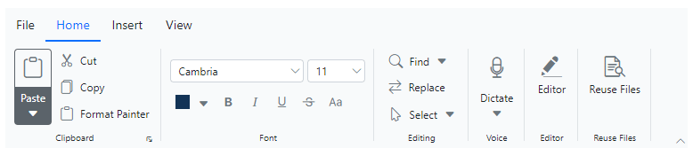
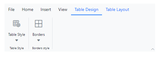
Tabs and groups
Provides a structured way to organize and group related functions, improving user experience by enabling quick access to specific features within categorized sections. Each group contains a launcher button that reveals additional functions, allowing users to explore and utilize more tools efficiently.

Simplified layout
The Vue Ribbon offers a simplified mode that organizes items and groups into a single row for improved usability and reduced clutter. End users can quickly navigate to other commonly used items in the overflow menu and switch to normal mode using built-in toggle button.

Built-in Ribbon items
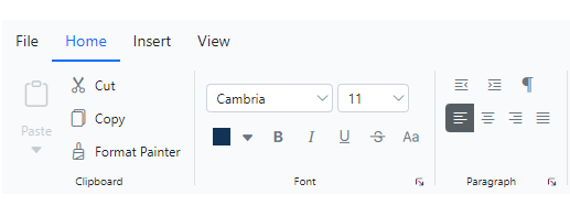
Several built-in support items, such as buttons, checkboxes, dropdown buttons, split buttons, combo boxes, and more can be customized and used to execute specific actions. Three size modes: large, medium, and small, are supported.
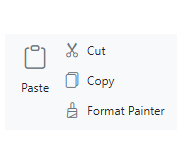
Button items
Use different sized buttons to showcase content and icons in a visually appealing and interactive manner.

Checkbox items
Enables users to toggle between checked and unchecked states, caption the checkbox and position the label either before or after the checkbox.
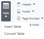
Dropdown button items
The dropdown button item functions like a regular button, but includes a dropdown menu that displays menu items.
Split button items
The split button item combines the functionality of a button with a dropdown menu, allowing users to perform a default action and access additional options.
Combobox items
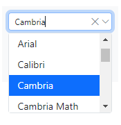
The combobox item combines a drop-down list with an editable textbox, enabling users to select from predefined pop-up list options.
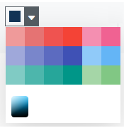
Colorpicker item
The color picker ribbon item enables users to select colors from a palette or define custom colors.
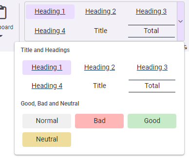
Ribbon gallery
In addition to the existing built-in items, gallery items allow users to perform specific actions by displaying a collection of related items, including icons, content, or images.
Custom ribbon items
The Vue Ribbon supports templates to customize the ribbon items with any non-built-in items or HTML content.
Contextual tabs
The contextual tab allows users to display ribbon tabs on demand based on their needs. Similar to the normal ribbon tabs, it supports adding all built-in and custom ribbon items to execute specific actions.
Help pane
The help pane template, positioned at the right side of the Ribbon, enables users to access help content typically for actions such as managing document permissions, sharing functions, and more.
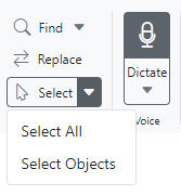
KeyTips
KeyTips enable users to quickly access the tabs or ribbon items using defined unique key tips (up to 3 characters). To display, press Alt + Windows/Command keys, and close or traverse back by pressing the Esc key.
Tooltips
The Vue Ribbon component supports tooltips to display information when hovering over items, offering users additional details, enhancing user experience.

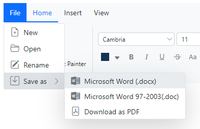
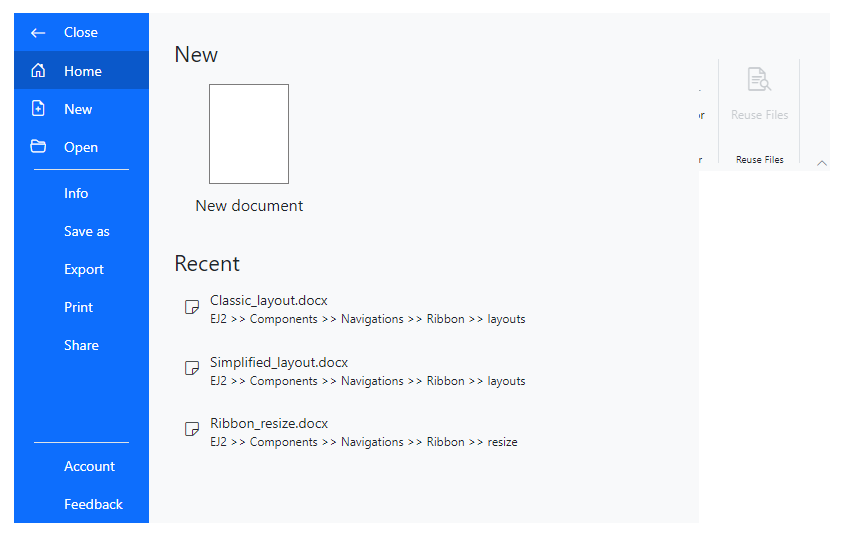
File menu
Supports a built-in menu that allows you to add file-related actions easily.
Backstage view
In addition to the traditional file menu, the backstage view displays information such as application settings, user information, etc. The backstage options are displayed on the left, while the content of each option is shown on the right.
Auto resize
The Ribbon efficiently manages space by expanding or collapsing groups, with larger groups collapsing first during resizing. Users can customize the order of groups according to their needs for a personalized Ribbon.

Built-in themes
The Vue Ribbon supports these built-in themes: Tailwind CSS, Bootstrap 5, Bootstrap 4, Bootstrap, Material, Fabric, Fluent, and high contrast. Users can customize one of these built-in themes or create new themes to achieve their desired look and feel by simply overriding SASS variables or using the Theme Studio application.
Accessibility
- Fully supports WAI-ARIA accessibility practices to work with screen readers and assistive devices.
- Follows WAI-ARIA best practices for implementing keyboard interaction.
- Follows WCAG 2.0 standards in design of the UI visual elements such as foreground color, background color, line spacing, text, and images.
- Supports right-to-left (RTL) text direction for users working with RTL languages like Hebrew, Arabic, or Persian.
Vue Ribbon code example
Easily get started with the Vue Rating using a few simple lines of Vue example as demonstrated below. Also, explore our Vue Ribbon example that shows you how to render and configure the Vue Ribbon.
<template>
    <ejs-ribbon id="ribbon" :fileMenu="fileSettings">
        <e-ribbon-tabs>
            <e-ribbon-tab header="Home">
                <e-ribbon-groups>
                    <e-ribbon-group header="Clipboard" orientation="Column" >
                    <e-ribbon-collections>
                        <e-ribbon-collection id= "paste-collection">
                            <e-ribbon-items>
                                <e-ribbon-item type="SplitButton" id="pastebtn" :allowedSizes="largeSize" :splitButtonSettings="pasteSettings" >
                                </e-ribbon-item>
                            </e-ribbon-items>
                        </e-ribbon-collection>
                        <e-ribbon-collection>
                            <e-ribbon-items>
                                <e-ribbon-item type="Button" :buttonSettings="cutButton">
                                </e-ribbon-item>
                                <e-ribbon-item type="Button" :buttonSettings="copyButton">
                                </e-ribbon-item>
                            </e-ribbon-items>
                        </e-ribbon-collection>
                    </e-ribbon-collections>
                    </e-ribbon-group>
                </e-ribbon-groups>
            </e-ribbon-tab>
            <e-ribbon-tab header="Insert">
                <e-ribbon-groups>
                    <e-ribbon-group header="Tables" >
                    <e-ribbon-collections>
                        <e-ribbon-collection>
                            <e-ribbon-items>
                                <e-ribbon-item type="DropDown" :dropDownSettings= "tableSettings">
                                </e-ribbon-item>
                            </e-ribbon-items>
                        </e-ribbon-collection>
                    </e-ribbon-collections>
                    </e-ribbon-group>
                </e-ribbon-groups>
            </e-ribbon-tab>
        </e-ribbon-tabs>
    </ejs-ribbon>
</template>

<script>
import Vue from 'vue';
import { RibbonFileMenu, RibbonItemSize, RibbonPlugin } from "@syncfusion/ej2-vue-ribbon";

Vue.use(RibbonPlugin);

export default {
    provide: {
    ribbon: [RibbonFileMenu]
    },
    data: function () {
        return {
            largeSize: RibbonItemSize.Large,
            fileSettings: {
                visible: true,
                menuItems: [
                { text: "New", iconCss: "e-icons e-file-new", id: "new" },
                { text: "Open", iconCss: "e-icons e-folder-open", id: "Open" },
                { text: "Save as", iconCss: "e-icons e-save", id: "save" }]
            },
            pasteSettings:{
                iconCss: 'e-icons e-paste', content: 'Paste',
                items: [{ text: "Keep Source Format" }, { text: "Merge format" }, { text: "Keep text only" }]
            },
            tableSettings:{
                iconCss: 'e-icons e-table', content: 'Table',
                items: [{ text: 'Insert Table' }, { text: 'Draw Table' }, { text: 'Convert Table' }, { text: 'Excel SpreadSheet' }]
            },
            cutButton:  { iconCss: "e-icons e-cut", content: "Cut" },
            copyButton:  { iconCss: "e-icons e-copy", content: "Copy" }
        };
    }
}
</script>140+ VUE UI COMPONENTS
ALL COMPONENTS
SMART COMPONENTS
GRIDS
DATA VISUALIZATION
DROPDOWNS
FILE VIEWERS & EDITORS
BUTTONS
INTERACTIVE CHAT
INPUTS
NAVIGATION
FORMS
NOTIFICATIONS
Standalone UI SDKs
Integrate the DataGrid, Chart, Scheduler, Gantt, Rich Text Editor, File Manager, and Diagram UI components into applications to enable rich interaction and visualization, delivering a seamless user experience.
Document Solutions
Integrate the PDF Viewer, DOCX Editor, Spreadsheet Editor, and document-processing libraries into the Vue applications to enable a smooth user experience.
Our Customers Love Us
Having an excellent set of tools and a great support team, Syncfusion® reduces customers’ development time.Here are some of their experiences.

Syncfusion helps small companies
Syncfusion has a very good service and innovative products. People at syncfusion is helpful and tries to give solution to customer needs. Essential Studio has enough controls for most business applications.

Regina V,

Programador informático, Small-Business
Perfect for any developer
The Syncfusion Essential Studio has excellent features that are updated or added constantly on a regular basis. The support is exceptional—fast and professional responses. The support team provides you with code samples. As for the bugs, they always try to include the fix in the next release.

Dejan D,
Chief Executive Officer, Small-Business
See Real Success Stories
Developers around the world trust Syncfusion’s Essential Studio to simplify complex projects and speed up delivery. With a vast library of UI controls, powerful SDKs, and reliable support, Essential Studio helps teams build enterprise-ready applications with confidence.
Read Our Customer StoriesIndustry
Software development
75% Cost reduction
50% Faster development
Industry
Utilities (oil and gas)
450+ hours saved
Streamlined processes and hours of development effort saved.
Advanced, flexible features
Empowered users through robust and versatile functionality.
Industry
Software and technology
1000+ of hours saved
Accelerated development with enterprise-ready UI components.
Efficient file management
Streamlined workflows with document libraries without building them from scratch.
Industry
Software and technology
2 Years of delay avoided
Two years of delays prevented with proactive planning.
On-time delivery
Projects delivered on schedule using trusted controls.
Industry
IT services and IT consulting
Improved performance
Large datasets handled with easy customization and quick debugging.
Highly customizable
Plug-and-play controls with quick template integration.
Industry
Professional services
Instant access
Quick availability of features and resources.
Reduced dependencies
Fewer dependencies for faster development.
Rated by users across the globe
Syncfusion Vue Resources
Learning
 Documentation
 Documentation


Awards
Greatness—it’s one thing to say you have it, but it means more when others recognize it. Syncfusion® is proud to hold the following industry awards.

