Trusted by the world’s leading companies

Overview
The Vue Badge is a pure CSS component used to convey notifications, messages, or statuses in different shapes and sizes. The Badge component can be easily integrated with ListView, Avatar, and other container controls.
Notification badge
The Vue Badge can display the number of unread notifications in different colors to indicate their priority level.
Link badge
Create clickable link badges using the link CSS badge variant with an anchor element. It has hover and focus states.
Overlapping badge
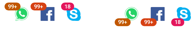
Create badges that overlap with profile icons or images, similar to social media notification number badges.
Badge position
A notification badge can be positioned at the top or bottom of profile icons or images. It is placed at the top by default.
Custom position
Even though badges support the conventional top and bottom positions, badge positions can be changed as desired. This can be done by adding a custom class to the badge element to override the default position applied from the source.
Predefined styles
Eight predefined contextual color variants are available for badges.
Types of badges
The CSS Badge control supports six different styles: default, circle, pill, notification, ghost, and dot.
UI customization
Completely customize the CSS Badge attributes, like dimensions and colors.
Integration with other components
Integrate the Vue Badge into various components to achieve different applications, such as displaying the number of unread messages in an email account or the status of product support.
Other supported frameworks
The Badge component is also available in React, Angular, and JavaScript frameworks. Check out the Badge on different platforms from these links:
Vue Badge code example
Easily get started with the Vue Badge using a few simple lines of Vue code, as demonstrated below. Also explore our Vue Badge Example that shows you how to render and configure a Badge in Vue.
<template>
  <div id="app">
       <h1>Badge Component <span class="e-badge">New</span></h1>
  </div>
</template>

<script>
    import Vue from "vue";
	export default
	{
	  data()
	  {
	  return {};
	  }
	}
</script>

<style>
@import "../node_modules/@syncfusion/ej2-base/styles/material.css";
@import "../node_modules/@syncfusion/ej2-notifications/styles/material.css";
</style>
Not sure how to create your first Vue Badge? Our documentation can help.
I’d love to read it now.140+ VUE UI COMPONENTS
ALL COMPONENTS
SMART COMPONENTS
GRIDS
DATA VISUALIZATION
DROPDOWNS
FILE VIEWERS & EDITORS
BUTTONS
INTERACTIVE CHAT
INPUTS
NAVIGATION
FORMS
NOTIFICATIONS
Standalone UI SDKs
Integrate the DataGrid, Chart, Scheduler, Gantt, Rich Text Editor, File Manager, and Diagram UI components into applications to enable rich interaction and visualization, delivering a seamless user experience.
Document Solutions
Integrate the PDF Viewer, DOCX Editor, Spreadsheet Editor, and document-processing libraries into the Vue applications to enable a smooth user experience.
Frequently Asked Questions
Why should you choose Syncfusion’s Vue Badge?
- Support for different types of badges like notification, pill, link, and overlap.
- Integration with other components such as Avatar, ListView, and Menu Bar.
- Standard, predefined, and contextual color variants.
- Industry-standard themes included: Material, Fabric, and Bootstrap.
- One of the best Vue Badge in the market that offers a feature-rich UI to interact with the software.
- Simple configuration and API.
- Support for all modern browsers.
- Touch-friendly and responsive UI.
Expansive learning resources such as demos and documentation to let you get started quickly with the Vue Badge component.
Where can I find the Syncfusion Vue Badge demo?
You can find our Vue Badge demo, which demonstrates how to render and configure the Badge.
Can I download and utilize the Syncfusion Vue Badge for free?
No, this is a commercial product and requires a paid license. However, a free community license is also available for companies and individuals whose organizations have less than $1 million USD in annual gross revenue, 5 or fewer developers, and 10 or fewer total employees.
How do I get started with Syncfusion Vue Badge?
A good place to start would be our comprehensive getting started documentation.
Our Customers Love Us
Having an excellent set of tools and a great support team, Syncfusion® reduces customers’ development time.Here are some of their experiences.

Syncfusion helps small companies
Syncfusion has a very good service and innovative products. People at syncfusion is helpful and tries to give solution to customer needs. Essential Studio has enough controls for most business applications.

Regina V,

Programador informático, Small-Business
Perfect for any developer
The Syncfusion Essential Studio has excellent features that are updated or added constantly on a regular basis. The support is exceptional—fast and professional responses. The support team provides you with code samples. As for the bugs, they always try to include the fix in the next release.

Dejan D,
Chief Executive Officer, Small-Business
See Real Success Stories
Developers around the world trust Syncfusion’s Essential Studio to simplify complex projects and speed up delivery. With a vast library of UI controls, powerful SDKs, and reliable support, Essential Studio helps teams build enterprise-ready applications with confidence.
Read Our Customer StoriesIndustry
Software development
75% Cost reduction
50% Faster development
Industry
Utilities (oil and gas)
450+ hours saved
Streamlined processes and hours of development effort saved.
Advanced, flexible features
Empowered users through robust and versatile functionality.
Industry
Software and technology
1000+ of hours saved
Accelerated development with enterprise-ready UI components.
Efficient file management
Streamlined workflows with document libraries without building them from scratch.
Industry
Software and technology
2 Years of delay avoided
Two years of delays prevented with proactive planning.
On-time delivery
Projects delivered on schedule using trusted controls.
Industry
IT services and IT consulting
Improved performance
Large datasets handled with easy customization and quick debugging.
Highly customizable
Plug-and-play controls with quick template integration.
Industry
Professional services
Instant access
Quick availability of features and resources.
Reduced dependencies
Fewer dependencies for faster development.
Rated by users across the globe
Syncfusion Vue Resources
Learning
 Documentation
 Documentation


Awards
Greatness—it’s one thing to say you have it, but it means more when others recognize it. Syncfusion® is proud to hold the following industry awards.

