
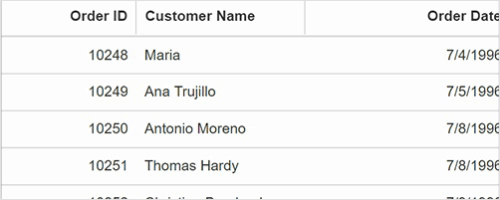
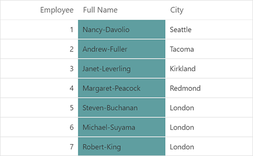
Define columns
Users can define the needed columns explicitly in a Data Grid. Enhance the appearance of columns by setting the header text, text alignment, cell value format, and width.
Auto generate columns
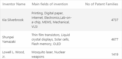
When the column collection is not specified, Data Grid will create columns definitions for users by creating column objects from the data source.
AutoFit columns width
Users can interactively auto-size column widths to show their full content by double-clicking on column borders. Data Grid supports programmatically auto-sizing columns. The Autofit feature displays columns based on their defined width. If the total column width is less than the grid width, white space will appear instead of columns auto-adjusting to fill the grid.
Cell attributes
Users can decorate each cell element of the DataGrid with their own attributes by customizing styles, adding additional class names, and more.

Text wrap
Wraps the DataGrid cell text to the next line when it is too large to fit a cell. Users can wrap the header or content cell`s text by setting the available wrap mode options.
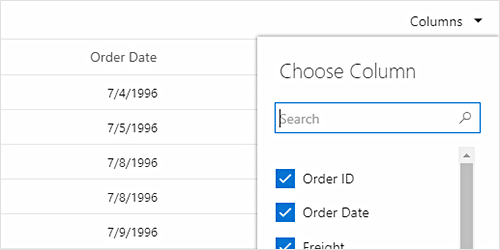
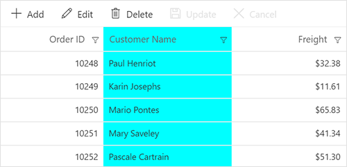
Column chooser
The column chooser provides a list of column names paired with check boxes, allowing users to toggle visibility on the fly. This helps users control column visibility through an interactive UI.
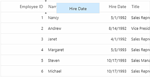
Reorder
Reorder DataGrid columns either through user interaction or programmatically. Simply dragging a column header to the desired column position will reorder the columns of a DataGrid.
Resize
Column resize allows changing the column width on the fly by simply dragging the right corner of the column header. A scroll bar appears when the DataGrid content width exceeds the element width.
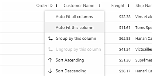
Column menu
Allows performing various column-based actions with the help of the Data Grid column menu. Menu items can also be customized to list only the preferred actions.
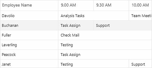
Column spanning
Span the adjacent DataGrid cells based on the preferred criteria.
Foreign key column
It is possible to show values from external or lookup data sources in a column based on the foreign key/value name. Allows all Data Grid actions like sorting, filtering, editing, grouping, and other operations in the foreign data column.
Value accessors
The value accessors specify how the cell value is to be retrieved from the data. The preferred value accessors can be used when the row data is not just a simple object.
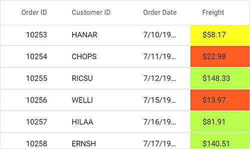
Cell styling
Data Grid supports the customization of cell styles programmatically or by using CSS.
Our Customers Love Us


See Real Success Stories
Developers around the world trust Syncfusion’s Essential Studio to simplify complex projects and speed up delivery. With a vast library of UI controls, powerful SDKs, and reliable support, Essential Studio helps teams build enterprise-ready applications with confidence.
Read Our Customer StoriesIndustry
Software development
75% Cost reduction
50% Faster development
Industry
Utilities (oil and gas)
450+ hours saved
Streamlined processes and hours of development effort saved.
Advanced, flexible features
Empowered users through robust and versatile functionality.
Industry
Software and technology
1000+ of hours saved
Accelerated development with enterprise-ready UI components.
Efficient file management
Streamlined workflows with document libraries without building them from scratch.
Industry
Software and technology
2 Years of delay avoided
Two years of delays prevented with proactive planning.
On-time delivery
Projects delivered on schedule using trusted controls.
Industry
IT services and IT consulting
Improved performance
Large datasets handled with easy customization and quick debugging.
Highly customizable
Plug-and-play controls with quick template integration.
Industry
Professional services
Instant access
Quick availability of features and resources.
Reduced dependencies
Fewer dependencies for faster development.
140+ VUE UI COMPONENTS