Overview
The DataGrid control offers comprehensive features for grouping data by one or more columns. Users can effortlessly organize data in a hierarchical structure based on matching column values. The ability to expand or collapse groups can be achieved through user interaction or programmatically. Additionally, the control allows custom grouping logic to suit specific data grouping requirements. When grouping multiple columns, customizable indent columns are automatically generated to visually represent grouping levels.
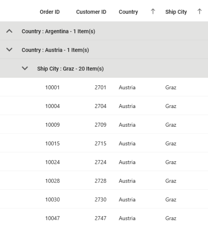
Column grouping
Programmatically group data by one or more columns using customizable templates. The DataGrid control provides the functionality to display or hide columns when data is grouped.

Group expand and collapse
Easily view the records of each group with a user-friendly interface. The group captions in the DataGrid control features an intuitive expand icon, allowing for effortless expansion or collapse of groups. Users can also programmatically expand or collapse groups directly from the code-behind.
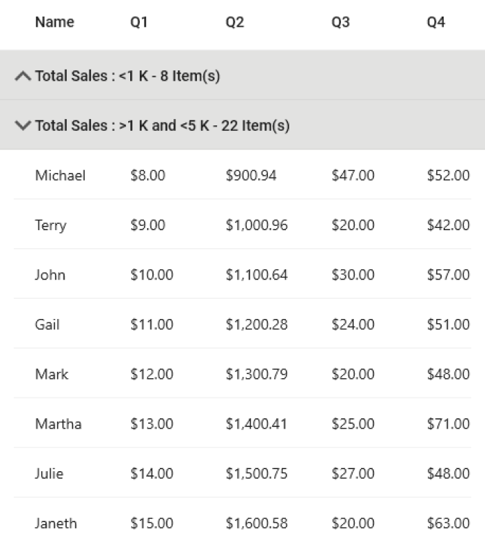
Custom grouping
Group data columns based on custom logic to achieve specific grouping requirements. This allows custom groupings tailored to the user’s need.
Additionally, sort all the inner records within each group to ensure a consistent and organized presentation of data.
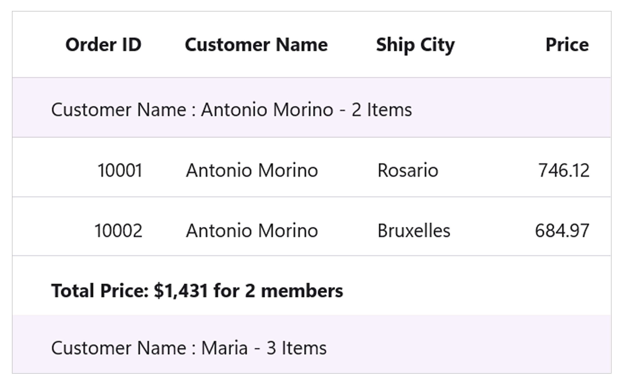
Summary for groups
View summaries for columns in a group caption. Users can also show the summary of records in a group.
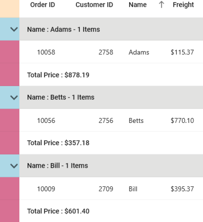
Indent column customization
The columns to the left of the summary rows when grouping multiple columns are known as indent columns. The number of indent cells in each summary row is determined by the level of the group. DataGrid offers the flexibility to customize the size and background color of the indent column, enhancing its visual appeal. Additionally, in a .NET MAUI DataGrid control, it is possible to further customize the background color of the indent cells based on the type of row.
Our Customers Love Us


See Real Success Stories
Developers around the world trust Syncfusion’s Essential Studio to simplify complex projects and speed up delivery. With a vast library of UI controls, powerful SDKs, and reliable support, Essential Studio helps teams build enterprise-ready applications with confidence.
Read Our Customer StoriesIndustry
Software development
75% Cost reduction
50% Faster development
Industry
Utilities (oil and gas)
450+ hours saved
Streamlined processes and hours of development effort saved.
Advanced, flexible features
Empowered users through robust and versatile functionality.
Industry
Software and technology
1000+ of hours saved
Accelerated development with enterprise-ready UI components.
Efficient file management
Streamlined workflows with document libraries without building them from scratch.
Industry
Software and technology
2 Years of delay avoided
Two years of delays prevented with proactive planning.
On-time delivery
Projects delivered on schedule using trusted controls.
Industry
IT services and IT consulting
Improved performance
Large datasets handled with easy customization and quick debugging.
Highly customizable
Plug-and-play controls with quick template integration.
Industry
Professional services
Instant access
Quick availability of features and resources.
Reduced dependencies
Fewer dependencies for faster development.
 95+ UI controls
200+ interactive .NET MAUI demos
3.2M+ downloads
95+ UI controls
200+ interactive .NET MAUI demos
3.2M+ downloads