Angular Tree Grid - Powerful Tree List Component
- Load large amounts of data by dynamically loading child data on demand.
- Include flexible UI interactions like expanding and collapsing parent records, dialog editing, and more.
- Attractive UI appearance with built-in themes such as fabric, bootstrap, etc.

Quick Overview Video
Trusted by the world’s leading companies

Overview
The Angular TreeGrid is a feature-rich control used to visualize self-referential, hierarchical data effectively in a tabular format (a tree-like structure). Its rich feature set includes many functionalities: data binding, virtualization, editing, sorting, searching, filtering, infinite scrolling, paging, frozen rows and columns, exporting to multiple formats, aggregating rows, and more.
Why choose Syncfusion Essential Studio® Angular Tree Grid?
High performance
Display data hierarchically, its optimized design provides high performance and load millions of records in just a few seconds.
Seamless data binding
Bind data seamlessly with various local and remote data sources such as JSON, OData, WCF, and RESTful web services with the help of a data manager.
Self-referential, hierarchical grid
Angular TreeGrid is designed to visualize self-referential and hierarchical in a tabular format. This in turns displays the relationship between parent and child records.
AI-Assisted Development
Build hierarchical data management experiences faster with the Agentic UI Builder and Syncfusion Agent Skills. Generate expandable rows, nested data layouts, filtering, and editing workflows with minimal manual effort.
Adapts to any resolution
The Tree Grid has a highly responsive layout and an optimized design for desktops, touch screens, and smart phones. It works well on all mobile phones that use iOS, Android, or Windows OS.
Create your own template designs
Using templates, users can create a custom UI in the Angular Tree Grid based on their application need using a wide range of template options.
Attractive customizable themes
Cutting edge design with 5+ built-in themes such as Fluent, Tailwind CSS, Bootstrap, Material, Fabric, and more. Utilize the online Theme Studio tool to customize themes of Angular Tree Grid easily.
Globalization and localization
Enables users from different locales to use the Tree Grid by formatting dates, currency, and numbering to suit their preferences.
Angular Tree Grid Code Example
Easily get started with the Angular Tree Grid (Tree Table) using a few simple lines of HTML and TS code example as demonstrated below. Also explore our Angular Tree Grid Example that shows you how to render and configure a Tree Grid in Angular.
<ejs-treegrid [dataSource]='data' [treeColumnIndex]='1' height='350' childMapping='subtasks'>
<e-columns>
<e-column field='taskID' headerText='Task ID' textAlign='Right' width=90></e-column>
<e-column field='taskName' headerText='Task Name' textAlign='Left' width=180></e-column>
<e-column field='startDate' headerText='Start Date' textAlign='Right' format='yMd' width=90><e-column>
<e-column field='duration' headerText='Duration' textAlign='Right' width=80></e-column>
</e-columns>
</ejs-treegrid>
import { Component, OnInit } from '@angular/core';
import { sampleData } from './datasource';
@Component({
selector: 'ej2-treegrid-container',
templateUrl: 'default.html'
})
export class DefaultComponent implements OnInit {
public data: Object[] = [];
ngOnInit(): void {
this.data = sampleData;
}
}AI-assisted development
Build feature-rich Angular Tree Grid experiences faster
Accelerate hierarchical grid development with Syncfusion AI tools that turn requirements into fully configured nested data experiences with minimal manual setup.
Agentic UI Builder
Turn prompts into ready-to-use UI screens, layouts, and workflows with Syncfusion Angular components.
Example Prompt Create an employee hierarchy grid with expandable rows and inline editing.
Agent Skills
Accelerate development with Syncfusion AI Agent Skills for faster implementation and integration.
Example Prompt Generate a Angular tree grid with nested rows, sorting, filtering, and CRUD actions.
AI Coding Assistant
Accelerate development with AI that generates, configures, and troubleshoots component code directly in your IDE.
Example Prompt Show how to enable lazy loading in the Syncfusion Angular Tree Grid.
Skeleton loading indicator
The Tree Grid shows the shimmer effect as a loading indicator while fetching data and binding it to the tree grid during initial rendering, refreshing, or after performing grid actions like sorting, filtering, and more. The Tree Grid offers two types of effects, spinner and shimmer.


Column
Columns define the schema of a data source in Angular Tree Grid. Features include formatting, column definitions, text wrapping, column chooser, column menu, column reordering, and other important features.
Paging
Through paging, a segment of data can be viewed from the assigned data source. The Angular Tree Grid offers built-in pager UI with options to customize its entire UI. It also has an on-demand paging mode for effective data retrieval from remote web services.


Sorting
The Angular Tree Grid allows users to sort a column by simply clicking on the header. A Ctrl + header click performs multi-sorting. Sort data in either ascending or descending order.
Filtering
Filtering helps view specific or related records that meet a given filtering criteria. It supports various filter types that include powerful Excel-like filter. The Angular Tree Grid filter allows users to choose appropriate filter types, define their own custom filtering logic, and customize the filtering UI based on their application needs. Filtering with related parent or child records can be defined.


Selection
Angular Tree Grid allows selecting rows or cells. One or more rows or cells can also be selected by holding Ctrl or Command, or programmatically.
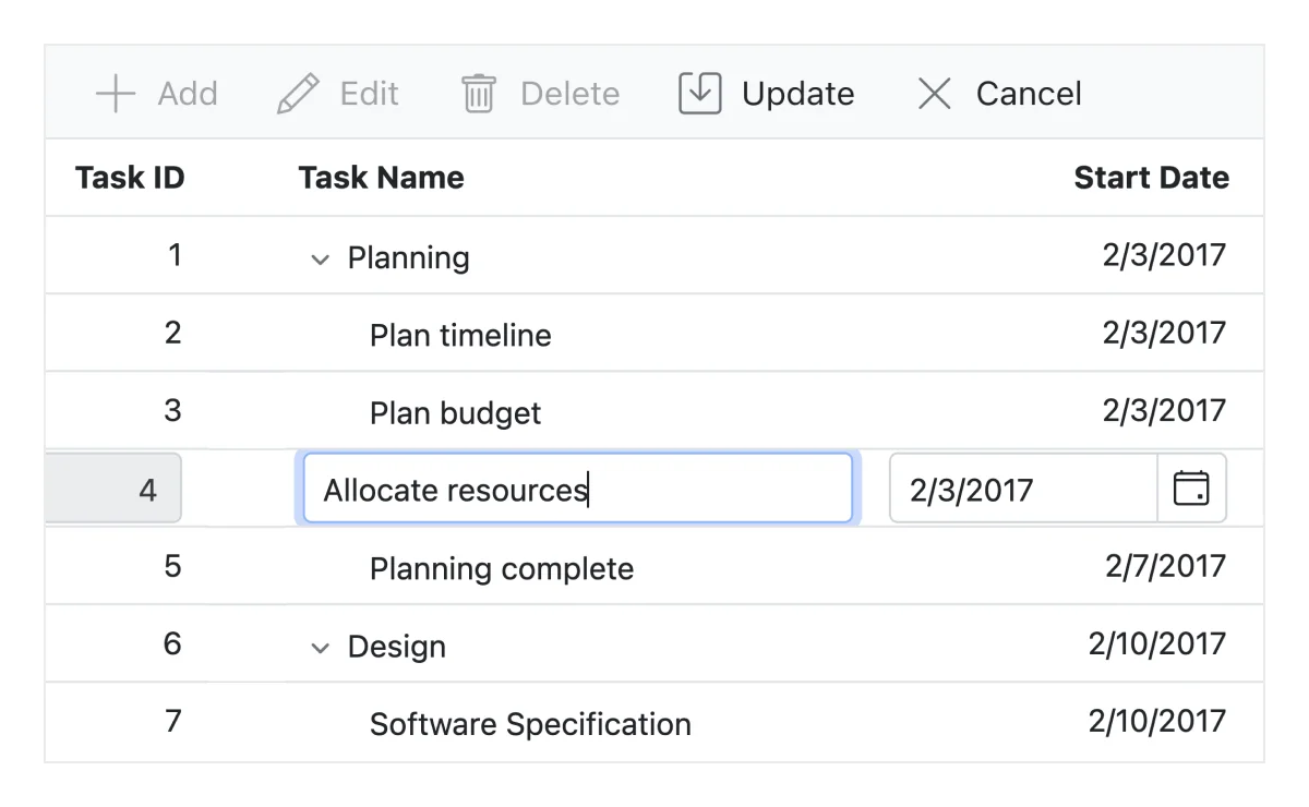
Editing
The Angular TreeGrid provides full support to create, read, update, and delete operations (CRUD). In addition to built-in editor components to edit a particular column value, using template support users can create custom editor components that suit their application needs. It performs editing operations with JSON collection or remote data service with the help of data manager.
Row drag and drop
The Angular TreeGrid allows users to drag and drop rows within the same or another tree grid. This functionality is especially useful for reorganizing data and creating a more intuitive user experience.


Aggregation
Aggregates for column values can easily be displayed using the aggregate feature. Aggregates can be customized to show their value in every hierarchy with a set of predefined summary types.
Frozen columns
Frozen columns are visible at the left or right or both the sides of the Angular Tree Grid and make the remaining grid content scrollable. It is mainly used to compare cell values.

Search
You can search the records using the search method. Integrate search text box in the Angular TreeGrid’s toolbar by adding search items.
Custom tooltip
Angular TreeGrid component allows you to set tooltips for treegrid cells. Hover over the tree nodes to display tooltip text.

Exporting

Excel, PDF, CSV export
Easily export the HTML5 Tree Grid control in various file formats such as Excel, PDF, or CSV. Users can also programmatically customize the exported document.

Users can print data either by using the print option from the toolbar or programmatically. Print all the rows of a Angular Tree Grid regardless of the number of pages or print the currently viewed page alone.
Additional features

Row height
Row height is a major factor when displaying the number of records in the view port, and it is effortlessly customizable based on the application’s UI requirement. It is also possible to set row height conditionally.

Copy to clipboard
The clipboard provides an option to copy selected rows or cells’ data into the clipboard. Use Ctrl+C and Ctrl+Shift+H key combinations to copy data with and without headers, respectively.

Context menu
The context menu improves user action with Angular Tree Grid using popup menu. It appears when the cell, header, or pager is right clicked. In addition to built-in default menu items, it allows you to add custom context menu items.

Width and height
Allows changing the Angular Tree Grid size by setting the width and height properties. Horizontal and vertical scrollbars will appear when the content overflows the Angular Tree Grid element. For the Angular Tree Grid to fill its parent container, the user must simply set the height and width to 100%.

Stacked headers
Stacked headers allow grouping and visualizing column headers in a stacked manner. There is no limit to the number of columns that can be stacked. Allows the user to perform all Angular TreeGrid actions, even when the columns are stacked.
Accessibility

Keyboard navigation
The Tree Grid ensures that every cell is keyboard accessible. Major features like expanding or collapsing child rows, sort, select, and edit can be performed using keyboard commands alone; no mouse interaction required. This helps in creating highly accessible applications using this component.

Screen reader
The Angular Tree Grid has complete WAI-ARIA accessibility support. Its UI includes high-contrast visual elements, helping visually impaired people have the best viewing experience. Also, the valid UI descriptions are easily accessible through assistive technologies such as screen readers.

Right to left (RTL)
Right-to-left rendering allows displaying the text and layout of the Angular Tree Grid from right to left. This improves the user experience and accessibility for RTL languages.
Angular version compatibility
With continuous improvement in Angular versions, the Angular Tree Grid is kept up to date to make it compatible with versions starting from 4 to the latest version.

Other supported frameworks
The Tree Grid is available for the Blazor, React, JavaScript, and Vue frameworks. Explore its platform-specific options through the following links:


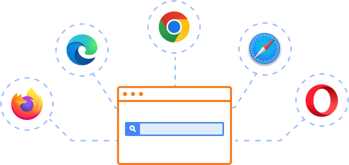
Supported browsers
The Angular Tree Grid works well with all modern web browsers, including Chrome, Firefox, Edge, Safari, and Opera.
Not sure how to create your first Angular Tree Grid? Our tutorial videos and documentation can help.
I’d love to watch it now I’d love to read it now140+ ANGULAR UI COMPONENTS
ALL COMPONENTS
SMART COMPONENTS
GRIDS
DATA VISUALIZATION
DROPDOWNS
FILE VIEWERS & EDITORS
BUTTONS
INTERACTIVE CHAT
INPUTS
NAVIGATION
FORMS
NOTIFICATION
Standalone UI SDKs
Integrate the DataGrid, Chart, Scheduler, Gantt, Rich Text Editor, File Manager, and Diagram UI components into applications to enable rich interaction and visualization, delivering a seamless user experience.
Document Solutions
Integrate the PDF Viewer, DOCX Editor, Spreadsheet Editor, and document-processing libraries into the Angular applications to enable a smooth user experience.
Frequently Asked Questions
Why should you choose Syncfusion Essential Studio® Angular Tree Grid?
Load large amounts of data by dynamically loading child data on demand.
Include flexible UI interactions like expanding and collapsing parent records, dialog editing, and more.
Flexible data binding with support to use local and remote data sources such as JSON, RESTful services, OData services, and WCF services.
- One of the best Angular Tree Grid in the market that offers feature-rich UI to interact with the software.
- Attractive UI appearance with built-in themes such as fabric, bootstrap, etc.
- Simple configuration and API.
- Supports all modern browsers.
- Mobile-touch friendly and responsive.
Expansive learning resources such as demos, documentation and videos to learn quickly and get started with Angular Tree Grid.
Where can I find the Syncfusion Angular Tree Grid demo?
You can find our Angular Tree Grid demo, which demonstrates how to render and configure the TreeGrid.
Can I download and utilize the Syncfusion Angular Tree Grid for free?
No, this is a commercial product and requires a paid license. However, a free community license is also available for companies and individuals whose organizations have less than $1 million USD in annual gross revenue, 5 or fewer developers, and 10 or fewer total employees.
How do I get started with Syncfusion Angular Tree Grid?
A good place to start would be our comprehensive getting started documentation .
Our Customers Love Us
Having an excellent set of tools and a great support team, Syncfusion® reduces customers’ development time.Here are some of their experiences.

An amazing toolset to accelerate UI development
The number of components available is the best thing about this library. We think of a UI component, and the Angular JS library already offers it. We use the Angular JS library to accelerate development. The experience using and implementing has been great. The support is also excellent.

Shrikant P,

Customer Success Manager, Small-Business
A giant framework with great pricing options
I have loved the components and options that Syncfusion has, besides, its documentation, demos, and Support are excellent.

Alejandro Javier V,
CEO, Small-Business
See Real Success Stories
Developers around the world trust Syncfusion’s Essential Studio to simplify complex projects and speed up delivery. With a vast library of UI controls, powerful SDKs, and reliable support, Essential Studio helps teams build enterprise-ready applications with confidence.
Read Our Customer StoriesIndustry
Software development
75% Cost reduction
50% Faster development
Industry
Utilities (oil and gas)
450+ hours saved
Streamlined processes and hours of development effort saved.
Advanced, flexible features
Empowered users through robust and versatile functionality.
Industry
Software and technology
1000+ of hours saved
Accelerated development with enterprise-ready UI components.
Efficient file management
Streamlined workflows with document libraries without building them from scratch.
Industry
Software and technology
2 Years of delay avoided
Two years of delays prevented with proactive planning.
On-time delivery
Projects delivered on schedule using trusted controls.
Industry
IT services and IT consulting
Improved performance
Large datasets handled with easy customization and quick debugging.
Highly customizable
Plug-and-play controls with quick template integration.
Industry
Professional services
Instant access
Quick availability of features and resources.
Reduced dependencies
Fewer dependencies for faster development.
Rated by users across the globe
Syncfusion Angular Tree Grid Resources


UI Kits
 Figma Download
Figma Download
Awards
Greatness—it’s one thing to say you have it, but it means more when others recognize it. Syncfusion® is proud to hold the following industry awards.

