Overview
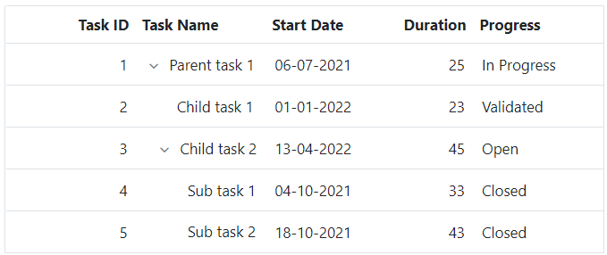
Columns define the schema of a data source in Angular Tree Grid component. It supports formatting, column definitions, column chooser, column menu, column reordering, and other important features. The operations such as sorting, filtering, and searching can be performed based on column definitions
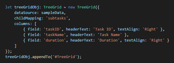
Define columns
You can define the needed columns explicitly in a Tree Grid. You can also enhance the appearance of columns by setting the header text, text alignment, cell value format, and width.
Auto size
Users can interactively auto size column width to show its full content by double clicking on column borders. It also supports triggering auto sizing to the required columns programmatically.
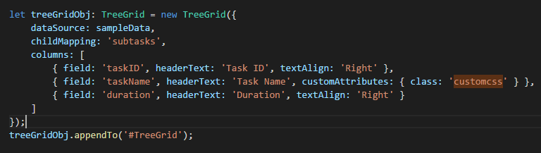
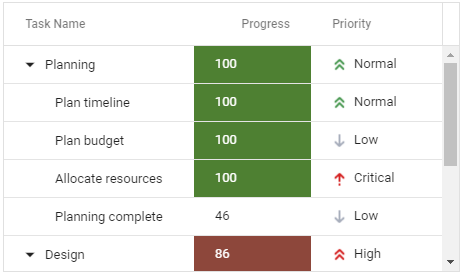
Cell Attributes
Users can decorate each cell element of a Tree Grid with their own attributes by customizing styles, add additional class names, etc.
Text wrap
Wraps the Tree Grid cell text to the next line when it is too large to fit inside a cell. Users can wrap the header or content cell’s text by setting the available wrap mode options.

Reorder
Reorder Tree Grid columns either through user interaction or programmatically. Simply dragging a column header into the desired column position will reorder the columns of a Tree Grid.
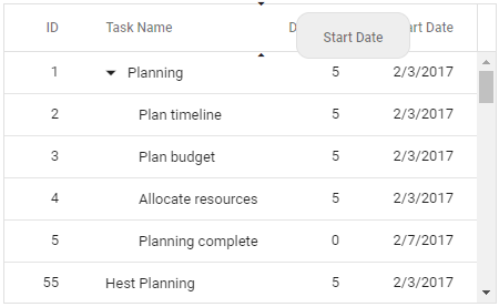
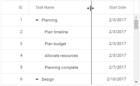
Resize
Column resize allows changing column width by simply dragging the right corner of the column header. A scroll bar appears when the Tree Grid content width exceeds the element width.

Column menu
Allows performing various column-based actions with the help of TreeGrid column menu. Menu items can also be customized to list only the preferred actions.
Value accessors
The value accessors specify how the cell value is to be retrieved from the data. The preferred value accessors can be used when the row data is not just a simple object.
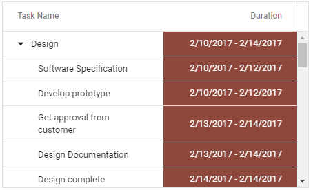
Cell styling
The Angular Tree Grid supports customization of cell styles by using CSS or programmatically
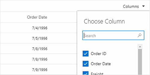
Column chooser
The column chooser provides a list of column names paired with check boxes that allows the user to toggle visibility. This helps the users to control the column visibility through an interactive UI.
 Hierarchical data binding
60+ interactive demos
925K+ downloads
Hierarchical data binding
60+ interactive demos
925K+ downloads

145+ ANGULAR UI COMPONENTS