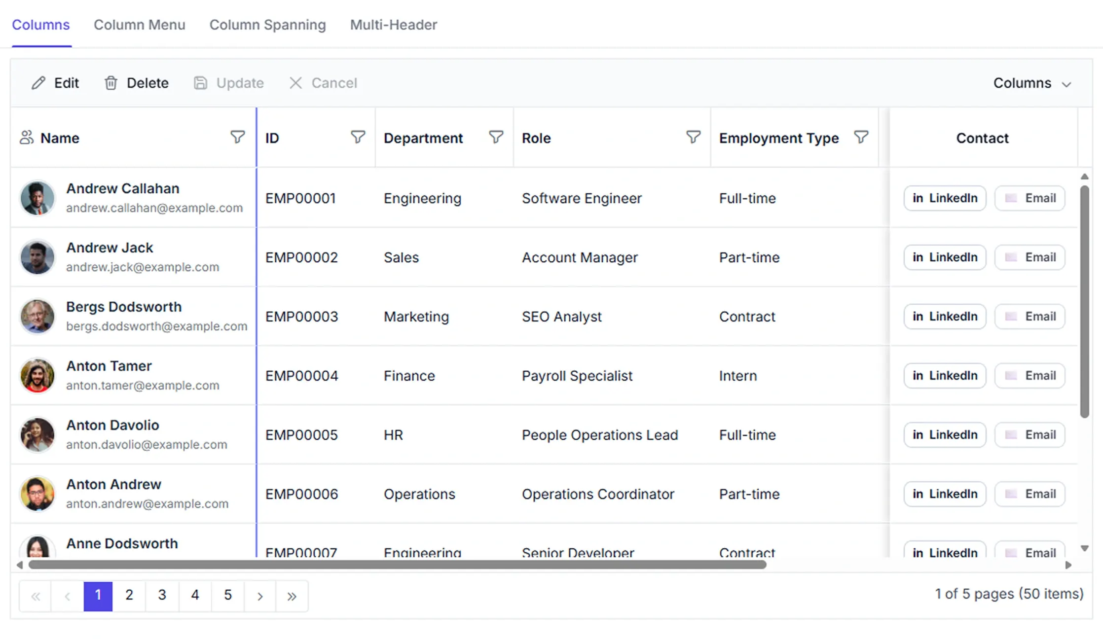



Flexible column configuration
Configure column layouts with flexible controls for headers, visibility, resizing, reordering, freezing, formatting, and templates. Build layouts that meet complex business needs while ensuring a consistent user experience.
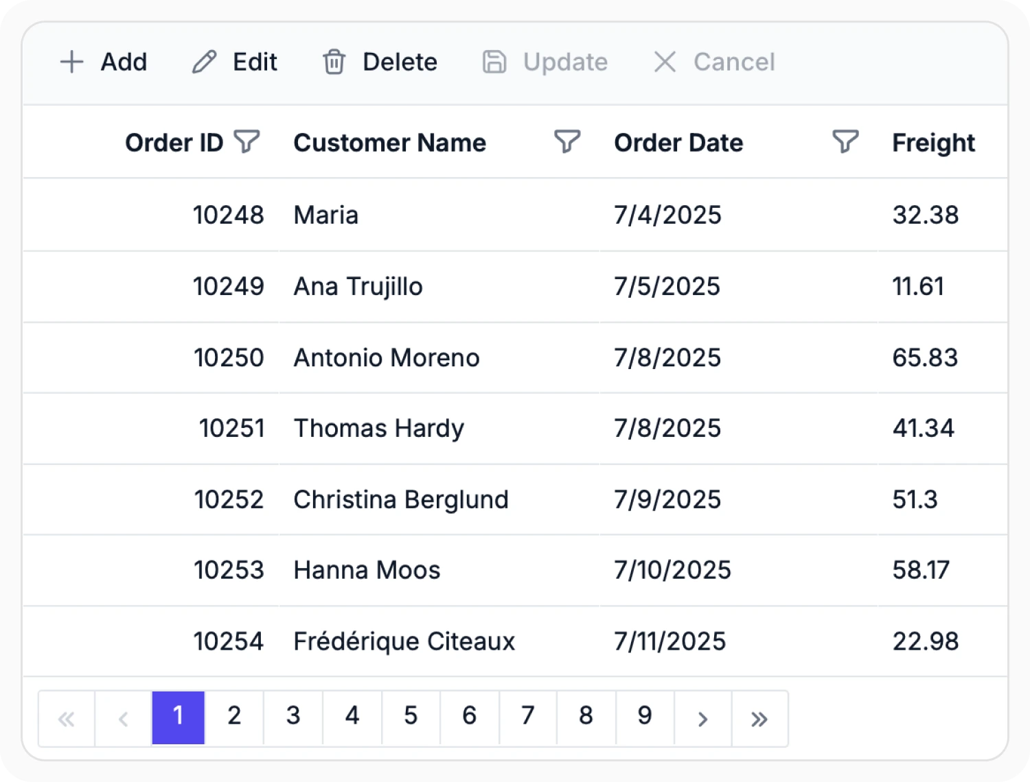
Configure Data Grid columns
Define columns manually to create a fixed and structured layout. Use automatic column generation when column details are unknown or may change as new columns are added to the data source.
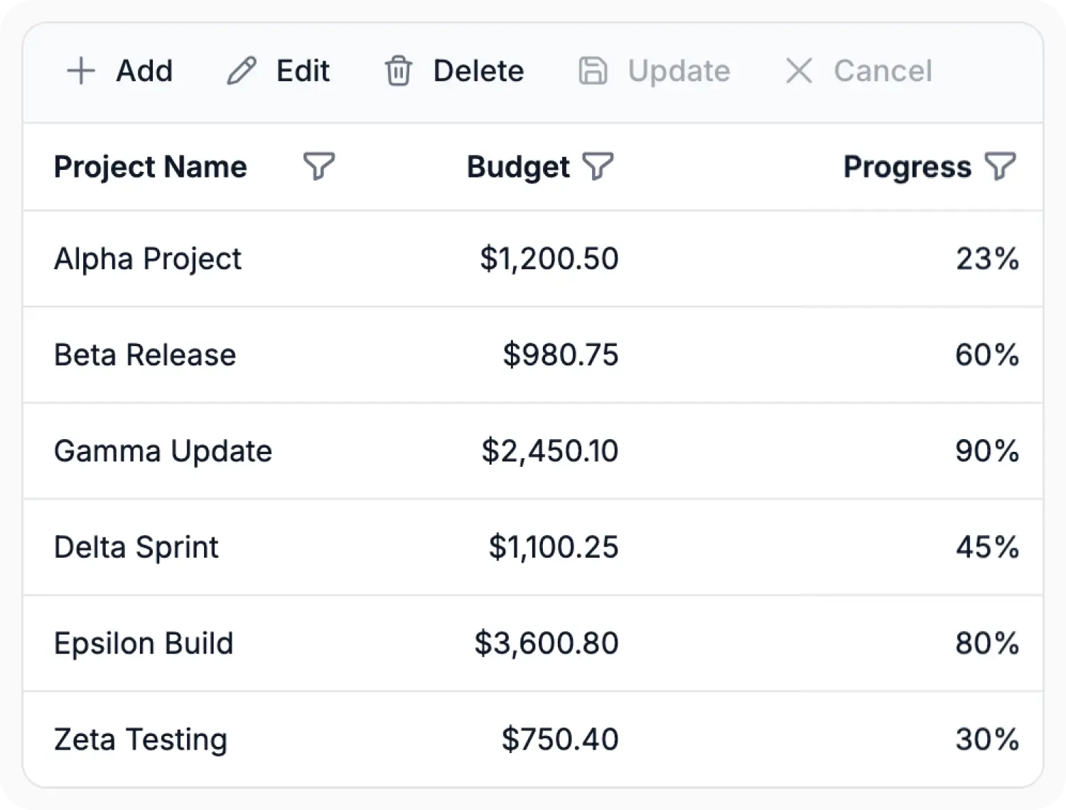
Customize column formatting and layout
Customize Data Grid columns to control how content is displayed through formatting, width, alignment, and wrapping. Use this feature when layouts require consistent presentation across different types of data.
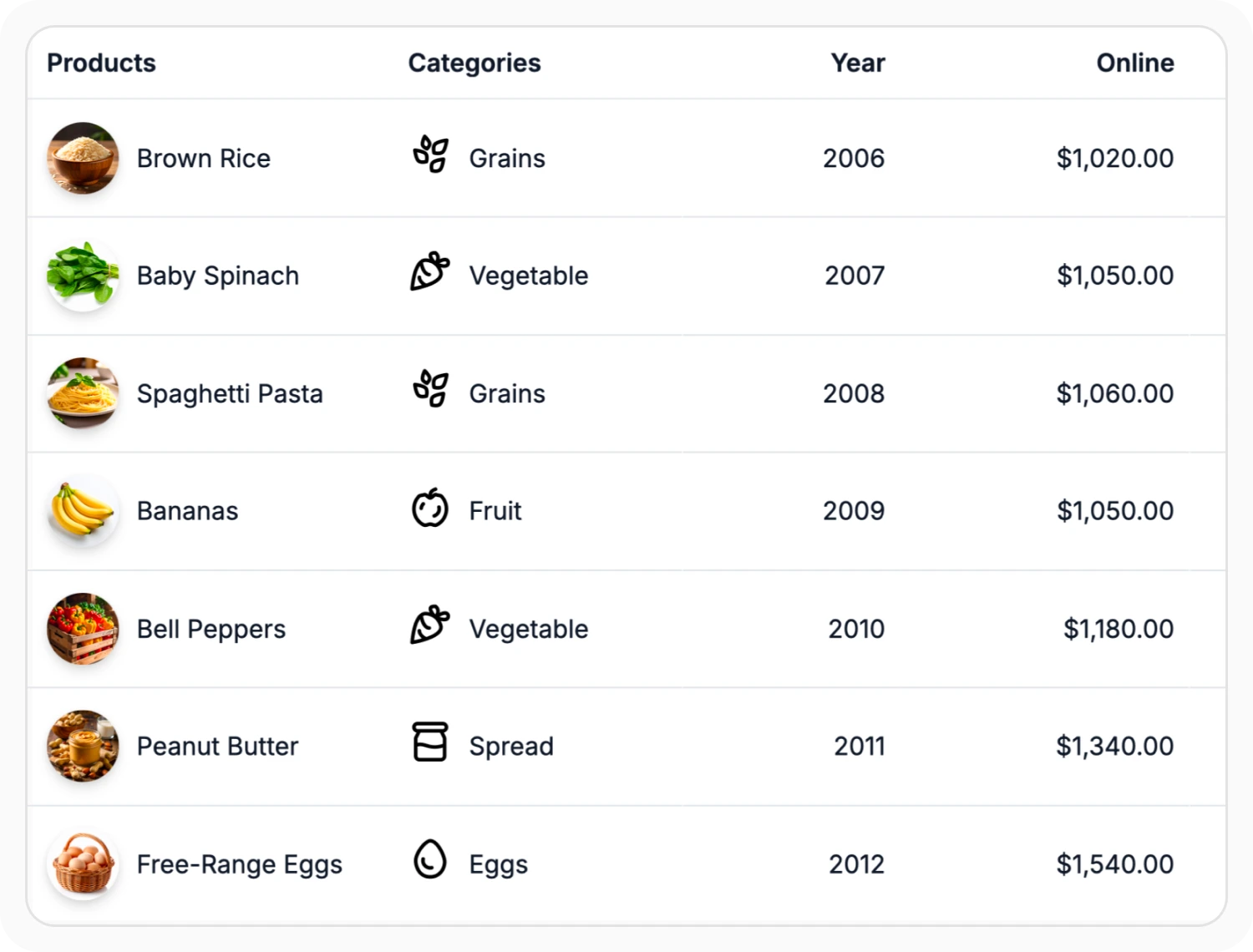
Rich cell templates
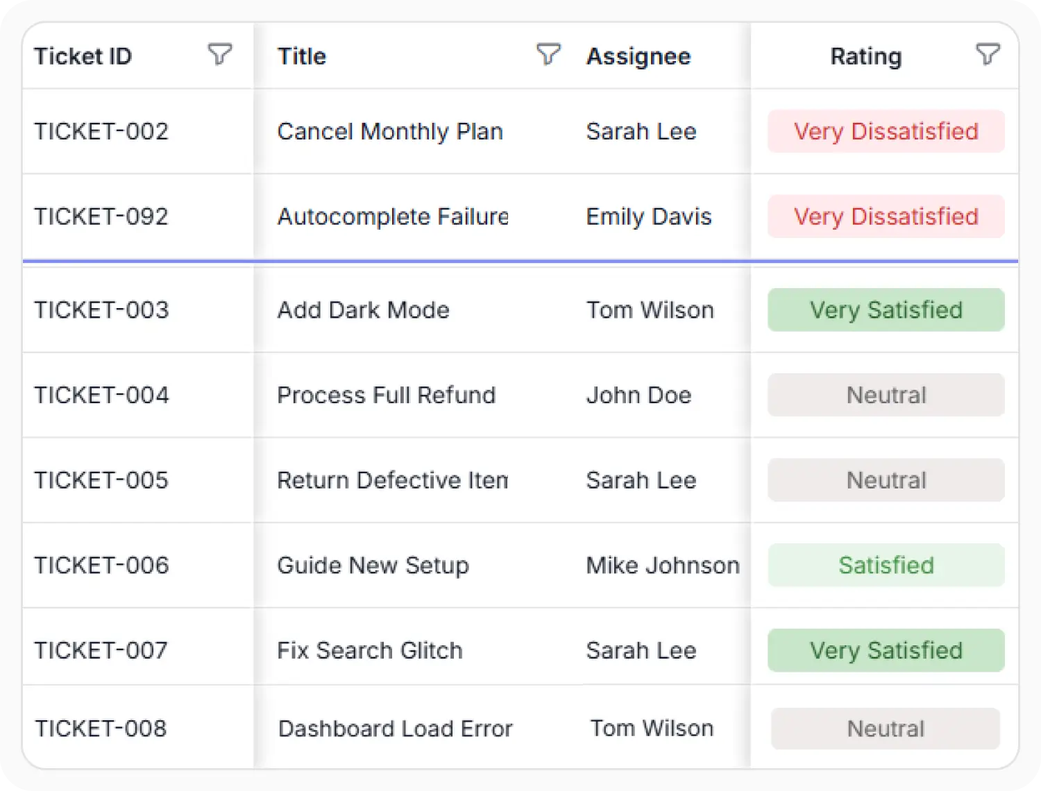
Display images, icons, badges, custom components, and other custom content in Data Grid columns. Use this feature to enrich cell presentation with visual elements, interactive components, and formatted content beyond plain text.
Column pinning for enhanced visibility
Keep selected columns visible while scrolling by pinning them to the left, right, or their current position in the Data Grid. Use column pinning to keep important columns visible at all times while viewing additional columns.
Create multi-level column headers
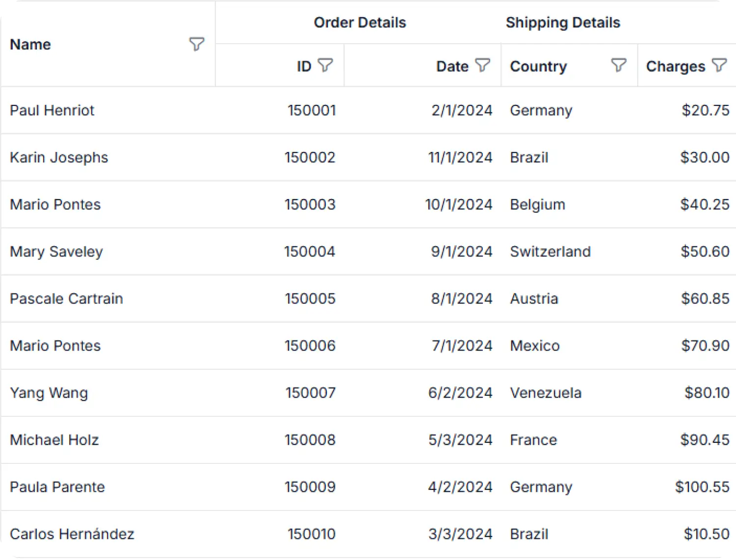
Multi-level column headers group related columns under a single parent header. Use this feature when datasets contain multiple related columns that benefit from organized categorization.
Column visibility control
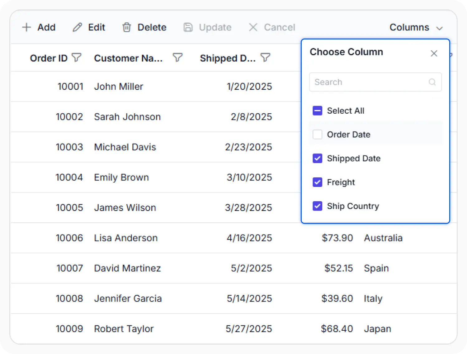
The column chooser allows columns to be shown or hidden based on display requirements. Use this feature when different views require different sets of columns to be displayed.
Column resizing
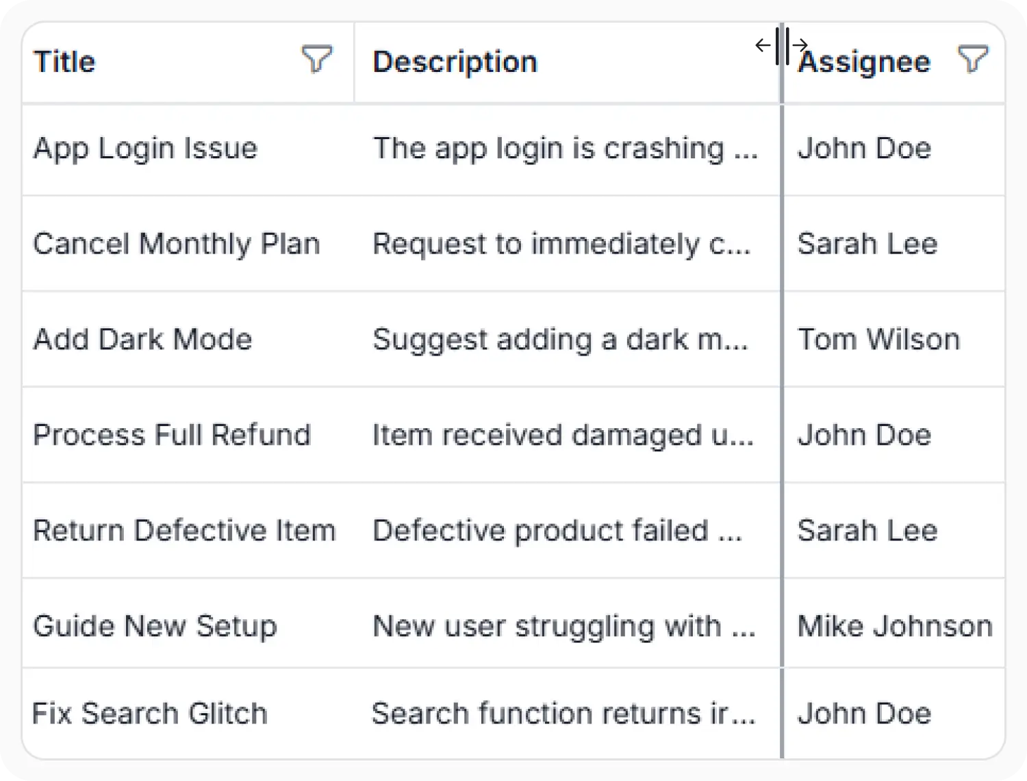
Column resizing allows column widths to be adjusted based on the displayed data. Use this feature when columns require different widths to accommodate varying content and layout requirements.
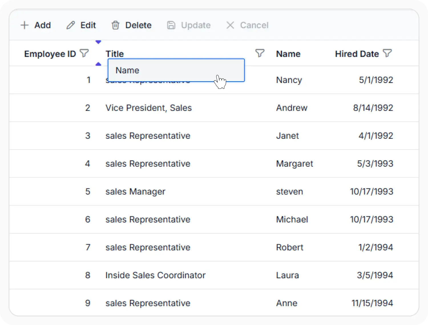
Column reorder
Column reordering changes the order of columns to match different viewing preferences. Use this feature when column positions need to be rearranged to support different workflows or data review requirements.
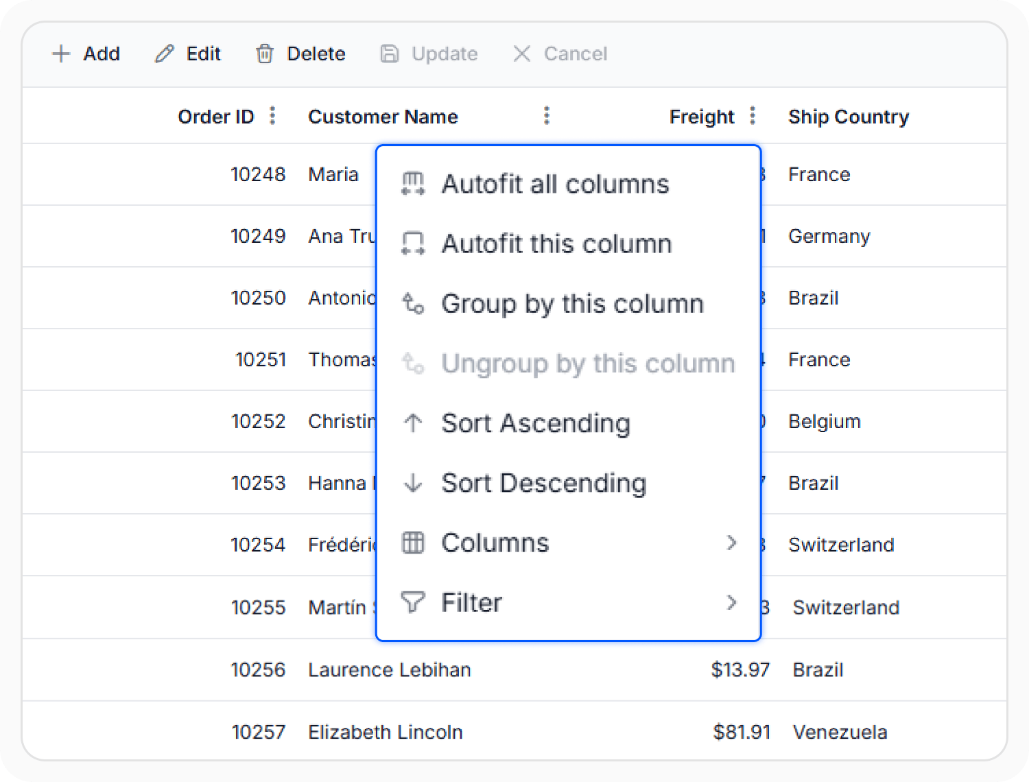
Column menu actions and controls
The column menu provides access to sorting, filtering, grouping, and visibility options for individual columns. Use this feature when column settings and operations require frequent updates.
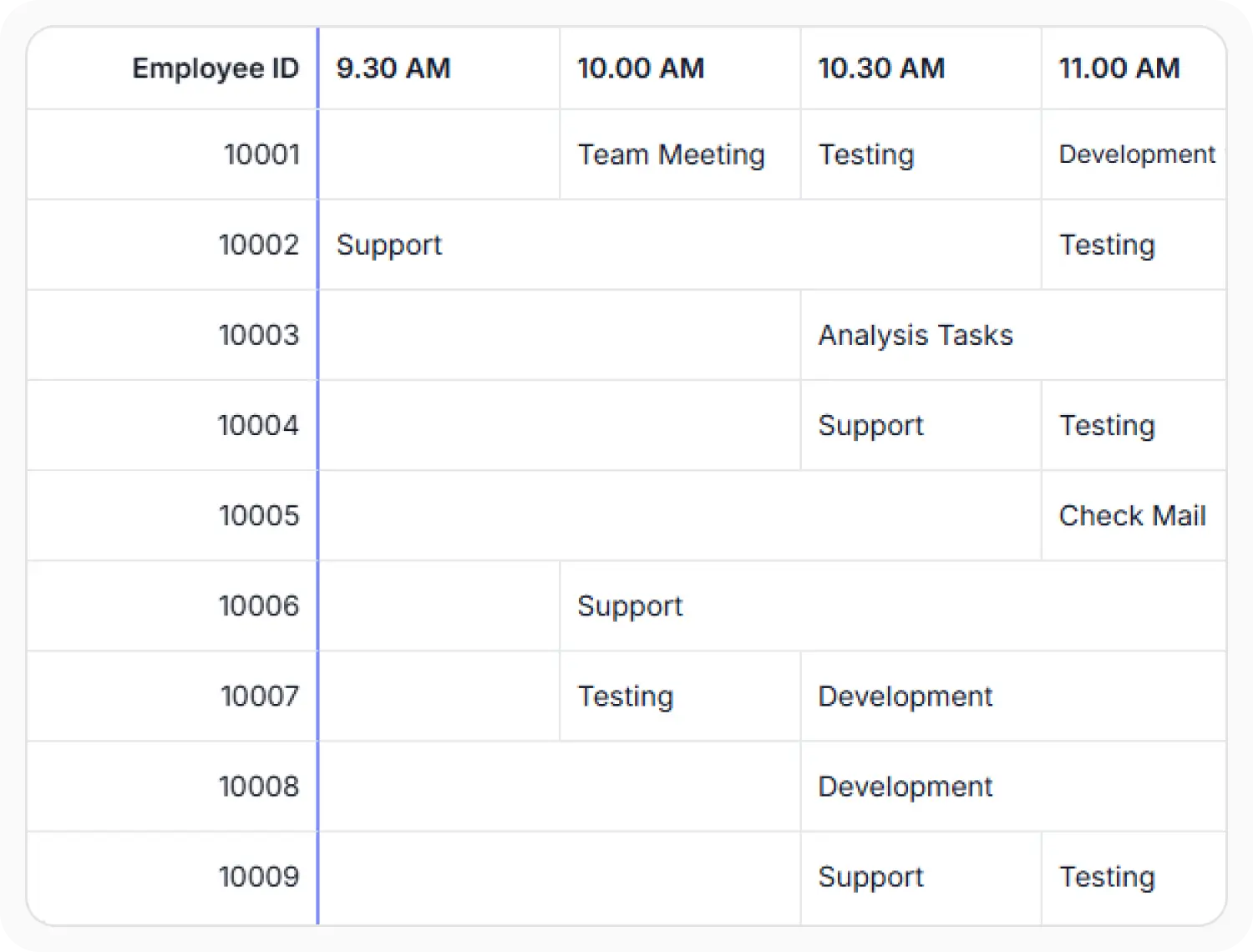
Column spanning layouts
Column spanning combines adjacent columns into a single cell to display related information across multiple columns. Use this feature when the same value or related content appears across adjacent columns to avoid displaying repeated values in the Data Grid.
See Why Developers Love Syncfusion
Our Customers Love Us
Having an excellent set of tools and a great support team, Syncfusion reduces customers’ development time. Here are some of their experiences.




Frequently Asked Questions
Do React Data Grid columns support custom formatting and headers?
Yes. React Data Grid supports column formatting, header text, cell styling, header attributes, and cell attributes for tailored presentation.
Can React Data Grid columns display calculated values?
Use value accessors to retrieve or generate custom values for display. Value accessors can combine multiple fields, calculate derived values, or change presentation without modifying the underlying data source.
How do React Data Grid columns adapt to screen size and content?
React Data Grid supports column resizing, and text wrapping to help layouts adapt to different screen sizes and varying content lengths. These features improve readability and ensure information remains accessible while making efficient use of available space.
Can foreign key columns display related values in React Data Grid?
Yes. Foreign key columns allow the React Data Grid to display meaningful values from related data sources while preserving sorting, filtering, grouping, and editing capabilities.
Does React Data Grid support column visibility?
Yes. The column chooser enables users to show or hide columns dynamically without changing the underlying dataset. This helps users focus on relevant information, reduce visual clutter, and customize data views based on their responsibilities or workflows.
How do React Data Grid columns handle auto-generation from dynamic data?
React Data Grid can auto-generate columns from incoming data, supporting dynamic datasets with minimal configuration. For greater control over formatting and behavior, explicit column definitions can be used alongside auto-generated columns.
Resources
Learn more about React Data Grid column customization
Explore demos, KB articles, and documentation to get the most out of React Data Grid column customization and data presentation features.
Explore guides, setup details, and quick-start tips.
See live use cases in action.
Ask, share, and connect with peers.
Find solutions and best practices fast.
Get expert help when needed.
Feature requests and bug reports
Track issues and suggest improvements.
See Real Success Stories
Developers around the world trust Syncfusion’s Essential Studio to simplify complex projects and speed up delivery. With a vast library of UI controls, powerful SDKs, and reliable support, Essential Studio helps teams build enterprise-ready applications with confidence.
Read Our Customer StoriesIndustry
Software development
75% Cost reduction
50% Faster development

Industry
Utilities (oil and gas)

450+ hours saved
Streamlined processes and hours of development effort saved.

Advanced, flexible features
Empowered users through robust and versatile functionality.
Industry
Software and technology
1000+ of hours saved
Accelerated development with enterprise-ready UI components.

Efficient file management
Streamlined workflows with document libraries without building them from scratch.
Industry
Software and technology

2 Years of delay avoided
Two years of delays prevented with proactive planning.

On-time delivery
Projects delivered on schedule using trusted controls.
Industry
IT services and IT consulting

Improved performance
Large datasets handled with easy customization and quick debugging.

Highly customizable
Plug-and-play controls with quick template integration.
Industry
Professional services
Instant access
Quick availability of features and resources.
Reduced dependencies
Fewer dependencies for faster development.
Awards
Greatness—it’s one thing to say you have it, but it means more when others recognize it. Syncfusion® is proud to hold the following industry awards.