Basic charts
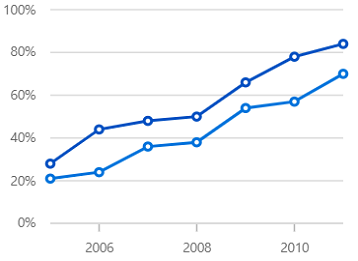
Line chart
Line charts display data over time, highlighting trends at continuous intervals.
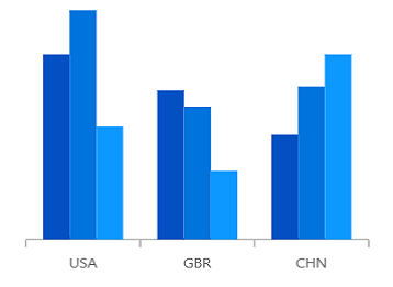
Column chart
Vertical bar charts provide a clear visual comparison of distinct sets of data.
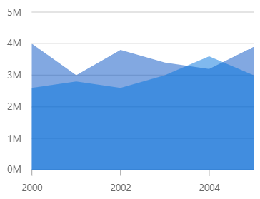
Area chart
Similar to line charts, area charts display data as continuous lines, but with the space beneath the line filled in.
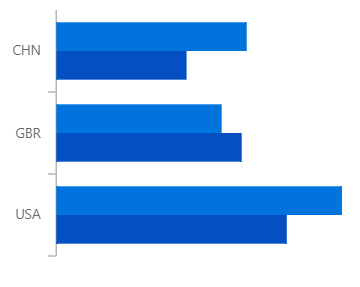
Bar chart
To compare values among categories, data can be represented using horizontal bars.
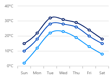
Spline charts
Spline area chart
Smooth lines connect the data points and the space beneath the lines is filled in.
Step charts
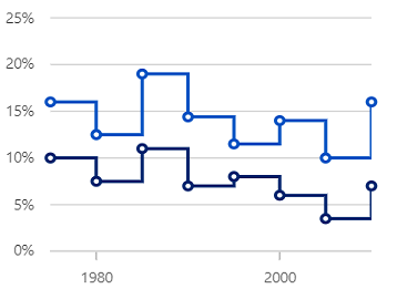
Step line chart
Connect data points using vertical and horizontal lines to represent step-like progression.
Step area chart
Like the step line chart, but with the areas connected to the lines shaded.
Stacked charts
Stacked bar
Horizontal, stacked bars plot layered data points to show the contribution of each part to the total value.
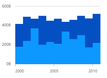
Stacked column
Data points are plotted one above the other using vertical bars.
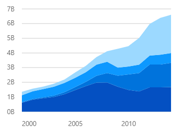
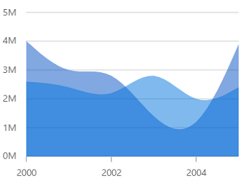
Stacked area
Like the area chart, but with the data points stacked on top of each other.
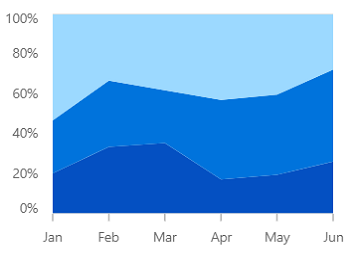
100% stacked area
Shows the contributing percentages of multiple data series in stacked columns. The cumulative value of each stacked column is always 100%.
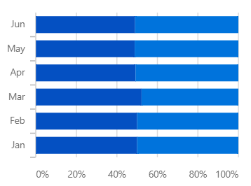
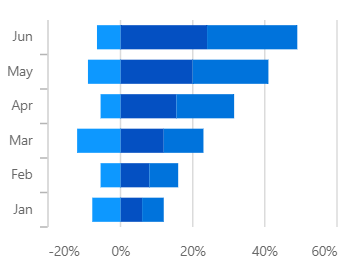
100% stacked bar
Shows the contributing percentages of multiple data series in stacked bars. The cumulative value of each stacked bar always totals 100%.
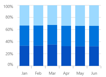
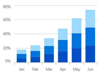
100% stacked column
Shows the contributing percentages of multiple data series in stacked columns. The cumulative value of each stacked column is always 100%.
Range charts
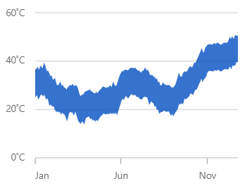
Range area chart
Shows variations in the data values for a given time. The area between the beginning and end of the range is filled.
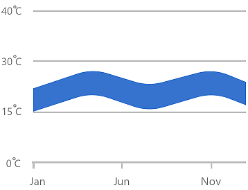
Spline range area chart
Similar to the range area chart, except that the data points are connected by a smooth line.
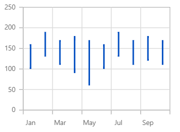
Range column chart
Like the column chart, but this shows the variations in the data values for a given time using vertical bars.
Correlation charts
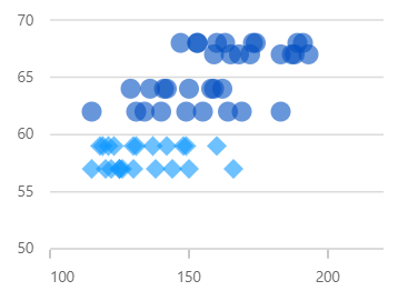
Scatter
A scatter plot displays each data point using two numerical variables to reveal the relationship between them.
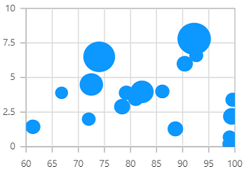
Bubble
Data is visualized with three numerical dimensions, where the third is indicated by the size of the bubble.
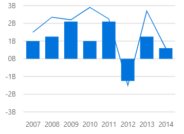
Combination chart
Combination charts, or mixed charts, combine different chart types in one display to enhance data interpretation.
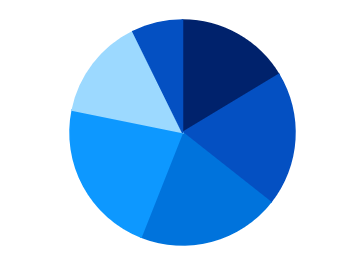
Circular charts
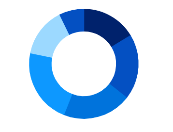
Donut chart
Similar to a pie chart, but with an open space at the center.
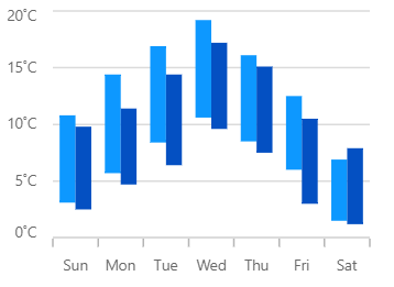
Financial charts
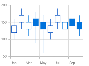
Candle chart
Used in the stock market to represent the high, low, open, close values of a stock with candle structures.
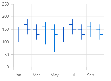
OHLC chart
Used in the stock market to represent the high, low, open, close values of a stock with OHLC structures.
Hilo chart
Shows the high and low values of the stock over the given period of time.
Pure React Components
Developed using React’s core principles, this library employs functional components and hooks without any external dependencies.