
DataGrid Control for ASP.NET MVC
- Responsive and adapts to devices with different dimensions.
- Out-of-the-box, built-in features such as editing, grouping, sorting to advanced Master detail, and stacked headers.
- Attractive HTML5 UI appearance with 17 built-in themes such as material and bootstrap.
Trusted by the world’s leading companies

Overview
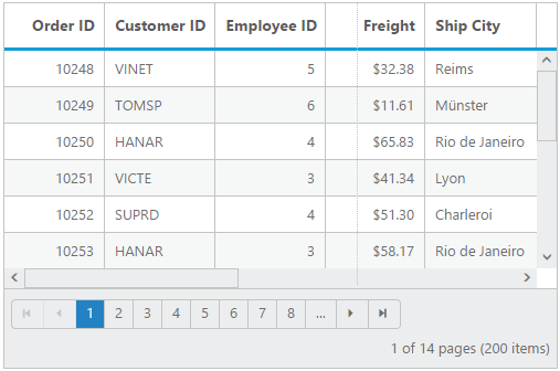
DataGrid component for ASP.NET MVC is a high-performance and feature-rich control. It is used to display data from JSON or web services in a tabular format and have more features with an attractive UI. The DataGrid control’s rich feature set includes many functionalities: data binding with adaptors, editing, filtering, grouping, paging, freezing rows and columns, aggregating rows, and exporting to Excel, Word, and PDF formats.
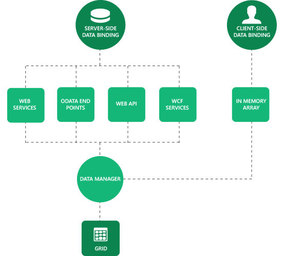
Data Binding
Data binding in grid is a powerful feature that is used to bind local JSON data and remote data, i.e., all RESTful services including OData web services. Further, it supports Essential JavaScript’s data manager binding which has a complete customization option for data processing.
MVVM
The grid control can be used in any JavaScript MVVM library environment. It has extended support for Knockout.js and AngularJS with custom binding handlers for Knockout, directives for AngularJS, and one-way and two-way bindings for both, also known as live bindings.
Virtual Scrolling
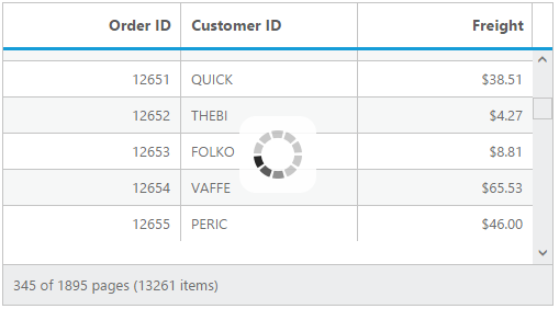
Virtual scrolling makes the grid control more compatible for scenarios where huge data sets need to be bound without a paged layout. It uses on-demand loading to add rows while scrolling, thus improving the grid’s initial loading time by requesting only visible row data.
CRUD (Create, Retrieve, Update, Delete)
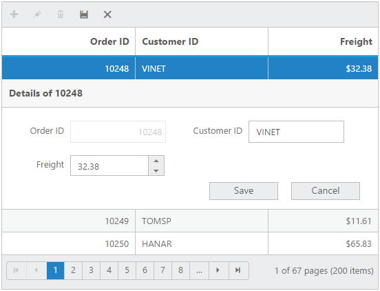
The grid control provides full support for CRUD operations. Editing can be enabled and customized with simple property settings. There are several editing options available, including different cell edit types and edit modes. Editing can be saved to a database as a batch operation using the Excel-like editing feature, and as individual operations using the dialog, inline, and external form editing options.
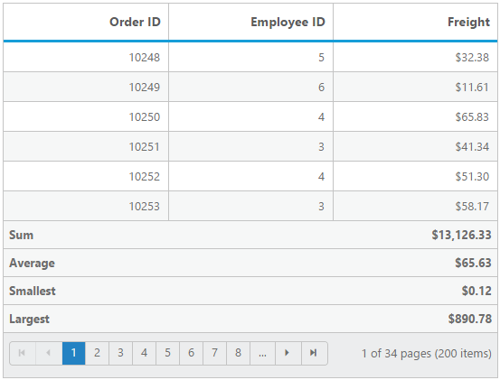
Aggregates
Aggregates for column values can be easily visualized using the grid’s summary feature. The aggregates can be customized to display values in individual summary rows, individual group summary rows, or in a group caption row. Some of the supported aggregates include sum, average, min, max, count, and custom.
Touch Optimized
All grid control features are optimized for touch screens. Supported interactions include swiping for paging and scrolling, and tapping for selection, sorting, and filtering.
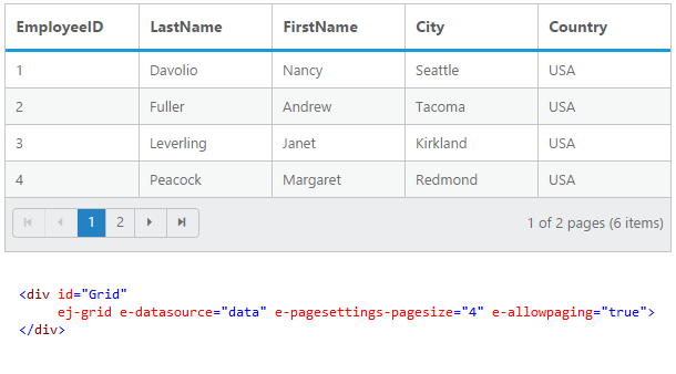
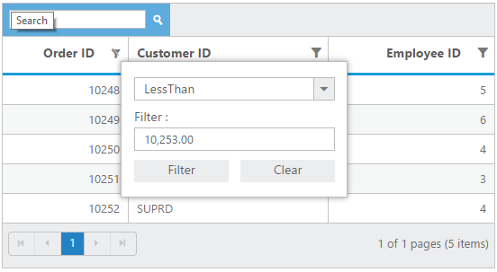
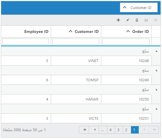
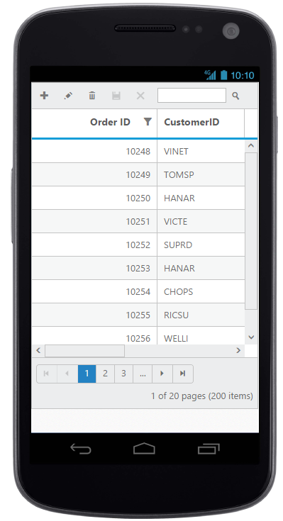
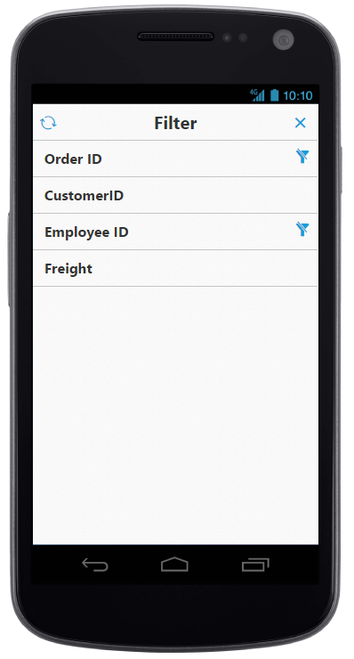
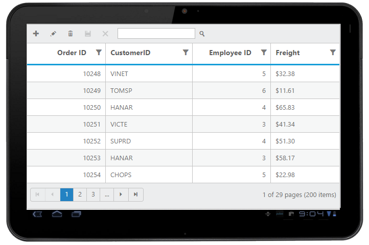
Page, Filter, and Search
Data compaction can be done in the grid using paging, filtering, and searching. For dynamically filtering data, the grid control supports two different filter types: filter menus and the filter bar. For paging, the grid control uses Essential Studio for JavaScript’s pager control for better layout and visualization, which can be fully customized. For search, the grid can be set to use an external search box or a default toolbar.
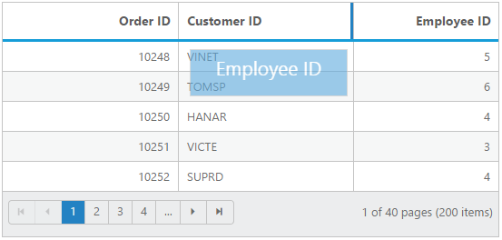
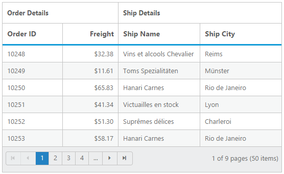
Freeze, Resize, and Reorder Columns
Grid columns can be set to freeze, resize, reorder, display, or hide at runtime and during initial loading. These features are useful when visualizing data across a large number of columns.
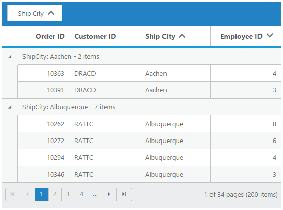
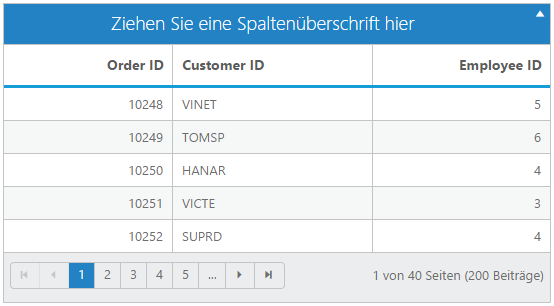
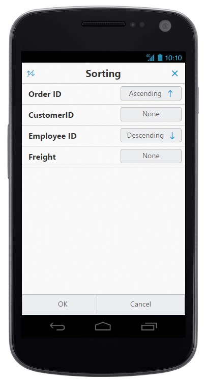
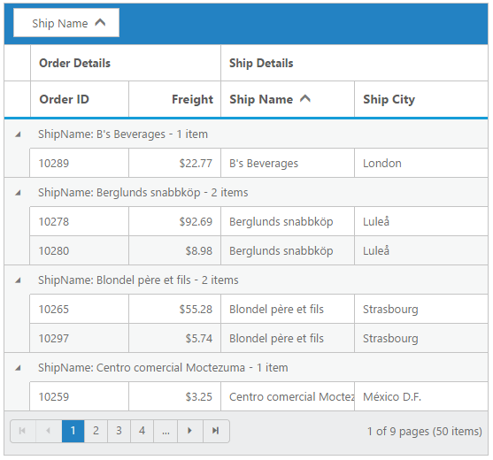
Sorting and Grouping
The grid control supports grouping and sorting to help users visualize data in an organized way. Data can be sorted or grouped in ascending or descending order. Also, the grid control provides support for multicolumn sorting and grouping. Sorting can be performed by simply clicking on column headers, and multicolumn sorting can be used by holding Ctrl and clicking on headers. For grouping, an interactive drop area is available where columns can be dragged and dropped.
Globalization and Right-To-Left (RTL) Support
All grid control strings in the user interface can be localized as needed. The grid control also supports languages with right-to-left script.
Templates
Templates can be used to create custom user experiences in the grid. Various template options allow customization of headers, columns, rows, detail rows, dialog editing, inline editing, and external form editing.
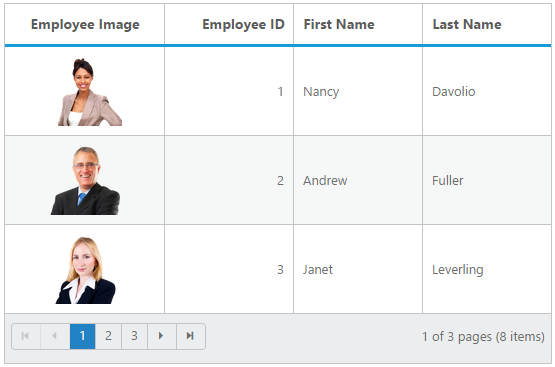
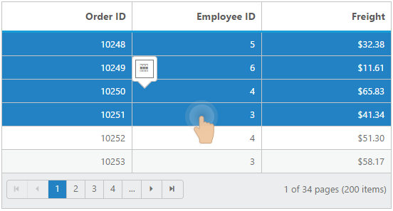
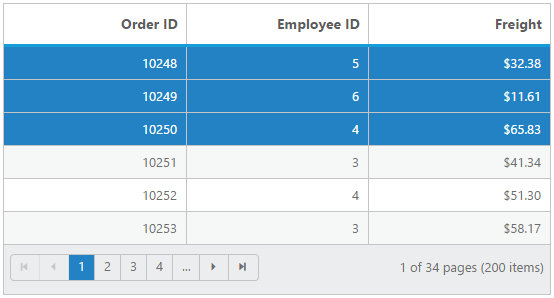
Selection
Selection enables users to select rows displayed in the grid. Based on the selection events, you can do any desired actions. There are two types of selection available in the grid: single and multiple. Single selection is used to select an individual row, and multiple selection is used to select multiple rows.
Exporting
Any data can be exported to an Excel, Word, or PDF file using the exporting feature of the grid control. It is possible to maintain group, sort, filter, and summary row data when exporting.

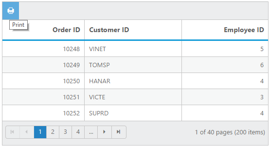
The grid control can be printed very easily by using the print grid feature. A print grid icon is available in the grid toolbar and clicking it will print the grid.
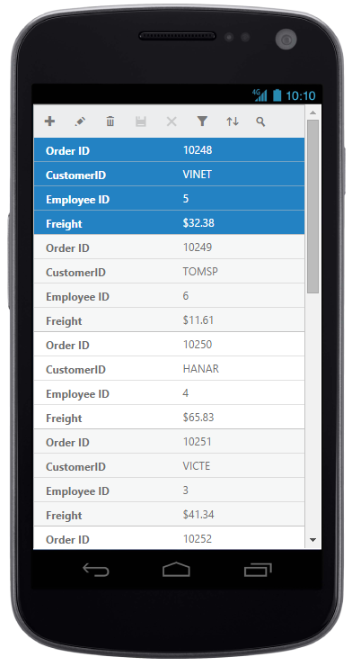
Adaptive Grid
The adaptive grid feature allows the grid to adapt to the screen size. There is a normal view and a details view to give your users the best look and feel for your application. The filtering interface also adapts in mobile views to provide a larger, more finger-friendly way to define filter parameters.
Stacked Header
Stacked headers allow you to display additional header information above grid columns. There is no limit to the number of stacked headers. The data columns can still be grouped, sorted, and filtered.
85+ ASP.NET MVC UI CONTROLS
ALL CONTROLS
GRIDS
DATA VISUALIZATION
DATA SCIENCE
EDITORS
NAVIGATION
NOTIFICATION
FILE FORMAT FRAMEWORKS
REPORTING
BUSINESS INTELLIGENCE
Rated by users across the globe
Awards
Greatness—it’s one thing to say you have it, but it means more when others recognize it. Syncfusion® is proud to hold the following industry awards.

