
ASP.NET MVC Circular Gauge Control
- Easily show the numeric values in a circular scale by using built-in features like multiple axes, custom labels, legend, and more.
- Customize the appearance of the circular gauge completely to simulate speedometer, analog clock, etc.
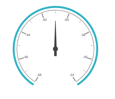
- Create half or quarter circular gauges to visualize it in a small area by modifying the start and end angles.
Trusted by the world’s leading companies

Overview
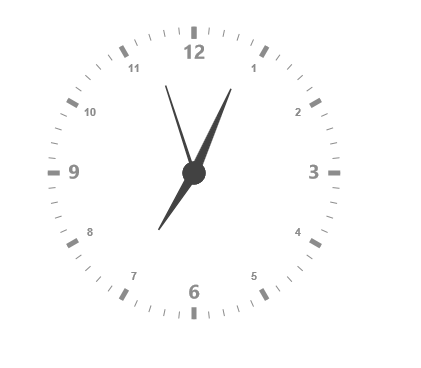
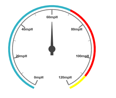
The circular gauge looks like a speedometer in the vehicles. The elements of the gauge such as pointer, pointer cap, scales, ticks, labels, and state indicators can be easily customized.
Easy Customization
The look and feel of a gauge is easily customized by changing the styles of the pointer, pointer cap, scales, ticks, labels, and state indicators.
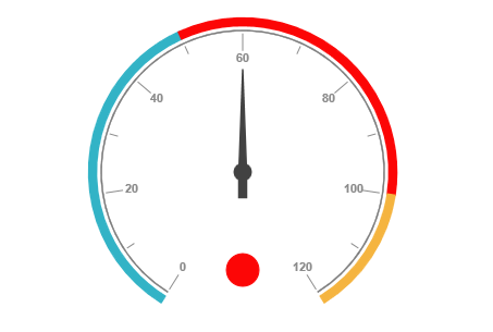
State Indicator Styles
The state indicator styles available within circular gauges are circular LED, rectangular LED, rounded rectangular LED, and the normal text. The main purpose of this indicator is to show the current state of the gauge with a specific color, based on its current value.
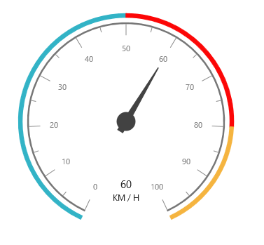
Custom labels
The circular gauge control supports custom labels. These labels display custom text and can be customized by location, background color, and size.
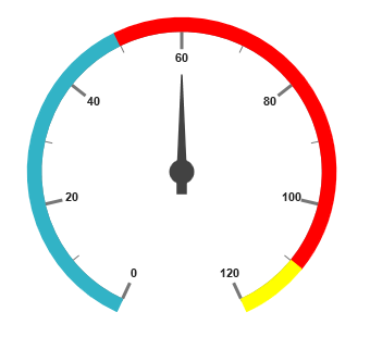
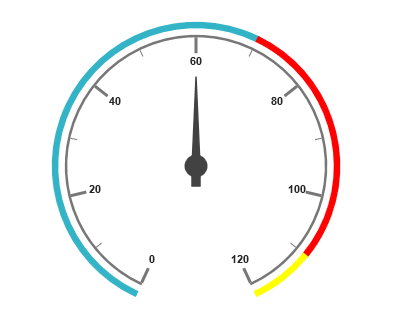
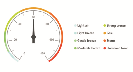
Range Indicators
The gauge control supports range indicators that can be used to highlight each specific range within a gauge scale with a different color. The users can specify their required start and end values for each range indicator within the gauge. They can also be located at different positions — such as cross (across the scale), inside (below the scale), and outside (above the scale).
Multiple Scales and Pointers
Gauges can be customized with multiple scales and pointers within a single gauge. Any number of scale elements and pointers can be added to a gauge.
Label Format
The circular gauge control provides various formatting options for labels to be displayed in any desirable format. For instance, the percent symbol can be specified to be appended after the label value.
Label Tick Customization
The appearance of a label tick mark in a circular gauge can be easily customized with its available options. The height and width of the text, its distance from the scale, and also its color can be easily customized.
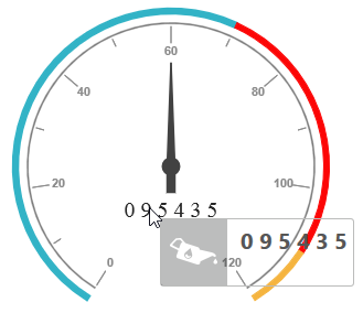
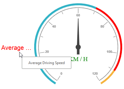
Label Tooltip
Tooltip will be displayed for the gauge label and custom labels. The tooltip can be customized with templates.
Outer Custom Label
An outer custom label can be displayed on the top, left, right, and bottom of the gauge.
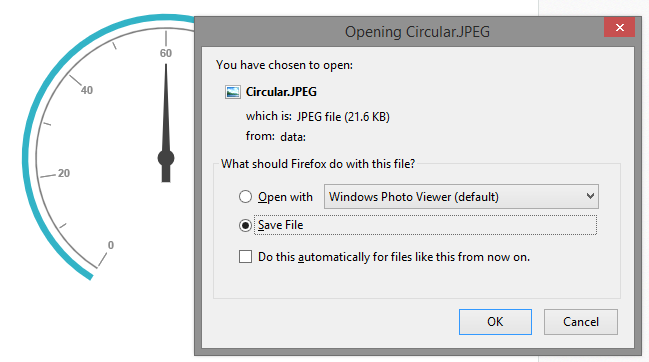
Export
The gauge control provides support for exporting a gauge control into various image formats. Circular gauges can be exported into formats such as .jpg, .bmp, or .gif.
Pointer Image
The circular gauge control provides support to replace the pointer with an image. Image pointer is applicable for marker and needle type pointers.

Legend
The legend will provide additional information and helpful in identifying the individual ranges in gauge. Circular gauge also provides various options to customize the position, alignment, shape, size, border and font of the legend.
85+ ASP.NET MVC UI CONTROLS
ALL CONTROLS
GRIDS
DATA VISUALIZATION
DATA SCIENCE
EDITORS
NAVIGATION
NOTIFICATION
FILE FORMAT FRAMEWORKS
REPORTING
BUSINESS INTELLIGENCE
Rated by users across the globe
Awards
Greatness—it’s one thing to say you have it, but it means more when others recognize it. Syncfusion® is proud to hold the following industry awards.

