


Explore React Charts Trendlines
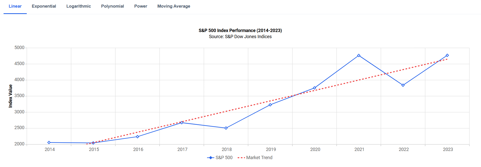
React Charts trendlines help reveal patterns, identify long-term trends, and forecast future values using linear, exponential, logarithmic, polynomial, power, and moving average models. Trendlines can be added to line, scatter, area, column, and financial charts without restructuring underlying data.
Show trends with a linear trendline
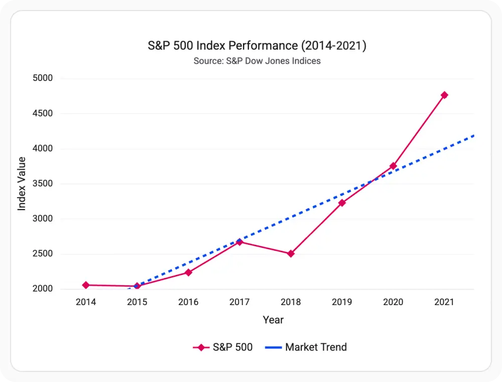
A linear trendline shows the overall direction of data that increases or decreases at a consistent rate. It helps make long-term trends easier to understand by reducing the impact of short-term fluctuations. Use it when you want to track steady growth or decline over time.
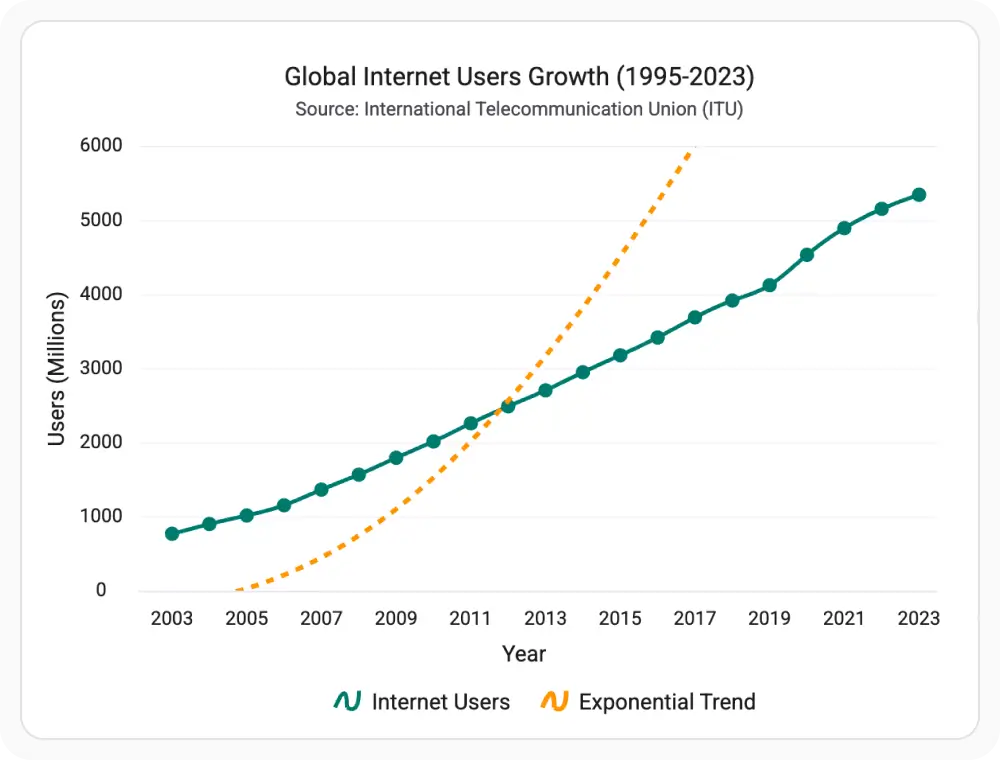
Show rapid growth with an exponential trendline
An exponential trendline models data that increases or decreases at an accelerating rate over time. It helps identify growth patterns where changes become progressively larger rather than remaining constant. Use it when growth or decline speeds up over time.
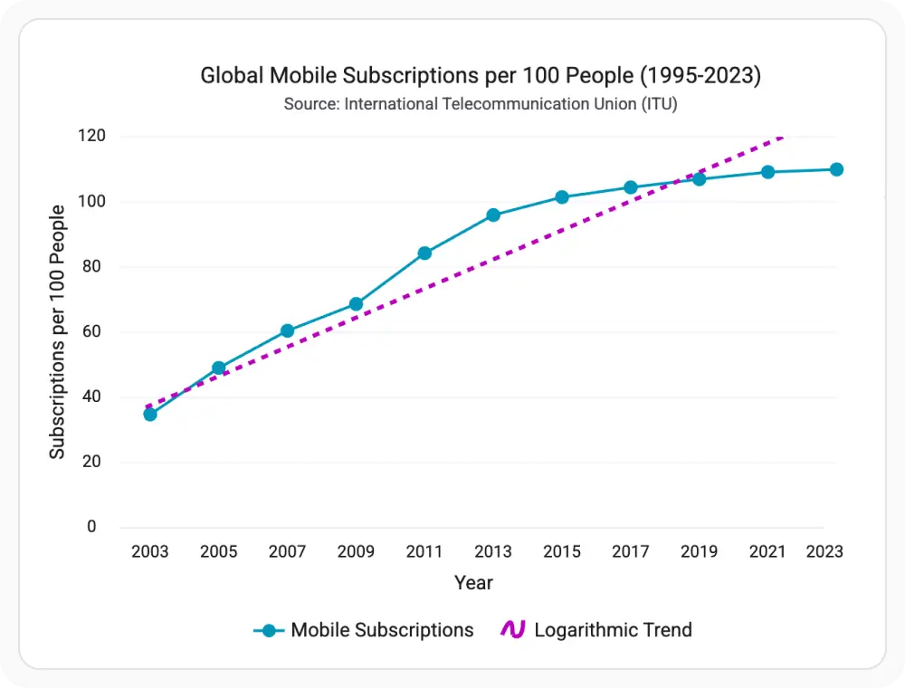
Show slowing growth with a logarithmic trendline
A logarithmic trendline models data that grows rapidly at first and then gradually slows over time. It helps identify patterns where growth begins to level off as values increase. Use it when early rapid growth is followed by slower, incremental progress.
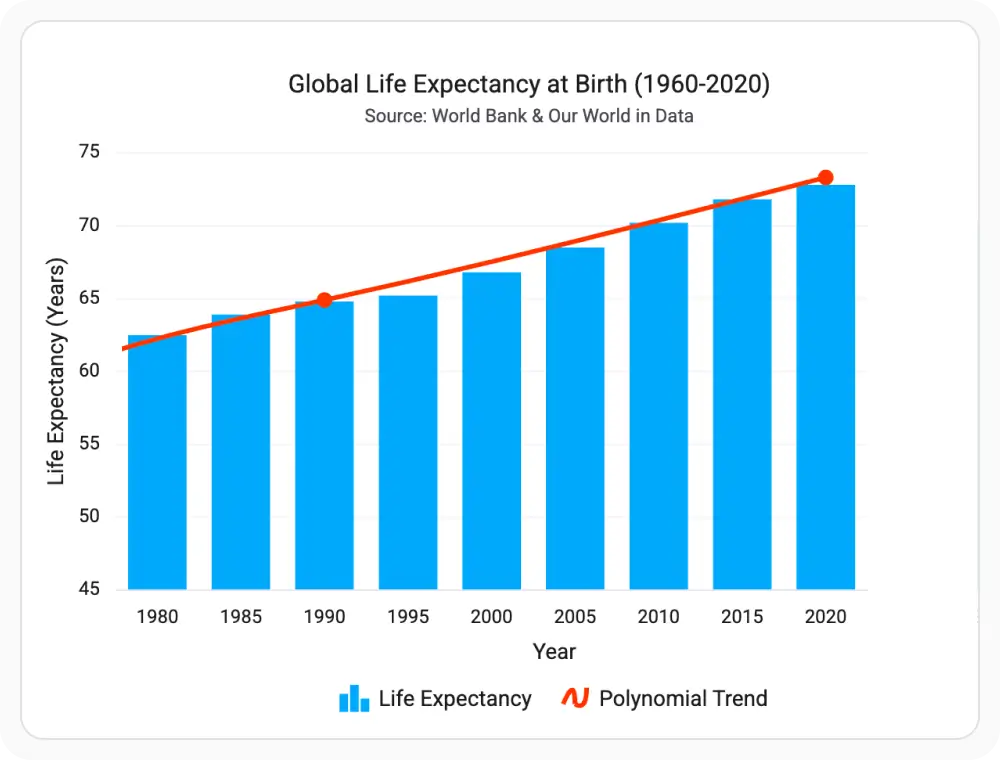
Show complex trends with a polynomial trendline
A polynomial trendline models data with multiple changes in direction, making it easier to visualize curves, fluctuations, and non-linear patterns. It helps reveal underlying trends in datasets that contain repeated rises and declines. Use it when data exhibits recurring peaks, valleys, or changing growth patterns.
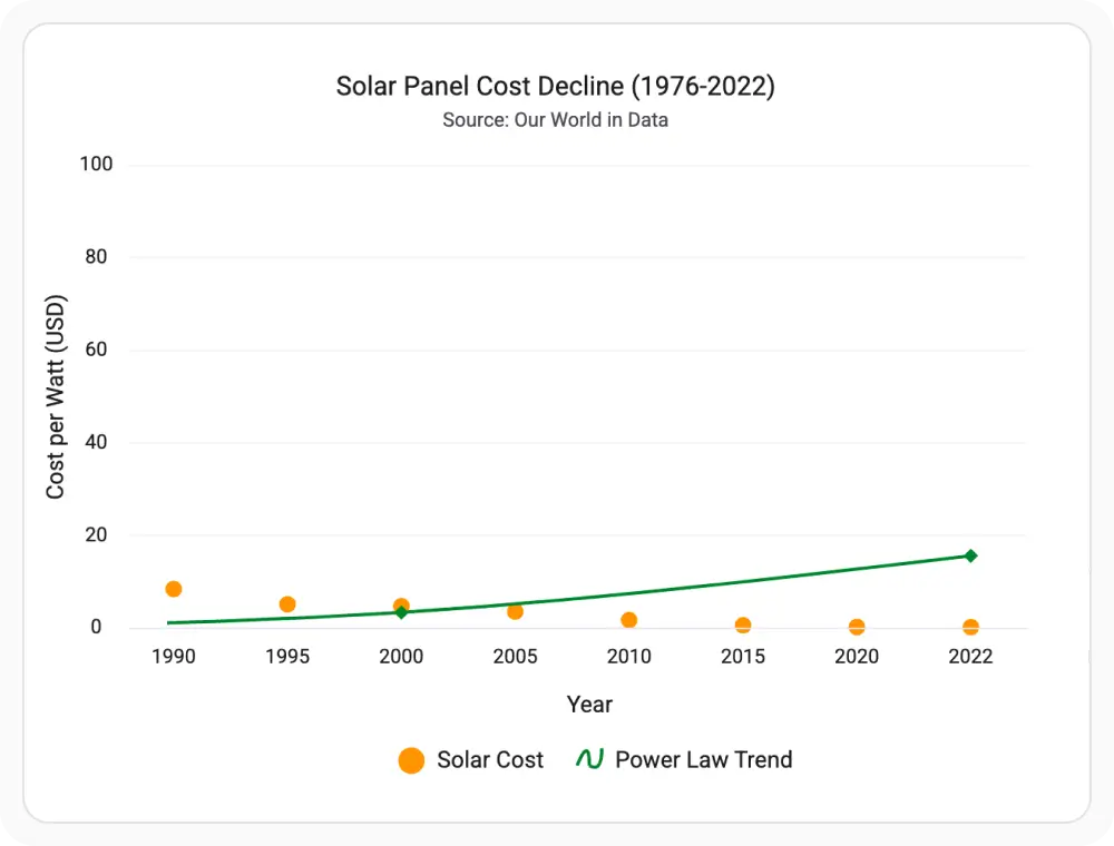
Show relationships with a power trendline
A power trendline models relationships where one value changes proportionally to another. It helps identify patterns between connected measurements and reveal how values increase or decrease relative to each other. Use it when analyzing correlated data that follows a non-linear relationship.
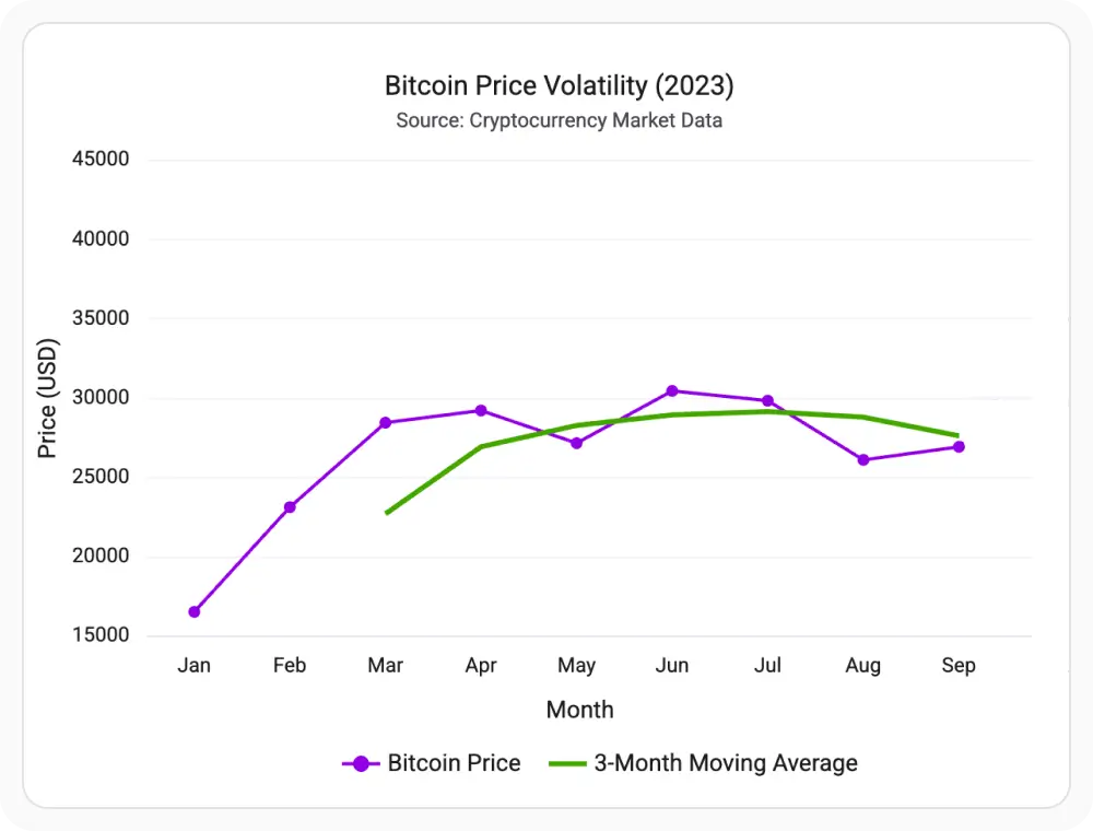
Reduce fluctuations with a moving average
A moving average trendline smooths short-term fluctuations by averaging data points over a specified period. It helps reduce visual noise and makes long-term trends easier to identify without being influenced by temporary spikes or drops. Use it when analyzing data with frequent variations or recurring fluctuations.
See Why Developers Love Syncfusion
Our Customers Love Us
Having an excellent set of tools and a great support team, Syncfusion reduces customers’ development time. Here are some of their experiences.




Frequently Asked Questions
What is a React Charts trendline?
A trendline is a line added to a chart that helps show the overall direction of the data. It makes trends easier to understand by reducing the visual impact of short-term fluctuations.
Can React Charts display multiple trendlines on the same series?
Yes. Multiple trendlines can be added to the same series for comparison and analysis. This helps evaluate different trend models and identify the best fit for your data.
When should I use an exponential trendline or a logarithmic trendline?
An exponential trendline is useful when data increases or decreases at an accelerating rate. A logarithmic trendline is ideal when changes are rapid initially and then gradually slow over time.
Which chart types support React Charts trendlines?
Trendlines can be added to line, scatter, column, area, candle, and hilo charts. They help highlight overall data patterns and make trends easier to interpret.
Can React Charts forecast future values using trendlines?
Yes. Trendlines can be extended beyond existing data points to estimate future values. They can also be extended backward to analyze and approximate past trends.
When should I use a polynomial trendline?
A polynomial trendline is suitable for data that rises and falls multiple times. It helps represent complex patterns that cannot be accurately shown with a simple straight line.
Resources
Learn more about our React Charts
Explore demos, KB articles, and documentation to get the most out of our React Charts.
Explore guides, APIs, and quick-start tips
Find solutions and best practices fast
See live use cases in action
Get expert help when you need it
Ask, share, and connect with peers
Feature requests and bug reports
Track issues and suggest improvements
See Real Success Stories
Developers around the world trust Syncfusion’s Essential Studio to simplify complex projects and speed up delivery. With a vast library of UI controls, powerful SDKs, and reliable support, Essential Studio helps teams build enterprise-ready applications with confidence.
Read Our Customer StoriesIndustry
Software development
75% Cost reduction
50% Faster development

Industry
Utilities (oil and gas)

450+ hours saved
Streamlined processes and hours of development effort saved.

Advanced, flexible features
Empowered users through robust and versatile functionality.
Industry
Software and technology
1000+ of hours saved
Accelerated development with enterprise-ready UI components.

Efficient file management
Streamlined workflows with document libraries without building them from scratch.
Industry
Software and technology

2 Years of delay avoided
Two years of delays prevented with proactive planning.

On-time delivery
Projects delivered on schedule using trusted controls.
Industry
IT services and IT consulting

Improved performance
Large datasets handled with easy customization and quick debugging.

Highly customizable
Plug-and-play controls with quick template integration.
Industry
Professional services
Instant access
Quick availability of features and resources.
Reduced dependencies
Fewer dependencies for faster development.
Awards
Greatness—it’s one thing to say you have it, but it means more when others recognize it. Syncfusion® is proud to hold the following industry awards.