


Explore theming and styling for React Charts
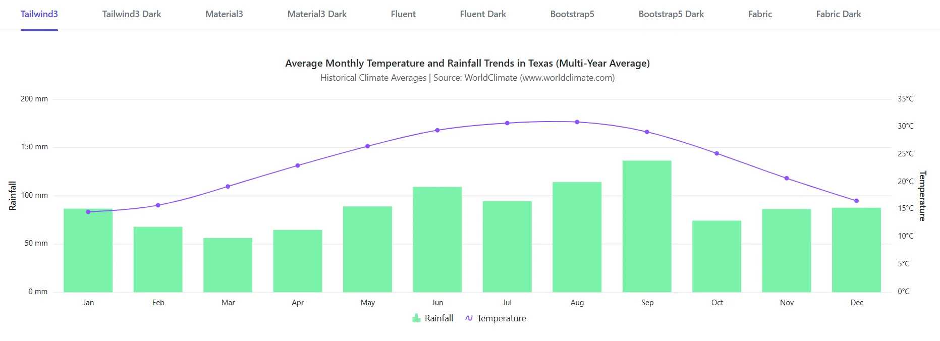
Create visually consistent and brand-aligned data visualizations with extensive theming and styling options. React Charts includes built-in themes for Material, Fluent, Bootstrap, Tailwind, Fabric, and more, along with support for light and dark modes, runtime theme switching, custom color palettes, and high contrast accessibility themes.
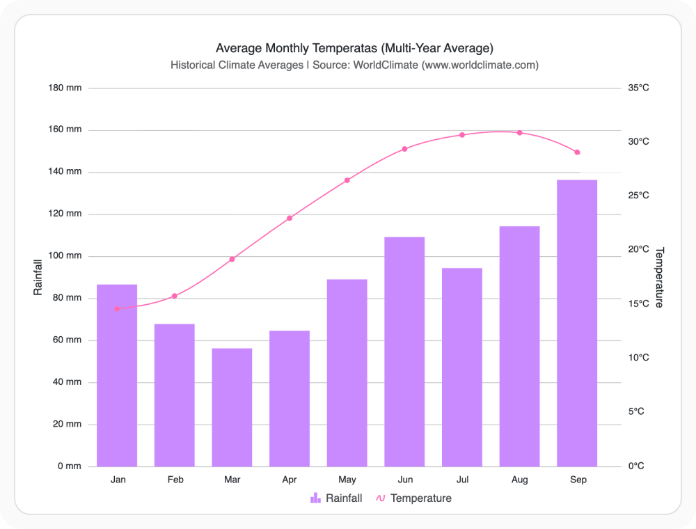
Match Material design standards
Apply the Material theme to align chart visuals with Google’s design language and UI guidelines. It provides a clean, modern appearance that helps charts blend seamlessly with Material-based applications. Use it when building applications that follow Material Design principles.
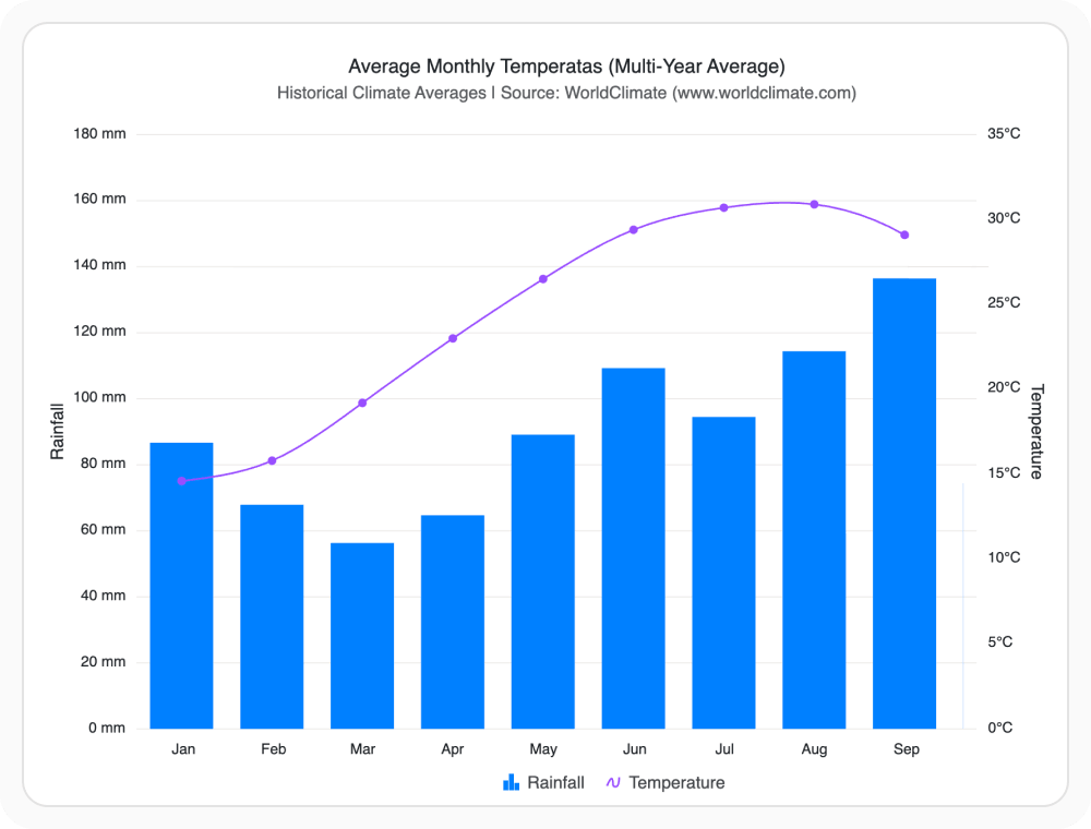
Match Fluent design standards
Apply the Fluent theme to align chart visuals with Microsoft’s design language and user experience guidelines. It provides a modern, professional appearance that helps charts integrate seamlessly with enterprise applications and business solutions. Use it when developing applications that follow Fluent Design principles.
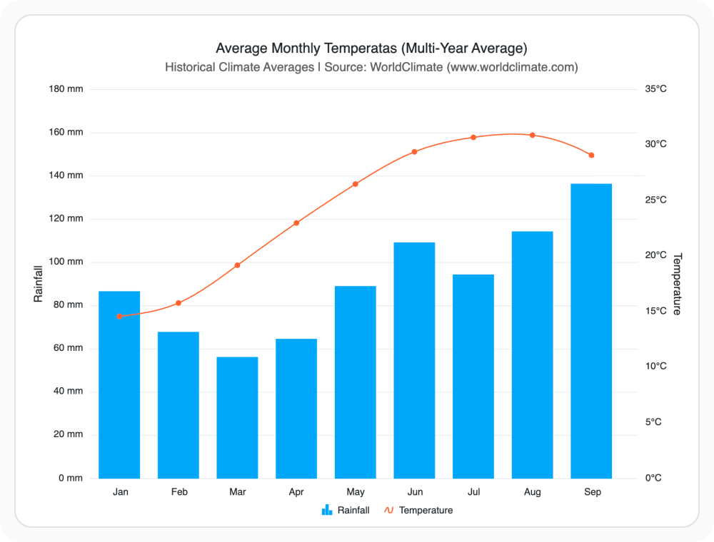
Match Bootstrap design standards
Apply the Bootstrap theme to align chart visuals with Bootstrap based user interfaces and styling conventions. It helps charts integrate seamlessly with existing layouts, components, and design patterns while maintaining a consistent user experience. Use it when building applications that rely on Bootstrap for styling and layout.
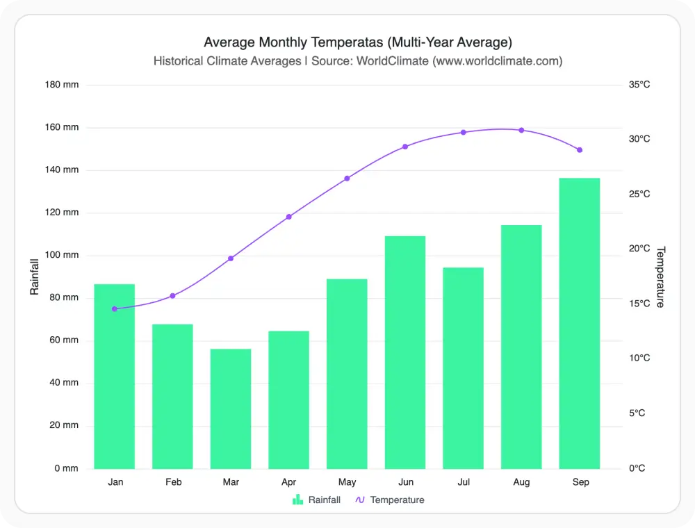
Match Tailwind design standards
Apply the Tailwind theme to align chart visuals with Tailwind CSS design patterns and styling conventions. It provides a clean, modern appearance that helps charts integrate seamlessly with dashboards, web applications, and data-driven user experiences. Use it when building applications that use Tailwind CSS.
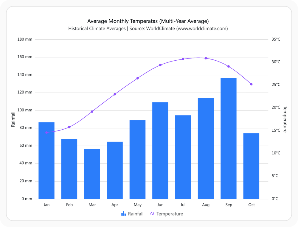
Match Fabric design standards
Apply the Fabric theme to align chart visuals with Microsoft’s Office-inspired design language. It provides a familiar and professional appearance that helps charts integrate seamlessly with enterprise applications and productivity-focused solutions. Use it when building business applications that follow Office-style design patterns.
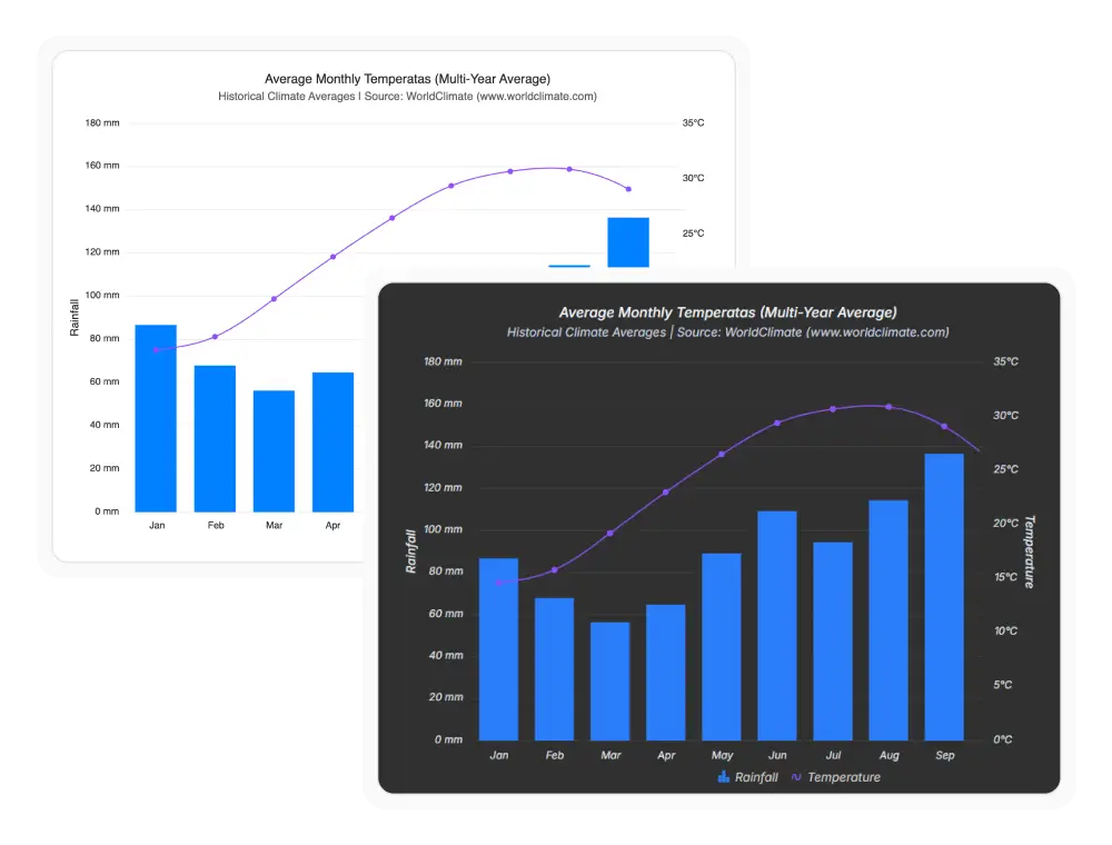
Support light and dark modes
Built-in themes include matching light and dark variants that help charts remain visually consistent with the surrounding application. This provides a seamless viewing experience across different environments and user preferences. Use it when supporting light and dark themes throughout your application.
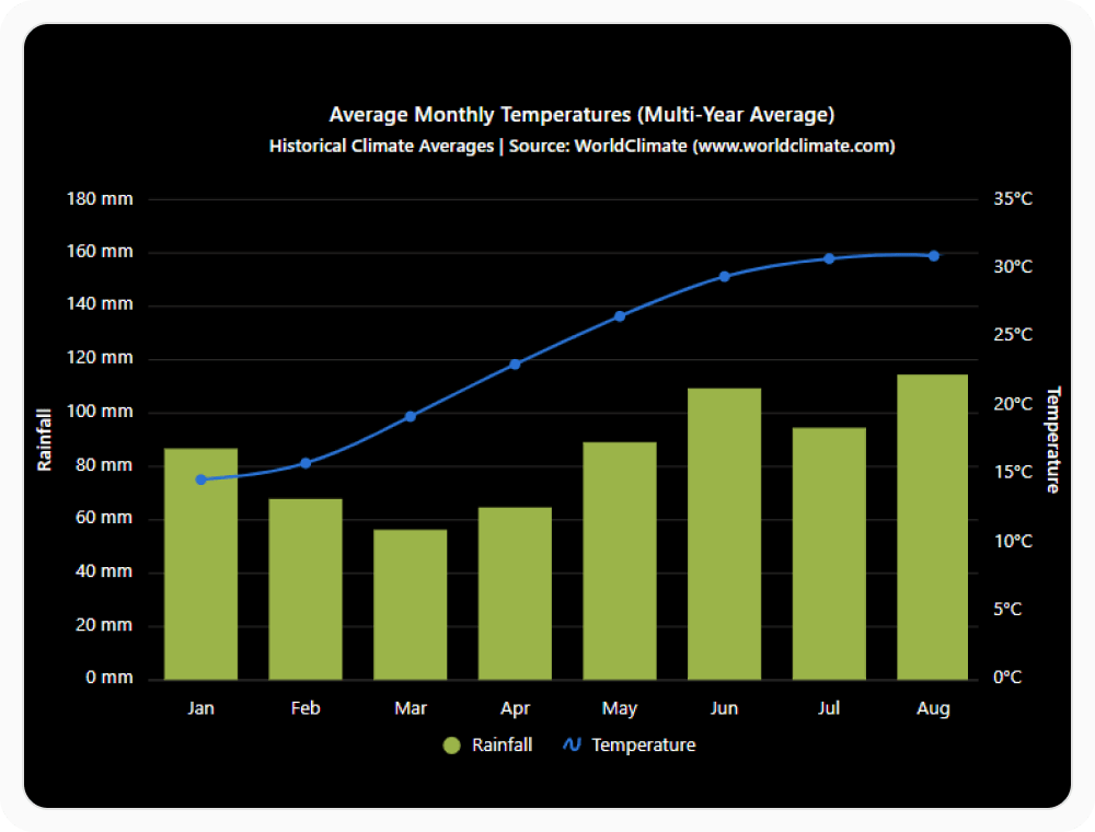
Apply high contrast accessibility themes
High contrast themes improve chart readability by increasing visual distinction between chart elements, text, and backgrounds. They help support accessibility requirements and make data easier to interpret in demanding viewing conditions. Use it when accessibility, compliance, and readability are important requirements.
See Why Developers Love Syncfusion
Our Customers Love Us
Having an excellent set of tools and a great support team, Syncfusion reduces customers’ development time. Here are some of their experiences.




Frequently Asked Questions
Which design systems are supported by React Charts themes?
React Charts includes built-in themes for Material, Fluent, Bootstrap, Tailwind, and Fabric design systems, each with matching light and dark variants.
Do all built-in React Charts themes include dark mode?
Most built-in themes include matching dark mode variants, providing a consistent visual experience across both light and dark interfaces.
Are React Charts themes consistent across chart types?
Yes. All chart types share the same underlying theme system, maintaining a consistent appearance across the entire application interface.
How can themes be switched dynamically in React Charts?
Themes can be changed at runtime without reloading the page, allowing charts to stay aligned with application theme changes instantly.
Can the built-in React Charts themes be customized?
Yes. Colors, fonts, and styling properties can be customized to match branding guidelines and specific application design requirements easily.
Are high-contrast themes available for React Charts accessibility?
Yes. High-contrast themes are also available to improve readability and support accessibility requirements for users with visual impairments.
Resources
Learn more about our React Charts
Explore demos, KB articles, and documentation to get the most out of our React Charts.
Explore guides, APIs, and quick-start tips
Find solutions and best practices fast
See live use cases in action
Get expert help when you need it
Ask, share, and connect with peers
Feature requests and bug reports
Track issues and suggest improvements
See Real Success Stories
Developers around the world trust Syncfusion’s Essential Studio to simplify complex projects and speed up delivery. With a vast library of UI controls, powerful SDKs, and reliable support, Essential Studio helps teams build enterprise-ready applications with confidence.
Read Our Customer StoriesIndustry
Software development
75% Cost reduction
50% Faster development

Industry
Utilities (oil and gas)

450+ hours saved
Streamlined processes and hours of development effort saved.

Advanced, flexible features
Empowered users through robust and versatile functionality.
Industry
Software and technology
1000+ of hours saved
Accelerated development with enterprise-ready UI components.

Efficient file management
Streamlined workflows with document libraries without building them from scratch.
Industry
Software and technology

2 Years of delay avoided
Two years of delays prevented with proactive planning.

On-time delivery
Projects delivered on schedule using trusted controls.
Industry
IT services and IT consulting

Improved performance
Large datasets handled with easy customization and quick debugging.

Highly customizable
Plug-and-play controls with quick template integration.
Industry
Professional services
Instant access
Quick availability of features and resources.
Reduced dependencies
Fewer dependencies for faster development.
Awards
Greatness—it’s one thing to say you have it, but it means more when others recognize it. Syncfusion® is proud to hold the following industry awards.