


Explore React Charts Dashboard Visualizations
Create interactive dashboard visualizations that help users track KPIs, monitor business performance, analyze trends, and respond to changing data. Use React Charts to build sales, finance, manufacturing, real-time, and responsive dashboard experiences for data-driven insights and decision-making.
Track sales performance with dashboards
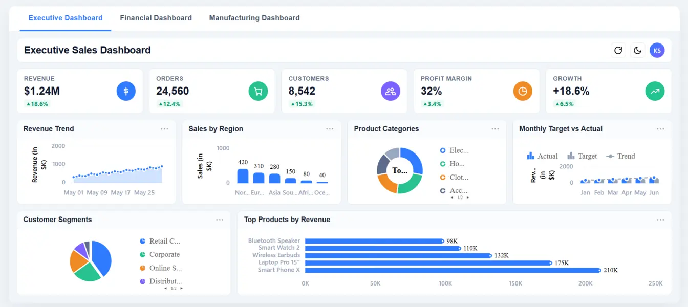
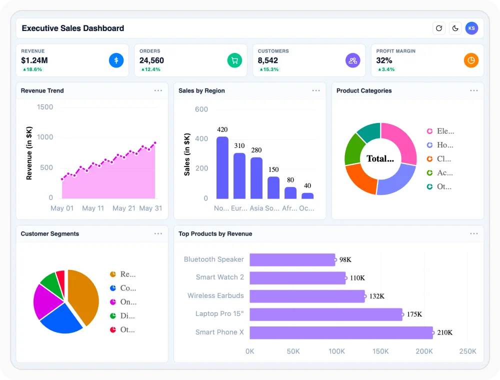
Sales dashboards consolidate revenue, product performance, customer behavior, and regional sales metrics into a single visual view. They help teams monitor trends, identify opportunities, and make data-driven decisions. Use it when tracking sales performance and measuring business growth.
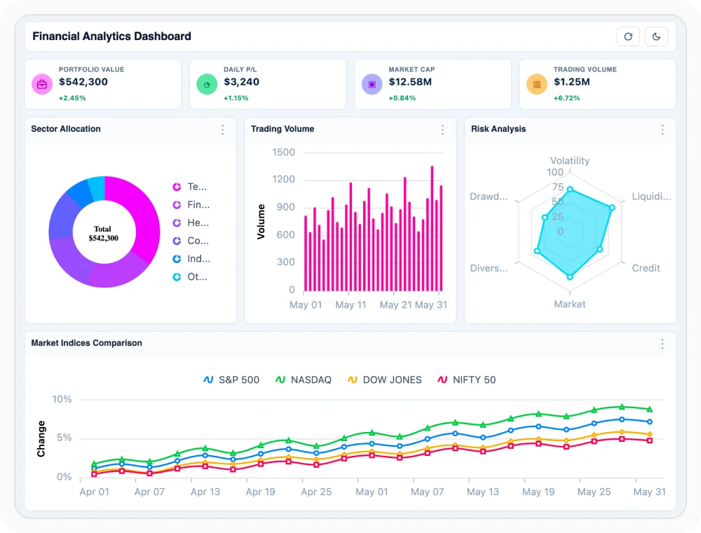
Monitor financial performance through dashboards
Financial dashboards visualize investments, market activity, portfolio performance, and key financial metrics in real time. They help users evaluate financial health, monitor market trends, and support strategic decision-making. Use it when tracking financial performance and business outcomes.
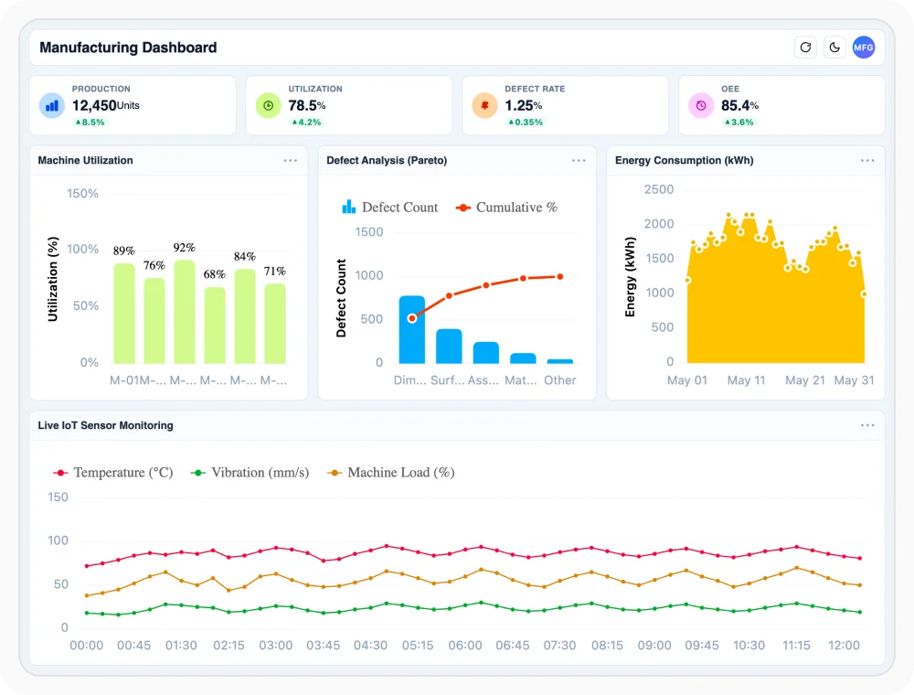
Monitor manufacturing operations with dashboards
Manufacturing dashboards provide visibility into production output, equipment utilization, quality metrics, and operational efficiency. They help teams identify bottlenecks, optimize processes, and improve overall performance. Use it when monitoring production activities and industrial operations.
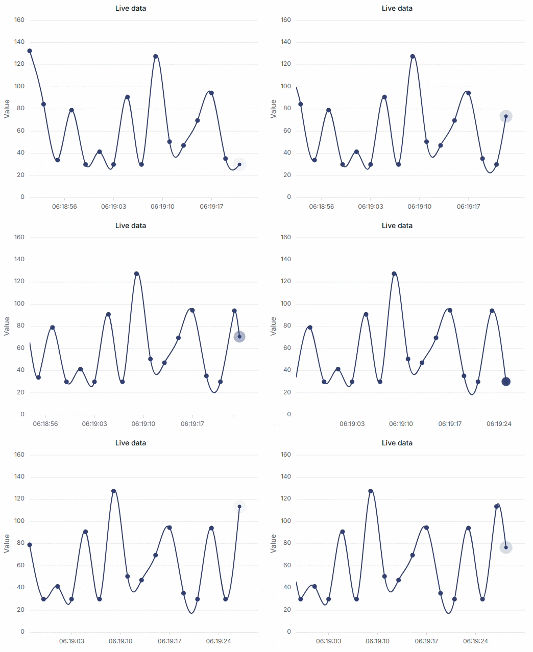
Track live data with dashboards
Real-time dashboards display continuously updated data from business systems, applications, and connected devices. They help users monitor changing conditions, respond quickly to events, and make timely decisions. Use it when tracking live metrics and ongoing business activities.
See Why Developers Love Syncfusion
Our Customers Love Us
Having an excellent set of tools and a great support team, Syncfusion reduces customers’ development time. Here are some of their experiences.




Frequently Asked Questions
What React Charts types work best for dashboard KPI tracking?
Line charts help track KPI trends over time, column charts compare values across categories, and pie or doughnut charts visualize contribution and distribution. Combining chart types provides a broader view of business performance.
How does React Charts handle multiple data series in dashboards?
React Charts can display multiple data series in a single chart, helping users compare trends, categories, or performance metrics side by side within the same dashboard for clearer analysis.
What dashboard interactions does React Charts support?
React Charts support interactions such as tooltips, zooming, panning, selection, and crosshair. These features help users explore dashboard data and understand insights more effectively.
Can React Charts support real-time data updates?
Yes. React Charts can update as new data becomes available, making live dashboards useful for monitoring business, financial, and operational metrics with timely insights and continuous performance tracking.
Is React Charts responsive for mobile screens?
Yes. React Charts are responsive and adapt to different screen sizes, helping dashboards remain readable and easy to interact with across desktops, tablets, and mobile devices.
Can multiple React Charts types be combined in one dashboard?
Yes. Multiple React Charts types can be combined in one dashboard to show trends, comparisons, proportions, and key performance indicators together for a complete performance view.
Resources
Learn more about our React Charts
Explore demos, KB articles, and documentation to get the most out of our React Charts.
Explore guides, APIs, and quick-start tips
Find solutions and best practices fast
See live use cases in action
Get expert help when you need it
Ask, share, and connect with peers
Feature requests and bug reports
Track issues and suggest improvements
See Real Success Stories
Developers around the world trust Syncfusion’s Essential Studio to simplify complex projects and speed up delivery. With a vast library of UI controls, powerful SDKs, and reliable support, Essential Studio helps teams build enterprise-ready applications with confidence.
Read Our Customer StoriesIndustry
Software development
75% Cost reduction
50% Faster development

Industry
Utilities (oil and gas)

450+ hours saved
Streamlined processes and hours of development effort saved.

Advanced, flexible features
Empowered users through robust and versatile functionality.
Industry
Software and technology
1000+ of hours saved
Accelerated development with enterprise-ready UI components.

Efficient file management
Streamlined workflows with document libraries without building them from scratch.
Industry
Software and technology

2 Years of delay avoided
Two years of delays prevented with proactive planning.

On-time delivery
Projects delivered on schedule using trusted controls.
Industry
IT services and IT consulting

Improved performance
Large datasets handled with easy customization and quick debugging.

Highly customizable
Plug-and-play controls with quick template integration.
Industry
Professional services
Instant access
Quick availability of features and resources.
Reduced dependencies
Fewer dependencies for faster development.
Awards
Greatness—it’s one thing to say you have it, but it means more when others recognize it. Syncfusion® is proud to hold the following industry awards.