Try Our Live Demo
Choose the right visualization for analysis scenarios
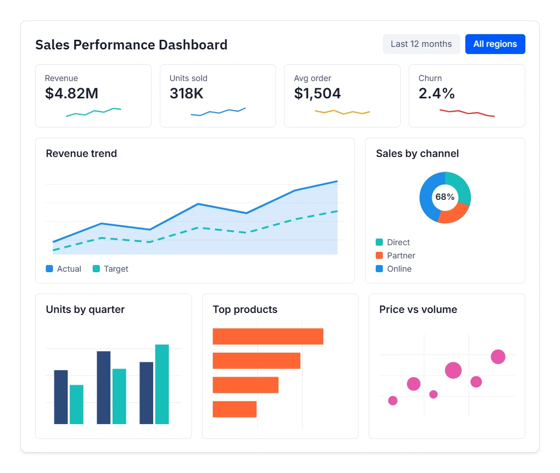
Syncfusion Charts includes general-purpose and specialized visualizations for business reporting, financial analysis, process flows, engineering applications, and advanced data exploration.
Analyze Business Data
Visualize trends, comparisons, distributions, and relationships with 55+ 2D chart types.
Show Proportions Clearly
Display part-to-whole relationships with Circular and 3D charts.
Analyze Specialized Data
Analyze market data, process flows, and RF characteristics with Financial Charts, Sankey, and Smith Chart.
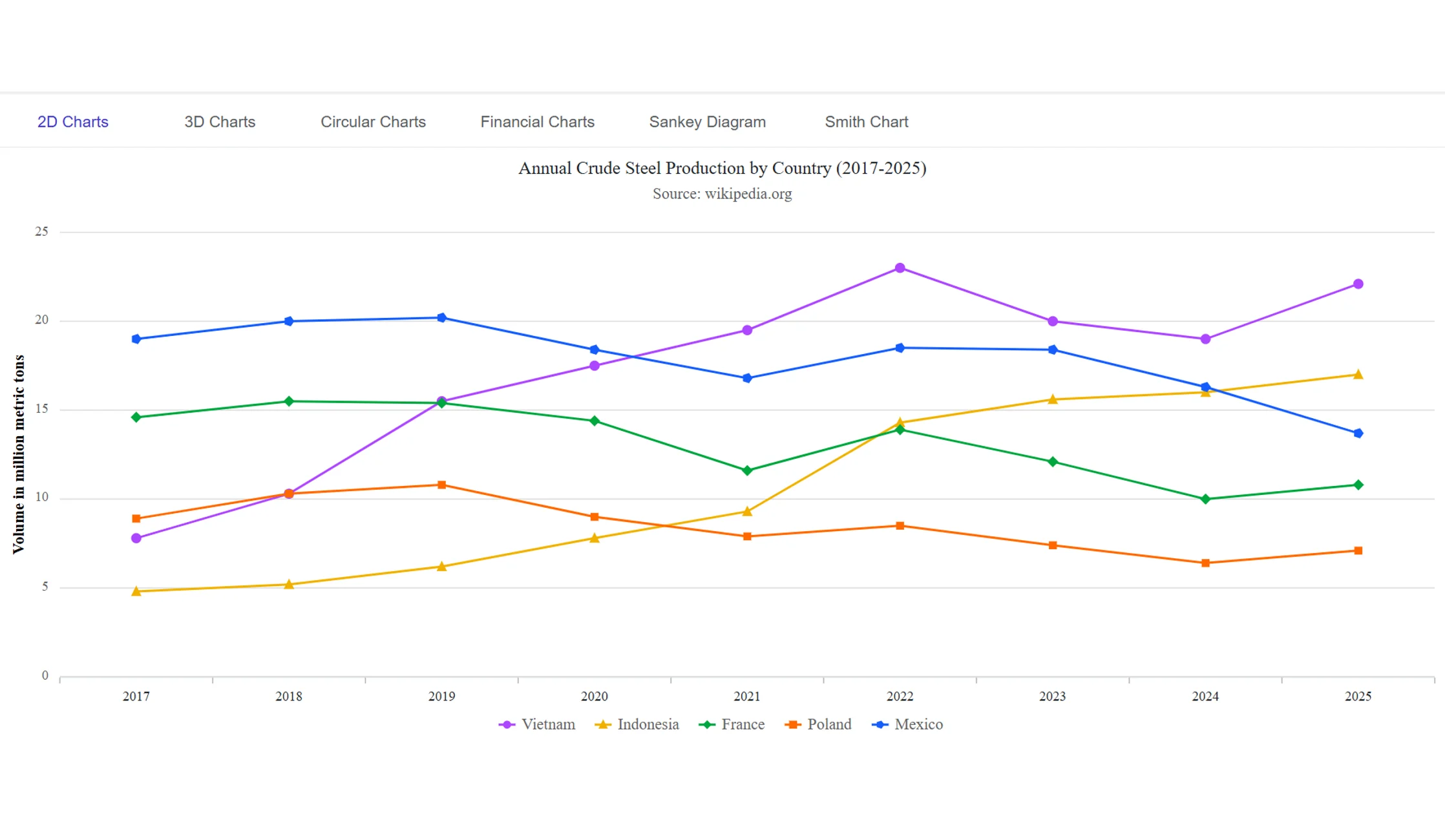
2D Charts
Visualize trends, comparisons, distributions, relationships, and cumulative values with 55+ 2D chart types. Use them when chart types must change without rebuilding data, since the consistent API and data model support flexible switching.
- Visualize trends with line, spline, and area charts.
- Compare categories using bar, column, grouped, and stacked charts.
- Analyze relationships and distributions with scatter, bubble, histogram, and box plot charts.
- Build dashboards, reports, and business intelligence applications.
3D Charts
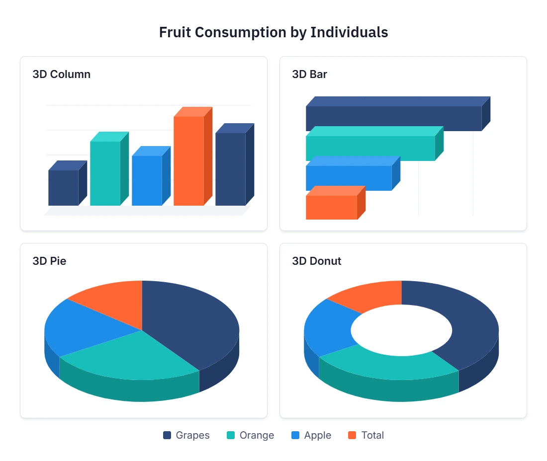
Visualize category comparisons and proportional relationships using 3D Column, 3D Bar, 3D Pie, and 3D Donut charts. Use them when dashboards must look visually distinctive, since depth-enhanced visualizations stand out in reports.
- Compare categories using 3D Column and 3D Bar charts.
- Show part-to-whole relationships with 3D Pie and 3D Donut charts.
- Create depth-enhanced visualizations for dashboards and presentations.
- Emphasize important comparisons and proportions.
Circular Charts
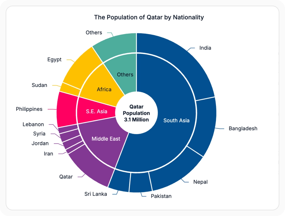
Communicate proportions, contributions, hierarchies, and funnel stages with Pie, Donut, Pyramid, and Funnel charts. Use them when business reporting or conversion analysis is required, since the visualizations support these workflows.
- Show category shares and contribution analysis with Pie and Donut charts.
- Highlight magnitude differences using varying-radius pie visualizations.
- Visualize conversion funnels, sales pipelines, and business stages.
- Present hierarchical and proportional data clearly.
Financial Charts
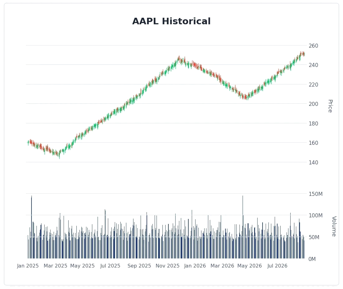
Visualize OHLC market data with Candlestick, Hilo, and Hilo Open Close charts. Use them when financial analysis is required, since built-in technical indicators evaluate trend, momentum, volatility, and price movement.
- Display open, high, low, and close market values.
- Analyze volatility and market movement over time.
- Apply technical indicators such as SMA, EMA, RSI, MACD, ATR, and Bollinger Bands.
- Build trading, investment, and financial analytics applications.
Sankey Diagram
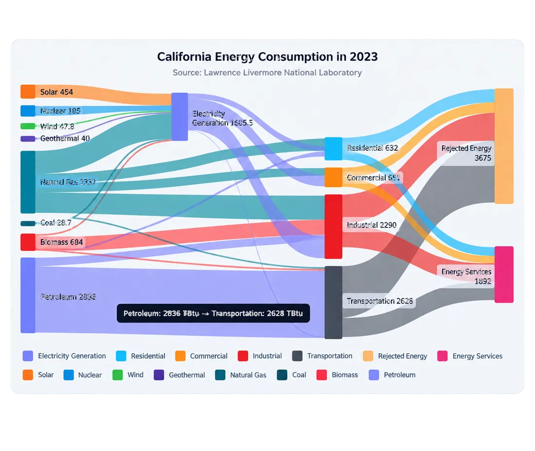
Display quantities moving between systems, categories, stages, or entities with connected flows whose widths represent proportional values. Use them when flow analysis is required, since proportional flow widths surface major contributors and bottlenecks.
- Visualize process flows and resource movement.
- Analyze customer journeys and conversion paths.
- Track energy, cost, and operational flows across systems.
- Identify major contributors and bottlenecks quickly.
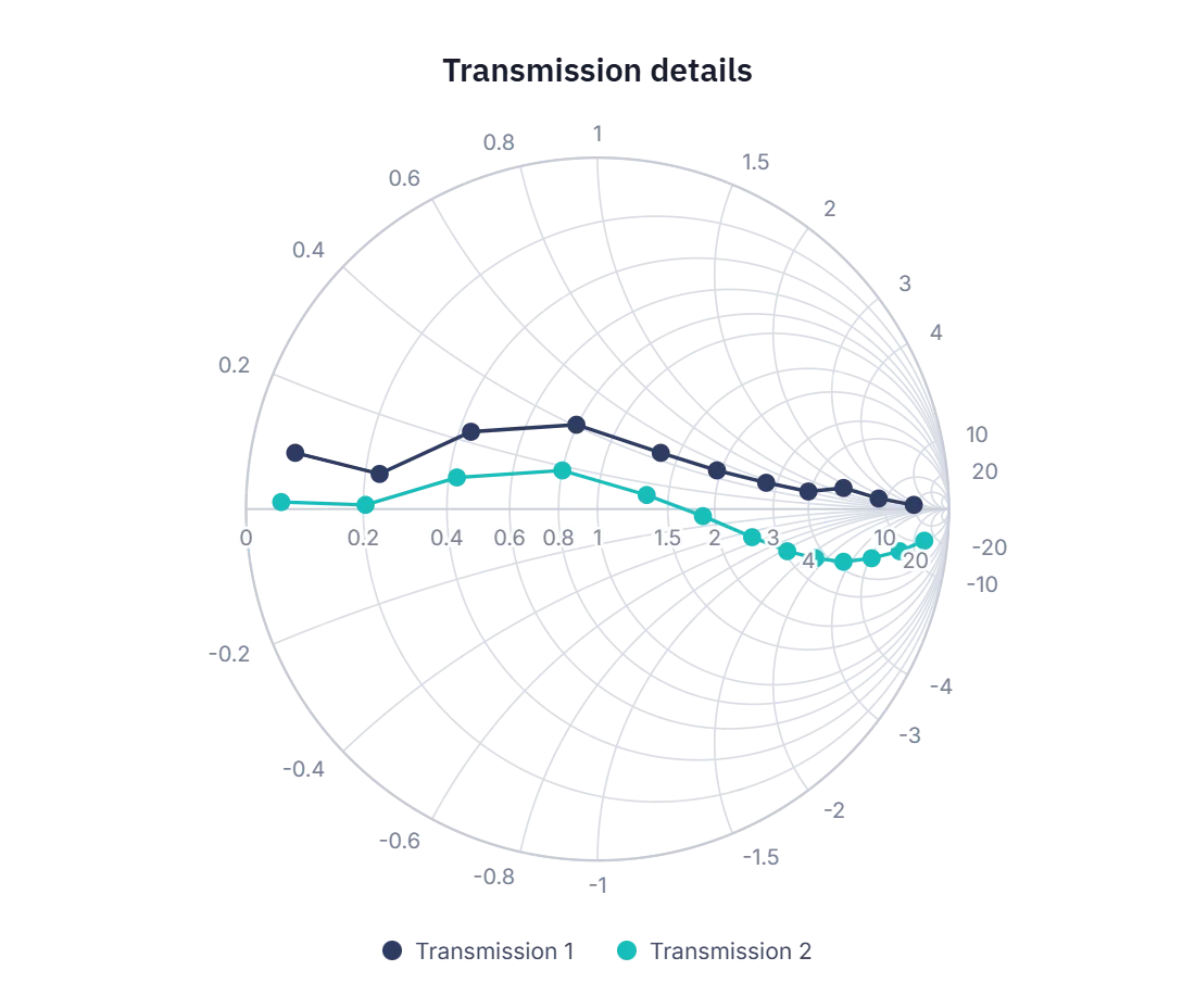
Smith Chart
Visualize impedance, admittance, and transmission-line behavior using the industry-standard Smith Chart. Use it for RF and microwave engineering workflows, since the chart supports impedance matching, reflection analysis, and engineering validation.
- Analyze impedance matching and reflection characteristics.
- Visualize RF, antenna, and transmission-line measurements.
- Compare multiple engineering datasets within a single chart.
- Support circuit analysis, validation, and reporting workflows.
Frequently Asked Questions
What chart categories are available in Syncfusion Charts?
Syncfusion Charts includes 2D Charts, 3D Charts, Circular Charts, Financial Charts, Sankey Diagram, and Smith Chart for general-purpose and specialized data visualization.
Which charts display part-to-whole relationships?
Use Pie, Donut, Pie with various radius, 3D Pie, or 3D Donut charts to show category contributions. Pyramid and Funnel charts are suitable for layered and stage-based values.
When should a Sankey Diagram be used?
Use a Sankey Diagram to show movement or transfer between entities and process stages. Each link width is proportional to its value, making the largest and smallest pathways easy to identify.
Which charts are best for trends and category comparisons?
Use line, spline, and area charts for trends over time. Use bar and column charts to compare values, rank categories, and identify high- and low-performing groups.
Can Syncfusion Charts visualize financial market data?
Yes. Financial Charts support Candlestick, Hilo, and Hilo Open Close series, along with DateTime axes, tooltips, zooming, and technical indicators for OHLC analysis.
What is Smith Chart used for?
Smith Chart is used to visualize transmission-line parameters and impedance data in high-frequency circuit applications. It supports customization, printing, and exporting for technical analysis and reporting.
Resources
Learn more about our Charts
Explore demos, KB articles, and documentation to get the most out of Syncfusion Charts.
Explore guides, setup details, and quick-start tips
See live use cases in action
Ask, share, and connect with peers
Find solutions and best practices fast.
Get expert help when needed.
Feature requests and bug reports
Track issues and suggest improvements
Awards
Greatness—it’s one thing to say you have it, but it means more when others recognize it. Syncfusion® is proud to hold the following industry awards.