Try Our Live Demo
Choose the right financial chart for market analysis
Use candlestick, Hilo, and Hilo Open Close series with DateTime axes to compare price ranges, trends, and OHLC movement across trading periods.
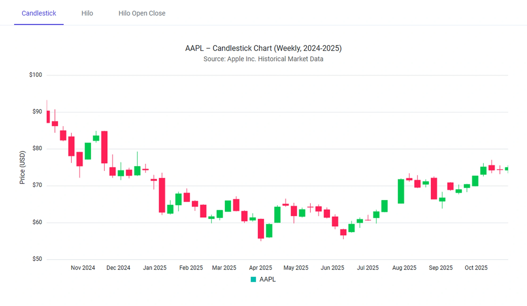
Candlestick charts for trading analysis
Candlestick charts show open, high, low, and close prices for each trading period with wicks and bodies.
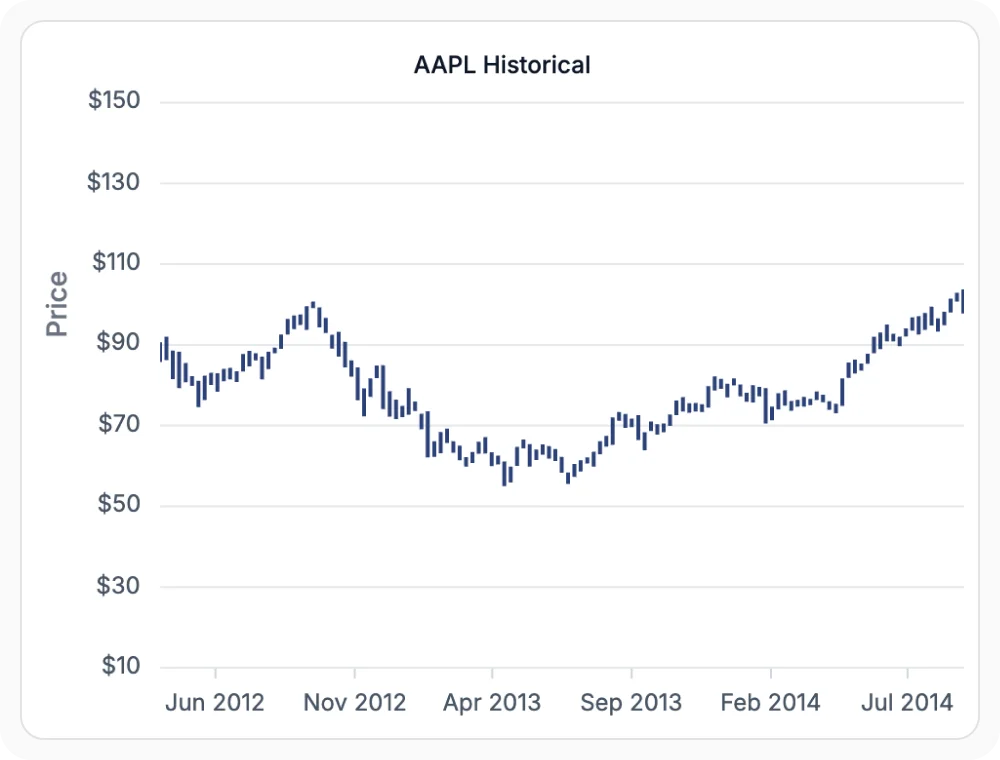
Compare price ranges with Hilo
Hilo charts show the highest and lowest prices for each trading period with vertical lines.
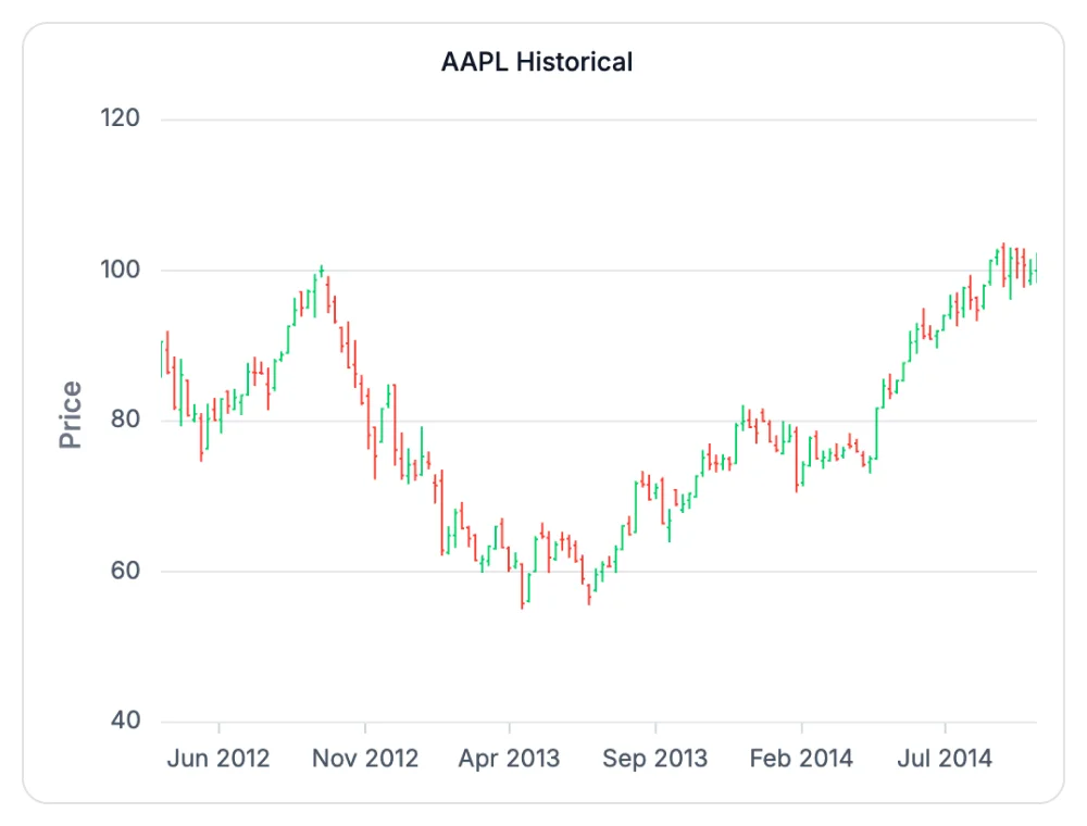
Hilo Open Close charts for OHLC analysis
Hilo Open Close charts show open, high, low, and close prices with a vertical line and horizontal ticks.
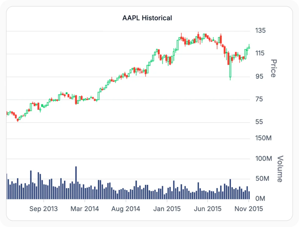
Candlestick charts for trading analysis
Candlestick charts show open, high, low, and close prices for each trading period. Use them when price direction and reversals must be reviewed, since wicks and bodies reveal the full price range and trading patterns.
- Display open, high, low, and close prices for each trading period.
- Reveal price direction, reversals, and trading patterns visually.
- Highlight bullish and bearish candles using body color and shape.
- Combine wicks to show the full intraday or inter-period price range.
Compare price ranges with Hilo
Hilo charts show the highest and lowest prices for each trading period with vertical lines. Use them when volatility and daily trading ranges must be compared, since the chart focuses on price range without open or close values.
- Show the highest and lowest prices for each trading period with vertical lines.
- Focus on price range without open or close values.
- Compare volatility and daily trading ranges at a glance.
- Combine with other series for technical comparison views.
Hilo Open Close charts for OHLC analysis
Hilo Open Close charts show open, high, low, and close prices with a vertical line and horizontal ticks. Use them for compact OHLC visualization in reports and dashboards, since the format is more compact than candlestick charts.
- Display OHLC prices with a vertical line and horizontal ticks.
- Present a more compact alternative to candlestick charts.
- Highlight open and close values using tick positions.
- Suit compact financial reports and trading dashboards.
GUIDED FINANCIAL ANALYSIS
Build a financial chart in four steps
Developers can choose a financial chart type, bind OHLC market data, configure analysis tools, and explore price behavior through visual indicators and interactions.
01
Select a financial chart
Choose candlestick, Hilo, or Hilo Open Close depending on how price information should be presented.
02
Connect market data
Bind open, high, low, close, and optional volume data for each trading period.
03
Configure analysis tools
Apply DateTime axes, indicators, tooltips, zooming, and crosshair interactions to support market analysis.
04
Analyze price behavior
Compare trends, volatility, momentum, and trading activity to evaluate market performance and opportunities.
PLATFORM SUPPORT
Visualize OHLC charts across platforms
Financial chart series types such as candlestick, Hilo, and Hilo Open Close are available across web, desktop, and cross-platform frameworks. Specialized indicators and tooltip formats may vary by platform.
| Capability | JS, React, Angular, Vue | Blazor | ASP.NET Core & MVC | WPF & WinForms | .NET MAUI | Flutter |
|---|---|---|---|---|---|---|
| Candlestick chart | ||||||
| Hilo chart | ||||||
| Hilo Open Close chart | ||||||
| DateTime axis alignment | ||||||
| OHLC tooltips | ||||||
| Technical indicators |
Frequently Asked Questions
What data fields do financial charts need for OHLC charts?
Hilo series require high and low values. Candlestick and Hilo Open Close series require open, high, low, and close values. Volume data is optional and can be used with supported technical indicators.
How do financial charts compare candlestick with Hilo Open Close series?
Candlestick series use bodies and wicks to represent open, high, low, and close values. Hilo Open Close series display the same data using a vertical line with open and close markers, providing a more compact visualization.
Can financial charts show OHLC values in tooltips?
Yes. Tooltips can display open, high, low, close, and volume values for each trading period, making it easier to inspect data points directly within the chart.
Can financial charts display multiple trading series?
Yes. Charts can display candlestick, Hilo, and Hilo Open Close series on the same chart. Shared axes help compare price ranges, trends, and OHLC movement across datasets.
Which axis works with financial OHLC charts?
A DateTime axis is typically used because financial data is organized chronologically. It helps align trading periods accurately and supports time-based market analysis.
Can financial charts use technical indicators for trading analysis?
Yes. Supported indicators such as Moving Averages, Bollinger Bands, MACD, RSI, and Accumulation Distribution can be displayed alongside financial series to help analyze trends, momentum, and volatility.
Resources
Learn more about our Charts
Explore demos, knowledge base articles, and documentation for financial chart configuration.
Explore guides, APIs, and quick-start tips
See live use cases in action
Ask, share, and connect with peers
Find solutions and best practices fast
Get expert help when you need it
Feature requests and bug reports
Track issues and suggest improvements
Awards
Greatness—it’s one thing to say you have it, but it means more when others recognize it. Syncfusion® is proud to hold the following industry awards.