Try Our Live Demo
Pick the right 3D chart for the data
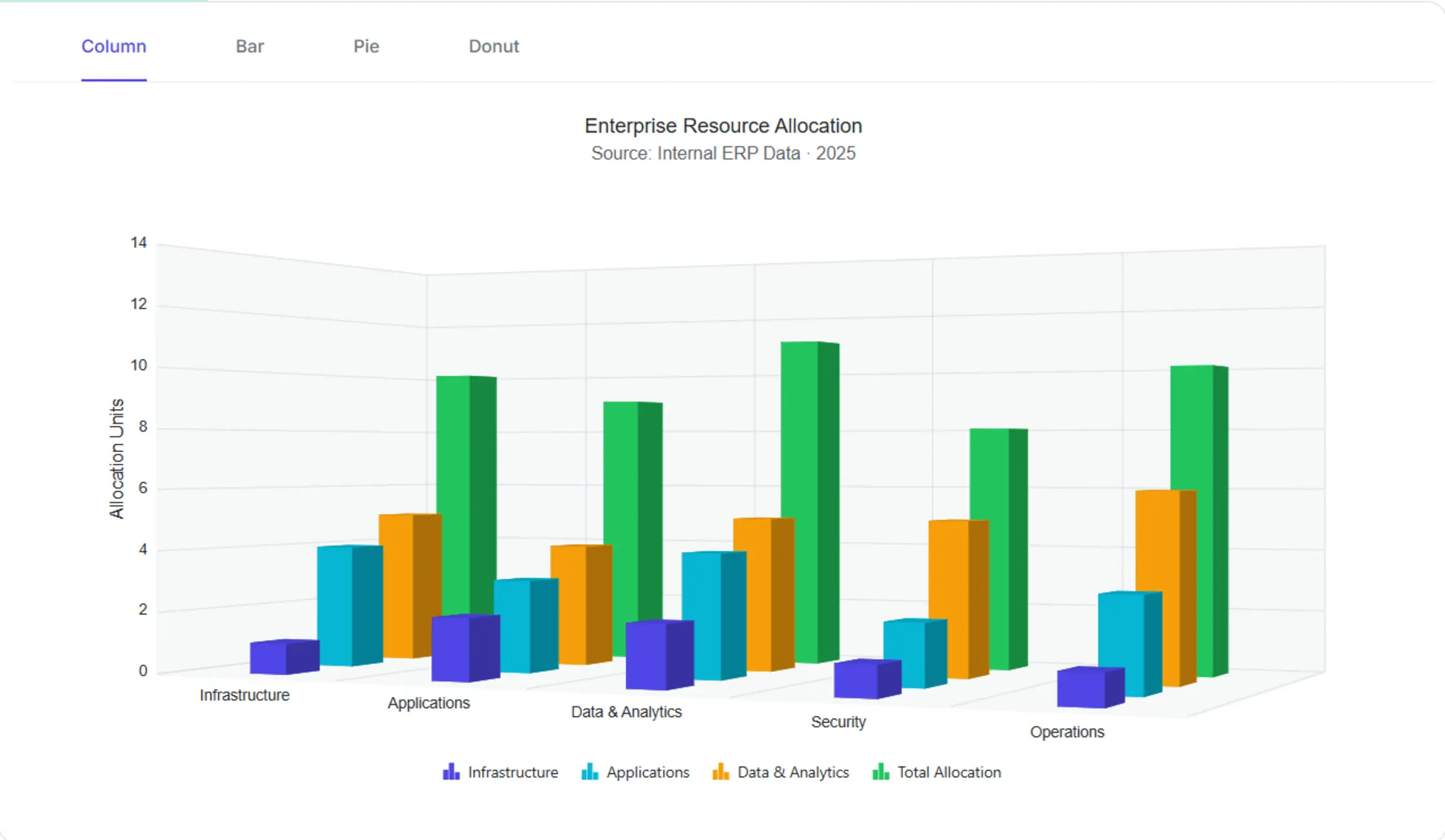
Choose from four built-in 3D chart types: 3D Column and 3D Bar for categorical comparisons across axes, and 3D Pie and 3D Donut for part-to-whole proportions.
3D Column Comparisons
Surface rank and magnitude differences across categories through depth-enabled vertical columns.
3D Bar Comparisons
Compare category values clearly when labels are long through depth-enabled horizontal bars.
3D Pie Proportions
Communicate part-to-whole share with depth that emphasizes volume in executive summaries.
3D Column Comparisons
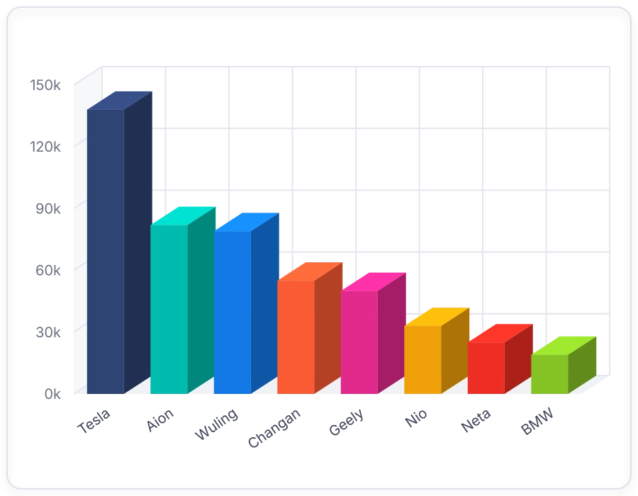
Render vertical three-dimensional bars for categorical comparisons. Use 3D Column charts when categories must be ranked and compared along two axes with depth for visual emphasis.
- Render vertical three-dimensional columns for categorical comparisons.
- Compare magnitudes and rank groups at a glance.
- Highlight the highest and lowest values within a series.
- Configure depth, rotation, and perspective through chart properties.
3D Bar Comparisons
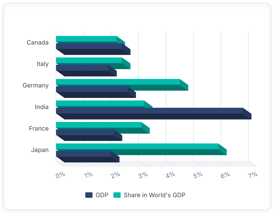
Render horizontal three-dimensional bars for categorical comparisons. Use 3D Bar charts when category labels are long, since depth-enabled horizontal bars provide space for readable axis labels.
- Render horizontal three-dimensional bars for categorical comparisons.
- Display long category labels clearly along the vertical axis.
- Compare values along a single horizontal direction for consistent scanning.
- Configure depth, rotation, and perspective through chart properties.
3D Pie Proportions
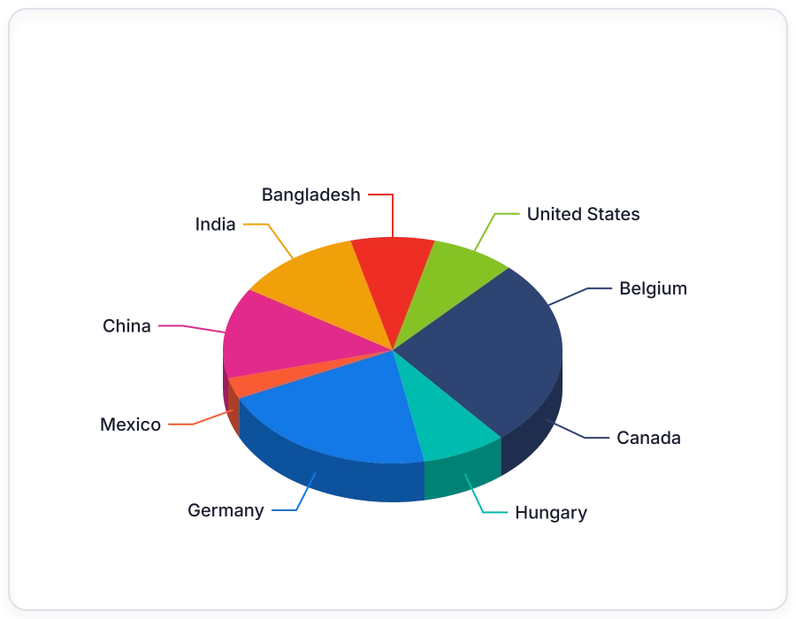
Render proportional data as three-dimensional pie slices. Use 3D Pie charts when emphasizing part-to-whole relationships with depth for executive-ready summaries.
- Render three-dimensional wedges that represent each category.
- Show part-to-whole proportions across categories with depth.
- Display each category’s share of the total at a glance.
- Configure depth, rotation, and tilt through chart properties.
3D Donut Proportions
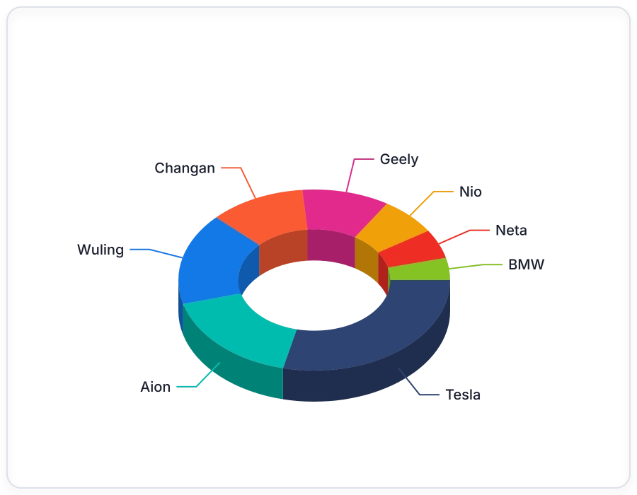
Render proportional data as three-dimensional concentric rings. Use 3D Donut charts when communicating part-to-whole proportions that require a center area for totals or contextual labels.
- Render three-dimensional rings that represent each category.
- Reserve the donut center for totals or labels.
- Show part-to-whole proportions with depth and visual emphasis.
- Configure depth, rotation, and tilt through chart properties.
GUIDED 3D CHART WORKFLOW
Build a 3D chart in four steps
Developers can choose a 3D chart type, bind data, render the 3D chart, and confirm that the depth-enabled visualization displays the expected categories and proportions.
01
Choose a 3D chart type
Pick 3D Column, 3D Bar, 3D Pie, or 3D Donut based on the comparison or proportion goal.
02
Bind the data
Provide categories and values in a data source compatible with Syncfusion Charts.
03
Render the chart
Render the chart with the chosen chart type to display three-dimensional bars, wedges, or rings.
04
Verify the visualization
Confirm that categories, values, and depth-based representation display as expected.
PLATFORM SUPPORT
Render 3D charts across platforms
Core 3D chart types are available across web, desktop, and cross-platform frameworks. Availability varies by feature for 3D Column, 3D Bar, 3D Pie, and 3D Donut chart types.
| Capability | JS, React, Angular, Vue | Blazor | ASP.NET Core & MVC | WPF & WinForms | .NET MAUI | Flutter |
|---|---|---|---|---|---|---|
| 3D Column Chart | ||||||
| 3D Bar Chart | ||||||
| 3D Pie Chart | ||||||
| 3D Donut Chart | ||||||
| Depth-based three-dimensional rendering | ||||||
| Category-based data binding |
Frequently Asked Questions
What 3D chart types are available in Syncfusion Charts?
Syncfusion Charts includes four built-in 3D chart types: 3D Column, 3D Bar, 3D Pie, and 3D Donut. These visualizations help present categorical comparisons and part-to-whole relationships using three-dimensional rendering.
What types of applications commonly use 3D charts?
Teams commonly use 3D charts in business dashboards, reporting applications, executive scorecards, operational monitoring systems, and analytics solutions to visualize comparisons and proportional data.
Are 3D charts available across multiple platforms?
Yes. Syncfusion provides 3D chart support across multiple web, desktop, and cross-platform frameworks. Refer to the platform support table for framework-specific availability.
When should developers choose a 3D Column or 3D Bar chart?
Use 3D Column and 3D Bar charts when comparing values across categories. Choose a 3D Column chart for standard category comparisons, and use a 3D Bar chart when category labels are lengthy or read more naturally along a vertical axis.
When should a 3D Pie or 3D Donut chart be used?
Use 3D Pie and 3D Donut charts to visualize part-to-whole relationships. These chart types are commonly used for budget allocation, market-share analysis, revenue contribution reporting, and category distribution scenarios.
Can 3D charts be used in dashboards and reports?
Yes. 3D charts are commonly used in dashboards and reports to present category comparisons, rankings, and proportional relationships in a visually distinctive format.
Resources
Learn more about our 3D Charts
Explore demos, KB articles, and documentation to get the most out of 3D Column, Bar, Pie, and Donut charts.
Explore guides, APIs, and quick-start tips
See live use cases in action
Ask, share, and connect with peers
Find solutions and best practices fast
Get expert help when you need it
Feature requests and bug reports
Track issues and suggest improvements
Awards
Greatness—it’s one thing to say you have it, but it means more when others recognize it. Syncfusion® is proud to hold the following industry awards.