Try Our Live Demo
Choose the right chart for the analytical question
Use a consistent API to visualize trends, comparisons, proportions, financial movements, relationships, and distributions across web, desktop, and mobile applications.
Track performance over time
Reveal growth, decline, and seasonal patterns in continuous data through line, spline, and area visualizations.
Identify high and low performer
Compare categories with bar and column charts to highlight differences in magnitude and rank items at a glance.
Communicate part-to-whole data
Use pie and doughnut charts to communicate composition and percentage breakdowns in market share, budgets, and similar datasets
Line charts for trend analysis
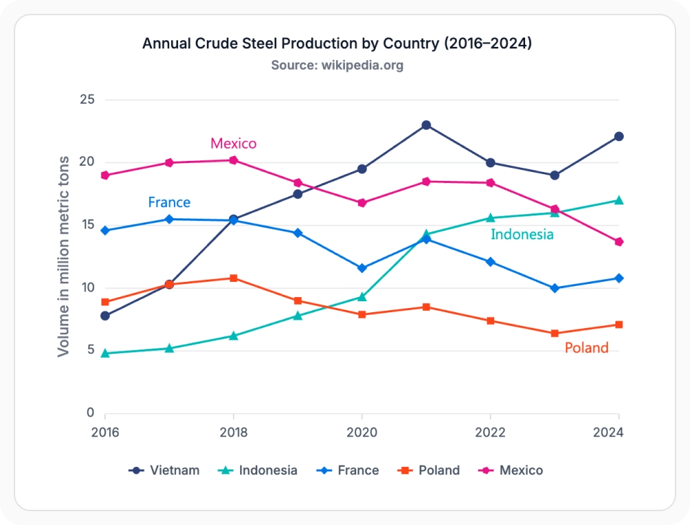
Line, spline, and area charts visualize trends and changes over time. Reach for these when tracking progress or monitoring changes across a period of time, since they help reveal growth, decline, seasonality, and performance patterns across continuous data.
- Visualize growth, decline, and seasonal patterns with line, spline, and area charts.
- Display multi-series trends with shared or independent axes.
- Combine area and line series for cumulative and trend views.
- Track KPIs and time-based performance metrics over any period.
Bar and column charts
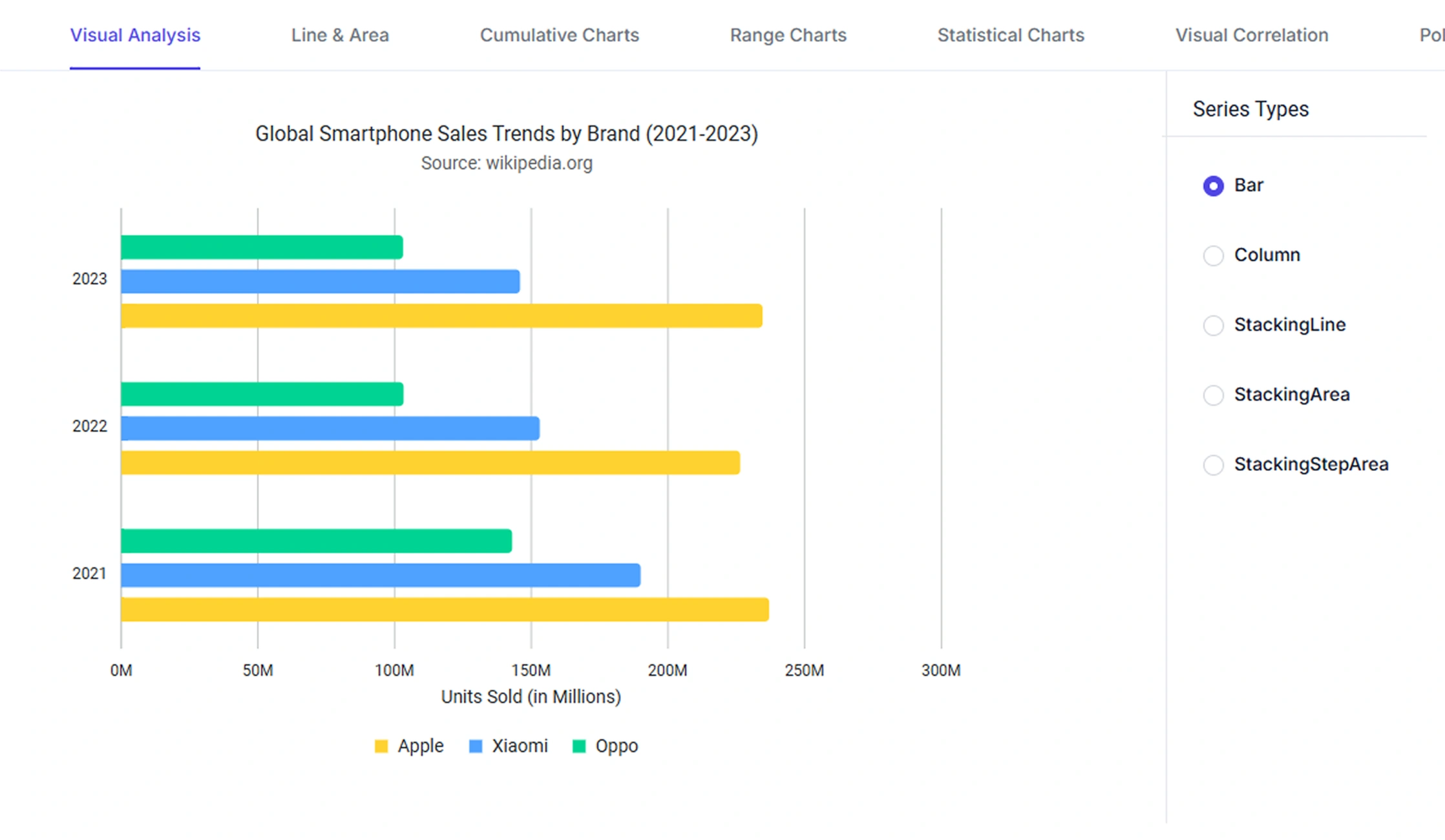
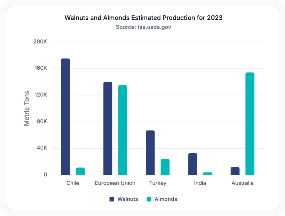
Bar and column charts display values as horizontal or vertical bars, making it efficient to compare data across categories. When comparing products, regions, departments, or other categories, they highlight differences in magnitude, rank items, and identify high and low performing groups at a glance.
- Compare values across products, regions, departments, or any named category.
- Highlight high and low performing groups with horizontal or vertical bars.
- Rank items with sorted bar and column visualizations.
- Combine stacked or grouped bars to break down totals.
Pie and doughnut charts
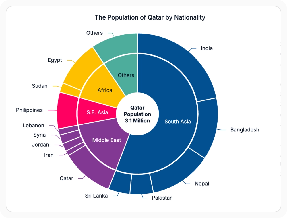
Pie and doughnut (donut) charts show how individual values contribute to a whole. They’re well suited to visualizing market share, budget allocation, or composition data, since they present proportions and percentages within a dataset at a glance.
- Show how individual values contribute to a whole.
- Visualize market share, budget allocation, and composition data.
- Use doughnut variants for additional center labels or KPIs.
- Highlight the largest or smallest slices with explode and radius options.
Financial charts for market analysis
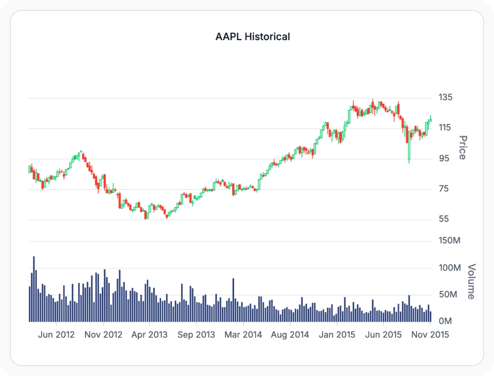
Financial charts such as candlestick and OHLC charts visualize open, high, low, and close price movements over time. Use them to analyze stocks, cryptocurrencies, or other financial instruments; they reveal trend direction, volatility, and trading activity across financial markets.
- Display open, high, low, and close price movements over time.
- Analyze trend direction, volatility, and trading activity.
- Combine multiple financial series in a single chart.
- Use specialized data labels aligned to OHLC values.
Scatter and bubble charts
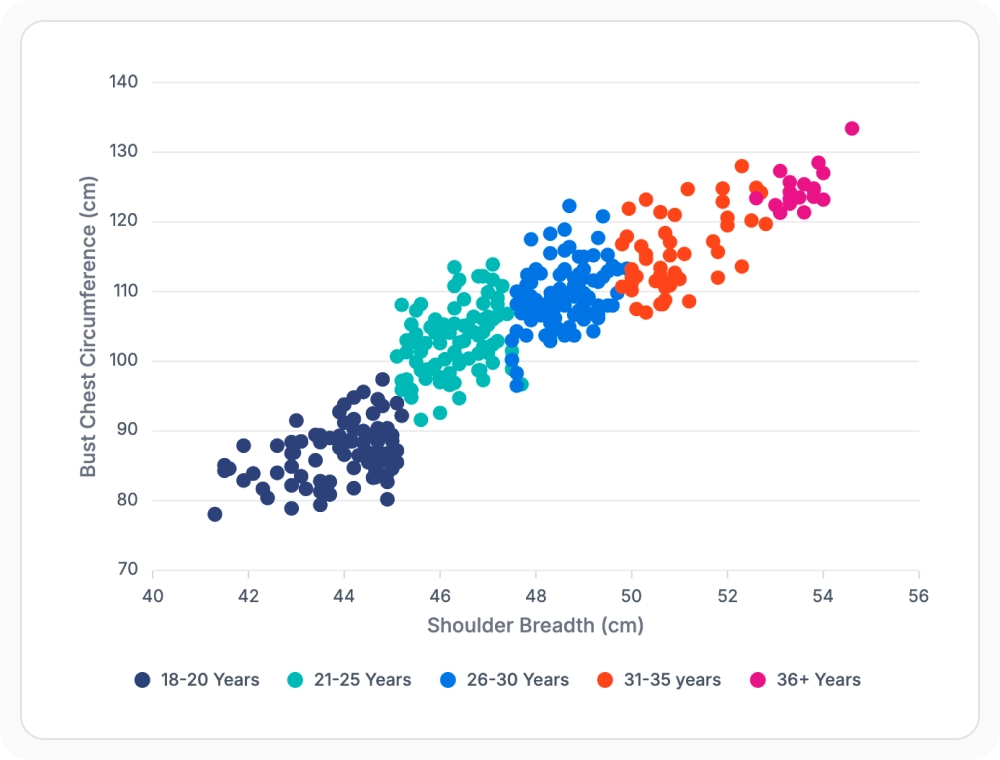
Scatter and bubble charts help reveal relationships between multiple variables. For exploring relationships between multiple variables or identifying patterns in large datasets, they surface correlations, clusters, trends, and outliers within a dataset.
- Reveal correlations, clusters, and outliers across multiple variables.
- Use bubble size to add a third dimension to scatter visualizations.
- Explore large datasets with performance-optimized rendering.
- Combine trend lines to highlight relationships visually.
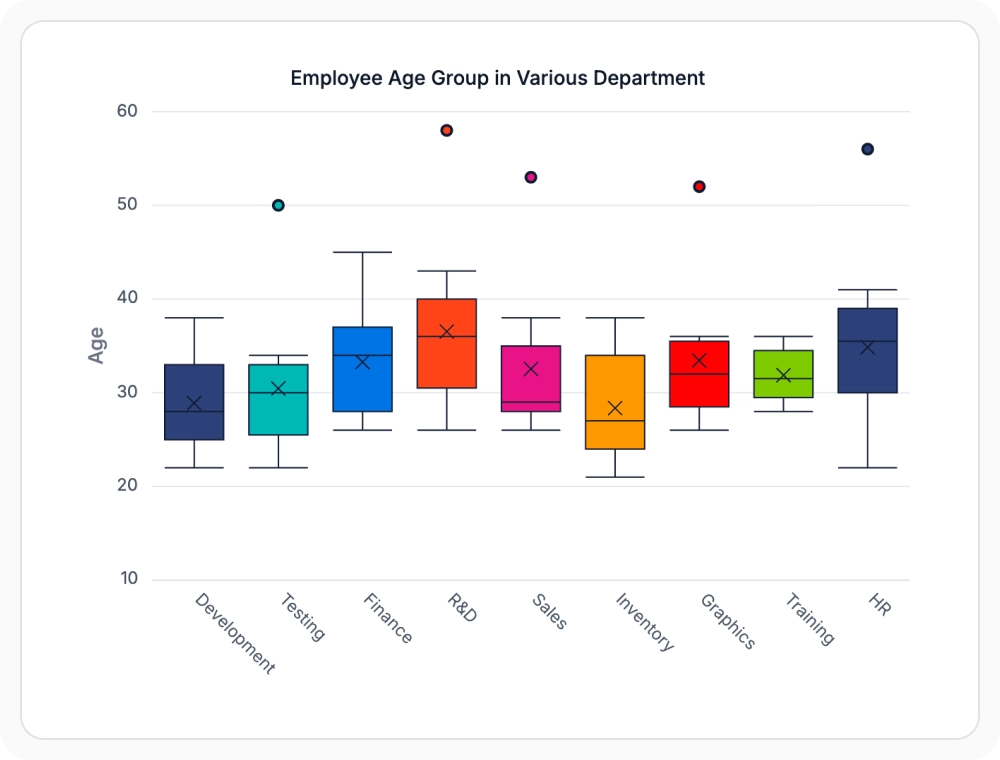
Distribution charts for statistical analysis
Histogram and box plot charts help explain how data is distributed. Use them when performing statistical analysis to identify patterns, variation, and outliers within a dataset.
- Visualize data distribution and spread across a range of values.
- Identify outliers, skewness, and variation with box plots.
- Use histograms to summarize frequency across bins.
- Show statistical summaries such as median, quartiles, and whiskers.
Polar and radar charts
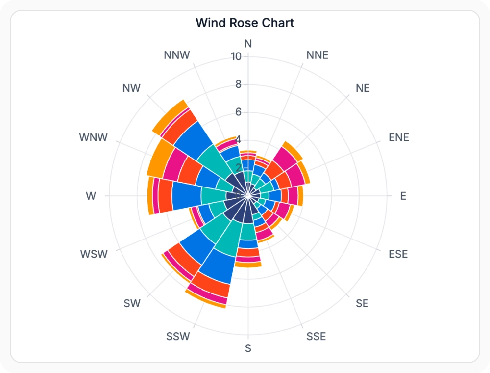
Polar and radar charts compare multiple metrics within a single visualization. They’re a strong fit for evaluating skills, products, teams, or performance metrics, highlighting strengths, weaknesses, and performance differences across categories.
- Compare multiple metrics inside a single circular visualization.
- Highlight strengths and weaknesses across categories.
- Visualize skill sets, product specs, and team performance.
- Combine multiple series for side-by-side metric comparisons.
Range and stacking charts
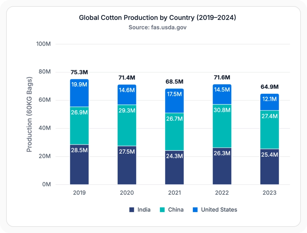
Range and stacking charts display minimum and maximum values across a period or categories, and show how individual values accumulate toward a total. They help track intervals, allocations, and cumulative progress across business, financial, and operational data.
- Display minimum and maximum values across a period or category.
- Show how individual values accumulate toward a total.
- Compare parts of a whole with stacked bar and column charts.
- Track cumulative progress and running totals over time.
GUIDED CHART TYPE SELECTION
Build the right visualization in four steps
Teams can evaluate the analytical goal, select the most appropriate chart type, bind data through a consistent API, and adapt or combine visualizations as application requirements evolve.
01
Define the analytical goal
Determine whether users need to analyze trends, compare categories, understand proportions, evaluate relationships, explore distributions, or monitor financial performance.
02
Select the best chart type
Choose from line, bar, pie, financial, scatter, distribution, polar, radar, range, stacking, or combination charts based on the data and analysis requirements.
03
Connect and configure data
Bind application data using a shared data model and configure axes, legends, tooltips, labels, and interactions for the selected visualization.
04
Adapt as requirements change
Switch chart types or combine multiple visualizations without restructuring the underlying dataset, helping teams evolve dashboards and reports as business needs grow.
PLATFORM SUPPORT
Render 55+ chart types across platforms
Core chart types such as line, bar, pie, scatter, and area are available across web, desktop, and cross-platform frameworks. Specialized types like financial, polar, and distribution charts may have varying availability by platform.
| Capability | JS, React, Angular, Vue | Blazor | ASP.NET Core & MVC | WPF & WinForms | .NET MAUI | Flutter |
|---|---|---|---|---|---|---|
| Line, bar, and column charts | ||||||
| Pie and doughnut charts | ||||||
| Financial charts (candlestick, OHLC) | ||||||
| Scatter and bubble charts | ||||||
| Distribution charts (histogram, box plot) | ||||||
| Polar and radar charts | ||||||
| Range and stacking charts | ||||||
| Combination charts |
Frequently Asked Questions
What chart type is best for showing trends over time?
Line, spline, and area charts are best for showing trends over time. They help visualize growth, decline, seasonal patterns, and performance changes across any dataset.
Which chart type is best suited for category comparison?
Bar and column charts are best for comparing values across categories, supporting quick identification of differences and ranking of items.
Do all chart types support tooltips and legends?
Tooltips, legends, data labels, and animations are supported across all standard chart types. Financial chart types support tooltips and legends but have specialized data label formats aligned to OHLC values. Box plot and histogram chart type support tooltips with statistical summary values.
Can multiple chart types be combined in one chart?
Yes. Charts supports combination charts, allowing chart types like line, column, area, and spline to be displayed together within a single chart.
Which chart type works best for analyzing relationships?
Scatter and bubble charts are best for exploring relationships between variables, helping identify patterns, trends, and outliers.
Can chart types be switched without changing the data source?
Yes. All standard chart types accept the same data point structure. Switching a series type requires only a type property change on the series definition, not a data structure change. Financial chart types (candlestick, OHLC) require OHLC fields and are the only series that use a different data model.
Resources
Learn more about our Charts
Explore demos, KB articles, and documentation to get the most out of the Charts.
Explore guides, APIs, and quick-start tips
See live use cases in action
Ask, share, and connect with peers
Find solutions and best practices fast
Get expert help when you need it
Feature requests and bug reports
Track issues and suggest improvements
Awards
Greatness—it’s one thing to say you have it, but it means more when others recognize it. Syncfusion® is proud to hold the following industry awards.