Try Our Live Demo
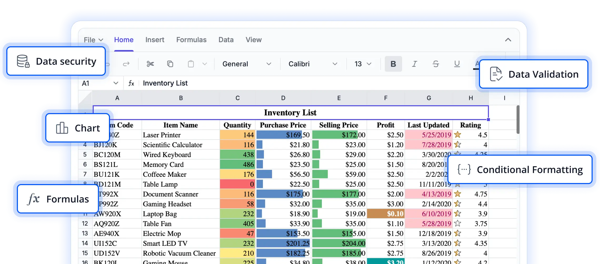
Transform spreadsheet data into meaningful visual insights
Explore charting capabilities that help users visualize trends, compare values, and uncover patterns within spreadsheet data. These features make complex information easier to understand and support more informed decision-making in React applications.
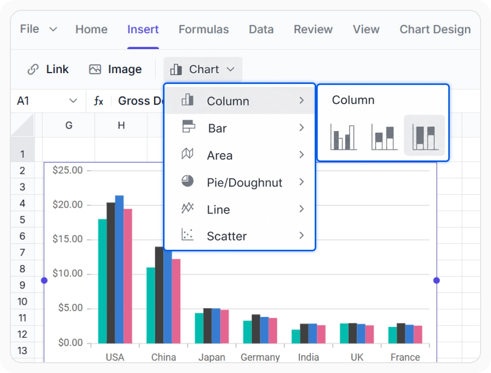
Compare data with column charts
Column charts display category-based data for clear value comparison. Use when you need to evaluate performance across multiple groups or categories in your spreadsheet.
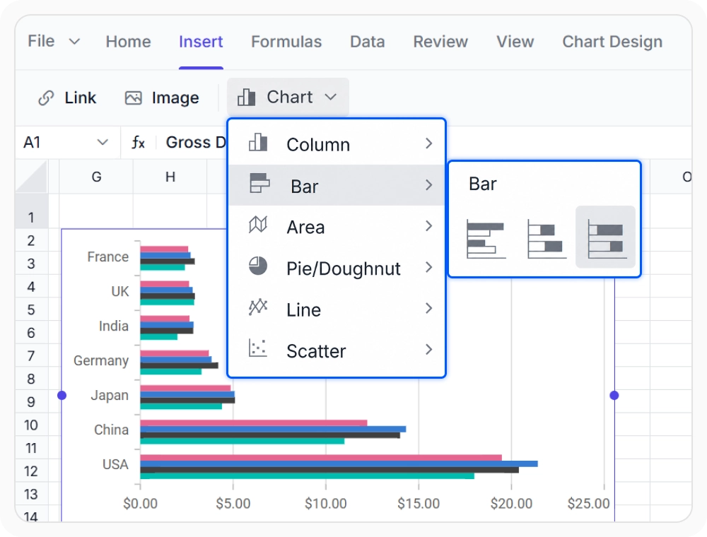
Rank categories with bar charts
Bar charts compare ranked categories to highlight top and bottom performers. Use when you need to order many categories by value for easy performance review.

Show trends with area charts
Area charts highlight volume, contribution, and growth trends over time. Use when tracking business metrics across periods to see cumulative changes and overall progress.
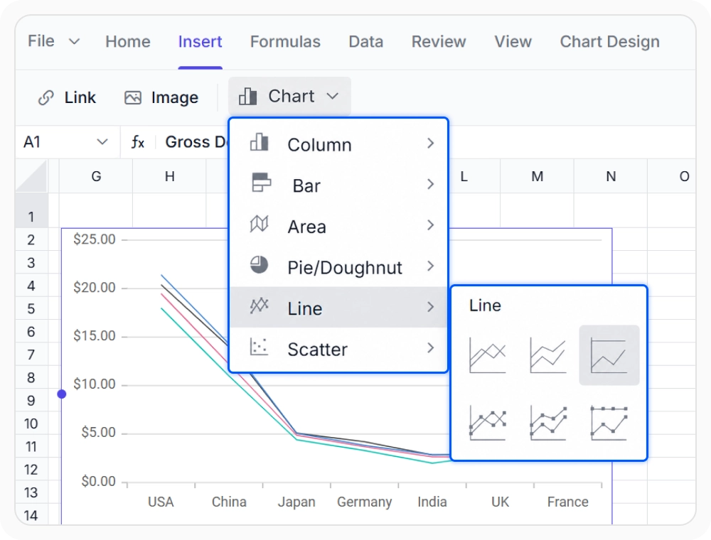
Analyze trends with line charts
Line charts show changes across time periods, highlighting trends and recurring patterns. Use when you need to analyze performance data over days, months, or years.
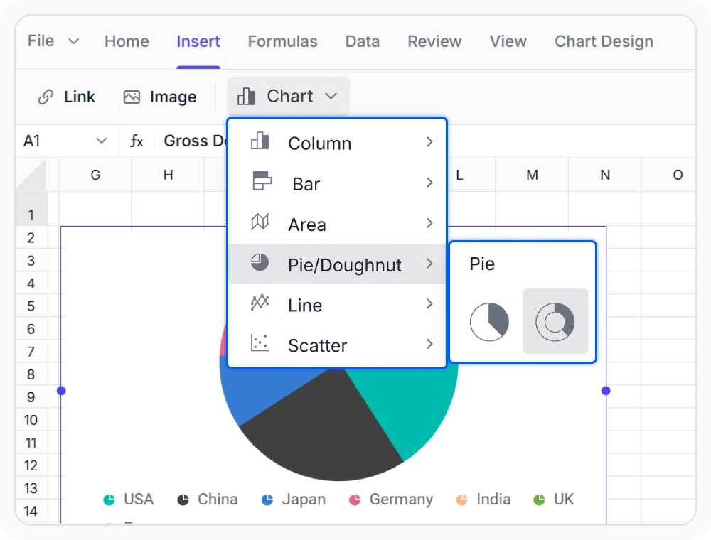
Show proportions with pie charts
Pie charts display category proportions and distribution. Use when decision-makers need to understand how individual segments contribute to an overall business outcome.
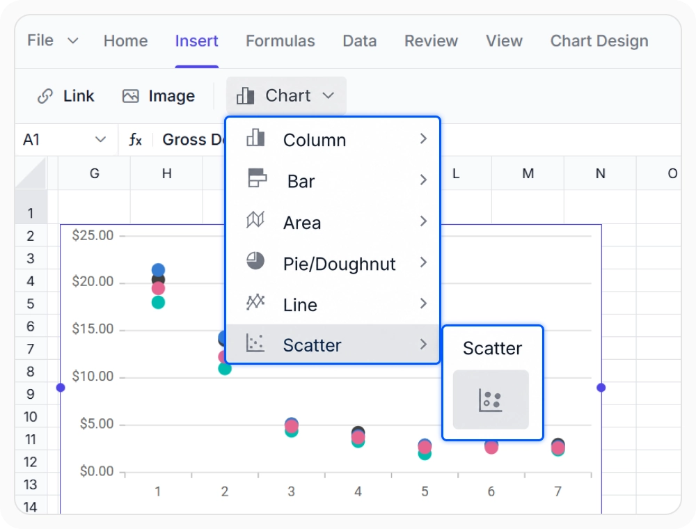
Find correlations with scatter charts
Scatter charts reveal relationships between two variables, showing trends, clusters, and outliers. Use when reports need to reveal how changes in one metric influence another over time.
See Why Developers Love Syncfusion
Our Customers Love Us
Having an excellent set of tools and a great support team, Syncfusion reduces customers’ development time. Here are some of their experiences.




Frequently Asked Questions
What chart types are available in the React Spreadsheet Editor?
The Syncfusion React Spreadsheet Editor supports column, bar, area, line, pie, and scatter charts. Each chart type helps visualize data, compare values, and analyze trends, proportions, and relationships for better spreadsheet insights.
How are charts created from worksheet data in React Spreadsheet Editor?
Charts are created by selecting a worksheet data range and choosing a chart type. The chart remains connected to the selected data, automatically reflecting changes made to the underlying worksheet content.
Do React Spreadsheet Editor charts reflect changes made to the connected data range?
Yes. Charts remain connected to their source data ranges and update automatically when the underlying cell values change. This keeps visualizations accurate without requiring the chart to be recreated or manually refreshed after each data update.
Can chart appearance be customized in the React Spreadsheet Editor?
Yes. Chart titles, colors, themes, data labels, sizing, and positioning can be customized within the React Spreadsheet Editor. These options help tailor chart appearance for application requirements and reporting needs.
Does the React Spreadsheet Editor allow changing chart types after creation?
Yes. Chart types can be changed after creation without rebuilding the chart from the data range. This makes it easy to evaluate different visualizations and select the most effective chart for the data.
Which chart types can be used for trend analysis in the React Spreadsheet Editor?
Line and area charts are commonly used for trend analysis in the React Spreadsheet Editor. Line charts help visualize changes, fluctuations, and patterns over time, while area charts highlight overall magnitude and cumulative changes alongside trends.
Resources
Learn more about our React Spreadsheet Editor
Explore demos, KB articles, and documentation to get the most out of our React Spreadsheet Editor.
Explore guides, APIs, and quick-start tips
See live use cases in action
Ask, share, and connect with peers
Find solutions and best practices fast
Get expert help when you need it
Feature requests and bug reports
Track issues and suggest improvements
Awards
Greatness—it’s one thing to say you have it, but it means more when others recognize it. Syncfusion® is proud to hold the following industry awards.